
Client
VUB is the second largest bank in Slovakia, which belongs to the Italian group Intesa Sanpaolo. It has more than 150 branches in Slovakia and serves more than one million clients.
Challenge
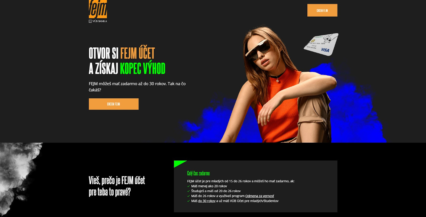
VUB has launched a campaign to promote a youth account called FEJM. The campaign had a separate landing page www.fejm.sk, which VUB decided to test. VUB wanted to test the usability of the site as well as the opinions of the target group on the benefits of the bank account and the copy used in the campaign and on the site (which used highly informal and slang-ridden language to appeal to the target demographic).
So how do you find out if young people trust a bank when the bank tries to use their language? You ask them. But how much does it cost to do customer research among hundreds of young people who may have an actual interest in your product? How do you find them? How long will it take? The answer is usually weeks of your time and thousands of euros out of your wallet. But with UXtweak, we had it done in a couple of days, at the hundredth of the cost. Read further to learn how we managed this.
Setting up a study in RePlay Tasks
We decided to use UXtweak’s tool for conducting online usability testing to see how young people would interact with (and react to) the FEJM landing page. RePlay Tasks is the most straightforward tool of its type – it requires no installation and no file uploading on the side of the tester. Testers need to simply click a link and complete the study by navigating a website or a prototype. This made it the ideal tool to use, because we could promote the study online and easily acquire a large number of testers from our target group. Thanks to minimum technical barriers, it was very easy for anyone to participate in the study. Especially since they were being instigated by competition and the promise of nice prizes.
Creating the tasks
We had three main hypotheses that we wanted our study to verify in regards to the FEJM campaign page:
- The youth find the familiar, slang-laden language of the page to be a preferable means for the bank to communicate with them.
- Users gain a good understanding of the promotion for opening a new bank account (30 € discounts in one of two selected stores). The promotion is viewed as a good incentive for picking up VUB as one’s bank of choice.
- The website explains all the information about FEJM that users may need, clearly and thoroughly.
With these objectives in mind, we settled on two tasks. The first one aimed more at natural free viewing and exploration, while the second one was chosen to verify if people could find a specific piece of information on the page:
Task 1: Find out what FEJM is and what are its benefits
Task 2: Find out who and how can create a FEJM account
Since both of these tasks took place entirely on one page, the start and end URL was the same. Rather than measure success based on whether the respondents could navigate to a different page, we were more interested in how testers processed the information found within this single page. To gather this information, we used a post-task questionnaire. Here are some sample questions that we used:
- Describe your understanding of the discount that you’ll earn by creating a FEJM account and how this discount works.
- The FEJM account is intended for people aged:
- 15-19
- 18-26
- 15-26
- 20-26
As you can see, we used questions with full-text answers to gain insight about the user’s understanding of the more complex ideas on the page, while selection answers were used to simply gauge comprehension.
Once our tasks were prepared, we simply copied them into our UXtweak study, and the core of the usability testing was ready. However, there are plenty of other options in a RePlay Tasks study that we made use of.
Creating questionnaires
In RePlay Tasks, you can include a survey at the beginning and also at the end of your study, which is the ideal place for collecting feedback or data that can be used to segment the respondents during analysis. We found appropriate use for both types of questionnaires.
We placed demographic questions like gender and age in the pre-study questionnaire.
Meanwhile, we asked feedback-oriented questions like the following at the end of the study:
- Choose the option that best describes your attitude to the 30 € discounts in stores selling stylish glasses and sneakers.
- On a scale of 1 to 5, rate how the site’s language is appropriate for a bank to communicate information about the FEJM account
Since we were only interested in opinions and observations of young people (or in the edge case, their parents or legal guardians) we also made use of the screening question. With this option, we could filter out all candidates who picked the last option to the following question:
Are you 15-26 years old?
- Yes
- No, but I’m their parent or legal guardian and I would be aiding them with creating their new bank account.
- No
Localizing and customizing our testing
Since the potential young clientele of VUB comes from Slovakia, we needed to appropriate our study towards them. UXtweak’s welcome messages and instructions can be customized, so we translated them to Slovak and rephrased them for young people. And importantly, we included information about the incentive for our testers – how they could win a valuable prize.
Recruiting respondents
With RePlay Tasks, sharing your study is easy, you just share it via a direct link. We used Facebook Ads, targeting our young target group, and promising a chance to win a prize to all who participated. Only those who completed the full study could enter by submitting their email address in the post-study questionnaire. We later entered the email addresses into a virtual ballot to draw the winners.
Interpreting the results
In total, we had 446 entries, of whom 78 (17%) fully completed the study until the end.
As the first step of the analysis of the results, we used feedback from questionnaires to learn how testers perceived the campaign page. We then segmented the respondents based on their answers in the questionnaires (something that can be done with filters in RePlay Tasks) to observe their behavior. We confirmed our suspicions that certain crucial pieces of information haven’t caught some user’s attention or weren’t seen at all.
Some of our findings were based on quantitative data, such as the number of respondents who answered a question incorrectly, others on anecdotal feedback, such as: “sometimes you need to keep your seriousness” and “these phrases don’t belong into the dictionary of the young” regarding the site’s language.
Here are some of the findings we made
- The discount was perceived mostly as a bonus, or as a less significant decision making factor
- Young people aged 15-19 are more favorable to the language used by the site, those aged 20-26 are less so, finding it as undermining the bank’s trustworthiness. Some of the respondents found the way of expression and used language more engaging and natural for them, better than austere “administrative” language used by banks.
- Some of the information on the website was unclear to participants – they didn’t understand what it means to “Open up a FEJM and we will boost it by 30 €“
- Respondents had trouble finding information about the account (who the account is for, what are its benefits), some didn’t even scroll down after pressing a button for more information. Some respondents complained about too much scrolling.
Conclusion
What the client needed for testing
- Hypotheses they wanted to verify
- Tasks and questionnaires to verify their hypothesis
- An incentive for the respondents – in our case, every participant who successfully finished the study was included in a draw for valuable prizes
- Recruiting – the direct link to the study was shared on social media. We used Facebook ads to target our target group
- The time needed for evaluation
VUB knows its customer’s opinions of the website thanks to UXtweak, which helped them streamline the experience on the FEJM campaign page. The feedback was gathered quickly and effectively. You can try UXtweak too! Register here.