Hey UXtweakers,
Over the last few months, we’ve been rebuilding UXtweak to make it more flexible and more focused on what matters day to day. Today, we’re sharing the first major milestone: the redesigned dashboard.
Our goal was to reduce the “noise” and help you:
- Get a clear, bird’s-eye view of your studies and recruiting status – so it’s easy to see what needs attention and what can wait
- Keep key actions, such as results, setup, and sharing links, within reach
- Access results and launch studies faster, spending less time on logistics and more time interpreting outcomes
Here’s what you will see on the dashboard:
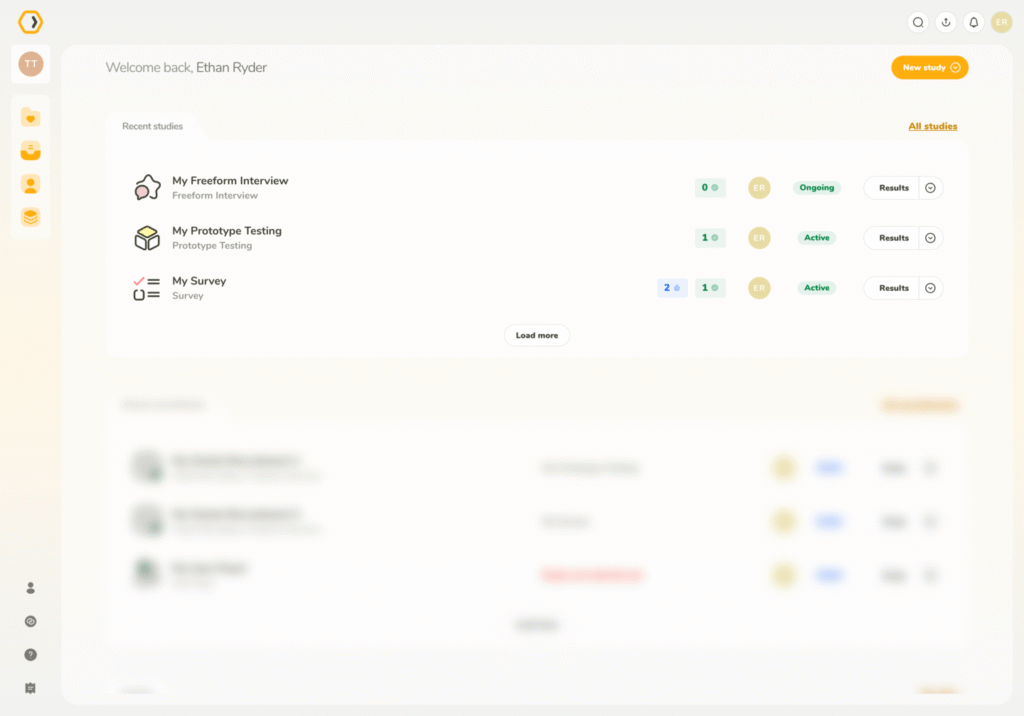
Recent studies – pick up where you left off
At a glance, you can now see:
👉 Real-time progress: study status (Draft, Active, Inactive, Finished) and quick stats on completed vs. abandoned participants
👉 Context: study type (Tree Test, Card Sort, etc.) and who on your team created it
👉 Actions: view results, copy study URLs, jump to setup, and handle common tasks directly from the dashboard
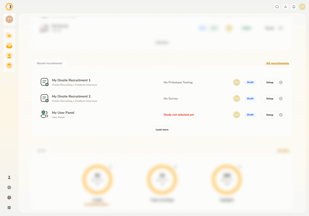
Recent recruitments – recruitment monitoring at a glance
Get a clear view of how participant sourcing is going, whether you’re using the UXtweak User Panel, Own Database, or bringing your own participants.
It makes it easier to spot slowdowns or potential issues before they affect your timeline.
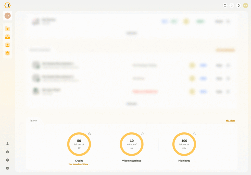
Visual quota management
Track your remaining quotas (pre-paid participants, AI credits, responses, highlights and more) visually and plan your month’s research directly from the dashboard.
We also refreshed the sidebar navigation and streamlined study creation to remove friction from everyday work.
Take a look and let us know what you think. If something still feels off or noisy, we’d love to hear it. 🐝
Happy researching,
UXtweak team
