We all love taking shortcuts from time to time. But sometimes, our minds take these shortcuts without our knowledge and hinder the end result. These impromptu shortcuts are referred to as cognitive biases in UX.
Designers often deal with these biases and create designs that aren’t up to the mark. Sometimes, they let their personal beliefs get in the way, while other times, they get caught up too much in the first piece of information they receive.
These are just a few examples of cognitive biases in UX. Today, we have covered a list of all such biases that hinder designs and how to limit them.
What is cognitive bias?
Cognitive bias is an error in thinking that occurs when people process information. It causes them to make judgments and decisions that are not always logical or accurate. These biases are like mental shortcuts that help us make decisions quickly but can lead to mistakes.
For example, you might believe a product is better because it has more positive reviews, even if they are not credible.
Or you might think flying is more dangerous than driving because plane crashes are dramatic and get more news coverage, even though flying is statistically safer. This is how cognitive biases can influence our decisions and lead to incorrect conclusions.
Types of cognitive biases in UX
Cognitive biases in UX can be split into groups based on whether they stem from our own perceptions or social interactions. Let’s look at these biases and the techniques and tools we can use to minimize their impact.
1. Confirmation bias
Confirmation bias is the tendency of people to search for, interpret, and remember information in a way that confirms their preexisting beliefs or opinions. They only focus on information supporting their views while disregarding information contradicting them.
Example of confirmation bias in UX
A UX designer is testing a new productivity app that they believe should prioritize a minimalist design. They might unconsciously focus on confirming this belief during testing.
During this process, they could overlook usability issues or features that contradict their preference for minimalism. As a result, missing out on opportunities to improve the app’s functionality for a broader range of users.
How to limit confirmation bias in UX?
It’s essential not to limit your testing process to the assumptions you make. Assumption mapping can help as you jot down all your assumptions regarding a product and user behavior. Based on these assumptions, you can test and see which ones are actually true and fit for the situation.
However, it’s crucial not to force these assumptions on users and allow them to make decisions freely.
2. Anchoring bias
Anchoring bias happens when people rely too heavily on the first piece of information they receive while making decisions. This initial information becomes a reference point, and all future judgments or decisions are made accordingly. Even if the anchor or initial piece of information is irrelevant, it can hinder the decision-making process.
Example of anchoring bias in UX
When a pricing page shows a high-priced option first, users may perceive subsequent lower-priced options as more affordable. For instance, displaying a premium plan at $150/month before a standard plan at $50/month makes the standard plan seem like a better deal.
How to limit anchoring bias in UX?
Design experiences that help users make decisions based on relevant information instead of anchors. When you are presenting information, show all relevant options in a balanced way without emphasizing one over the other.
If your premium plans are priced on a higher end, make sure you balance them out by clearly displaying the wide range of features that make the plan worth the investment. In this manner, users consider all choices equally rather than being influenced by the first one they see.
3. Framing effect
The framing effect is a cognitive bias in which people make decisions based on how the information is presented. It occurs when the same information is framed differently, leading to different interpretations and choices. A simple example would be:
- Treatment A has a 90% survival rate
- Treatment A has a 10% mortality rate
Although both descriptions provide the same statistical information, people are likely to perceive Treatment A more positively than Treatment B.
Example of framing effect in UX
In terms of UX, here’s an example from the pricing point of view:
Positive frame: Sign up for an annual subscription and save $20
Negative frame: Sign up for a monthly subscription over the annual and lose $20
Even reading the latter seems so negative that it’s unlikely that any action will be taken. Therefore, how you frame the information can greatly affect how users perceive and act.
How to limit the framing effect in UX?
Avoid overly positive or negative language. Stick to neutral, factual descriptions to prevent distorting users’ perceptions. At the same time, give them options to make comparisons. When they get enough options to compare, they will make decisions according to that instead of relying on how information is framed.
4. Recency bias
As the name suggests, recency bias is a cognitive bias that emphasizes the most recent events over older data. These events seem more significant or representative than they actually are. It leads to skewed judgments as the users overlook the broader context in favor of the most immediate experiences.
Example of recency bias in UX
When users provide feedback based on their most recent experience with an interface, they might forget the positive experience they have had all along. Their overall satisfaction with the product decreases based on one shortcoming. Similarly, if they are used to certain navigations, more suitable alternatives might reduce their satisfaction as they are used to the initial one.
How to limit recency bias in UX?
Instead of relying solely on recent feedback, aggregate feedback from various points in time. Look at trends and patterns in user satisfaction over the long term to understand overall user sentiment accurately.
You can even prompt users to provide feedback on their overall experience with the product, not just their most recent interaction. Ask specific questions here to encourage users to reflect on their entire user journey’s positive and negative aspects.
Create user journey maps that show the entire experience, from initial interaction to ongoing usage, to understand how different stages and interactions contribute to overall satisfaction.
Learn how to create a user journey map in this quick video ⬇️
5. Peak-end rule
The Peak-end rule suggests that people judge their experiences based on how they felt at the peak (the most intense point of the experience) and at the end rather than the experience as a whole. Whether they feel positive or negative towards the end dominates their overall experience with the product.
Example of peak-end rule in UX
Let’s say a customer is browsing through an eCommerce store. He easily finds what he is looking for, and the checkout process is smooth. The overall experience is remembered positively, as there were no issues searching for the product and making the final purchase.
On the flip side, if the checkout process was cumbersome, he might leave the store without making the final purchase and remember the entire experience negatively.
How to limit peak-end rule in UX?
Provide a high-quality user experience consistently across different touchpoints. Smooth transitions between different stages should minimize abrupt endings.
While peaks and endings are memorable, try improving the average experience across all interactions to balance out any negative impacts of less memorable moments.
6. Social desirability bias
Social desirability bias is a cognitive bias that causes people to act in a way they believe will be viewed favorably by others. People often refrain from providing honest or accurate information or opinions. This cognitive bias can affect surveys, interviews, and other forms of research aimed at enhancing user experience.
Example of social desirability bias in UX
Let’s say you conduct usability testing for a new mobile app and ask participants to rate their satisfaction with its interface. Due to social desirability bias, participants might give a higher rating than they truly feel when appearing cooperative. Such actions skew the results, making it seem like the interface is more user-friendly than it actually is.
How to limit social desirability bias in UX?
Create a feedback mechanism where users can answer anonymously. They are more likely to provide honest opinions if they know their responses cannot be traced back to them personally.
Sometimes, users also alter their responses if they know they are interacting directly with the product’s developers or designers. Use third-party researchers to ensure a more open and honest flow of information.
Lastly, rather than solely relying on self-reported data, observe actual user behavior whenever possible. Heatmaps and session recordings can provide valuable insights into how users interact with the product without relying on their self-assessment.
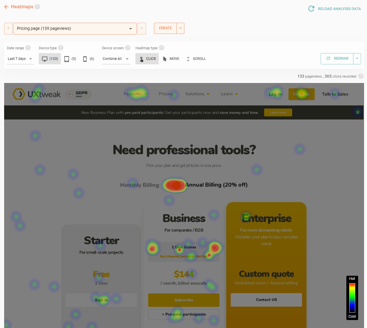
Example of a heatmap.
You can generate heatmaps like this together with session replays using UXtweak’s Session Recording Tool. Record and watch how users navigate your product, and easily spot where they face issues! 🐝
7. False consensus effect
The False Consensus Effect is a cognitive bias in which individuals overestimate the prevalence of their beliefs, opinions, and preferences within a population. They tend to believe that their views are more widely shared than they actually are. In fact, they expect others to think or behave similarly.
Example of false consensus effect in UX
Let’s say a UX designer is tasked with designing the navigation and categorizing products for an online clothing store. The designer, who personally prefers shopping by garment type (tops, bottoms, dresses) and material (cotton, denim, silk), decides to structure the navigation around these categories.
They believe most users would find this categorization convenient for browsing and purchasing clothing items. However, without understanding user preferences, they may overlook the needs of different user segments. Some users might prefer browsing by fashion trends (Boho, chic, formal wear) rather than traditional garment types.
Others may prioritize shopping by occasion (work attire, casual weekend, weddings), which could lead to frustration if these categories are not prominently featured in the navigation.
How to limit false consensus effect in UX?
This bias arising from rigid beliefs, can be limited by card sorting. It’s a method where you let the users decide on the categories that make sense to them while browsing and shopping online. This approach shifts the focus from the designer’s assumptions to user perspectives.
Therefore, it frees you from limited viewpoints and creates experiences that align with the user’s needs.
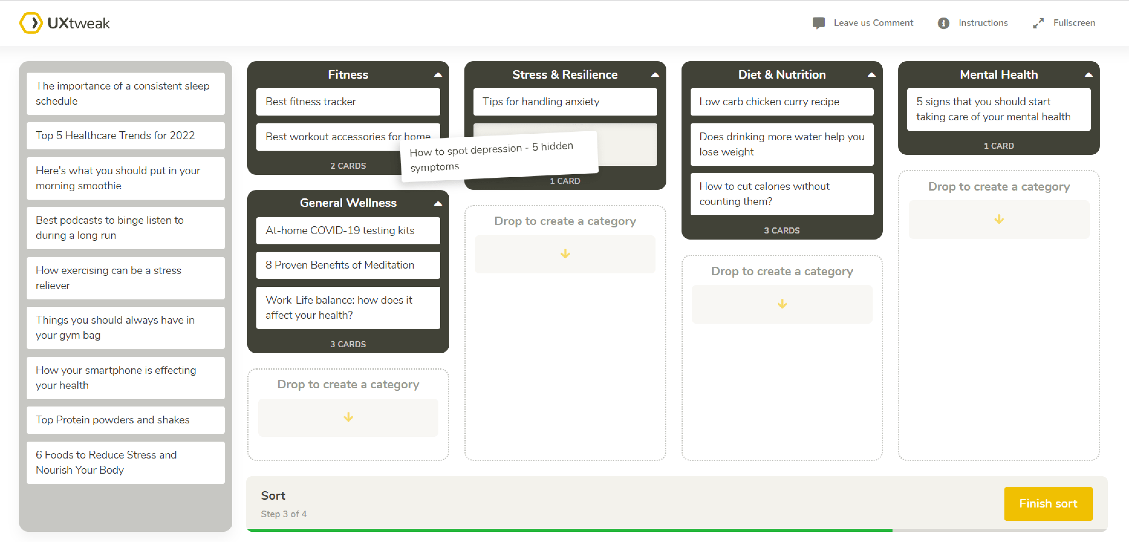
Card sorting example.
You can conduct cards sorting easily with UXtweak Card Sorting Tool. Find out how users perceive your product’s navigation structure and what is the best way to categorize your website’s content!
For even more insights, run your card sorting in combination with tree testing, using a tree testing tool. This way you’ll be able to double check the card sorting insights and understand where users face issues in your navigation!
Check out how these two methods work in our demos 🔥


8. Clustering illusion
The Clustering Illusion makes individuals perceive patterns or clusters in random or unrelated data. It leads them to believe that events are more closely related or clustered together than would be expected by chance alone.
Example of a clustering illusion in UX
Session recordings are a valuable tool in UX design, providing real-time insights into how users interact with a website or application. However, due to time constraints, designers often watch a limited number of session recordings.
If these few recordings show similar user behaviors, they might generalize these findings to the entire user base. Therefore, they might overemphasize certain issues that aren’t as prevalent as they appear.
How to limit clustering illusions in UX?
Analyze and generate insights from larger samples, as they provide a more accurate representation of user behavior. Combine qualitative and quantitative data to explore greater details.
9. Hindsight bias
We have all heard that one person say “I knew this sports team was going to win all along.” Investors may claim they knew a particular stock would rise or fall. These are examples of hindsight bias, the “know-it-all” of all cognitive biases in UX.
After an event has occurred, people often believe that they had predicted or could have predicted the outcome. In other words, they overestimate their ability to predict certain outcomes.
Example of hindsight bias in UX
Consider a scenario where you are working on the UX of a streaming app and notice that many users are abandoning their carts before completing the subscription. The hindsight bias immediately makes you think, “Of course, the subscription process was confusing! Why didn’t we realize that before?”
That’s where the trouble begins! You start working on simplifying the process without trying to conduct user research to identify the actual problem.
How to limit hindsight bias in UX?
Instead of jumping to conclusions and thinking the problem is obvious, create a user journey map that considers the feelings and thoughts of users at each stage as they encounter it.
This will prevent you from jumping ahead and coloring your experience with what you know (hindsight). Throughout the process, you will identify that there were multiple issues, such as unclear pricing, limited options, lengthy signup forms, etc.
10. Bandwagon Effect
The Bandwagon effect occurs when people adopt certain behaviors, styles, or attitudes simply because others are doing so. We often see it as “trends” on social media. People quickly jump in and align with the majority or popular opinion. It arises from the need to fit in, be part of a group, or be associated with success and popularity.
Example of bandwagon effect in UX
In terms of UX, chatbots have started gaining popularity. Almost every website you jump into has a chatbot ready to assist you. However, many fail to give the expected service and frustrate users. This, when combined with no option of reaching out to a human representative can lead users to bounce off and never return.
While chatbots offer a convenient way to answer basic questions and streamline interactions, implementing them solely because “everyone else is doing it” can backfire.
How to limit bandwagon effect in UX?
Before adopting any UX trend, conduct user research to determine whether it aligns with user needs and expectations. If it does, keep testing and refining it to ensure user-friendliness. While it’s nice to keep up with technological advancements, always keep your human reps ready for assistance if introducing anything like a chatbot.
11. Availability heuristic
The Availability Heuristic is a cognitive bias in which people tend to make decisions based on how easily they can think of examples or information. For instance, consumers might perceive a product as superior because it’s the first brand that comes to mind due to extensive advertising. That might not be true, but our brain still makes decisions accordingly.
Example of availability heuristic in UX
A user is exploring various options for a new productivity app. They come across two apps that offer similar features but have different user interface designs:
App A: The user recently read an article praising its sleek design and innovative navigation.
App B: They have seen several advertisements for this app recently, highlighting its ease of use and popularity among users.
The user might be more inclined to choose App A because the positive article they read about its design is readily available in their memory.
Since they remember the positive information, App A is more attractive, even though they haven’t compared its functionality with App B.
How to limit availability heuristic in UX?
If you don’t want users to make quick and uninformed decisions, provide as detailed information as possible. Ensure your top features are highlighted while encouraging users to test them through demos and comparison tools. All while doing so, keep your top reviews shining in front of them to show the faith other users have in you.
12. Observer-expectancy effect
The observer expectancy effect is a bias in which a researcher’s beliefs about an experiment’s outcome influence the participants’ behavior. Researchers might unknowingly give subtle cues or signals, such as body language, tone of voice, or facial expressions, that lead to a specific response.
Example of observer-expectancy effect in UX
Let’s say a researcher is testing the efficiency of a new feature. When users successfully use the feature, they may smile and nod or give other sorts of encouraging cues. This non-verbal encouragement can lead participants to use the feature more, even if they find it confusing or not particularly helpful.
How to limit observer-expectancy effect in UX?
To avoid such effects, you can use moderators who are not involved in the design process and are unaware of the expected usability testing results. The testing environment and instructions given should also remain neutral, with nothing added from the researcher’s side to get specific results.
You can also use tools such as heatmaps and session recordings to keep human intervention to a minimum and garner accurate data.
13. Sunk cost fallacy
The sunk cost fallacy occurs when individuals continue to invest in a project based on the cumulative previous investment in terms of time, money, and effort. Instead of evaluating the current and future benefits, they continue to invest money in areas that are less likely to give fruitful results.
Example of sunk cost fallacy in UX
Let’s say a company spent many hours developing a new product feature. The development team has spent months designing, coding, and testing this feature. However, during user testing, it becomes evident that users find this feature confusing and do not use it as intended. Despite this, the company launched the feature because of the investment already made.
How to limit sunk cost fallacy in UX?
Create a user-centered design process that involves frequent usability tests and feedback sessions. This helps identify issues early on before significant resources are invested.
At the same time, go for an iterative design process that allows continuous refining of features instead of making large, unguided investments. If not, you are creating too confusing features and can risk losing your loyal customers.
14. Endowment effect
The endowment effect states that people assign more value to things merely because they own them. This effect implies that people will likely demand much more to give up an object than they would be willing to pay to acquire it.
It can be seen when people sell things they own, as they are likely to place a higher value on them. It simply means the object has more value to them than potential buyers do.
Example of endowment effect in UX
An example of the endowment effect in UX would be software companies’ 30-day trial. Once users start using the software and become used to its benefits, they may be more likely to perceive it as valuable and worth purchasing. This happens even if the initial price sets them off.
How to limit the endowment effect in UX?
The endowment effect makes users overly attached to a product’s existing features and workflows. They might be reluctant to change, making introducing new elements or improving the system difficult.
To avoid that, implement changes gradually rather than all at once. It will help users adapt to the changes and reduce resistance due to the endowment effect.
At the same time, users are kept a part of the change process through usability testing and feedback sessions. Let them know the changes are made, keeping their needs in mind.
General considerations for limiting cognitive biases in UX

Tip 1: Conduct user research
Instead of making assumptions, engage directly with users to gather genuine feedback and insights. Use various UX research methods, such as interviews, surveys, and usability tests, to gain a deep understanding of their needs and behaviors.
Tip 2: Have a diverse team
A diverse team brings a variety of perspectives and experiences, which can help identify and mitigate biases. Create a team with diversity in gender, culture, background, and expertise that leads to more balanced and inclusive designs.
Tip 3: Create a data-driven design
Base design decisions on data and analytics rather than assumptions or personal preferences. Use analytics, user feedback, and performance metrics to guide the design process and validate decisions with concrete evidence.
Tip 4: Don’t get caught in your own notions
Remain open to new information and be willing to challenge your own beliefs and assumptions. Regularly seek out and consider alternative viewpoints to avoid becoming entrenched in a single perspective.
Tip 5: Map out your assumptions
Clearly identify and document your assumptions at the beginning of the project. Continuously test and validate these assumptions through user research to ensure they hold true in actual scenarios.
Learn more about assumption mapping and how to use it in the design process:
Wrapping up
Now, you have everything you need to limit these cognitive biases in UX. As much as knowing these areas can help you become more cautious, you need the right tools to take action. For instance, when you need to ensure you don’t let your assumptions get in the way, use a Preference Testing Tool to understand user preferences better.
Similarly, when you feel like changing your website’s interface, don’t just assume which areas aren’t working anymore. Use a Usability Testing Tool to understand how users react to the interface and make changes according to their responses.
And if you don’t want to fall into the trap of the sunk cost fallacy effect, conduct prototype testing to understand how well users interact with your prototypes.
These are just a few examples of the many tools UXtweak provides that can help you limit these cognitive biases.
Want to learn more about how it can help? Register for your free account and try it yourself or contact our team today!