Key takeaways
💡 Define the problem and user needs clearly, using research insights from interviews, usability testing, and data analysis.
✨ Craft a compelling narrative that outlines your design process, supported by visuals like personas, user flows, and journey maps.
📊 Highlight measurable impact by linking results to business goals and keeping your language accessible to non-design stakeholders.
🔍 Focus on key elements that showcase your skills, tailoring your case study to the specific role and using tools like UXtweak for research and testing.
Writing a UX case study can often feel overwhelming. Many designers struggle to balance storytelling with concrete results. Mentioning key moments without drowning in unnecessary details is a constant challenge.
It’s easy to get stuck choosing the right visuals, research insights, and data to include. And then, there’s the pressure to keep things concise while still showcasing your full impact.
In this article, we’ll cover everything you need to tackle these challenges from structuring your case study to focusing on key takeaways.
What is a UX case study?

A UX case study is a detailed story of how you solved a specific user experience problem. It walks through your design process, from understanding the problem and doing research to creating solutions and testing them.
It’s your chance to show off your problem-solving skills and how your work led to real, measurable improvements.
Think of it as a behind-the-scenes look at how you approached a project, what challenges you faced, and how you came up with the final design that made everything work better for the user.
UX case study vs UX portfolio VS resumé
A UX case study, portfolio, and resumé might all seem like they do the same thing—show off your work—but each has its own purpose.
Knowing how they’re different can help you present your skills the right way, whether you’re applying for a job or showcasing your process.
Aspect | In-Person Research | Remote Research |
Non-Verbal Observation | Enables detailed observation of gestures and body language. | Limited due to screen constraints and video quality. |
Environment | Conducted in a controlled setting to minimize distractions. | Takes place in participants' natural environment. |
Reach | Restricted by geographical and logistical factors. | Access to a geographically diverse audience. |
Cost | Higher expenses for venues, equipment, and participant travel. | Higher expenses for venues, equipment, and participant travel. |
Flexibility | Scheduling is rigid and less adaptable. | Offers greater flexibility and supports different time zones. |
Technical Issues | Minimal technical risks with proper preparation. | Potential disruptions from internet or platform issues. |
Engagement | Facilitates higher engagement through physical interaction. | May reduce engagement due to lack of in-person connection. |
Setup Requirements | Demands significant setup, including location and equipment. | Simple setup via virtual platforms. |
Data Collection | Allows real-time observation and adjustments. | Relies on digital tools and may need follow-up for clarity. |
Time Investment | Typically more time-consuming, especially for larger studies. | Faster to organize and execute iterative research. |
💡 Pro Tip
To make your case study or portfolio even stronger, don’t forget to mention the specific UX research methods you used.
Spotlighting techniques like usability testing, user interviews, or A/B testing can show off your ability to gather and analyze user data. Showing a solid grasp of these methods can give your work extra depth that hiring managers love to see.
Why UX case studies are useful
UX design case studies are crucial for the following reasons:
Showcase your problem solving skills
A UX case study lets you walk through the steps of how you tackled a design challenge. For example, you can explain how you redesigned a checkout process to reduce cart abandonment.
Highlight real results
Case studies give you space to show off the impact of your work. Maybe your design increased conversion rates by 20% or made a mobile app more accessible to users with disabilities.
Tell your design story
It’s not just about the end result; it’s about how you got there. Did you face unexpected roadblocks? Did you pivot based on user feedback?
A case study lets you share the full journey.
Prove your value
Instead of just saying you can do the work, a case study actually shows it. This can be a huge advantage in job interviews, as it gives hiring managers something concrete to dig into.
Build credibility
By walking through a real project, you’re proving that you understand the UX process—from research to wireframes to testing. It’s way more convincing than just listing skills on your resumé.
💡 Pro Tip
Running prototype user testing early and often during the product development process maximizes your chances of meeting user needs.
To learn more about how to conduct it, check out our step-by-step prototype user testing guide.
Common elements of UX design case studies

Let’s now look at some common elements of well-written UX design case studies:
Problem statement
The problem statement is where you lay it all out—the core issue you’re trying to tackle. It should be clear and to the point, explaining the challenges faced by users or the business. However, that’s generally the hardest part.
During a discussion among UX design professionals, many agreed that identifying the focus or problem for a UX case study can be challenging. Here are some useful tips to consider:
- Start small by identifying a common issue or a simple task users need to complete.
- Draw from personal experience by focusing on challenges you face in apps you use daily.
- Try to visualize the problem and create a user journey map to pinpoint issues and find improvement opportunities.
- Leverage frameworks – for instance, start with the Jobs-to-Be-Done framework for guidance and clarity.
Possible solution
This section focuses on identifying the main problem and proposing potential solutions. When brainstorming solutions, tools like user interviews can provide valuable insights into user needs and frustrations.
Using user interview tools helps collect and organize feedback directly from your target audience.
Explain how these insights guided your design choices—whether it was simplifying a user journey or improving a specific feature. Clearly aligning the problem with the proposed solution allows readers to understand why this approach was the most suitable.
💡 Pro Tip
Want to include user interviews in your UX research?
Try UXtweak’s Live Interviews! Seamlessly schedule, recruit, conduct, and analyze your all user interviews.
⬇️ Learn more about the feature and be the first to try it!
Design process
Here, you’ll want to walk through your design process step by step.
This could include brainstorming, sketching, wireframing, prototyping, and testing. It’s not just about what you did, but why you did it. Did you make any pivots based on user feedback? Did the design evolve as new challenges emerged?
This gives insight into your iterative process and problem-solving approach.
Qualitative research insights
For qualitative insights, methods like user interviews, contextual inquiries, and focus groups are commonly used. These methods help you understand user motivations, emotions, and behaviors.
When presenting qualitative research, it’s great to include the main questions you asked during interviews and highlight direct quotes from users to capture their experience in their own words.
This gives your case study a human touch and adds credibility to your findings.
💡 Pro Tip
Check out our guide to better understand the differences between qualitative and quantitative UX research.
Quantitative research insights
Quantitative insights come from data-driven research methods like usability testing, surveys, or A/B testing. For example, you might conduct usability testing and present metrics like the task success rate or time on task.
This can be visually represented through graphs, charts, or heatmaps. Presenting concrete numbers helps quantify the impact of your design and shows evidence of improvement or problem areas.
See these research methods in action! 🐝
UX artifacts
UX artifacts are the tangible deliverables that showcase your design thinking at each stage. Common artifacts include UX personas, user flows, user journey maps, and empathy maps.
Personas help illustrate who your users are, while user flows and journey maps visualize how users navigate through a product or service.
It’s helpful to present these artifacts according to the phase in which they were created, so the reader can see how they informed your design decisions at different stages.
Learn how to create your own user journey map in this video 🔽
Wireframes
Wireframes give a rough layout of your design’s structure without getting into the visual details. They’re used to map out content, functionality, and how users will interact with different elements.
In your UX case study, show both low-fidelity (basic layout) and high-fidelity (more detailed) wireframes. This helps demonstrate how your design evolved from concept to execution.
Testing and results
Once your design is live or prototyped, it’s time to test the prototype. User testing, A/B testing, and usability testing are all common methods to evaluate the effectiveness of your design.
In this section, discuss the feedback you received and the key results—whether it’s improved task success rates or higher user engagement.
If you made adjustments after testing, explain how the results shaped the final design.
15 best UX case study examples for UX designers
Let’s now look some UX case study examples for inspiration and improvements:
- How HubSpot grew traffic, conversions, and revenue
- Zebpay’s UX transformation
- A UI/UX case study on spotify
- UX design case study on Duolingo
- UI UX case study on Bumble
- UX case study example of Google
- Airbnb UX case study
- Slack’s improved user experience
- Calendly’s UX redesign
- Google Drive redesign case study
- Canva redesign case study
- Redesigning Trello onboarding experience
- UX re-writing and re-design of Zoho People app
1. How HubSpot grew traffic, conversions, and revenue
This HubSpot case study stands out by leading with results. It dives straight into the numbers, making the impact clear from the start. HubSpot’s approach boosted traffic by [X%], with [X number of visitors] each month.

The case study then breaks down key figures: [100K leads per month], [129% increase in conversion rate], and [27% increase in new customers]. These numbers show how the strategy translated into actual growth. It also includes a clear timeframe, helping readers understand the speed of results.
Another standout feature of this case study is its use of visuals. Instead of relying solely on text, it incorporates engaging charts and graphs to show how the continuous approach led to results.
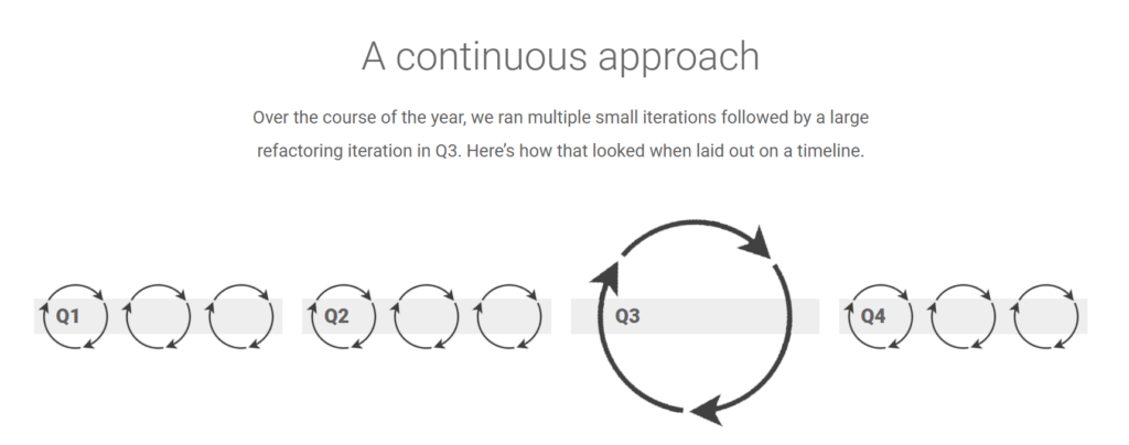
These visuals break up the content, making it more digestible and keeping readers interested.
In a nutshell—this case study showcases a combination of a great approach combines with relevant visuals.
2. Zebpay’s UX transformation
After an initial description of the platform Zebpay, the case study dives into a quick representation of the challenge and the solution. Even with a quick read, it’s clear that the goal was to make the platform more accessible for both beginner and expert traders.
The case study does a great job of presenting the problems and solutions side by side, giving readers a clear understanding of the issues and how they were tackled.

Once the challenge and solution are clear, the case study quickly presents a before-and-after comparison of the user interface.
A simple drag feature lets you see the transformation, where the “before” view is seamlessly replaced by the improved “after” design.
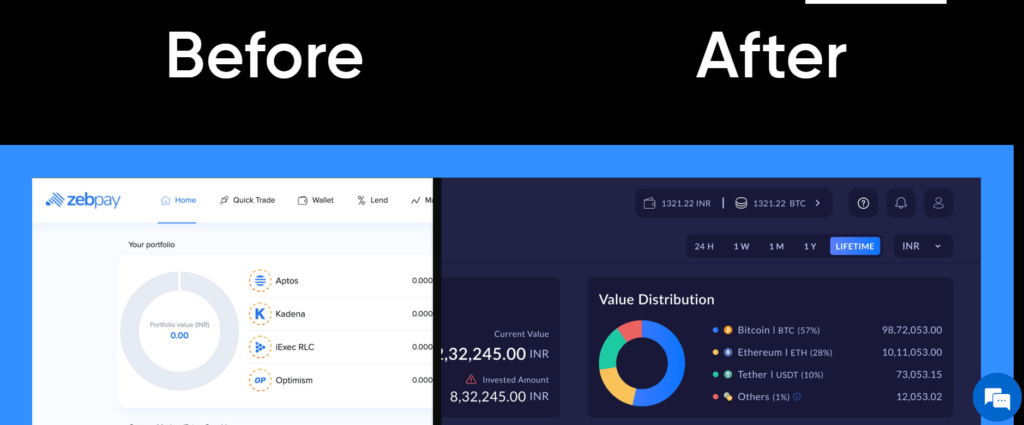
In a nutshell—What we love about this case study is its concise, visually compelling presentation. As you scroll, more visuals and insights appear, clearly showing how the UX design was improved step by step.
3. A UI/UX case study on spotify
This UI UX case study is a great example of clearly outlining the entire UX design process—from initial research to ideation, and finally, addressing the problems with solutions.
It was written by a Spotify user unhappy with recent updates, who took matters into his own hands and redesigned the interface using Figma mockups.
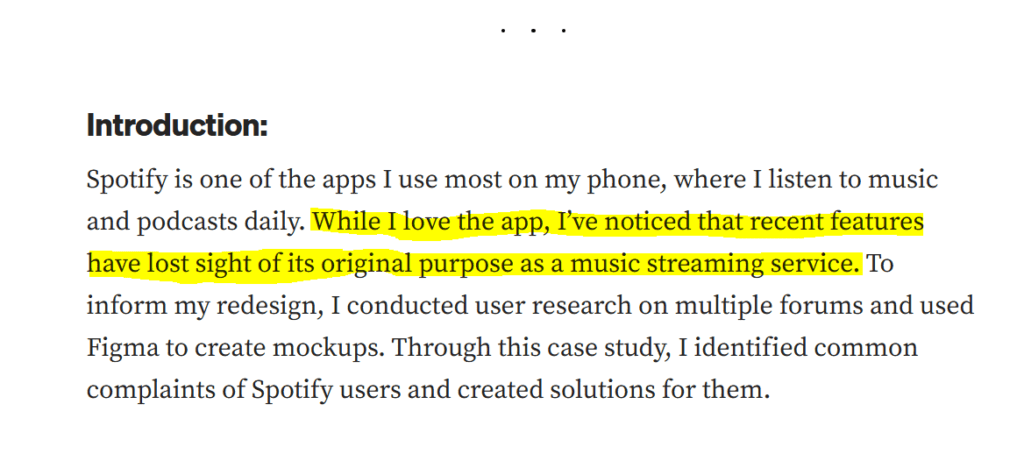
He precisely walks us through every step of his process. For example, he turned to Reddit for his research, tapping into its massive user base to uncover frustrations.
From this, he identified two major issues:
- An increased focus on podcasts, despite users seeking a better music experience
- A shuffling algorithm that repeats the same songs, failing to offer true randomness
After introducing these problems, the case study dives into more details in the problem/solution section.
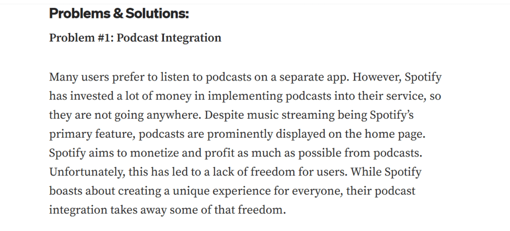
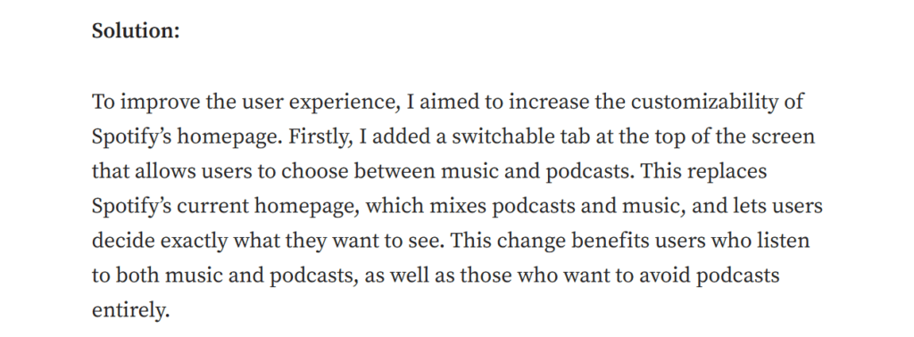
Next, he followed it with the image of the changed interface:
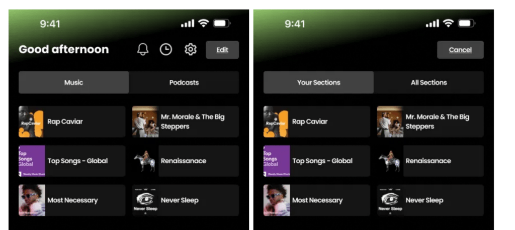
In a nutshell—What’s great about this case study is its smooth flow from identifying the issues to developing solutions. It’s comprehensive yet clear, ensuring nothing is missed and providing full clarity throughout.
4. UX design case study on Duolingo
This Duolingo case study is a great example of how to walk users through the entire usability testing process. One cool thing they do is compare the interface with other apps, mentioning its strengths.
For instance, instead of bombarding users with a long form when they hit “Get Started,” Duolingo jumps right into language selection. This quick and friendly approach shows how they prioritize user experience.

Mentioning this in the UX design case study followed by the areas of improvements can really add depth. It helps readers grasp what’s working well and identify where things might fall short.
By mentioning both the strengths and weaknesses, you provide a complete picture of the user experience. So, when writing a UX design case study, aim to provide a well-rounded perspective to the readers.
In a nutshell—we love that this case study provides a comprehensive view of of the process and clearly shows that the company is taking the usability of their platform seriously.
5. UI UX case study on Bumble
Another effective way to write a case study is by showing the user flow. Here, in this case study, the author went from downloading the Bumble app to onboarding and feature testing, identifying issues without bias as a new user.
For example, when the app prompted him to upgrade to premium immediately after signing up, he questioned why users would pay before even exploring the basic features.
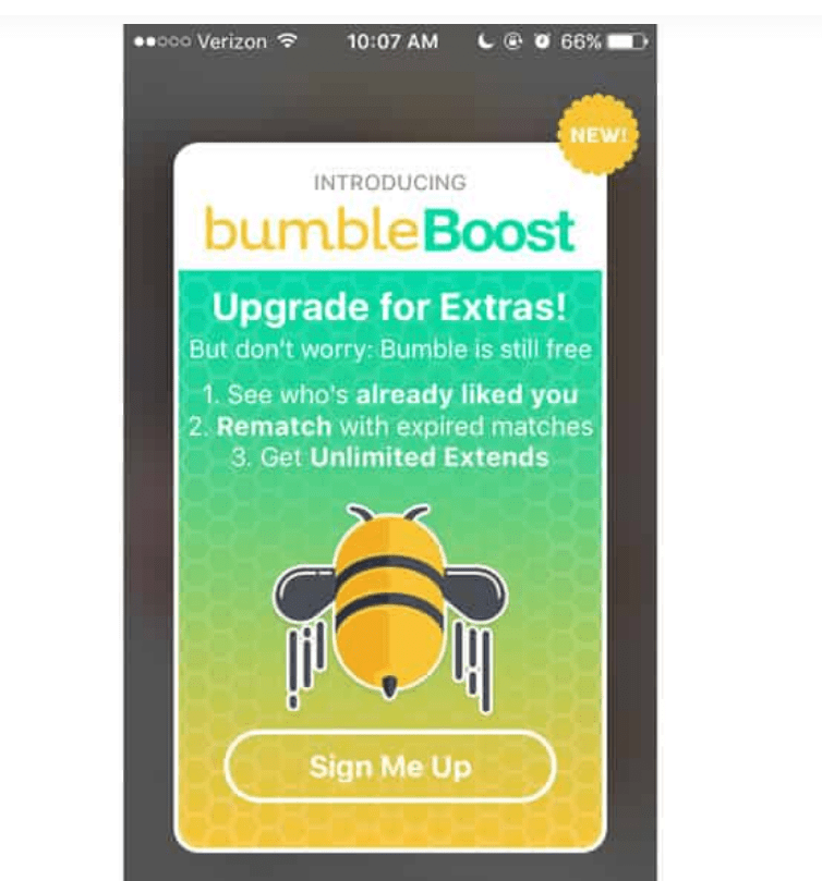
This step-by-step approach, with clear reasoning behind UX/UI issues, makes the case study relatable and insightful for readers.
In a nutshell—this case study highlights the user flow in a very simple, yet very natural way.
6. UX case study example of Google
The UX case study by the design lead at Google on AdWords is a fascinating read! He walks us through how he updated the platform to make campaign management easier for both seasoned advertisers and newbies.
The study dives deep into the challenges faced, such as overwhelming data complexity, and showcases how he simplified it for clarity.
When introducing something new, like the card framework, he backed them up with actual visuals, giving clear understanding:
What really stands out are the tweets from actual advertisers sharing their love for the new features. This kind of real-user feedback really adds credibility and shows the positive impact of the updates.

In a nutshell— we love that this case study highlights how the design lead simplified campaign management by addressing data complexity and introducing features like the card framework.
7. Airbnb UX case study
Sometimes, a well-crafted graph with relevant numbers can convey your findings effectively. That’s exactly what the Airbnb case study does.
It features an exhaustive performance review of 193 design elements and benchmarks against 250 other sites to provide a comprehensive view of the e-commerce UX landscape. This data is presented in a clear graph, making the insights accessible at a glance.
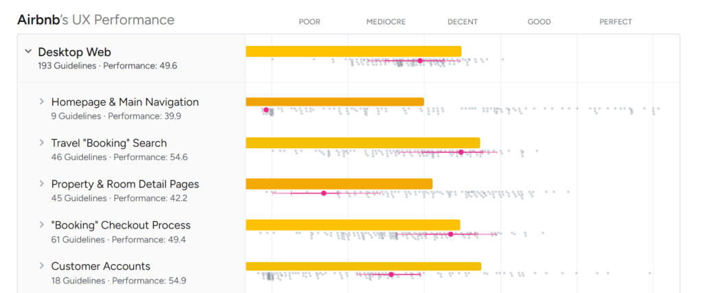
If you’re crafting your own UX case study, take note of how effective visuals can support your narrative.
Ensure that your graphs or charts are not just decorative but serve to enhance the reader’s understanding of your findings.
In a nutshell—the case study demonstrates the power of clear visuals, using graphs to present a performance review of 193 design elements benchmarked against 250 sites. This makes the insights impactful and easily accessible.
8. Slack’s improved user experience
The Slack case study is a great example of using user feedback to make improvements. It starts by recognizing that big teams often find the platform’s user interface overwhelming because of too many menus.
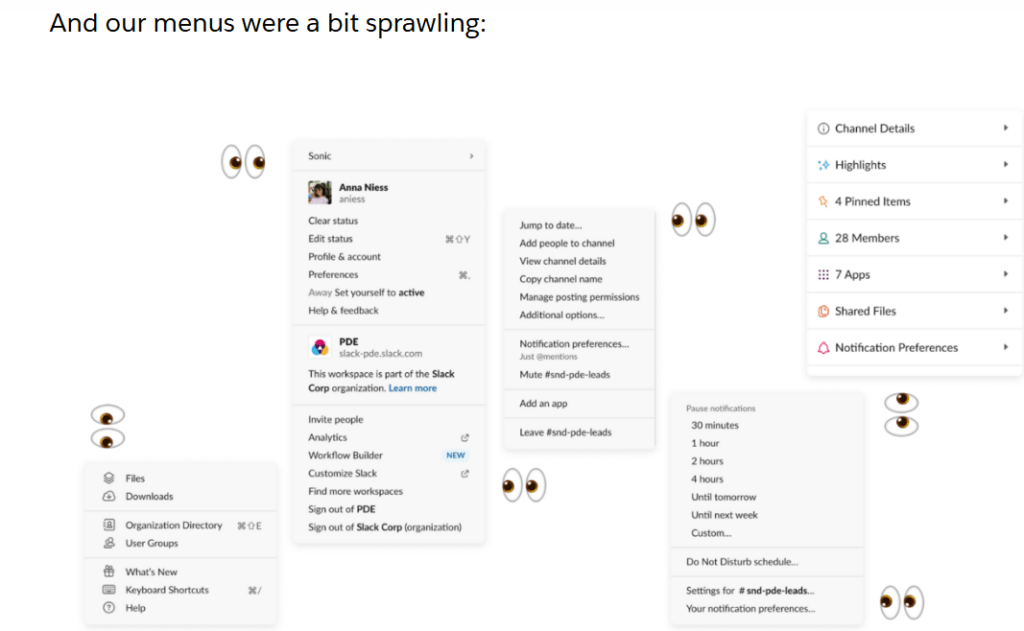
What’s really cool is how they brought together a team to co-design with customers. This collaboration helped them get real insights.
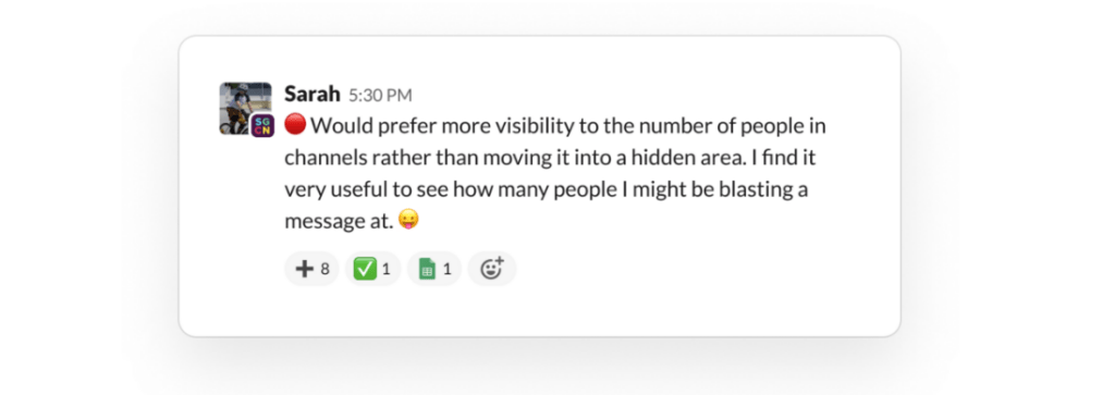
One important lesson from this case study is to highlight any unique methods you use, like co-designing with users. This makes your case study more interesting and shows your dedication to user-centered design.
The flow of the Slack case study is also impressive. It begins with the company acknowledging the problem and gradually reveals how they found a solution and what the final user experience looks like.
In a nutshell— Slack’s case study highlights the value of co-designing with users to address issues like an overwhelming interface for large teams while also showcasing a user-centered approach.
9. Calendly’s UX redesign
The Calendly UX redesign case study does a great job of starting with real user reviews before jumping into the redesign process. When you’re working on a UX redesign, it’s super important to show the actual problems that led to the changes.
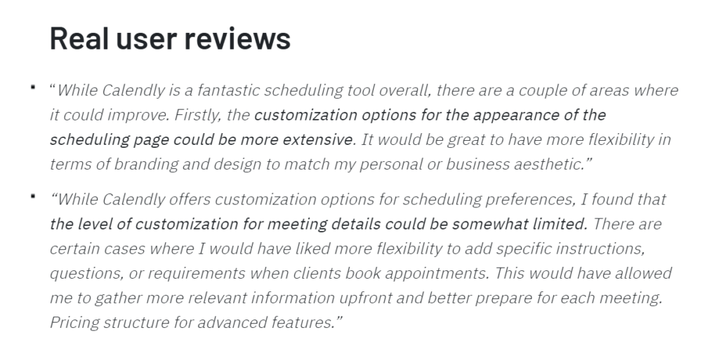
Including feedback from users—whether it’s reviews from different platforms or insights from interviews—can really highlight the issues.
Another smart move in this case study is the use of flow charts. Calendly includes a chart after every feature they redesigned, which gives a quick overview of what the designers did and the results they achieved.
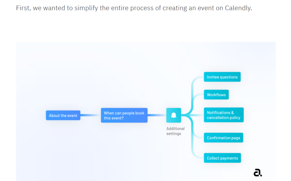
This visual helps everyone understand the process at a glance.
In a nutshell—this UX redesign case study uses flow charts in a great way to visually summarize each redesigned feature and its results. This makes the results super easy to understand.
10. Google Drive redesign case study
We really love how the Google Drive case study includes first-hand research. Conducting your own surveys and presenting your own numbers makes the case study more engaging compared to relying on third-party data.
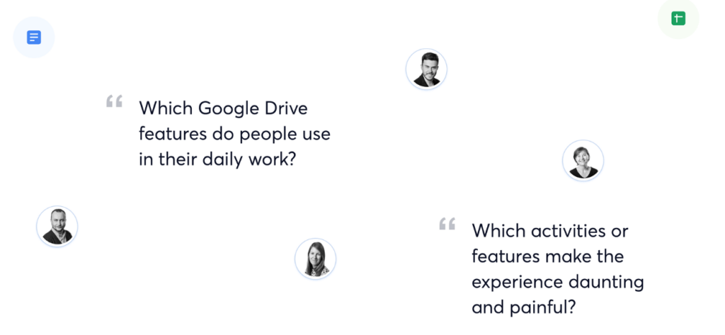
In this case, the company surveyed its employees and created graphs to visualize the findings. This not only makes the data easier to understand but also adds credibility.

The layout of the case study is also fun and engaging, so you’ll find yourself browsing through it in no time. Moreover, the side-by-side comparison of the old and new versions is a fantastic touch.
It allows readers to see the improvements at a glance, showcasing the enhanced designs effectively.
In a nutshell—the Google Drive case study stands out for us with first-hand research, custom graphs, and a fun layout. The side-by-side comparison effectively showcases the improvements in design.
11. Canva redesign case study
Gabby Hoefer’s case study on redesigning the Canva tablet app is a fantastic example of how to approach a UX project. It’s neatly divided into phases, starting with initial sketches and wireframes, then moving on to proper redesigning and implementation.

The use of visuals throughout the case study is impressive. With lots of screenshots and mockups, the information is engaging and easier to understand. Visuals help clarify complex ideas, which is essential in UX design.

In a nutshell—The UX project case study is well-structured, moving from sketches to final redesigns. The use of visuals, including screenshots and mockups, makes the content engaging and simplifies complex ideas.
12. Redesigning Trello onboarding experience
This Trello redesign case study stands out for its thoughtful approach to user personas. Instead of jumping straight into the design process, it takes the time to introduce and explain the user personas that were created.
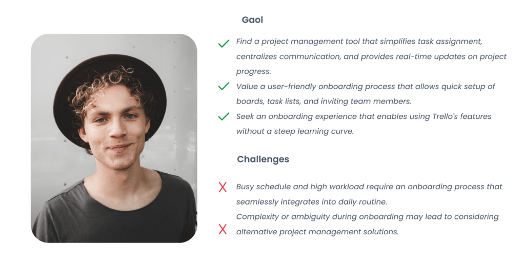
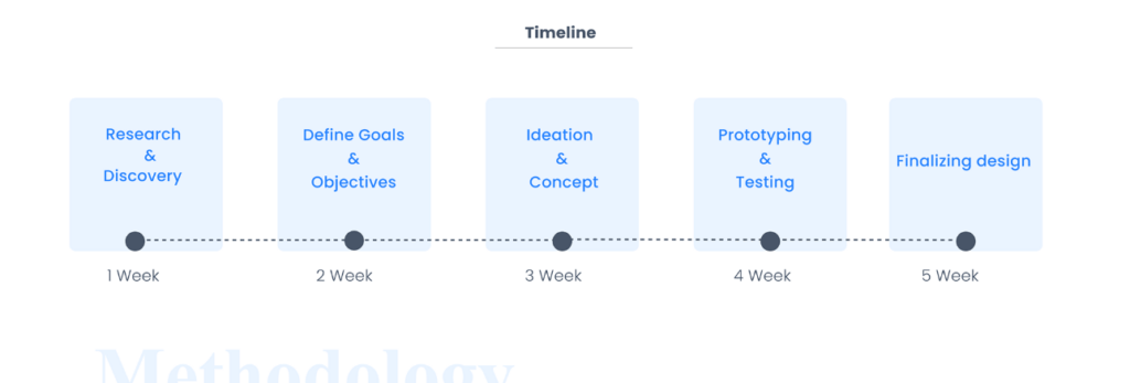
We also loved how the Trello redesign case study clearly outlines the time allocated to each phase, such as research, ideation, and prototyping.
This level of detail gives readers a realistic expectation of what goes into a redesign project and gives insights into time management.
Another great feature of the Trello redesign case study is its competitive and SWOT analyses.

Instead of just focusing on the redesign process, it offers a detailed behind-the-scenes look at how the team assessed their competition.
In a nutshell—this case study does a great job of explaining user personas, showing project timelines, and even diving into a competitive analysis, giving a clear look at the design process and time management.
13. UX re-writing and re-design of Zoho People app
What we love about the Zoho People app case study is how effectively it highlights key design issues. Screenshots of the app have red markings showing exactly where the problems lie in the UI, along with suggestions for improvement.
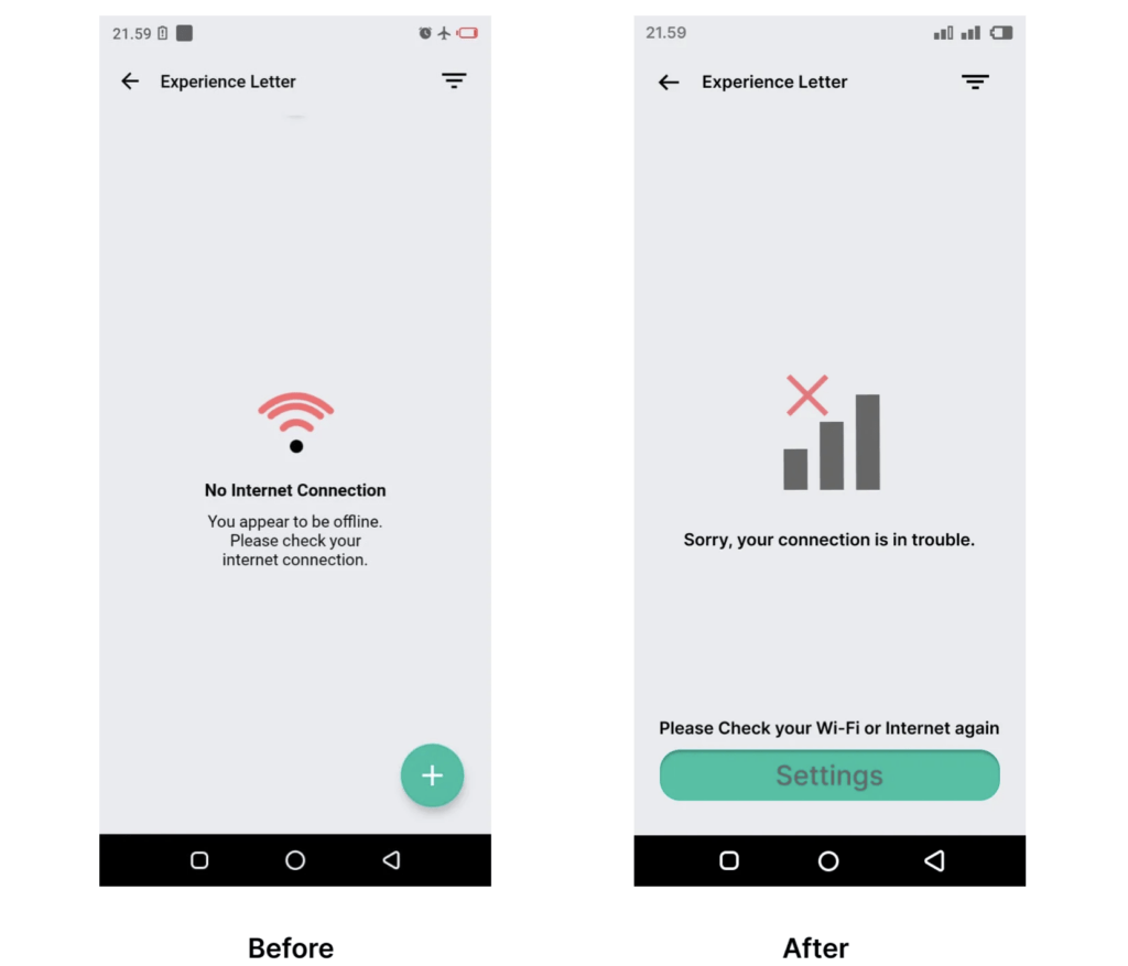
In a nutshell—what this case study does really well is it suitably highlight the issues at hand. By doing so, it makes design changing much easier.
Perfect length of a UX design case study

The perfect length of a UX design case study really depends on how much detail you need to showcase your work.
But here’s a general rule: keep it long enough to tell a compelling story, but short enough to hold your reader’s attention.
You want to cover the essentials—problem, process, and solution—without overwhelming someone with every single detail. Aim for around 1,000 to 1,500 words.
That’s enough to dive into key points like research insights, design decisions, and final outcomes, but not so long that the reader loses interest. Include visuals, but don’t overdo it—quality over quantity.
Number of case studies to include in a portfolio
When building a UX portfolio, the number of case studies you include should focus on quality over quantity. Ideally, aim for 3 to 5 solid case studies. This gives potential employers or clients a well-rounded view of your skills without overwhelming them.
Each case study should highlight different strengths—maybe one shows off your research skills, another dives into your design thinking, and a third shows problem-solving.
💡 Pro Tip
If you’re new to the UX field and haven’t crafted your portfolio yet, check out our guide on how to build a UX portfolio with zero experience.
UX case study templates
Here are some UX case study templates to get you started:
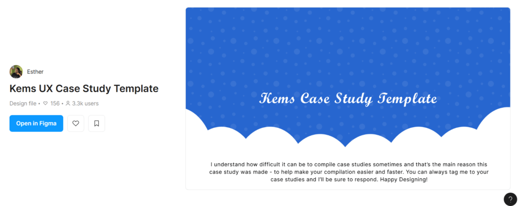
UX case study template by Figma

UX case study template by TheDesignership

Free UX case study template
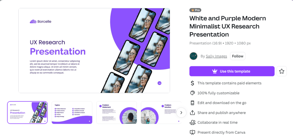
Canva UX case study template
Tips for UX case studies that will get you hired
Here are some additional tips to make your UX design case studies compelling:
Tell a compelling story
Don’t just present facts—take the reader on a journey. Start with the problem, build tension by describing challenges you faced, and end with a resolution.
Frame your case study like a narrative that highlights your thought process and how you overcame obstacles.
Show your process, not just the final design
Hiring managers want to see how you think, so don’t skip the messy middle! Include sketches, wireframes, and iterations to showcase your design process.
Explain why you made certain decisions and how you arrived at the final solution.
Focus on user-centered design
Show that you deeply understand your users by emphasizing user interviews, journey maps, and personas. Include details about user interview tools you used and how insights from users guided your design choices. This shows you’re driven by real needs, not assumptions.
Be concise, but detailed where it matters
Keep your case study concise, focusing on the key elements that demonstrate your strengths. Dive deeper into parts where you made important decisions or overcame significant challenges, but avoid overwhelming the reader with unnecessary details.
Include testing and iteration
Be transparent about the iterations you made based on user feedback or testing results. Show that you’re willing to adapt and improve your designs based on data and real-world testing, and explain what you learned during the process.
If you want to learn more about how to navigate your UX career, check out our conversation with Sarah Doody – a UX researcher and designer.

Tips for UX case studies to secure stakeholders’ buy-in

Here are some tips to create UX case studies that effectively secure stakeholders’ buy-in:
Align with business goals
Make it clear how your design addresses key business objectives. Whether it’s increasing user engagement, boosting conversions, or improving customer satisfaction, directly link your solution to the company’s strategic goals.
Stakeholders are more likely to buy in when they see the tangible business value of your work.
Show metrics and data
Stakeholders love numbers, so complement qualitative insights with quantitative data. Conduct usability testing, A/B testing, or gather analytics to show measurable improvements.
For example, you might highlight a decrease in user drop-off rates or an increase in task success rates. Visualizing these metrics with charts or graphs helps reinforce the value of your design.
Present a clear problem-solution framework
Stakeholders want clarity, so frame your case study around a simple problem-solution structure. Start by clearly defining the problem, walk them through your design process, and end with the solution’s impact.
Breaking down complex ideas into easily digestible chunks keeps your audience engaged and focused.
Use visuals to tell the story
Stakeholders may not always be design experts, so use visuals like user journey maps, wireframes, and prototypes to simplify complex ideas.
Visual storytelling helps stakeholders quickly grasp the problem and understand how the design resolves it. Make sure the visuals align with your narrative and support key points.
Adjust the language for non-designers
Avoid overly technical or design-heavy language. Speak in terms that resonate with business leaders—think of words like “efficiency,” “growth,” “conversion,” and “customer satisfaction.”
Explain design decisions in a way that non-designers can easily understand and relate to.
💡 Pro Tip
Sometimes, research initiatives are met with objections from stakeholders. Learn how to deal with resistance to UX research.
Wrapping up
Writing a compelling UX case study requires a combination of solid user research, data-backed insights, and effective storytelling. This is where tools like UXtweak come in handy.
UXtweak offers a range of features—from usability testing to user journey tracking and card sorting—that allow you to collect both qualitative and quantitative data.
With its user interview tools and session recordings, you can gather deep insights into user behavior and pain points. And when it comes to writing your case study, UXtweak makes it easy to present clear, actionable insights.
You can include key metrics from usability tests, visualizations of user flows, and heatmaps to demonstrate the impact of your design.
Want to learn more about how UWtweak can help? Talk to our team today!


