We all love and recommend to choose the safest option when it comes to website navigation. But sometimes it’s important to not only make it user-friendly and easy to look through but also add a little creativity to the mix. We’ve done some research and gathered top 10 website navigation examples with unique and innovative designs that have taken menus to the next level!
Hope they inspire you in the best way possible, let’s get into it!

Keeping it simple, while not keeping anything from you
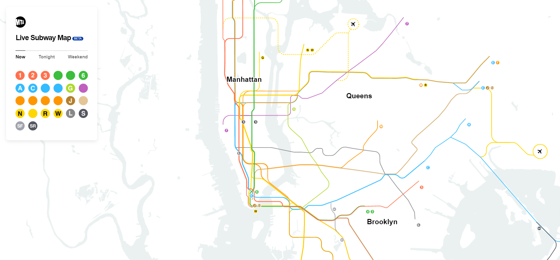
Metropolitan Transit Authority New York – Live Subway Map
The MTA simply did a great job. Everything you see can be used to your advantage. You can see the whole map of New York while viewing every subway line displayed on it. There is also an option to click on any station your heart desires. This will display a handy menu where you can see every line at the specific station, as well as a time estimation when each train will arrive.
For all the trainspotters out there, you can also see exactly where the train is. All of this is crammed into one website with a minimalistic design. Simply put — Bravo! The designers did an amazing job.
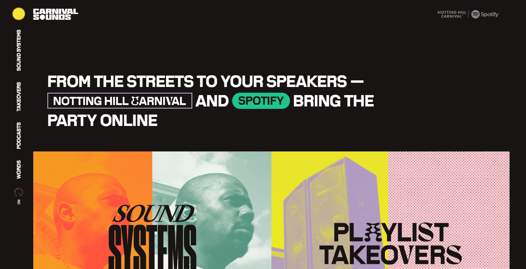
Not every menu has to be at the top of the page and vertical
Carnival Sounds
Sometimes if you try something new, it just doesn’t go well. On this website, the designers tried something new with the menu and put it on the side of the screen vertically. For some, the text might be hard to read, but for the majority of users, it’s all good. Don’t worry about trying new things, because even if it does not work out as well as you had hoped, there is always the option to rework it into something more suitable.
One feature worthy of mentioning is the option to turn off flashing images. This is a great feature, and if your website has this kind of flashing content, you should definitely include it. This helps make the internet a better place for people suffering from epilepsy or sensory sensitivity.
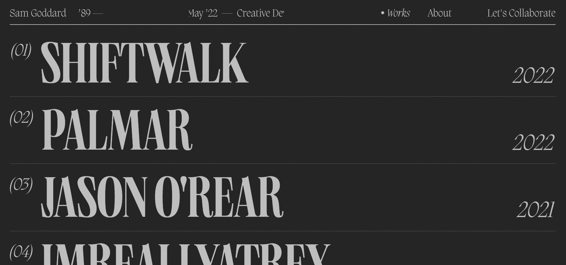
The whole website is a menu? If done well, it can look stunning
Sam Goddart ‘89
This type of navigation is a slippery slope, I admit, but if embedded well, it can improve the entire look of the website. For example, Sam Doddart’s site here, it looks perfect. You can see all his work in one clean and simple menu that serves as the building block.
Not everyone’s content is suitable for this kind of navigation, however, make no mistake, this design is not reserved just for portfolio types of websites.
Try and see if this is for you. If not, there are many kinds of navigation you can choose from.
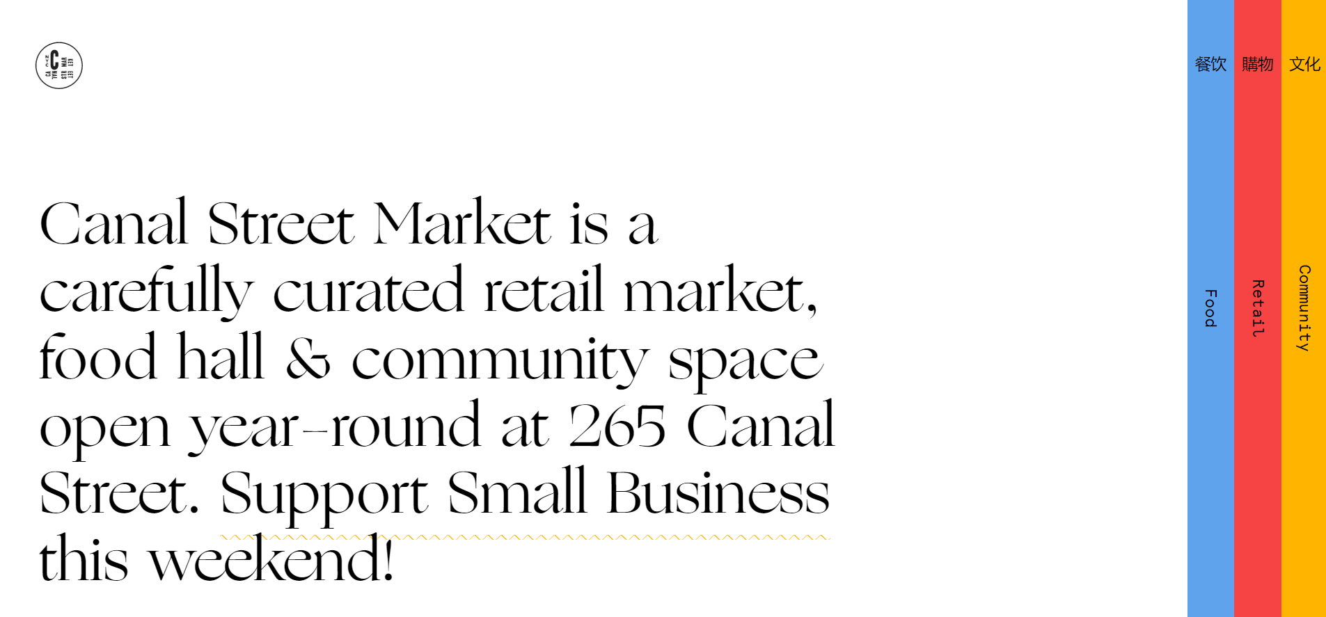
Intuitive and innovative
Canal Street Market
The Canal Street Market website looks very good. With only 3 buttons, you can take command of the whole page and learn everything about the community, food, and retail spaces in a few simple and seamless transitions. Feeling inspired? You should!
Proving website navigation is about looks too
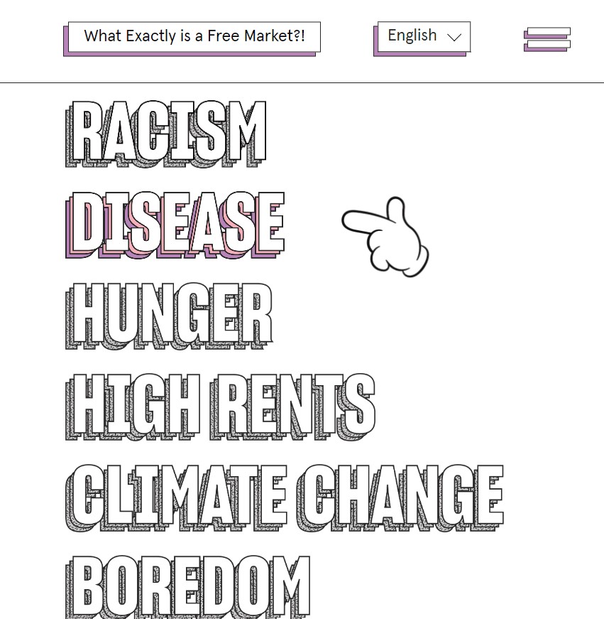
Free Markets Destroy
Being innovative doesn’t always mean thinking of something new and revolutionary. This simple menu, which is used on several websites, feels unique because of the font and color palette. Paired with the big Mickey Mouse-esque mouse pointer makes this website look cheery and happy, almost like the storefront of an Ice Cream shop.
This is a total contrast between the actual content of the page. Free Markets Destroy tackles many problems, ranging from racism and hunger to climate change. This combination of worlds – cheerful colors and menu with its almost depressing content, creates an eerie feeling. Well done! Consider us speechless.
Making a subtle change can improve the page drastically
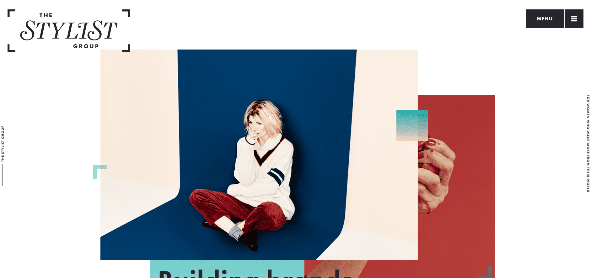
The Stylist Group
On many websites, you can feel overwhelmed by the menu and its stable presence. Sometimes you want to read a blog or see a video and you still cannot get rid of the whole menu. The Stylist Group opted for a more inconspicuous menu, which stays hidden until you click on the menu icon.
Therefore, you can enjoy the website’s contents without the menu staring menacingly at you all the time. Even this minor change helped the website to look clean and composed. So don’t hesitate to hide the things that are not needed and can potentially ruin the seamless experience of your web page.
Style more, innovate less
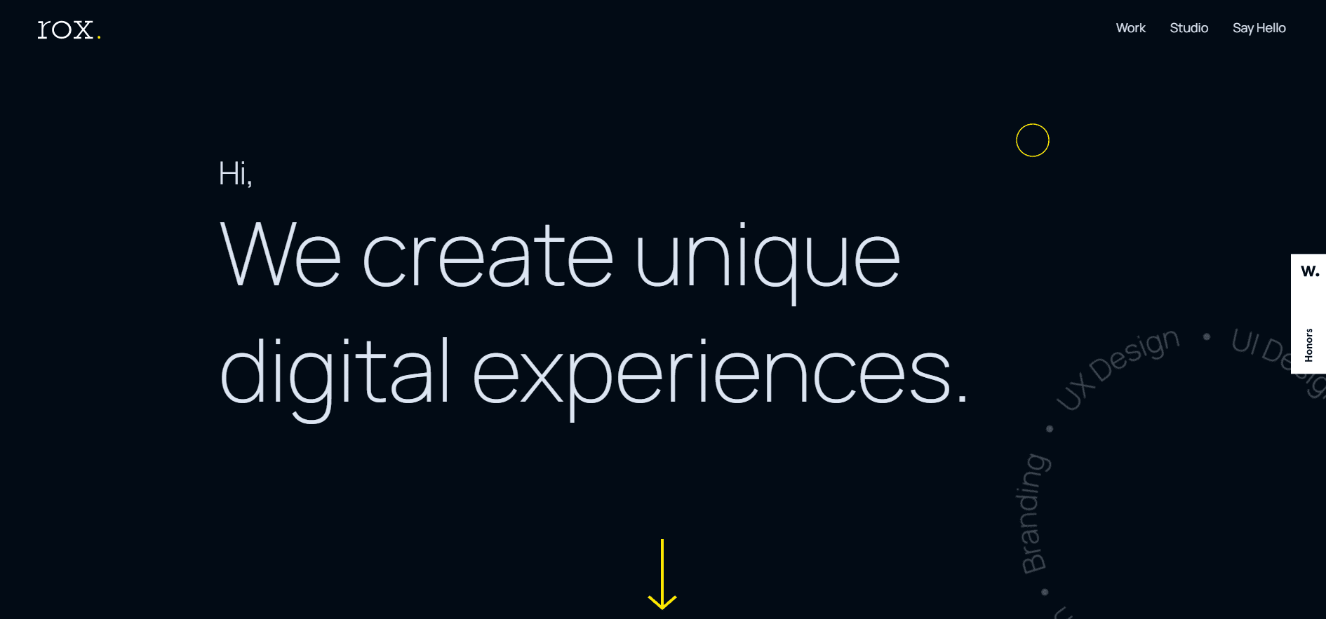
www.werox.co.il
Rox Studios have taken a different approach to navigation. It’s not the style, but rather the feel of it that is unique. The first thing you will certainly notice is the change of mouse cursor style. The website changes your basic and dull cursor to an engaging yellow hollow circle. Here comes the selling piece. When you hover your mouse over some content or the menu options, your cursor changes to a large, full, yellow circle with white text, mimicking the thing you are hovering over.
This not only makes you more curious about what is going on behind the big yellow circle, but also makes for a much better and more engaging experience as opposed to the plain old cursor with only some subtle change of color when hovering over the link.
Design that makes us want to fly out and visit
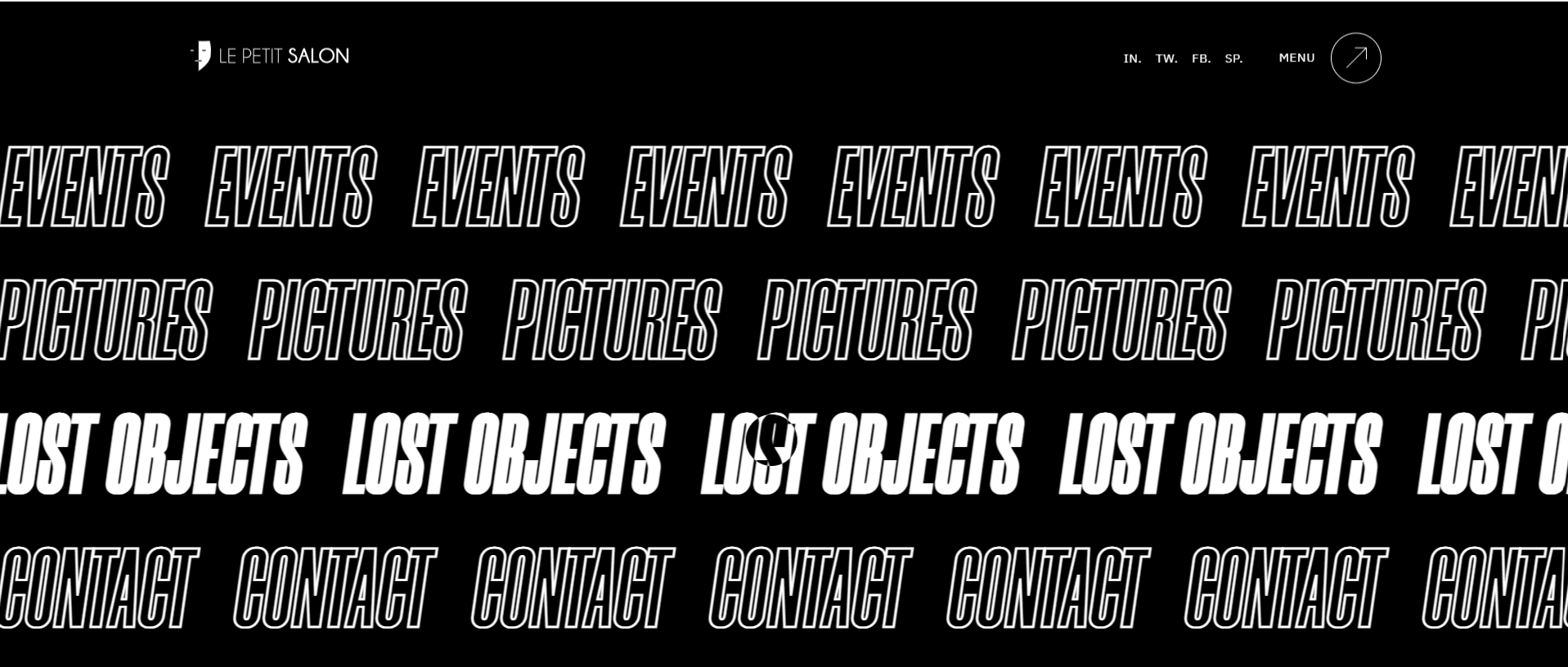
Le Petit Salon
This design is stunning. Not only has the menu been thought out well, but the entire page looks engaging and makes you want to visit immediately. Why? Well, first of all, when you click on the menu, an entire page selection comes out — not just some boring one, but one with white hollow text that becomes full when hovering over it. The whole menu seems like something straight out of a nightclub. And since it is a nightclub, Le Petite Salon brings all of this together.
Moreover, when you move your mouse over the heading of the landing page, a series of pictures will appear. These pictures illustrate the atmosphere as well as the entire feel of the club, when physically in it.
We could ramble on about this website and its engaging design for hours, but we’ll spare you the dialogue. If one page is worth inspiring you, then this is the one.
Are vertical menus a thing now?
Bien Studio
Here is another great example of a well-designed menu, which is not cluttered with useless information. Only the most important things are included to interact with. Another thing worthy to mention is the seamless transition between different subpages. This all enhances the user experience and makes it more engaging to users.
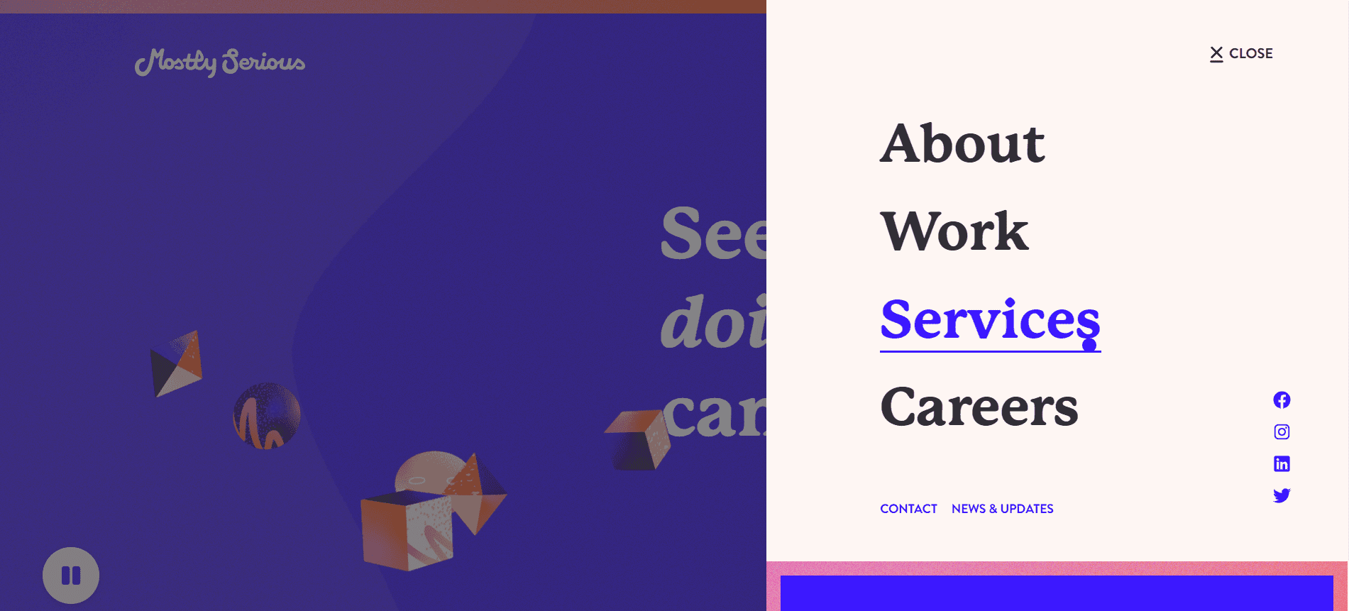
Old menu, new fresh feel
Mostly Serious
We all know this style of navigation. You click on the menu bar and the subpages appear from the side of the screen. But the colors and the font makes it feel more fresh and appealing to look at. When designing a unique menu, you don’t need to go all out. This web page proves that even the smallest of adjustments might make a big difference to the user and his experience on the site.
Ready to make a splash with your navigation?
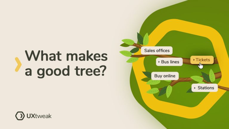
First of all, you have to make sure that everything in it adds up. Our tool – UXtweak can help with that part of the equation with Card Sorting and Tree testing. However, the design part is entirely up to you. Therefore, try and design something that will make you stand out from the crowd and maybe even experiment until you get it right.
We have provided you with the inspiration, so make the most of it because someday in the future, you might also be listed as an inspiration for others.