Different slots on screws require screwdrivers with different heads. UI elements are the same way. Even if the distinctions between them are subtle – as is the case between checkboxes and toggle switches – they work best when they’re used in the right context, to solve the right problem.

How are checkboxes and toggle switches similar?
If you’re a UI designer, you may find a switch and a checkbox to feel somewhat interchangeable. Both of them are form components with two elementary states – “yes” vs. “no”, “active” vs. “inactive”. A switch is either on or off, a checkbox either checked or unchecked. Their binary nature makes switches and checkboxes simple and highly versatile for letting users set options and make choices through an interface.
However, this is the point where the similarities end.
Using a checkbox where a toggle switch should be and vice versa may lead to confused and frustrated users who think that your interface isn’t working correctly.
Differences between toggle switches and checkboxes
The chief difference between a toggle switch and a checkbox is whether there’s instant cause and effect relation between the control element and whatever it’s controlling. This stems from the origins of the two components.
The toggle switch is a control based on an electrical switch. When you turn on the lights in a dark room, you expect the room to light up immediately after flipping the switch. If that doesn’t happen, there’s either something wrong with the switch, or there might even be some deeper problem with the electrical grid, such as a power outage.
And that’s why when it comes to a toggle switch, users expect it to have an immediate effect in the same way, such as enabling dark mode, or subtitles in a video. You should never have to press any other buttons in order to apply changes that you’ve already toggled.
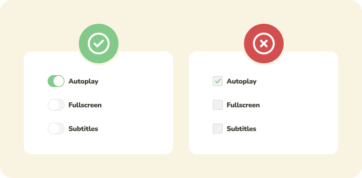
Checkboxes date back to paper forms. On paper, there was no expectation that checking a checkbox would lead to immediate action. It’s merely a selection. Consider a school test. Even when you fill in your answer, you still have the chance to come back to it later and change it. The teacher will only count your points after you’ve handed over the piece of paper.
Toggling checkboxes should never trigger an instant change – not until the user submitted them by pressing a button. The extra step of pressing a button is usually there because the action of submitting carries a heavier weight. If the setting can be changed at all after it’s been submitted, it will need to be submitted again.
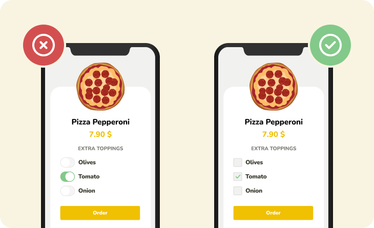
Delaying the action until the settings have been submitted is ideal for processing settings in batch, such as when fetching the results of an advanced search. The results of a partial filter would be useless and fetching them each time would only slow down the interface.
Examples: Checkbox vs Toggle switch
Aside from the cardinal difference between a checkbox and a toggle switch, there are a couple of nuances that may arise in complex real-world scenarios when more than one control element is needed. The following examples should help you figure out which type of element works best for you in your current situation.
Example 1: Hierarchy of options
What to use: Checkbox
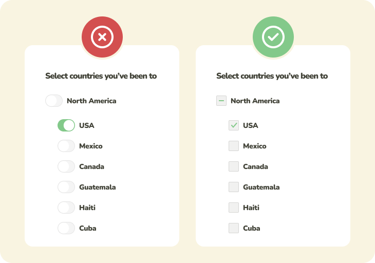
If your settings form a hierarchical structure, where one greater parent option encapsulates several smaller options, you should use checkboxes.
This is because checkboxes actually have an additional indeterminate state besides “yes” and “no” that further differentiates them from the toggle switch. Use the indeterminate state to express when only a portion of the option group is selected.
Example 2: Grouped options
What to use: Checkbox
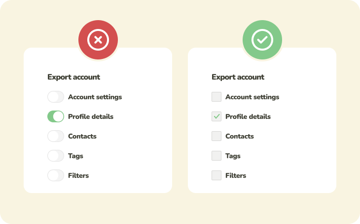
When the user’s supposed to pick one or multiple related options from a list, multiple checkboxes are the best solution.
Example 3: Multiple unrelated options
What to use: Toggle switch
When you need to put several options in the same interface, however the individual options have no relation to one another, a toggle switch is the correct solution, particularly if the options have an immediate observable effect for the user.

Conclusion: Activation or selection?
To an amateur designer, a checkbox and a toggle switch may seem all too similar. However, not knowing how to suitably employ either of them may cause confusion and unmet user expectations. Consider the context.
What role will the would-be toggle or checkbox play in the user’s interaction with the interface? Should it have an immediate effect? Or should the user have to confirm the change with the press of another button? Answering these questions will point you to the metaphorical screwdriver that’s the right tool for the job.
