That’s the reaction of most users when they encounter a slow-loading website with minimal responsiveness. The Doherty Threshold helps solve these issues by ensuring the system’s response time meets or exceeds the threshold.
When users experience a more fluid and responsive interaction, their overall experience will improve. Fewer users will abandon your app, and engagement levels will increase.
But for all that to happen, you need to learn how to implement the Doherty threshold in UX design. That’s what our article will explore today to help you create websites and apps that users will love.
What Is the Doherty Threshold?
The Doherty Threshold is a concept in human-computer interaction that suggests that there is an optimal level of user engagement with technology. Beyond this level, any increase in functionality or performance may not necessarily lead to improved user satisfaction or productivity. It originated from a paper titled “A Comparison of Programming Systems and Doherty Threshold” by Walter J. Doherty in 1976.
This law essentially says that as technology becomes more sophisticated, there is a point at which adding more features or capabilities can actually diminish user experience rather than enhance it. This is because, beyond a certain threshold, users may become overwhelmed or distracted by too many options, leading to decreased efficiency and satisfaction.
Thanks to the Doherty law, we now see more user-centric designs and simplicity in technology. Rather than focusing solely on adding more features, designers, and developers recognize the importance of understanding user needs and preferences. Based on those needs, they design interfaces that are intuitive, streamlined, and efficient.
Key Points of the Doherty Threshold
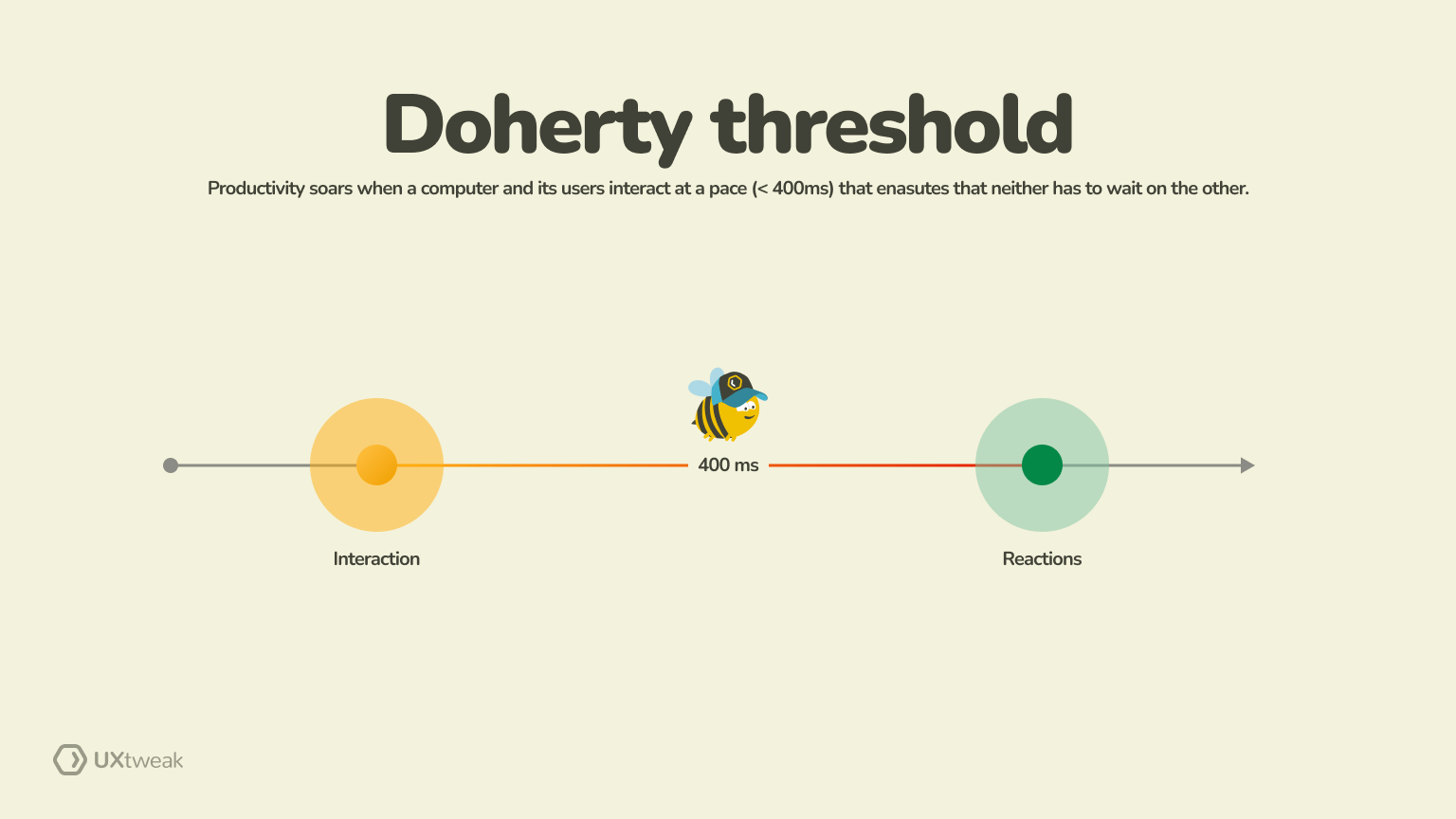
Before we move on to learning about the psychology behind this law, let’s have a quick look at the key takeaways of the Doherty Threshold.
Optimal system responsiveness
The Doherty Threshold tells us there’s a sweet spot in how responsive our systems should be. Once we hit that sweet stop, further enhancements will no longer enhance the user experience.
As a UX designer, you must balance responsiveness enhancements with other factors, such as usability testing, security, and visual appeal.
Take the habit of constantly refreshing the feeds of social media users. They want to view the latest updates from their friends and contacts frequently. As a UX designer, you aim to ensure that the feed refresh process is both efficient and engaging. Initially, it takes approximately 2 seconds to complete.
However, through optimization efforts, you managed to reduce the refresh time to under 1 second, hitting the sweet spot identified by the Doherty Threshold. Any efforts to improve the speed from here might not yield significant results. Pouring all your efforts into squeezing out tiny speed improvements might neglect other aspects crucial for user satisfaction.
Diminishing returns
As a designer, adding new features in areas that your users already love seems fascinating. But beyond a certain point, those features could lead to diminishing returns in terms of perceived value. Take, for instance, a travel planning app.
Initially, incorporating social sharing features for trip collaboration enhances user experience. But if you keep adding features like real-time location sharing or group itinerary planning, you’ll likely encounter diminishing returns.
Each new feature offers less value than the previous ones, potentially cluttering the app and detracting from its primary focus. As a UX designer, it’s crucial to recognize when you’re reaching this point.
Timely feedback
When users receive immediate feedback in response to their actions, they feel acknowledged, which, in turn, increases engagement. This feedback can also help prevent errors by guiding users and alerting them to potential issues before they escalate. Clear error messages, warnings, or validation cues can help users correct mistakes and navigate the system with confidence.
Prompt feedback also reassures users that their actions are being processed, even if there’s a slight delay in system response. Minimizing perceived wait times and keeping users informed can help designers create a more fluid and responsive user experience.
Balancing complexity
Balancing complexity is a critical consideration for UX designers when creating digital products or systems. There must be an appropriate balance between functionality and simplicity to ensure that user experience remains intuitive.
Simplicity vs. feature depth is often a challenge designers encounter. How many features are too many features? While additional features can enhance functionality, it’s all about how you present them in front of users.
For example, a note-taking app might offer advanced formatting options, collaboration features, and integrations with other tools. However, presenting all these features upfront might overwhelm users who simply want to jot down quick notes.
That’s where balancing simplicity by providing a clean, minimalist interface with easy access to advanced features through progress disclosure can cater to both novice and power users.
Phycology Behind the Doherty Threshold
The Doherty Threshold works really well because it thrives on certain psychological principles. Here’s how:
Cognitive load
Cognitive load refers to the amount of mental effort required to complete a task. This concept is crucial in user interface design as excessive cognitive load can lead to frustration and abandonment of the task. Designers must aim to minimize cognitive load to improve user experience.
For example, a website with cluttered navigation, multiple pop-ups, and complex forms imposes a high cognitive load on users.
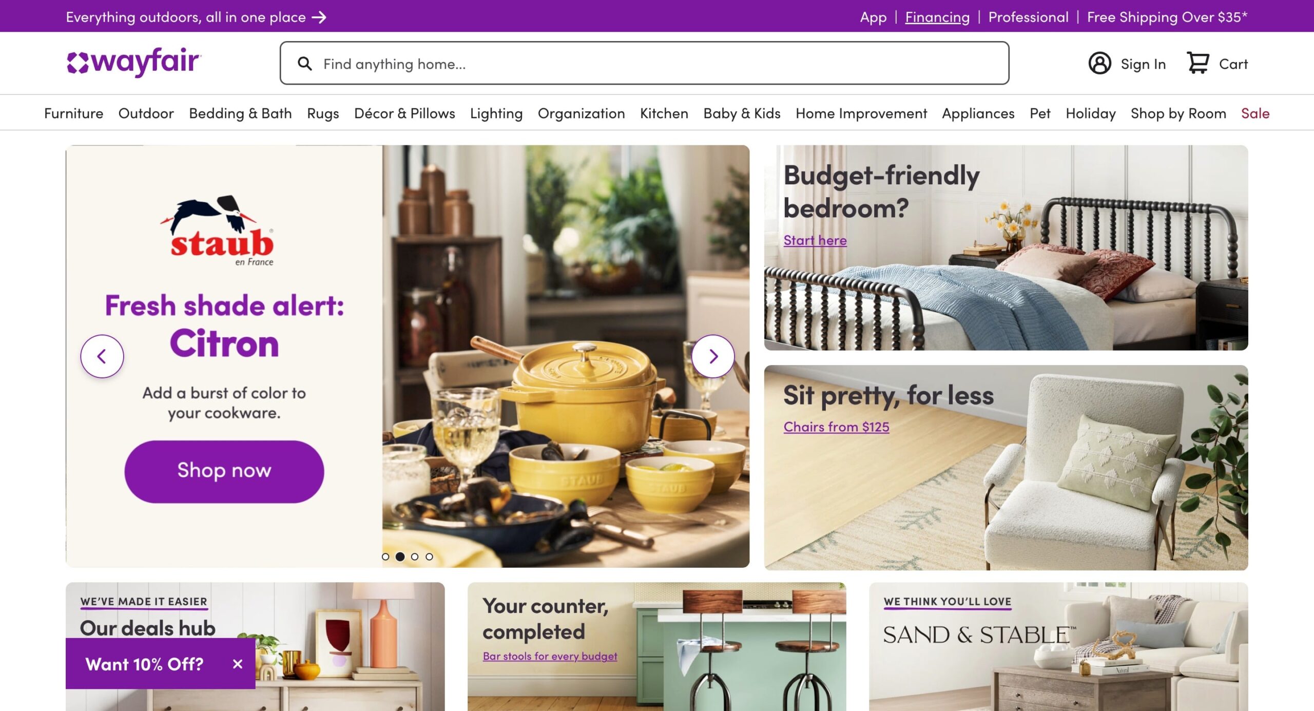
Take Wayfair’s website homepage, for example. Plenty of options and a lack of visual hierarchy can leave users feeling overwhelmed, making it tricky to figure out what to do next.
Source: wayfair.com
Look at how almost every element on the website is the same size, color, and icon. Users are being told to shop for rugs, lighting, kitchen appliances, and kids’ products all at once. Instead of clicking on an option, users might feel overwhelmed and leave.
That’s exactly what we need to avoid. Present a well-designed website with a clear visual hierarchy. Guide your users to where they need to click to improve their experience. In simple words, minimize distractions and reduce users’ cognitive load to help them focus on tasks more effectively.
Learn more: Website Creation Checklist: 10 Things to Follow | UXtweak
Attention span
Attention span refers to the length of time a person can concentrate on a task without becoming distracted. Understanding attention span is crucial for designing interfaces that capture and retain attention for longer periods.
Take social media platforms like Instagram, for instance. The reel feature neatly capitalizes on shorter attention spans by continuously providing new content to engage users and keep them on the platform.
User expectations
Users already have some set expectations when it comes to the performance and features of a product or service. Meeting or exceeding these expectations is crucial for user satisfaction and retention.
For example, when users download a mobile app for ride-sharing, they expect features such as real-time location tracking, estimated arrival times, and secure payment options.
Most importantly, they expect the service to be exactly as promised on the app. If not, your app will get negative reviews just like Uber does:

Flow state
Flow state describes a mental state of complete focus in an activity. When you are engrossed in something, you continue doing it and lose track of time. Achieving flow is associated with enhanced performance, enjoyment, and satisfaction.
Video games are designed to facilitate flow by providing progressively challenging tasks, immediate feedback, and a sense of control. Players often lose track of time, and each additional level boosts their confidence and satisfaction. Remember the time when we just had to reach the end of Vice City? Yes, that’s the kind of flow we are talking about!
Perception of control
The perception of control refers to users’ belief that they can influence the outcome of their interactions with a system. We all love having a sense of control over things, and providing users with that enhances their engagement.
Productivity apps often incorporate customizable settings and personalization options. These options allow users to tailor the interface and workflow as per their preference.
Now, imagine having a rigid interface and set workflows that cannot be modified. Before you know it, half of your users will shift to a platform that gives them more control.
Doherty Threshold and UX Design
The Doherty law is one of those UX laws and principles that greatly impact how we approach user experience (UX) design. It focuses on the importance of understanding the balance between functionality and usability while prioritizing user preferences in the design process.
Let’s take certain instances where we can use this law in our design process.
Using Animation to Engage the User
Users are quick to leave a platform if the waiting times are too long. Animation, such as loading screens or progress bars, can mitigate the perception of delays during these times.
With subtle animations and transitions, designers can maintain user interest and prevent frustration during unavoidable waiting periods.
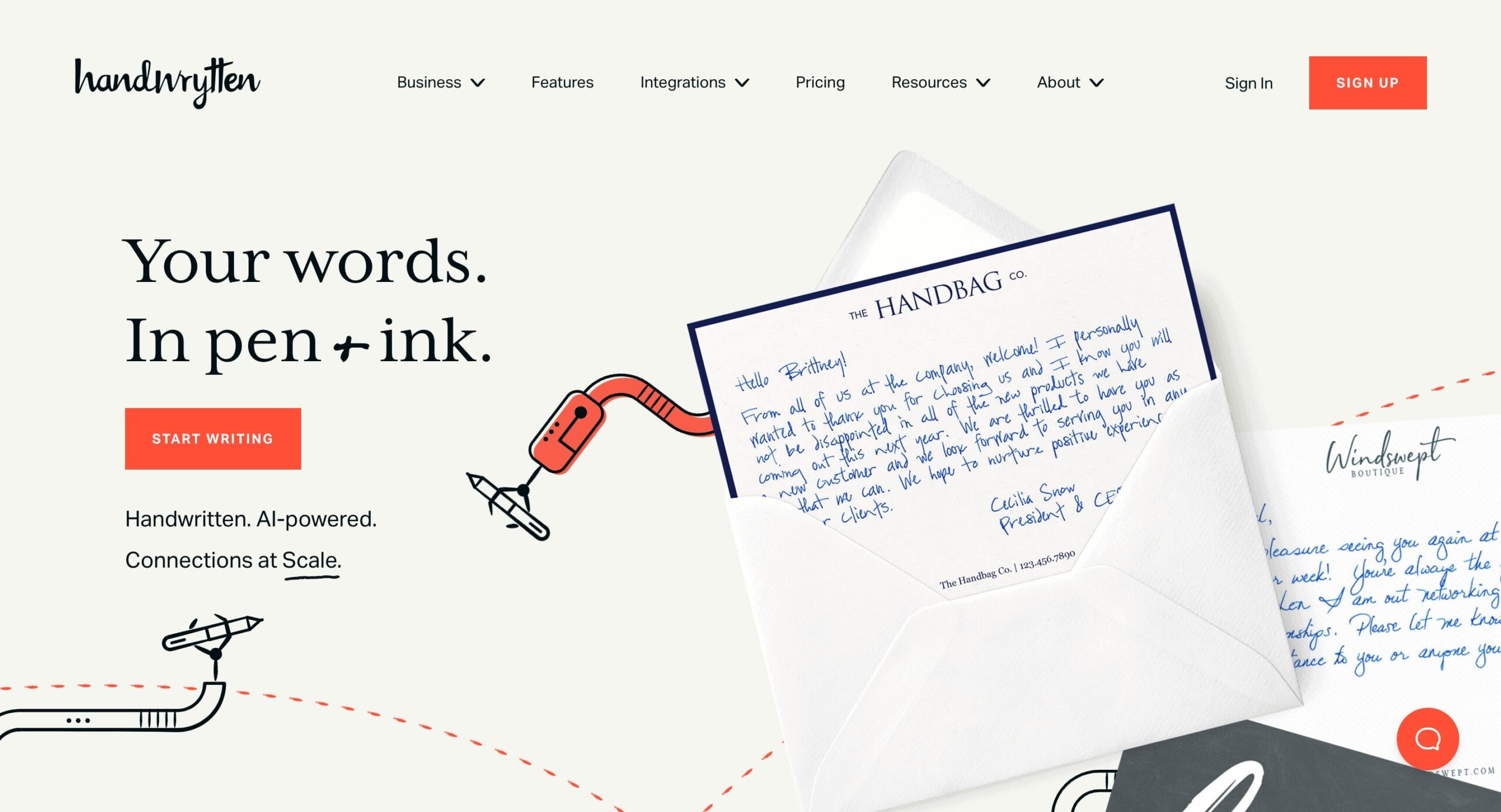
Take Handrytten’s homepage, for example. With subtle animations and clear communication of what the website does, it wins at engaging users. It gives the needed artistic flair and communicates rightly to the users.
Source: handwrytten.com
If you want to learn more about improving the UX on your website, check out our list of UX courses that can help!
Conducting Performance Testing
Performance testing is crucial to ensure that a website or app meets user expectations for responsiveness. It involves analyzing various aspects of system performance under different conditions to identify bottlenecks, weaknesses, and areas of improvement.
For instance, while designing a website, the images should be of appropriate size so as not to affect the loading speed. Similarly, the website should be tested on the grounds of a sudden surge in traffic. So, when the business announces sales, the website doesn’t crash with the increase in traffic.
Optimizing the User Flow
No one likes going through unnecessary complex steps while interacting with a website or app. Designers need to focus on developing a smooth user flow to enhance user efficiency and satisfaction. One way to do so it to use a user flow diagram. ⬇️
A streamlined user flow enables users to accomplish their goals with minimal delays, aligning with the principles of the Doherty threshold.
For instance, if you are given the task of optimizing the user flow of a mobile shopping app, designers can start by simplifying the navigation to ensure users find products with minimal difficulty. This is usually done with the help of card sorting tool or tree testing tool. See how they work in these demos:
Designers can also choose to optimize the placement and design of CTA buttons throughout the user flow to guide users toward desired actions. The idea is to simplify every step and make it as obvious as possible.
Optimizing Website Assets
Optimizing the size of web and app assets such as images, scripts, and CSS files is essential for maintaining the Doherty Threshold. Large and unoptimized assets can significantly impact leading times, leading to frustrated users. Optimizing assets for fast loading ensures that the system remains responsive and meets user expectations.
Here’s an example of a website with no focus on size, navigation, or content. You can keep scrolling, but the homepage is never-ending and has fonts that aren’t pleasing to the eye.

Source: theroommovie.com
While these are just certain instances of how you can improve your UX, ensure you go through additional resources and read the best UX design books out there to enhance your knowledge.
Doherty Threshold Examples
Here are some Doherty Threshold examples to help you put the law into action.
Example 1: Website animation and effects
Designers often use animations and visual effects on websites to create a memorable browsing experience. However, there’s a threshold beyond which adding more animations may not improve user experience. In fact, some users may find it too distracting, provoking them to leave the platform.
Application of Doherty Threshold
Designers must balance the use of animation and effects to ensure they enhance rather than detract from the user experience. Animations must be used only to a point where they contribute to the website’s aesthetics and usability. They should also prioritize simplicity to avoid overwhelming users with unnecessary visual effects.
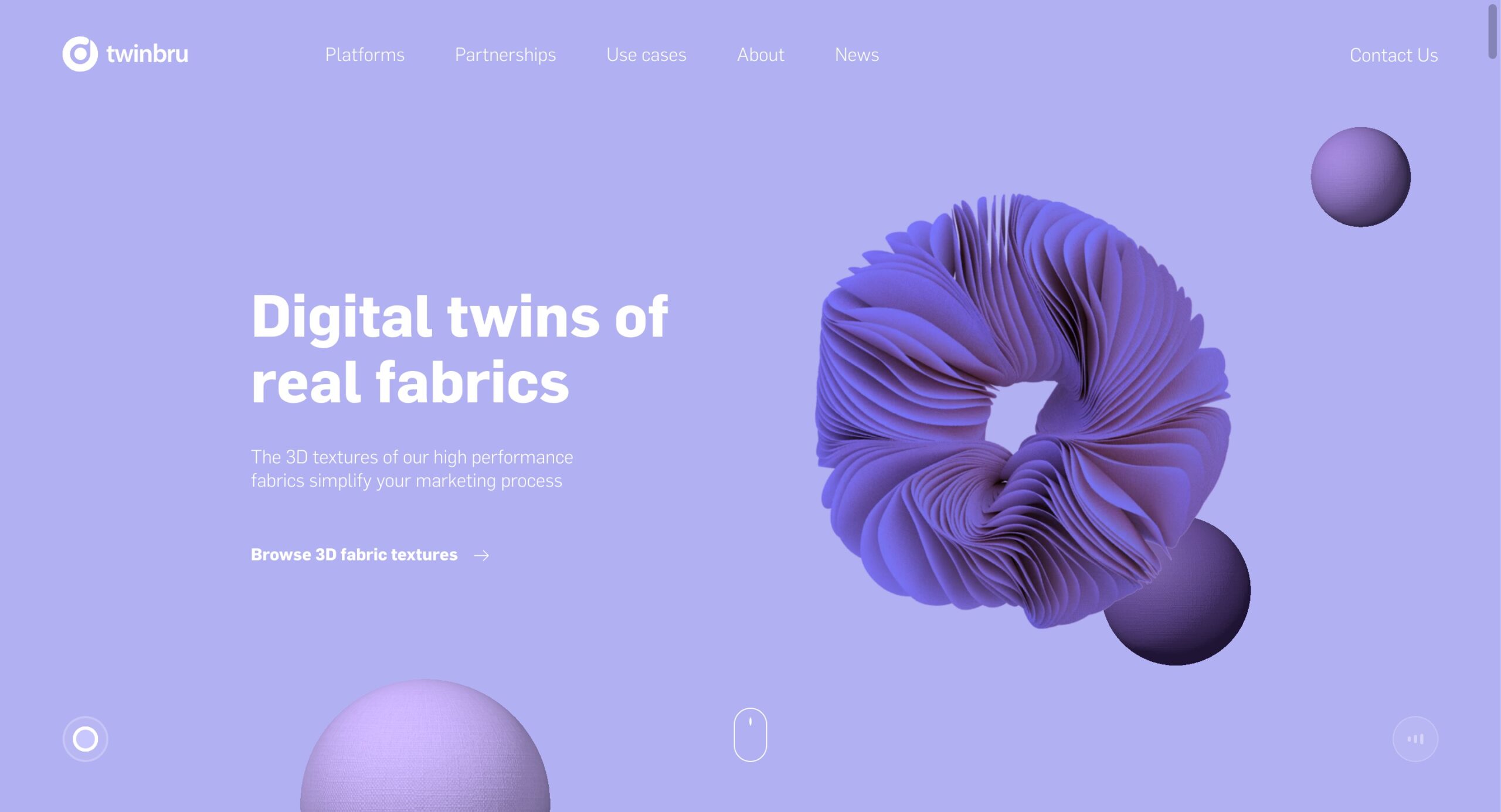
Twinbru does a great job here as a loading animation delights you while you wait for the page to load.
Source:twinbru.com
Example 2: eCommerce product recommendation
eCommerce websites often use algorithms to recommend products to users based on their interests and browsing history. But popping up too many recommendations at once is never a good idea. Users may find it intrusive or irrelevant, hindering their shopping experience.
Application of Doherty Threshold
Designers must optimize product recommendation algorithms to give timely suggestions without overwhelming users. The recommendations should only be made to a point where they offer valuable suggestions.
Any more additions may not increase user satisfaction. They must prioritize personalization and relevance to avoid exceeding the Doherty threshold.
For instance, instead of bombarding random suggestions, you can help users complete the look just like Atkin and Thyme do.
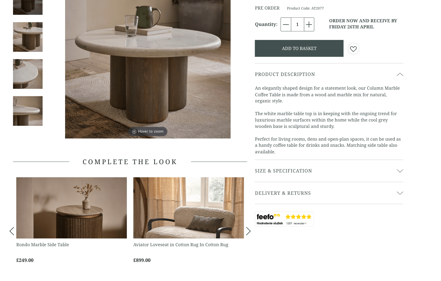
Source: atkinandthyme.co.uk
Example 3: Fitness tracking apps
Users love fitness tracking apps for the metrics they provide, whether it’s steps taken, calories burned, or heart rate monitoring. However, adding too many metrics wouldn’t necessarily improve user motivation and engagement. Instead, users may find them confusing, which leads to disengagement from the app.
Application of Doherty Threshold
Designers must optimize fitness-tracking app interfaces to prioritize relevant and actionable metrics. It should only provide the most essential health and fitness information in a clear and concise manner.
At the same time, bombarding them with constant notifications or reminders wouldn’t help either. Once they mute those notifications, there is less chance of them opening the app again. Therefore, it’s all about striking the right balance to keep users coming back for more.
Sworkit does this perfectly by keeping its interface simple and giving users options to customize their workouts.
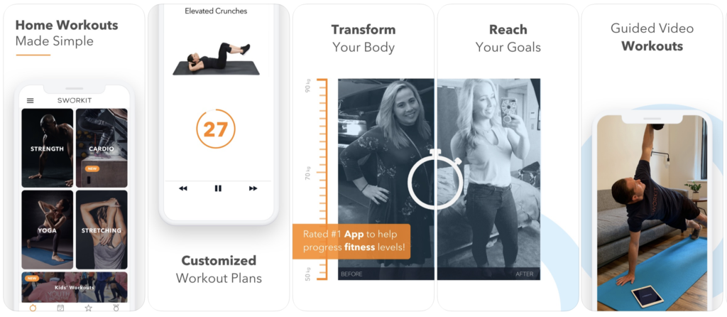
Source: sworkit.com
What’s next?
In conclusion, Doherty Threshold remains a pivotal concept in UX design, underscoring the importance of responsiveness and user engagement. By ensuring system interactions occur within this critical 400-millisecond window, designers can significantly enhance user satisfaction and productivity.
This timeless principle reminds us that, in the realm of user experience, attention to detail and user perception are paramount, driving the seamless interaction between humans and technology.
To ensure user-friendliness and usability of your designs, don’t forget to test them with users. UXtweak is here to help you with that! Use our all-in-one tool to conduct advanced UX research and level-up your UX.


