Are you creating products that prioritize user preferences and deliver a user experience that remains in their minds? If not, the widely recognized UX laws and principles are there to assist you. They help you build consistent designs across different elements, create easy-to-use interfaces, and provide a framework for solving common design challenges.
But you can’t just implement one principle and expect an increase in engagement. You need a blend of the most popular UX design laws, such as Miller’s law, Fitt’s law, Jakob’s law, and many more, to thrive in every area.
So, we took out time and created a list that covers the most important laws and psychological principles like proximity perception to get you going! Without further ado, here is a list of 23 UX laws that will guide you across every challenge and smoothen the overall process.
The most important 23 UX Laws
While the use of AI in generating designs, bold typography, animated gradients, and augmented reality continues to trend in the UX design arena, here are 23 UX laws that sufficed the taste of time and remain efficient:
- Fitt’s law
- Jakob’s law
- Hick’s law
- Law of similarity
- Von Restorff’s effect
- Miller’s law
- Tesler’s law
- Law of proximity
- Doherty threshold
- Parkinson’s law
- Postel’s law
- Cognitive load theory
- Goal gradient
- Peak-end rule
- Zeigarnic effect
- Design for extremes
- Occam’s razor
- KISS law
- Hofstradter’s law
- Yerkes Dodson law
- Serial position effect
- Aesthetic usability effect
- Parkinson’s law of triviality
1. What is Fitt’s law in UX?
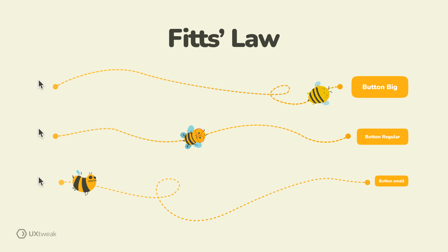
The first in our list of UX laws, Fitt’s law, suggests that the time taken for a person to select an object depends on two factors— size and distance of the object. The bigger objects closer to the subject are chosen more quickly.
Example: there’s a reason CTA buttons are bright in color and big in size. Users must quickly see the action button when browsing the website. If you want users to initiate action, you need to keep it visible and in close proximity. Moreover, when it’s bigger in size, it takes less time for users to move their cursors and click on it.
2. What is Jakob’s law in UX?
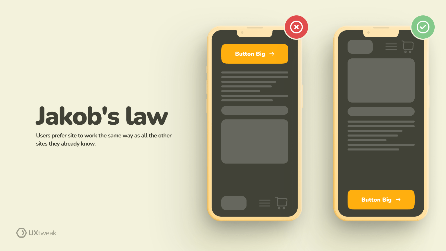
Jakob’s law in UX is among the UX laws emphasizing the importance of delivering a consistent experience across websites. It thrives on how familiarity plays a crucial role in enhancing user experience.
Example: When YouTube launched a new interface, it still allowed people to switch to the old one. That’s because people were used to that interface. The platform then gave them the time to accommodate the new one. Such flexibility prevents users from getting overwhelmed and avoids the burden of learning new models.
3. What is Hick’s law in UX?
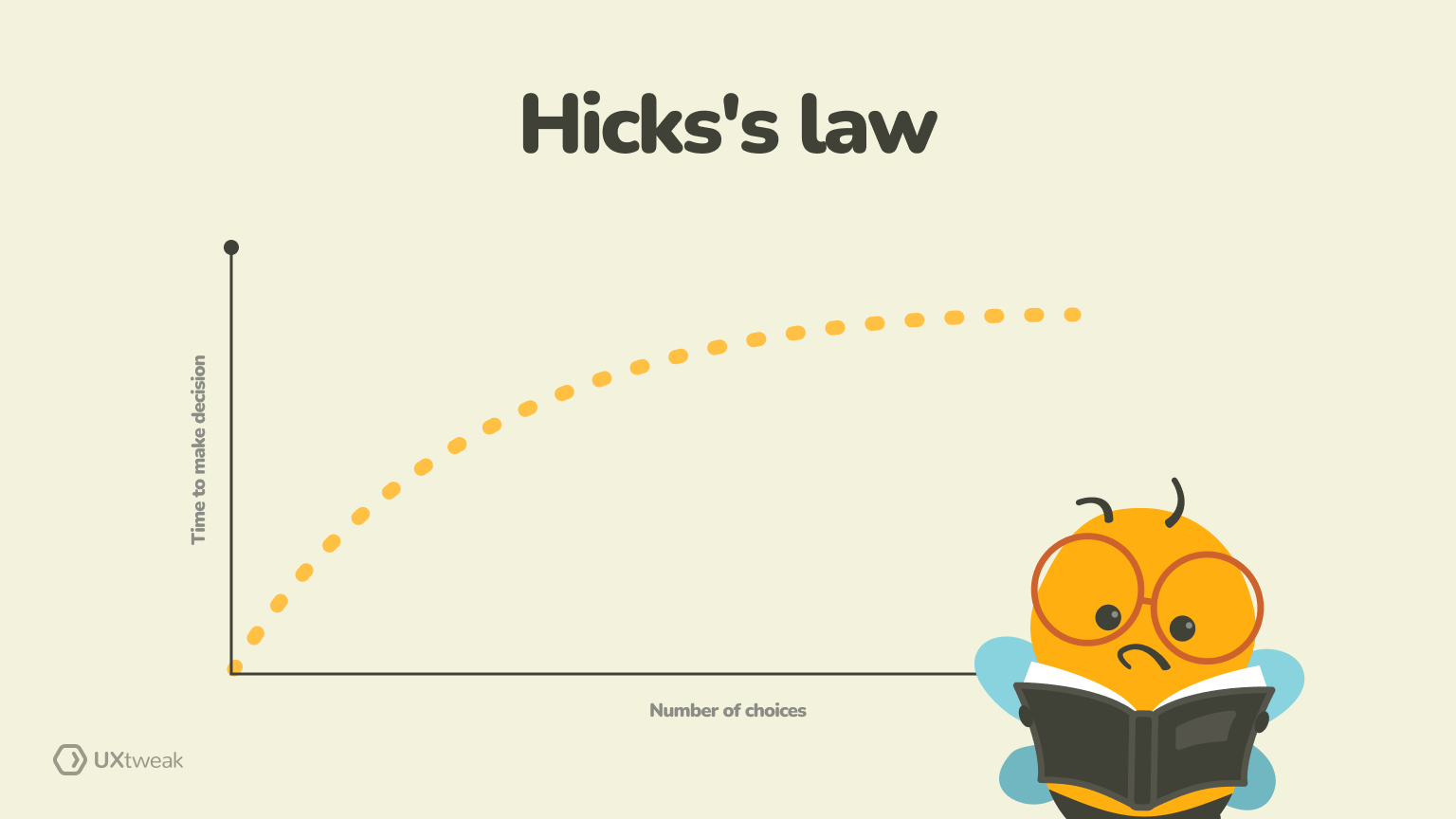
Hick’s law states that bombarding users with a lot of options will only increase the time taken to come to a decision. Human minds are not great at making choices when they see a lot of familiar options.
Example: Consider an eCommerce website’s product page. There are 20 different options for a product a user needs with highly similar features. Their brain will get confused, and in the process of making the perfect decision, they might procrastinate altogether. And that’s bad for business!
That’s where you can use Hick’s law to streamline the decision-making process by categorizing products, providing filters, or showing a limited number of relevant options per page.
4. What is the Law of similarity?
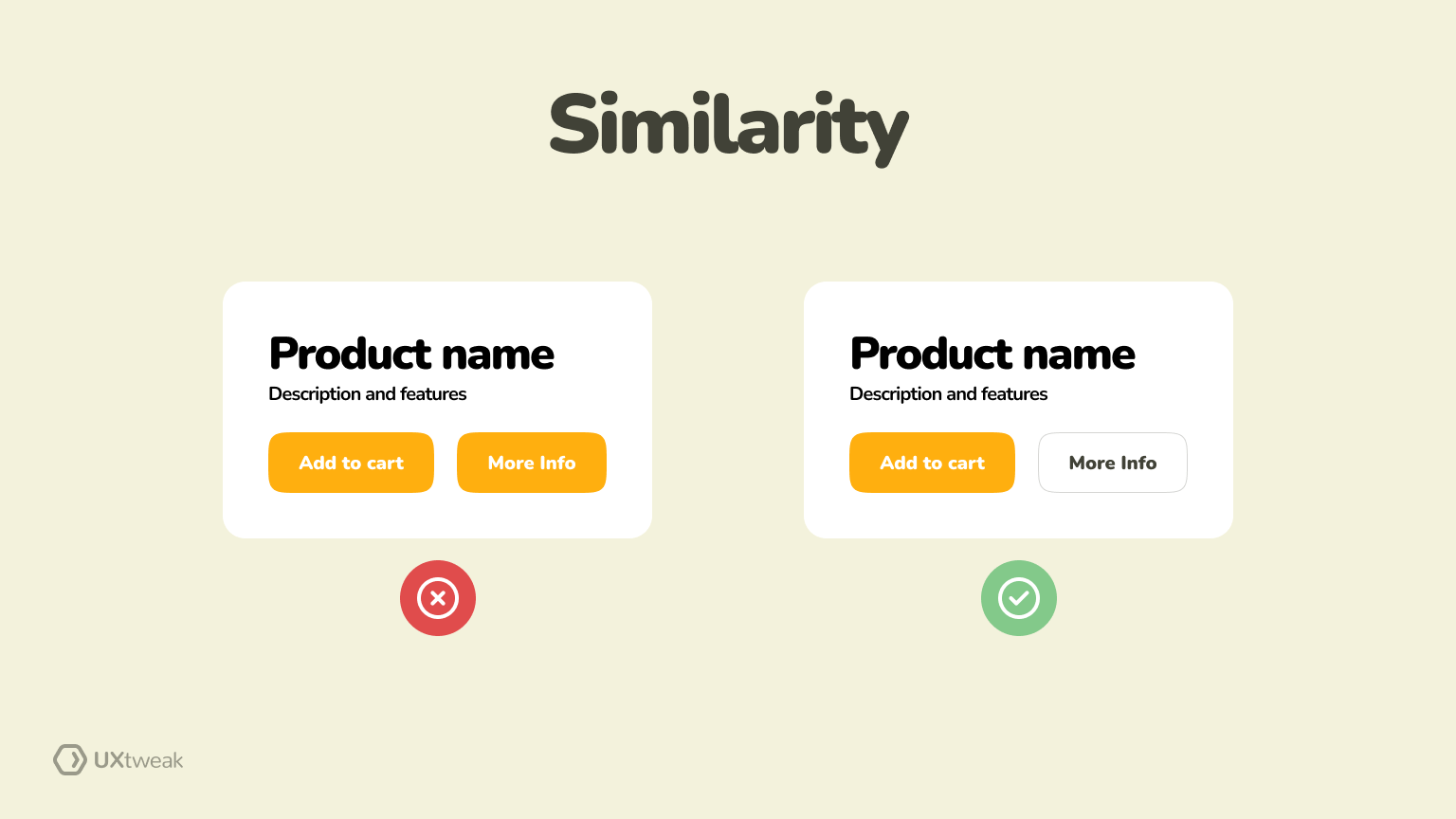
In our laws of UX design, the law of similarity suggests that items that share similar visual attributes are considered related. This includes similarity in elements concerning shape, color, size, or any other visual characteristic.
Example: By applying the law of similarity, you can create a sense of unity among related items. Take Canva, for example, and notice how its design-related elements are placed in circles with similar graphics.

Such similarities help users understand the relationships and purpose of different elements better. With this visual consistency, you contribute to a more intuitive and user-friendly experience.
5. What is Von Restorff’s effect in UX?
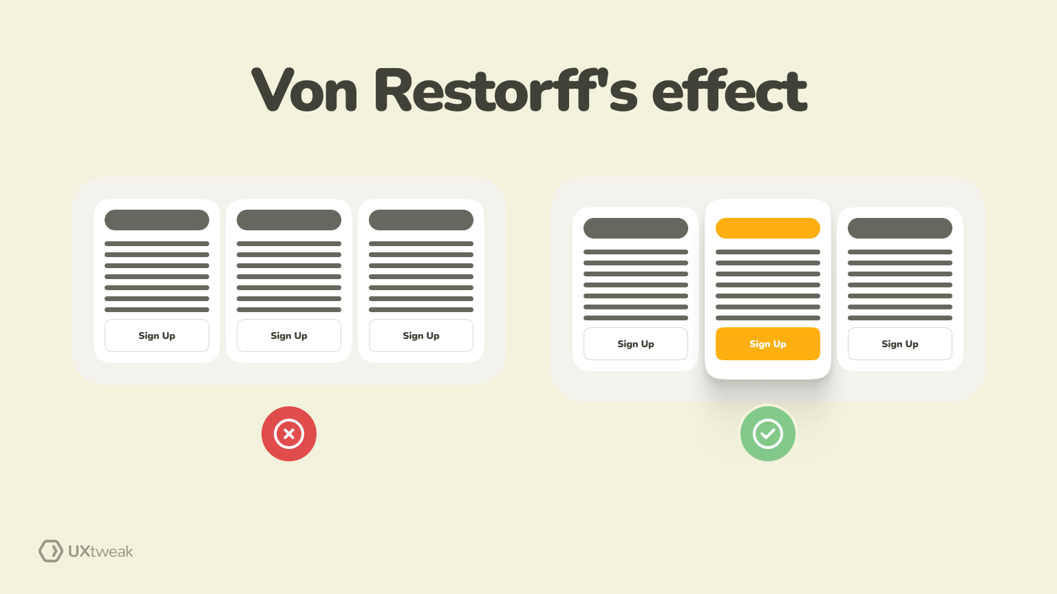
The Von Restorff or isolation effect in UX can be understood with the famous purple cow theory. Imagine seeing 100 regular cows and one purple cow; you’d notice and remember the unique one. Similarly, elements that stand out in UX are likely to grab attention and stay intact in users’ minds.
Example: A CTA button with vibrant colors, distinct fonts, and a larger size grabs instant attention on a webpage. Similarly, highlighting important offers in a separate text block makes them more noticeable. This approach helps prioritize essential information, minimizing distractions for the audience.
Also, gone are the days when you need to play the guessing game about which elements are working fine on your website. Using the right tools, you can conduct session recordings to record and watch what users are doing on your site.
You can understand what’s working well and what needs to be changed based on clicked elements.
6. What is Miller’s law?
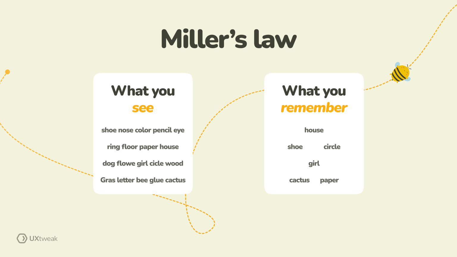
Miller’s law states that users have a limited working memory capacity. They generally process and remember approximately five to nine items at a time. When creating interfaces or presenting information, keeping it limited to these numbers is crucial to ensure information retention.
Example: when creating a website’s navigation menu, keep it limited to a few items users browse through and create categories further.
Instead of:
- Home
- About Us
- Services
- Our Team
- Portfolio
- Blog
- Contact Us
- Testimonials
- FAQs
- Support
UX designers might simplify it to:
- Home
- About Us
- Services
- Portfolio
- Blog
- Contact Us
They will easily process and navigate through the menu, creating a smoother user experience.
7. What is Tesler’s law in UX?
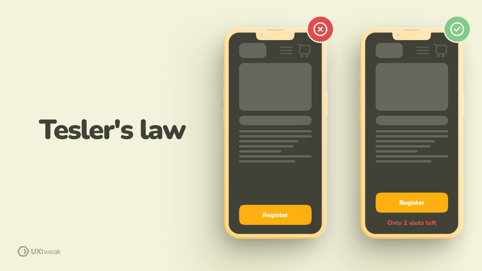
Tesler’s law in UX states, “Every application has an inherent amount of irreducible complexity. The only question is, who will have to deal with it—the user, the application developer, or the platform developer?”
No matter how hard you try, you cannot eliminate complexities. You can reduce it to a certain extent, but it remains there. To reduce the same, the law suggests designers focus on eliminating distractions.
Example: The designs you create should be intuitive and require minimal training. For example, look for unnecessary features or elements on your website. When you are giving instructions, eliminate jargon or complicated language.
8. What is Law of proximity in UX?
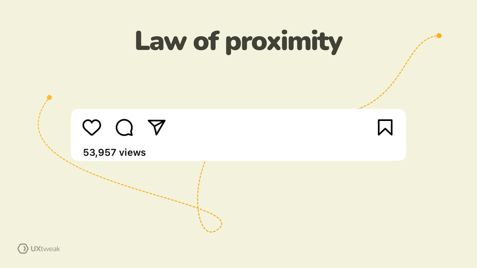
The law of proximity in UX design is based on the principle that elements placed close to each other are perceived as related. Grocery stores, for instance, always group related items together. That’s why you go above and beyond your shopping lists during grocery shopping. UX designers can use this to create a visual hierarchy that initiates action.
Example: Consider the placement of action buttons in apps like Instagram. You’ll notice like, share, comment, and save. When you see a relatable post, you like it, comment on it, and share it with your friends. And at the end, you’ll see a save button, too.
Now, imagine if Instagram randomly changes the placement of the save button. Your brain will get confused and take time to get used to the change. That’s where keeping related items together and in close proximity will help derive quicker actions.
9. What is Doherty threshold?

How often have you left a website because it took just a few seconds longer to load than it should? Probably many, right?
We, as humans, are quick to leave when things don’t match the subconscious threshold we have set. According to the Doherty threshold, the response time should not exceed the threshold (400miliseconds). If it does, you lose a potential customer then and there!
Example: The concept is vital for your website’s page loading speed or the checkout process. Remember, the more time they have, the easier it is for them to lose interest.
10. What is Parkinson’s law?
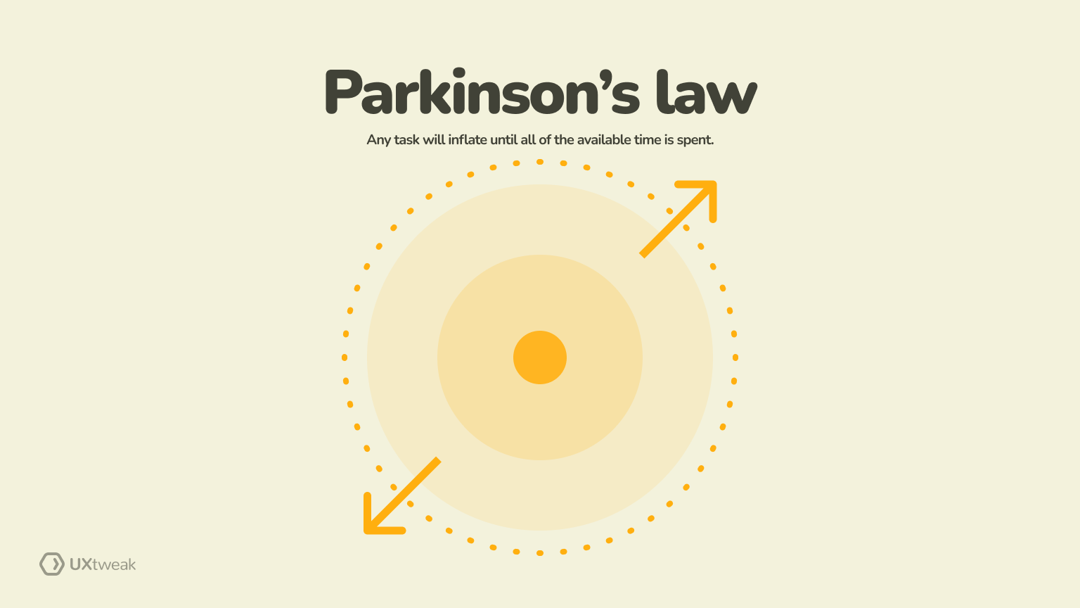
Parkinson’s law states that “work expands so as to fill the time availability for its completion.”
Regarding UX design, the time and resources allocated for a design task can influence the complexity and scale of the design work. If you don’t have clear constraints, you put yourself at risk of overdesign or unnecessary elaboration.
Example: Consider the development of a mobile app. Keeping the project timeline open-ended will lead you to endlessly adding features and refining details. As a result, you will create a feature-heavy and complex app that overwhelms users.
Using Parkinson’s law, project managers and designers should set realistic deadlines and establish clear priorities. The focus then remains intact on essential features and streamlined user experience.
11. What is Postel’s law?
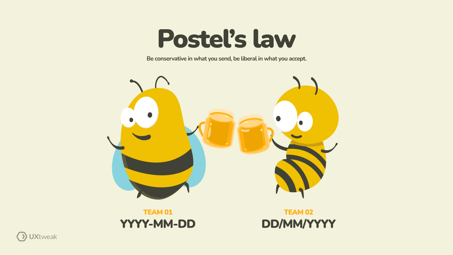
The Postel’s law states that “be conservative in what you send, be liberal in what you accept.”
Designers should be strict and precise when generating output and lenient when receiving input. This means you should open and accept a wide range of user inputs, even if they deviate slightly from the expected format.
Example: Consider a website form that requires users to enter a date. Applying Postel’s law, the system should be liberal in accepting various date formats (e.g., MM/DD/YYYY, DD-MM-YYYY, YYYY-MM-DD) for different user preferences. Such an approach enhances user experience by reducing potential errors during data input.
12. What is Cognitive load theory?
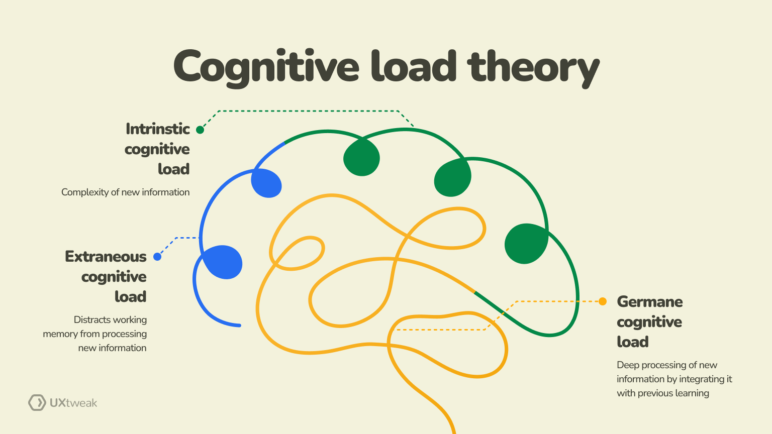
Cognitive load theory is next on our list of UI UX laws, which focuses on the mental effort required to process information in our working memory. It aims to understand how the design of instructional material and learning experiences can enhance learning outcomes.
Example: You can use this UX principle while designing interfaces that present information clearly and straightforwardly. The idea is to introduce information without overwhelming users with too much information progressively. That’s how they must put limited mental effort into understanding and taking the desired actions.
13. What is the Goal gradient effect in UX?

The goal gradient effect suggests that people increase their efforts as they reach closer to a goal. In UX design, this principle can encourage users to proceed further in an interface or application. As users get closer to completing a task, their motivation often increases.
Example: Use this effect in your checkout processes to ensure users don’t leave it in the middle. As users enter shipping information, choose payment methods, etc., a progress bar is shown near the end. They won’t leave in between if they know they are almost done.
14. What is the Peak-end rule?
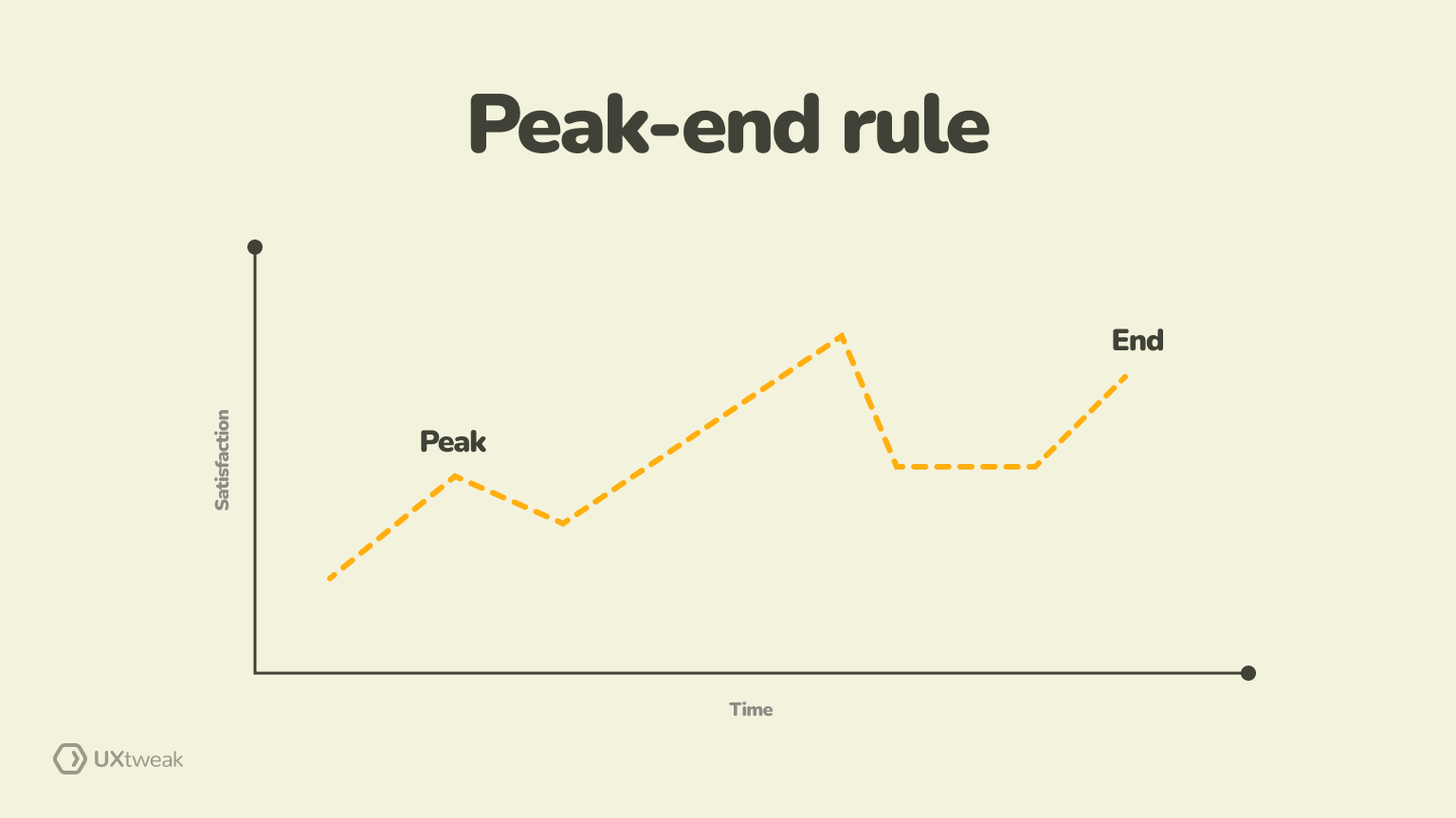
The peak-end rule focuses on the emotional impact of user interactions in influencing overall perceptions. It suggests that people tend to judge and remember experiences based on the most intense emotional point (peak) and the ending of the experience.
Remember the time when how I met your mother ended? Leaving all its fans furious based on its end when the peak moments drew them closer and closer to the show. Unlike the makers of HIMYM, you need to create memorable peak moments during user interactions along with ensuring a positive end to the experience.
Example: A fitness app should have achievement badges for reaching a certain goal. Moreover, when the workout ends, they should give a summary of their achievements during the period.
15. What is the Zeigarnic effect?
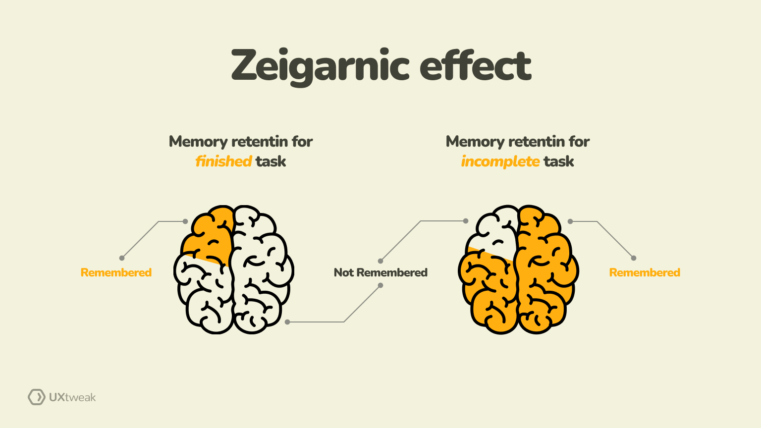
The Zeignaric effect states that people are more likely to remember uncompleted or interrupted tasks better than completed tasks. That’s where UX designers can act by creating a sense of curiosity through incomplete actions.
Example: The best example here is a to-do list app where users can create and manage their day-to-day workings. Every time the app displays a notification for incomplete tasks, it triggers the Zeigarnic effect. Users are more driven to complete those tasks and tick them off their lists. We can also call it the psychological need for closure.
16. What is Design for extremes in UX?

In our list of UX laws with examples, the design for extremes law encourages designers to consider both ends of the usability spectrum. From beginners and novices to experts and power users, the experience should cater to the diverse needs of every user.
Example: Create an intuitive interface, including guided tutorials and pro tips for beginners. Provide an option to customize toolbars to the preferences of intermediate users. Lastly, include advanced features to cater to the needs of expert users.
17. What is Occam’s razor?

Occam’s Razor states that “no more things should be presumed to exist than are absolutely necessary”, i.e., the fewer assumptions an explanation of a phenomenon depends on, the better the explanation.
In other words, you should favor simplicity over complexity when considering possible solutions.
Example: Designers, when faced with multiple design options, should prefer the simpler solutions that require fewer steps. This ensures users find what they are looking for without unnecessary complexity.
18. What is KISS in UX?
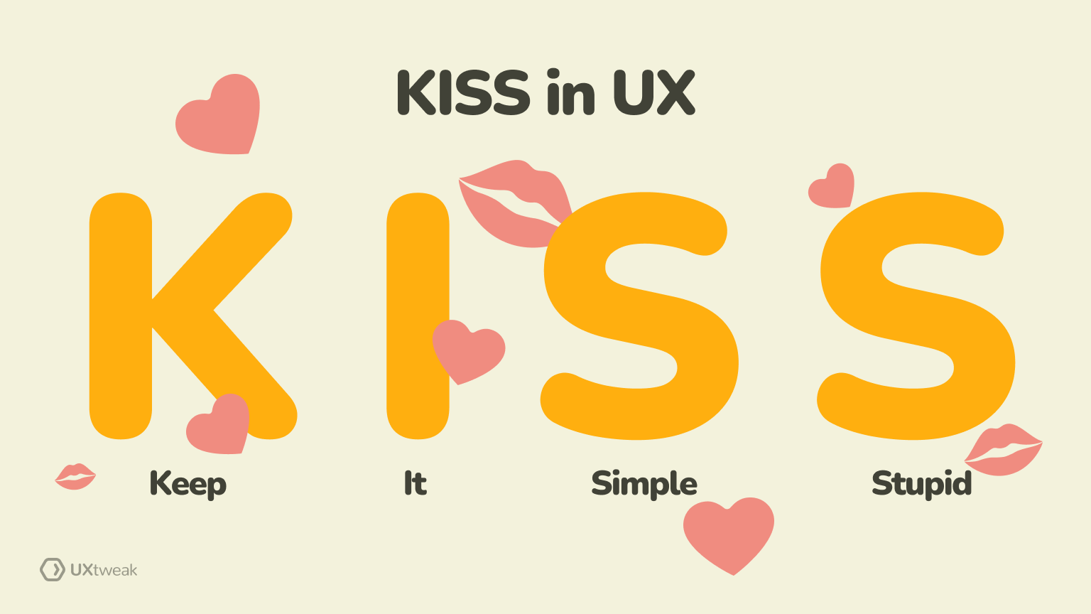
Keep It Simple, Stupid, or KISS is a design principle that again emphasizes the importance of avoiding complexity. You should create straightforward and intuitive interfaces that are easy for users to understand and navigate.
Example: Let’s say you run an eCommerce store. The checkout process should not have multiple optional steps, various input fields, and additional promotions. Instead, you should have clear steps, input fields with only the necessary information, and no distracting pop-ups.
This includes the likelihood of completing the purchase with ease, leading to potentially high conversion rates.
19. What is Hofstadter’s law in UX?

Hofstadter’s law takes a humorous angle and states that “it always takes longer than you expect, even when you take into account Hofstadter’s law”
The law highlights the inherent difficulty in accurately estimating the time required to complete a task. That’s where he suggests factoring in additional time for unforeseen challenges, expected delays, and inherent complexities.
Example: You set out four weeks for the initial design phase of your app, including user research, wireframing, and prototyping. However, during the design process, you come across complexities such as the need for additional user testing.
You need to add two more weeks then to complete the additional testing and move forward. Therefore, in the planning stages itself, add some additional time for such challenges.
20. What is Yerkes Dodson law?
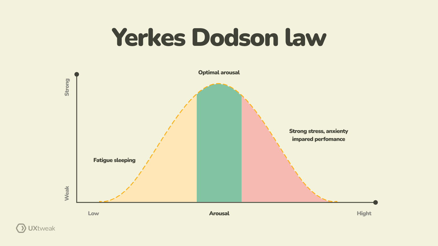
The Yerkes Dodson law in our list of UX laws suggests that there’s an optimal level of arousal for any given task. Both high and low arousal levels can result in decreased performance.
Example: Take gaming apps, for instance; if a game lacks challenges or fails to engage the player, they might get bored. If a puzzle game is too easy, users may quickly lose interest as there’s not enough stimulation for continued engagement.
On the other hand, if the difficulty becomes too intense, players may feel frustrated. As they are not enjoying the game, they will quit. That’s where UX designers need to adjust the difficulty based on the player’s performance.
The idea is to maintain an optimal level of arousal throughout the gaming experience.
21. What is Serial position effect?
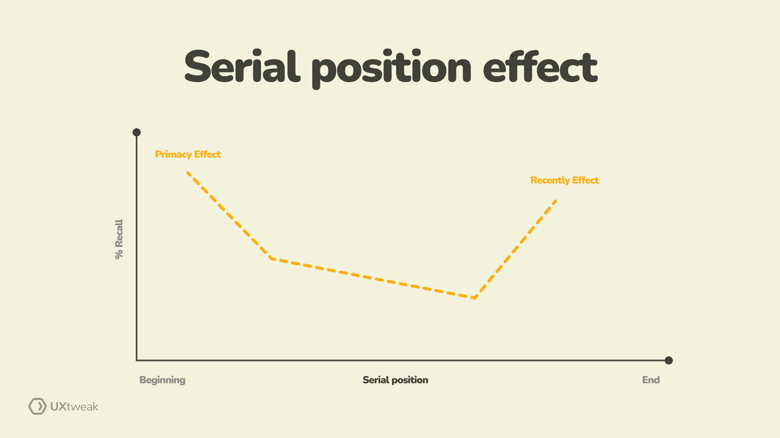
The serial position effect in our list of UX laws of design describes how people tend to recall items in a list based on their order. Both items at the beginning and end of a list are often remembered well. However, we tend to forget items in the middle.
Example: Such UX laws help in designing forms, as important information or instructions should be placed at the beginning or end rather than in the middle. Similarly, when running onboarding processes for websites or apps, present crucial information about the platform early to ensure retention. Implementing such UX laws and principles, you can ensure users recall and engage with information effectively.
22. What is Aesthetic usability effect in UX?

While Pinterest rules the aesthetic arena, users like engaging with aesthetics every chance they get. The aesthetic usability effect suggests that users connect aesthetically pleasing designs with usability.
While functionality and features are crucial, the visual appeal of a product or platform works wonders for the engagement level. In fact, users often neglect minor issues when aesthetics enter as they consider them a learning curve (win-win situation).
Example: Let’s say two eCommerce platforms offer similar high-quality products at great discounts. But only one of them focuses on an impressive color scheme, subtle animations, and modern design. Users will undoubtedly prefer the platform with an enhanced visual appeal as it contributes to a positive experience.
Therefore, it’s important to test your products for the Aesthetic Usability effect in order to ensure your designs are on point.
23. What is Parkinson’s law of triviality in UX?
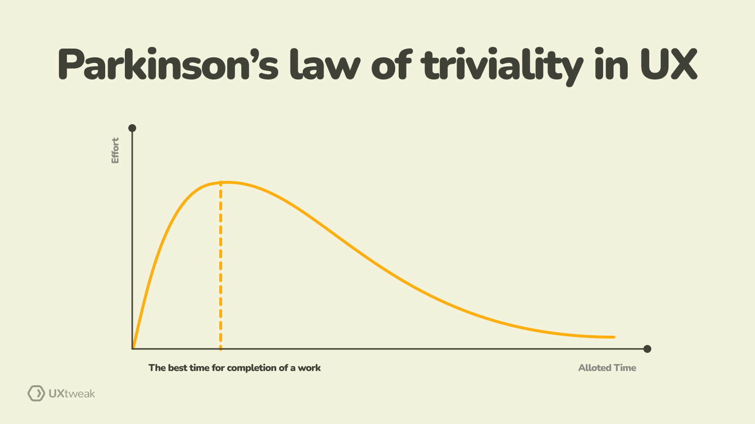
Last in our list of UX laws is Parkinson’s law of triviality or Bikeshedding, which suggests that people often give more attention to trivial issues in decision-making. The more complex a topic, the less likely individuals are to contribute meaningfully to the discussion.
Example: In the case of a website redesign, you might find your design team spending hours on the color and style of a small icon on the footer. Meanwhile, core issues such as improving the site information’s architecture or addressing usability issues get minimal attention/
That’s where you need to ensure you keep the focus intact on core objectives. These key points must receive your undivided attention.
Implement these 23 UX laws with the right tools
Now that you have a comprehensive list of 23 UX laws and principles, you need the right tools to make the most of them. For instance, you implement Jakob’s law to deliver consistent experience across websites. You need a website usability testing tool to understand how users are interacting with the website in the first place. With screen and voice recordings, you understand user behaviors and interactions to make necessary modifications.
That’s just one of the many tools UXtweak has to help you successfully implement UX design laws and principles! There are many more in our bucket to help you conduct UX research, test, and optimize the user experience.
Want to know more?
Create a free account or book a demo call, and our team will help you get started!


