
Every day, we are exposed to a lot of information. From schooling to working, to scrolling on social media, we come across tons of data and our brains can only keep up at every point due to information overload.
It’s been found that the average person’s capacity to remember is limited to ~7 chunks of information in working memory. This limitation is referred to as Miller’s law, as the study was conducted by the psychologist George A. Miller.
Miller’s law and the magic number 7
In 1956, cognitive psychologist George A. Miller published a paper “The Magical Number Seven, Plus or Minus Two: Some Limits on Our Capacity for Processing Information” which changed the way people understood the human mind and revolutionized the design world.
According to his study,
“the span of absolute judgment and the span of immediate memory impose severe limitations on the amount of information that we are able to receive, process, and remember.”
Let’s break that down.
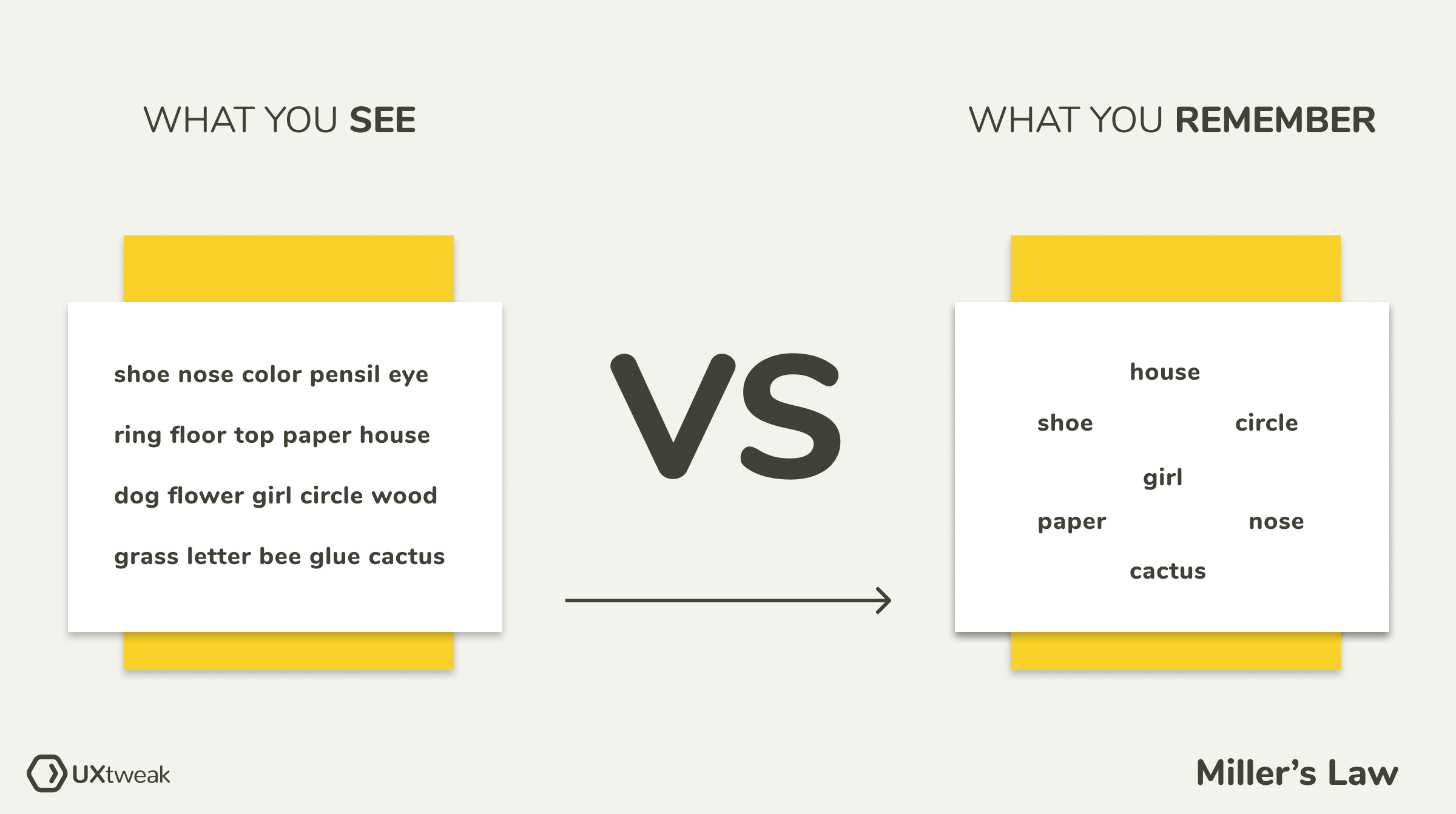
Miller simply suggests that “there is a clear and definite limit to the accuracy with which we can absolutely identify things”. For example, if you’re asked to listen to different tones and differentiate between the sounds, you’d most likely be accurate when it’s just three tones. But say you’re given 14 different ones. You may get some correctly but will probably mix up the others. And it’s totally normal.
Magic number 7
Let’s imagine that you’re given a minute to memorize 20 words and another minute to recall them. Chances are, you’d remember around 5 to 9 words. This 7 ± 2 capacity is a universal phenomenon, that has been tested in several experiments.
As a hack to stretch those limitations, our brains subconsciously groups bits of information into smaller chunks, and small chunks into larger chunks. For example, being able to differentiate between two letters is a bit, and being able to differentiate between two words is a chunk. However, both bits and chunks have the same 7 ± 2 limitations.
Miller’s law in UX design
User experience design is not about designing fancy websites and apps. It’s about ensuring customers have a smooth experience with your products and are able to easily achieve their goals.
Cognitive load
Have you ever prepared for an exam you were to write in a couple of hours? If so, you’ve most likely experienced the feeling when your brain is unable to process anything and is shutting down. This is because when our brain faces more infrmation that it can handle at the time, it slows down our ability to process and remember information.
Cognitive load is the amount of information that our working memory can hold at one time.
As a UX designer, presenting too much information whether features, colors, copy, navigation, animation, or other elements, at any point in your design, can cause information overload which frustrates users and ruins their experience. It’s not possible to completely avoid information overload. However, you can try to remove all the unneccesary distractions and follow one of the golden UX rules: “less is more.”
Chunking
Have you ever had to memorize a phone number? How did you do it?
For most people, the numbers are easier to remember in smaller groups of 3 or 4, like that:

This process of grouping information is known as chunking.
To maximize the limited memory, our brains automatically attempt to simplify complex information by organizing it into chunks. Organize your content into smaller chunks of information. That way it will be easier for users to process it.
The paradox of choice
There’s this TikTok video where shoppers are randomly chosen and given a set time to pick out whatever they want for free. Sounds like a great opportunity, right? Well, while most shoppers ended up picking the first item they saw from the shelf nearest to them, others put some thought into their choice and experienced decision paralysis. They couldn’t make up their minds on what they wanted. There were just too many options!
In their study on the paradox of choice, researchers Sheena Iyengar and Mark Lepper proved that the fewer options people have, the easier it is for them to make decisions. This paradox of choice also applies to our designs.
The more choices users have, the longer it takes for them to make a decision. Too many choices lead to decision paralysis and as a result, a frustrating experience.
Ways to Improve your UX
Here’s how you can apply the psychology behind Miller’s law to your designs:
Visual hierarchy
Rank design elements in order of importance and providing a clean visuals. This will help users focus on their initial goal with your product and increase your conversions.
“Visual hierarchy controls the delivery of the experience. If you have a hard time figuring out where to look on a page, it’s more than likely its layout is missing a clear visual hierarchy”
Information architecture
“Information architecture (IA) focuses on organizing, structuring, and labeling content in an effective and sustainable way. The goal is to help users find information and complete tasks.” – Usability.gov
A good design interface considers how users think, and organizes content in a way that complements their objectives.
By improving navigation and making websites friendly, you reduce the amount of effort needed to use the product, ultimately improving it’s UX. Gather insights on your Information Architecture with the help of Card Sorting and then evaluate it all with a simple Tree Test.

UX writing
Every website and app communicates with users through the words on their interfaces. So what is your product saying? Is your copy too hard for people to understand? Too vague? Misleading? Or perhaps even rude?
Present your content in a clear, concise, and useful manner. Adhere to other good user experience writing rules to reduce the cognitive load and help people easily go through your website.
Miller’s law: Good UX vs Bad UX
Let’s take a look at some designs that follow the principles of Miller’s law and how they compare to the ones that don’t.
Cognitive load
Bad UX:
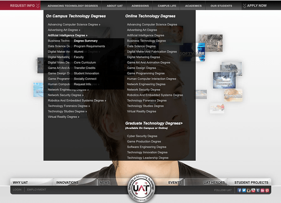
When users click on a website, there’s a subconscious expectation of what the website should show based on the information they had beforehand. When they see a homepage looking like this, loaded with all types of information, they just get scared.

Pic from UX Collective
Good UX:
This design reduces the cognitive load by presenting only the information that’s important to users. It’s a simple and clean interface with little to no distractions.

Chunking
Bad UX:
Applying Miller’s law in UX design is not just about grouping items into chunks, but also about how you present them. This website made use of the magic number ~7 rule to group elements but failed to present it in a way that reduces the cognitive load of users.
Pic from Marion
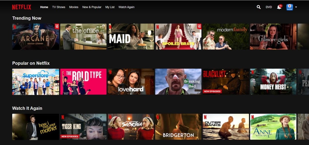
Good UX:
Netflix is known for their great UX and we can see why. Movies are grouped into 6 – 7 categories and presented in a user-friendly manner. That makes their product pleasant to use and look at.
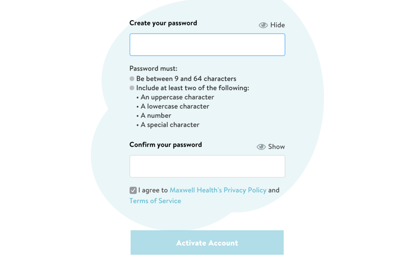
Information overload
Bad UX:
The way designs present important content can make or break the user experience. This particular design doesn’t highlight the important information, making it easy for people to overlook it and get frustrated when they inevitably make mistakes.
Pic from Careerfoundry
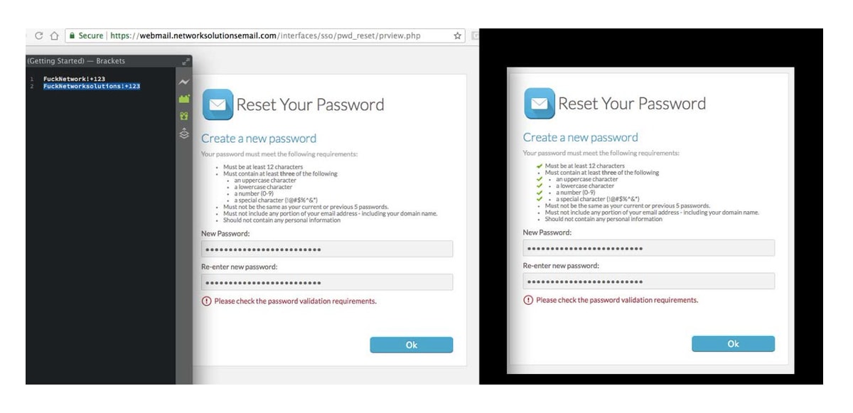
Good UX:
It is possible to have a list of password requirements and not overwhelm your customers. Good UX design follows the psychology behind Miller’s law by clearly presents important information in a concise manner.
Miller’s law: A rule or a suggestion?
Organizing elements into 7 ± 2 chunks has become a general phenomenon in UX design. But while some see this magic number ~7 as a rule, others see it as a suggestion citing that context and other factors play a huge role in deciding how to organize content.
Nonetheless, ignoring Miller’s law can have negative consequences on the UX of your websites and apps so keep it in mind when working on your next progect.
See other blogs in our Information Architecture section.


