You probably got so overwhelmed with so much information/content that you gave up and left the website in frustration. We have all been there. This article will help you learn how to structure the anatomy of your website with practical guides, helpful tips, and a look at UXtweak’s tree testing tool.
It’s very important to structure your website in an intuitive and easy-to-navigate way because it helps your customers find the information and products they need easily. This automatically translates into customer retention and loyalty, making your website a “go-to” for that particular service or product you offer.
However, this can only happen if you understand the anatomy of a website and thus design its architecture diagram with the user in mind. To be able to understand how to structure a website, it’s important to first define the anatomy of a website and how it lives on the web.
In simple terms, anatomy is the study of the structure or internal workings of something; however, we will be looking at the anatomy of a website as a use case here.
What is information architecture?
Information architecture is a system by which information (which can represent basically anything) is organized. Not only on the internet but also in the real world. The focus is on clear and logical organization, you that searching is intuitive and easy for the user.
For example, a store or library; the system by which the librarian or the store manager places books or goods on a shelf is also a non-digital form of IA.
However, in this article, we are focusing on the form of information architecture that you can find online, the website architecture.
What is website architecture?
Website architecture is a branch of information architecture that focuses solely on the structure of websites and web apps. It is the structure of web pages in a hierarchical form, which is reflected through categories and subcategories of different web pages and how they successfully link to each other.
An effective website architecture should encourage users to find information easily, as well as help search engine crawlers understand how each web page relates and interacts with each other.
In order to design a standout website architecture, it is important to have a working knowledge of the anatomy of a website and what it’s really made up of. Let’s look at the anatomy of a website in detail.
The anatomy of a website
Anatomy comprises a building block and when arranged properly, gives a unique visual appearance. The anatomy of a website is primarily concerned with the bodily structure and internal workings that makes up a website.
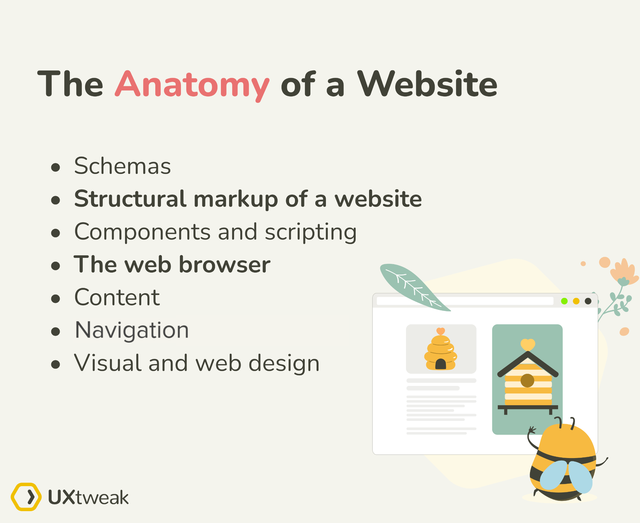
These are the main blocks that make up the anatomy of a website:
- Schemas
- Structural markup of a website
- Components and scripting
- The web browser
- Content
- Navigation
- Visual and web design
Schemas and Document type definition
Schemas are primarily structured data in the form of semantic code created through collaborative efforts by search engines in order for a website to be recognized on the web as well as across all search engine platforms.
The schemas are essentially the building block of your website.
Structural markup of a website
The key element of an electronic device is its semiconductor; the same is true of web documents in the sense that they are shaped from various interlinking elements that form the backbone of the Web.
Most web documents are formed through languages which describe the skeletal structure of the document, such as HTML and XML. RSS is also a classic example of a markup that structures a website’s content.
Without these core markup languages, your website would not be able to maintain its layout.
Components and scripting
You get your users to interact with your website by using client-side scripting which serves as the programming language on which your website is built. Languages like Javascript allow interaction when visitors click, move their mouse, press a key on their keyboard, or make any other noticeable gesture.
Your website will therefore react based on the functions implemented. Javascript and other client-side scripting languages can interact based on their own input function e.g., touch, speech, automated actions, and movement.
The web browser
The web browser is primarily responsible for the transfer of information and signals to your website. The server or user-agent, therefore, handles the request of users and in turn reflects the desired request to the end user.
Content
Content is basically information on a website. The content of a website is enclosed within a structure and it is shown when and where it needs to appear. The stronger the information on your web page is, the better your website will be, as it will become more usable for your users. Also, if you want your content to appeal to a multilingual audience, website localization will help you overcome language barriers.
Navigation
Clear navigation binds the website together. Stuff needs to be well-organized, otherwise, people will face problems with finding what they need. That is why it is a crucial part of a website structure and needs to be designed perfectly.
The best way to organize your navigation such as menus or sidebars is by implementing card sorting and tree testing in your user research process. These methods will help you come up with potential models, find out how users expect the website to be organized, and minimize any confusion.
Another thing to keep in mind is the cognitive patterns of users. We advise to apply the Miller’s law and the magic number seven to ensure navigation is intuitive to the target user.
Visual and web design
The visual appearance of your website plays a vital role in how your website will be perceived by users. The css is responsible for the styling of your website. It attaches itself to your structure and layers on elements of style, which give the visible physical appearance you desire.
Consider these building blocks when starting your next web project. They will help you understand how and why a website behaves the way it does.
Website Architecture Diagram
If the information on your website isn’t organized in the way your users expect it to be, they will tend to get lost and struggle to find the desired information. Once this happens, they’ll get frustrated, leave the page, and probably seek out your competitors. If you take good care of your website architecture, however, it will in turn create loyal customers and improve your company’s image.
Having your content organized in a clear, user-friendly way is also crucial to keeping your bounce rate as low as possible. Below is a diagram of a website architecture.

Importance of website architecture
The function of a website architecture primarily is to strengthen your website’s user experience.
Here are some of the main benefits of a good website architecture:
- Helps search engines effectively crawl your website.
- Helps to distribute “page authority” more equitably, so that a page isn’t left out.
- Increases conversions by making it easier for users to find products.
- Helps to strengthen topical authority because of the strong internal linking structure between related or similar topics.
- Makes sure users won’t get confused or irritated when trying to browse through your pages
Website architecture best practices
Here are a few best practices for creating a website architecture diagram:
1. Create a simple top-level navigation menu
Don’t make your users think too hard. A hard-to-navigate website will have a high bounce rate. Users don’t want to waste time trying to find information on your site. If they do, they’ll just leave.
Always provide information based on the menu item’s name. Conduct a card sort with your target users to find more ideas for labeling categories.
2. Keep your URLs simple and user friendly
It’s important to create user-friendly URLs. We have all come across URLs that look like this:
“example.com/store/rackets/default.aspx?lang=en&category=98a20”.
No user wants to see that because it can be easily misleading and doesn’t provide any type of information about a page you’re on.
Internal linkings are often more important than the URL structure itself. It will be helpful for both you and your users to structure the URLs as “example.com/topic”.
3. Model your website architecture after the top players in your industry.
Your customers are used to the website architecture of major brands in your industry, so if you run an e-commerce store, analyze how Amazon structures its website and emulate them. Your website will seem more familiar and, in turn, easier to navigate.
4. Add breadcrumb navigation
This tip does not ultimately apply to all websites. However, for example, if you have an e-commerce store with tons of pages and subcategories, it would be helpful to provide visitors with breadcrumb navigation bars so that they know exactly how they got to the target page.
5. Keep your website consistent.
Your website’s navigation format, design principles, and link displays should all follow a consistent pattern. Keeping these elements the same will keep your users on your site longer because it’ll be easier for them to quickly navigate to new pages and click on links.
Keep in mind that your website’s architecture is important for both UX and SEO. With a solid website structure and architecture, you’ll improve dwell time and keep your users engaged to consume more of your content. This means more conversions down the line, improving your ROI, and increasing revenue at your company.
How to create Website Information Architecture

1. Figure out your customer’s thoughts/wants/needs
To create a good website, you need to know your customer. After all, you’ll first need to define what kind of content your target audience is looking for. You can’t do it without knowing what problems you are trying to solve and for whom.
Survey or a live interview are the tools you can use to ask users anything you want to know. You can also observe users interacting with existing solutions to discover more about their behavior, preferences, expectations, the issues they face, or anything else.
Being prepared like this will let you create the best user personas, identify the top tasks to start tailoring your content, and design the way to fulfill the wants and needs of your potential visitors. Don’t forget to keep it consistent. Make sure it corresponds with the intention of your website. Prioritize your tasks to identify the top content you need to focus on.
2. Organize topics into categories
Unless the website you’re designing is quite small and simple, your goal with website architecture is likely to organize your content into a multilayered hierarchy. This will allow your users to find even specific information by gradually narrowing down what they’re looking for by navigating the site.
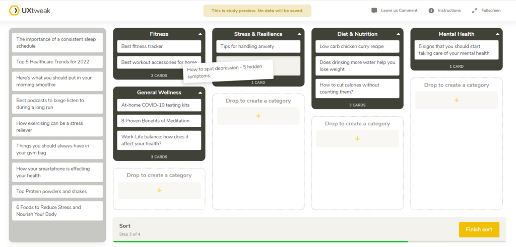
When it comes to designing your website architecture, you’ll want to know where people expect to find content. Card sorting is a great and simple exercise where you ask participants to sort cards (which represent information) into categories in a way they find intuitive. Your users aren’t UX designers – you can’t simply ask them where everything should be – but card sorting is the best possible alternative.
Before organizing your topics into categories, you should label them correctly. Try to think the same way your customer/visitor would. You’ll make labels the most effective and easy to understand. Avoid using unnecessary words – for example, using “Food” instead of “Buy food” is sufficient and keeps it as simple as possible. As long as the labels capture the concept they’re supposed to represent, they don’t need to copy the labels on your site exactly.
You should also think about the level of abstraction in your study – it may be possible to merge similar categories into one to reduce the number of cards. For example “Men’s shoes” and “Women’s shoes” can be grouped into “Shoes” in case the connections of those cards are clear.
Once you have names for your topics, you’ll want to have them categorized to find out which content belongs together. The best online tool for this is Card Sorting.
First, use open Card Sorting where you let your respondents decide the names of the categories and sort all the cards you provide them. In the next step, you can analyze the results to see which cards were often placed together and what were the popular ways of thinking for creating categories.
If the consensus is too small, we recommend running a hybrid and closed Card Sorting (depending on the analysis of the results of your studies) until you get results you’re satisfied with. Once you have everything grouped and named correctly, you can move on to testing your architecture.
3. Test your website structure
To test whether your website structure corresponds to what users expect it to be, try running a tree test with your target audience. It’s a simple exercise based on giving testers specific tasks, asking them to click through your website’s architecture (a tree) and choose categories where they think they’ll find the answers.
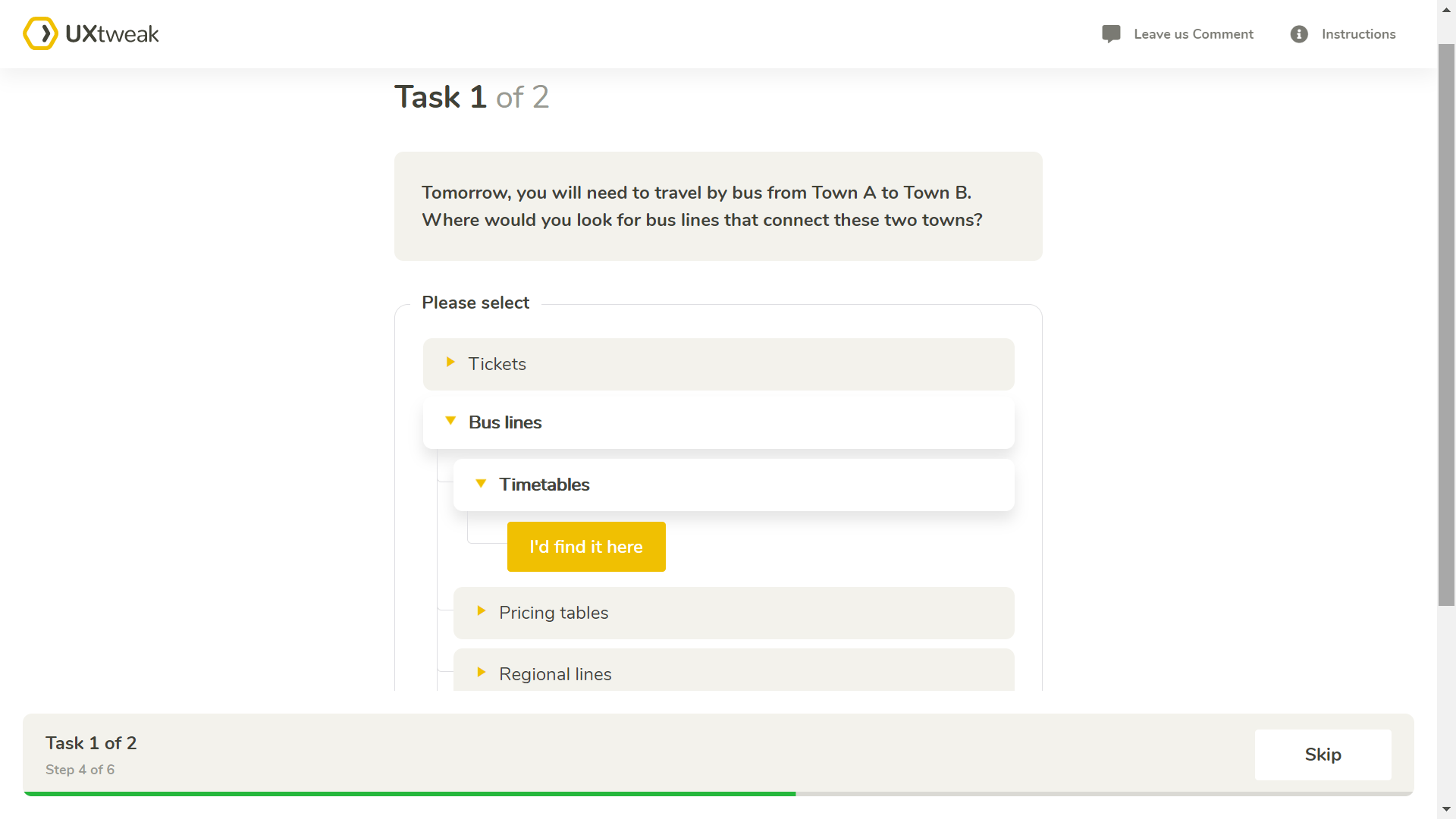
Think of the tree as a branching structure (e.g., navigation menu). It’s a list of categories and subcategories. You can create it with our handy editor, import it from a spreadsheet, or load it from an existing site. The tasks test the categories and labels in your tree structure by asking testers to find something contained within the tree.
With tree testing, you are able to quickly evaluate the findability of topics in your navigation menu, as well as understand where users get lost or confused.
Learn more about card sorting and tree-testing and how they can help you improve your website architecture in our YouTube video!
Engage your users with your website architecture
After learning about website anatomy, its components, website architecture diagram, and best practices for creating one, it is important for you to be able to evaluate any proposed menu structure and see how easy or difficult it will be for users to find the desired information, as well as identify confusing labels and overlapping categories.
Remember, you want your website to guide the user through products, services, and information that can help them solve their problem effectively. Register for your free account at UXtweak and run as many tests as you like!

