With the notifications beeping all the time and entertaining social media platforms it is easy to start losing the attention span on the other sites. Companies have to come up with a strategy to catch their users‘ attention when needed in case to make them finish a desired task on the website. In this article, we will take a look at what creates a good user experience and the most common causes of users getting distracted on the website.
Distraction comes from insufficient UX design
There is no doubt that our use of the internet increases every year. We learned to not read every single word that is presented to us. Instead, we just keep scanning the websites. Our attention span is not changing as much. It is more about higher expectations of the user experience that websites offer.
Where the attention is naturally required, we are usually able to focus – we manage to watch those Netflix series, or to read articles that we are really interested in. We can also buy those shoes we really wanted, even though the process of purchase has several steps where it‘s so easy to get out of the way by the smallest distraction.
There is a reason behind every unfinished purchase. On one hand, some costs may discourage the customer. On the other hand, there are errors in the customer journey. And those you can usually find out by usability testing.
Find out what makes an interface distractive
UX designers are responsible for delivering a smooth, user-friendly experience, where the user won‘t get frustrated, confused, and lost. Before jumping to any conclusions about why your website isn‘t performing well, you need to be empathetic. Look at your site through the eyes of your users. Discover usability problems with your website with real users to create better experiences and stop losing customers. We have created a list of the most common issues on sites that make people lose interest and attention, but are so easy to fix!
The text has to be readable, divided into smaller chunks
Non-readable text is definitely distractive. It is okay to go with a funky font for the logo for example, but for the body text, we recommend you to stick to some of the most commonly used font families, such as Inter, Open Sans, Merriweather, Helvetica, etc. It is because that way you can be sure that the text will be easily readable for every user. Not to mention, that the regular body text has to be at least 16px. Don‘t make users zoom the screen and shrink their eyes. Equally important is to divide the text into smaller, digestible chunks, supported with a title for each paragraph.
Colors have to be used strategically
Different colors can be perceived in different ways. Of course, each culture has its own perception of colors, but in web design generally, you should focus on two main things:
- Catch the attention with color: Use a contrasting or vibrant color on the important elements, such as call-to-actions. It will easily catch the eye of the user and will lead him to finish the task.

- Color contrast: Be aware that not all people have perfect vision. Someone‘s vision may be blurry, some people are colorblind. When users become worried about not being able to read what is on screen, their attention is gone. Be sure to use a color contrast checker between the background and the text.
Extra contrast tip: Avoid using #000 Black as background together with #FFF White as a text and vice versa. White has 100% color brightness, and black has 0% color brightness. Pure black together with pure white can cause eye strain when users read a greater amount of text.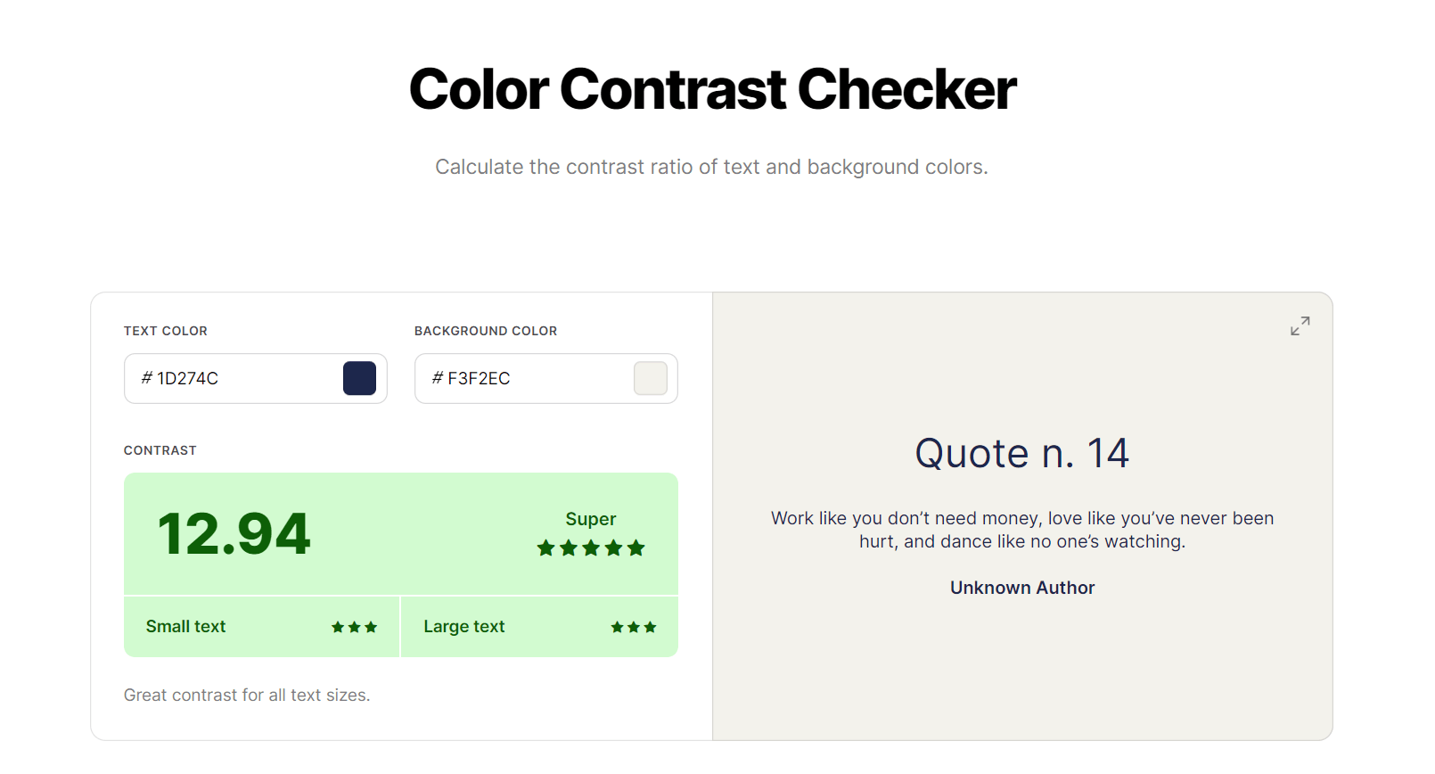
Use imagery, icons, and illustrations
90% of information transmitted to the brain is in the visual form. It is 60,000 times faster for the human brain to process images. Now, it is probably clear to you why the use of images is important to keep the user’s attention.
Using imagery together with the text is known as a Dual Coding Theory and helps users learn and understand the content faster and for a longer period of time. It will also help them to navigate through content easier. Try to use your own images and illustrations to support more complex information. For example, when presenting visitors with your features or giving them instructions, the brain will be able to scan the information being presented much faster. 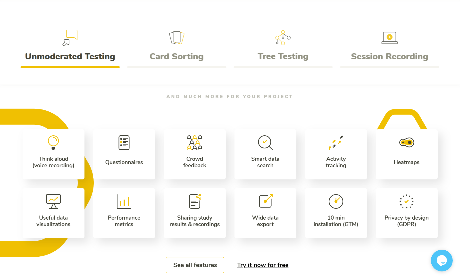
Be careful with too many visual effects
Maybe you‘ve had a chance to notice beautiful, visually pleasing web designs on websites such as Dribbble or Behance. However, even though they may look beautiful at first sight, the sad truth is that the extensive amount of drop shadows, gradients, and two-tone color schemes can actually cause needless distractions.

In the image below you can see the example of a designer using way too many visual effects. The gradient on every background, inconsistent card architecture, harsh shadows on the progress bar (together with the gradient), and simply just way too many colors. To take some action on such an interface, users would be most probably confused about the next step.
Avoid cognitive overload
Limiting the number of choices to avoid cognitive overload in a user, known as Hick‘s Law, helps the designers navigate the user‘s attention where it is needed.
Steve Krug in his book – Don‘t make me think, made several relevant points regarding the avoidance of cognitive overload in users:
- Even if it’s never used, a home button visible on the screen gives users a sense of reassurance.
- Users are just as likely to enter your website from the middle as from the home page. Every page on your site should be self-explanatory.
- Users tend to go with the first or easiest solution to their problem, instead of the best. That causes users to continue using that same solution over and over, without ever considering a better option.
- Much of web usage is motivated by a desire to save time. Users also tend to headlessly click on anything, just to find the solution believing it takes less effort.
Don‘t make the overlay interrupt users in the middle of a task
The issue with overlays is unfortunately a very common thing.
“Most overlays appear at the wrong time, interrupt users during critical tasks, use poor language, and only contribute to user disorientation.” – NNgroup.com
As the first case in the picture below we can see how the interruptive popup occurred in the middle of the most important task, which is making a purchase. The user will lose the concentration he had, and the risk that he won‘t continue increases. The second situation is a much better idea. The popup asking the user to do the app a favor is shown after the checkout was completed. 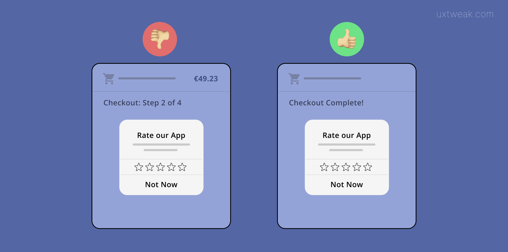
Avoid one-page website
If you‘ve been thinking about having a one-page website, it might be a good idea to rethink this decision. One page website means that all the website’s content will be stored on one single page and therefore there will be more space for distractions. It would take some time to scroll through it on the desktop. Imagine how long the mobile device user will have to scroll to navigate through the site. One-page websites are not good for SEO either. Instead, if you try to use Card Sorting to create a comprehensible menu, navigating through the website should not be a problem. As long as the user will see the meaning behind the menu and can find information easily, the increased number of clicks will not influence the overall experience.
Good user experience is all about the smallest details
User experience is about the smallest details. And when it comes to business, it is important to keep track of and analyze every step of the user behavior, trying to improve it more. In many cases, people leave websites after being too overwhelmed by their structure and content.
Even after you fix every issue listed up, there might be more situations in which users get distracted by something. We‘ve found the Session recording tool to be very useful to fix a problem like this, simply because it is possible to record the behavior of each user on the website and analyze it right after. Heatmaps, activity tracking, and detailed statistics help you discover previously unknown, and often surprising user activities.