
As a UX designer, the knowledge of proximity perception and cognitive abilities can be helpful when designing a user-friendly and intuitive product. We created this article to help you understand the concept of proximity perception and how you can apply it effectively in your designs.
As we continue to explore how people visually perceive the world, we need to understand the place of proximity and its principle in the world of user experience. In our earlier article on Gestalt principles, we defined Gestalt principles as a set of rules that explains how people interpret the world around them. Proximity perception is an essential part of these principles and therefore, modern user interface and experience design relies heavily on this principle.
Let us start by defining proximity and the principle of proximity. Then we can understand how it can help us design our products with good user experience in mind.
What is proximity?
Proximity is the measurement of whether we perceive design elements as close to each other, or separate from each other. Proximity equals closeness.
What is proximity perception?
The law of proximity perception states that objects located closely together will be perceived as one group. When we encounter any complex element, we tend to recognize the whole before we see any individual part. Elements that are far from each other, in contrast, will be perceived as separate.
The image below shows how the elements placed together are likely to be perceived as part of the same group or unit. There is a clear distinction between the dots, based on their color, yet in both images our brain will naturally divide the dots into two groups based on the proximity, not the color.
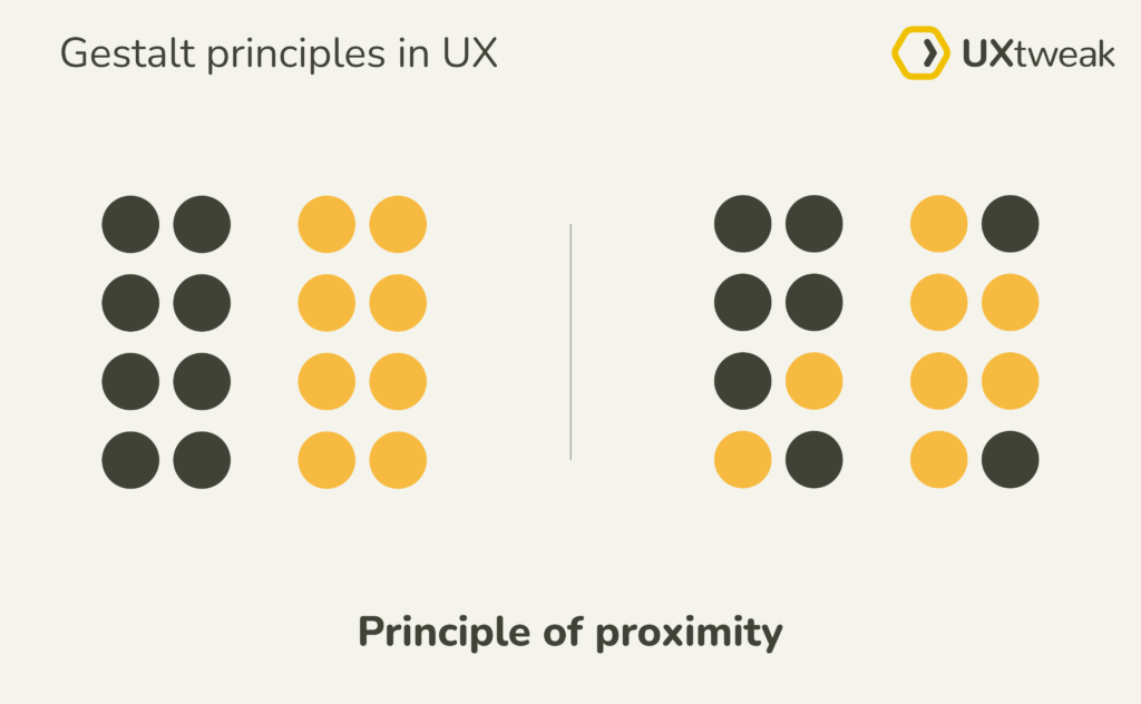
Source: UXtweak
What is proximity in UX Design?
The proximity perception principle is a great guideline when designing interfaces for mobile and web. It helps you as a UX designer to structure and organize the layout of your screens to make it easily readable, scannable, and well-perceived by users.
As a UX designer, a good grasp of the proximity perception theory will result in designing products that will make sense at the first glance. It will help you to place the design elements along the natural ways that our brain absorbs, retains, and interprets data.
Unsurprisingly, this is precisely what people need; familiar interfaces, a flat learning curve, and predictable interactions. This will help you retain users and give them the best user experience while they use and interact with your product. To learn about the impact of proximity in UX design more in depth, you can read more in an article here.
Importance of proximity in UX Design
We use proximity to communicate meaningful groupings and visual cues in UX design. Here are the main reasons for the importance of proximity in UX design:
1. Creates connections among elements
Proximity plays a very important role in the organization of content by creating relationships between visual elements in a composition, thereby establishing relevance, hierarchy, and structure between two or more elements.
2. Dispels connections among elements
Proximity, or lack thereof, can also be used to communicate that there is no relationship between design elements, and it can also be used to break organization just to show a lack of structure.

How to apply proximity in your design
A good understanding of proximity in design can help a designer differentiate between visual elements. This helps by giving users visual cues, reducing visual clutter, and making your design stand out as more comprehensible.
Separating or uniting elements on a page is often done with what is called “white space” or “negative” space. It is space that contains no visual elements, and is incredibly important in creating a structure for the page.
Here are some practical ways in which proximity principles can help level up you UX designs:
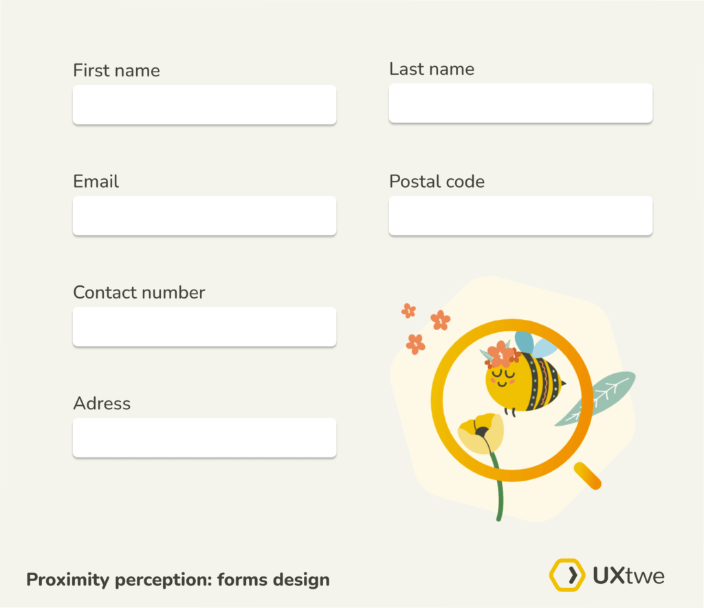
1. Form design and placeholder texts
Surely you have experienced poorly-designed forms. Undoubtedly, forms are the least enjoyable parts of user interactions, especially when filling out surveys.
Forms collect information from at least one party and deliver it to another. They typically come in three different dimensions according to Jessica Enders, and they are: words (what you say in the form), layout (how it is presented visually) and flows (how the user moves through the form). Using the proximity principle you can create a better experience for users when applied to: field labels and placeholder texts, input fields, and input format.
Northing is worse than a label where you are not sure which field in a form it corresponds to. By placing labels near corresponding form fields, and further away from the other fields, you greatly help your user scan through your forms easily. The same applies to placeholder text inside the fields.
Observing these practices is especially helpful if the form to be filled in is rather long. Users will understand the design better when it is easier to read. This will result in a greater chance of the form being filled in completely and submitted.
In the image below you can see a well designed form:
2. Typography and copy
Proximity plays an important role in the organization of copy content in user interfaces. Users do not usually stay on pages that are text heavy for very long; therefore, scannability of the text layout is vital.
People tend to scan through pages and check for things like headings, subheadings, highlights, and keywords. Only then they read more, if they become interested. For this reason, the text should be arranged according to the principle of both quick perception and aesthetics. If the text feels like one block, people will not read it. Here you want to slightly separate the elements (headings, words), so people can pick out the individual elements that interest them.
Here is an example where you can see the difference between a well designed text paragraph and one that feels too heavy.
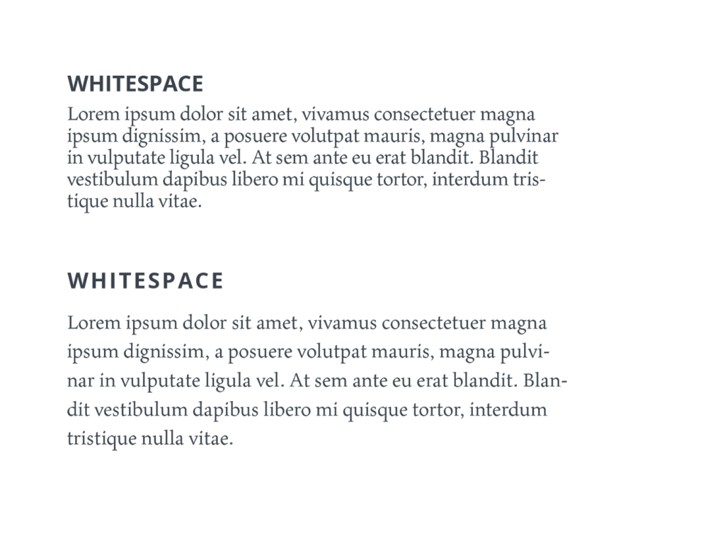
Source: Tubik Blog
3. Better comprehension on content
Content is very important in UX design. Good readability (the ease with which a reader can understand a written text) and legibility (the ease with which a reader can decode symbols) are good principles of ux design. Many factors can contribute to readability and legibility, including font family, font size, and text contrast. You can structure content on a page in a way that would positively impact the content legibility and readability of your product.
You help users scan and read content when you use groupings effectively for sentences and paragraphs.
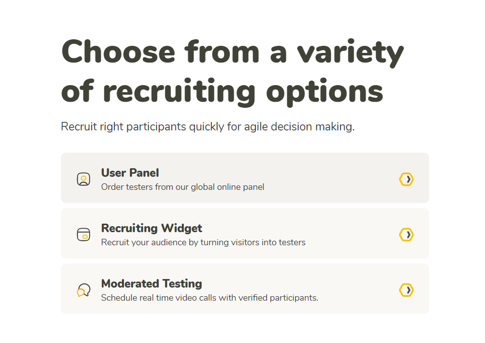
An example of grouping the website information in a readable way according to the principle of proximity.
4. Create emphasis on certain elements
It is very important to give priority to certain elements or content on a page that you would want to highlight or have them stand out. The principle of proximity can help you create a flow that will guide the viewer’s eye from one point to another. By adjusting white space, you can easily create focal points or areas that naturally attract the user’s attention.
Create focal points by creating a web design grid that will allow you to place design elements (such as text, images, or functional controls) consistently throughout a layout. After you have a grid, you can decide on arranging elements to guide users through key content sections across the screen.
Make use of white space and color contrast for emphasis to draw the user’s attention towards an element that is either a call to action or a feature update.
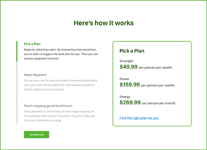
This health insurance company uses a grid pattern to create emphasis and guide users’ attention.
Elevate your design with the principle of proximity
Using the theory of proximity perception you can organize information and create a visual hierarchy in a way that makes your design more usable. You should leverage proximity to create meaningful groups so that users can easily understand and interact with your design. The easier it is to use your product, the more enjoyable experience your users will have.
If you would like to test how user-friendly your product is, register for a free account at UXtweak and try some of our free tools.