
The right UX color palette can help you show your brand’s personality, bring emotions to life, and guide users toward actions and relevant information. On the other hand, an unfavorable color scheme can mislead users and even harm a brand’s reputation.
Implementing effective color palettes is not just about aesthetics but also about creating a user-friendly experience. Color can help users distinguish between different web design elements, improve readability, and navigation aid.
In this guide, we’ll see how selecting a great UX color palette can lead to a remarkable user experience and eventually enhance your brand’s overall success.
Understanding the Basics of Color Theory

First things first. Color theory is a fundamental concept in art and design that explores how colors interact, combine, and create visually pleasing compositions. Theory helps you understand the principles of color and how to use colors in various visual mediums effectively, such as logo design, website layout, advertising materials, newsletter templates, among other visual resources.
The color wheel is one of the main elements of color theory to represent colors. It provides a reference point for understanding color relationships.
Additionally, concepts in color theory, such as temperature, harmony, symbolism, and contrast, are the foundations of understanding how colors work together. When you understand the fundamentals, you’ll be able to make informed decisions to select the colors, create harmonious palettes, and communicate the right message.
The Color Wheel
The color wheel is a visual representation of colors arranged in a circle. It is a basic tool used in design and art to understand how colors relate to each other.
- Primary colors are the three main colors: red, yellow, and blue. You can’t create these by mixing other colors.
- Secondary colors are a mix of two primary colors: orange (red + yellow), violet (red + blue), and green (blue + yellow).
- Tertiary colors are the mix of primary and secondary colors on the color wheel. Examples include red-orange, yellow-green, and blue-violet.
- Color temperature is the perception of warmth or coolness of a color. Warm colors –red, orange, and yellow– stimulate energy, passion, and warmth. Cool colors –blue, green, and purple– bring a sense of calmness, tranquility, and coolness.
- Neutral colors –white, black, gray, and beige– lack intense hue or saturation. They are often used as a base or background in design, allowing other colors to stand out and create contrast.
Once you know how to identify and classify colors, you should know different color schemes impact good UX design in different ways:
- Monochromatic color schemes use variations of a single color, creating a harmonious and subtle design that is easy on the eyes and can effectively convey a minimalist or elegant aesthetic.
- Analogous color schemes involve using adjacent colors on the color wheel.
- Complementary color schemes involve pairing colors directly opposite each other on the color wheel. This creates a high-contrast design that can be attention-grabbing and visually impactful.
- Triadic color schemes involve using three colors evenly spaced around the color wheel.
- Tetradic color schemes involve using a combination of two complementary color pairs. This can create a visually dynamic design but requires careful balancing to avoid overwhelming the user.
What Is Color Psychology?
Color psychology studies how colors affect human behavior. It explains how different colors can stimulate different feelings and have a certain impact on human perception and cognition.
Once you understand the psychological effects of color on user behavior, you can choose colors that align with your audience and convey the desired mood or message.

How to Choose the Best UX Color Palette for Your Website
When selecting the right color palette to enhance the visual appeal and usability of your design you should also consider these factors:
- Colors evoke emotions
Different colors can evoke specific emotions or moods. For example, warm colors be exciting, while cool colors can be soothing.
- Cultural associations
Colors can have diverse cultural meanings and associations. It’s essential to consider the cultural context in which you’ll present your design to ensure that the chosen colors are appropriate and do not convey unintended messages.
- Color symbolism
Colors may have symbolic meanings or associations. We often associate red with love and passion, whereas we associate white with cleanliness. Understanding color symbolism can help create designs that effectively communicate messages.
- Color contrast
Contrast is crucial in the world of web design to ensure readability and visual hierarchy. High contrast between foreground and background colors can improve legibility and make information more visually accessible.
- Color harmony
Harmonious color combinations create a balanced visual experience. Using color harmonies brings up the aesthetic appeal of a design.
- Accessibility considerations
Select your colors with accessibility in mind. Ensuring that color choices meet accessibility best practices, such as providing sufficient contrast for visually impaired users, allows for a more inclusive and user-friendly design.
- Personal preferences
Consider personal preferences and, most of all, brand identity. Colors that align with personal taste or brand identity can create a unique and memorable user experience.
How to Create a Color Palette: 10 Steps

Now, let’s outline the steps required to choose a color palette that effectively communicates your design’s purpose and resonates with your audience. From understanding color psychology to considering branding, we’ll guide you through creating an appealing, eye-catching color palette.
- Define the purpose and context. Understand the purpose of the design and the context in which you will use it. Consider the target audience, industry, and message that you want to convey through the design.
- Research color psychology. Study the emotions and associations that different colors evoke. Consider how you want the design to make users feel and which colors align with those emotions.
- Consider branding and identity. Consider any existing branding guidelines or color schemes if the design is for a company or brand. The design should align with your brand’s identity and personality.
- Create a mood board for inspiration. Collect visual inspiration, such as images, websites, or designs that resonate with your project’s desired look.
- Start with a base color. Choose a base color to set the tone for the design. This color can align with the brand or the emotions you want to evoke. The base color will serve as an anchor for the rest of the palette.
- Choose complementary or analogous colors. Build the color palette by selecting colors that work well with the base color. Complementary colors are opposite to the base color on the color wheel and create contrast. Analogous colors are adjacent to the base color, creating a more harmonious and subtle combination.
- Test for contrast and legibility. Make sure the selected colors provide enough contrast for readability and accessibility, mainly if the design includes text. High contrast between foreground and background improves legibility.
- Fine-tune and adjust. Experiment with different shades, tints, and tones of the chosen colors to create variations in the palette. Try different combinations and evaluate how they work together. Adjust as needed to create a visually pleasing palette.
- Consider color accessibility. You want to ensure your design is responsive and the color palette is accessible to all users. Check for sufficient contrast between colors to accommodate individuals with visual impairments. There are color accessibility tools available to help verify the compliance of your colors.
- Document and implement. Once your palette is ready, document the selected colors, including hex or RGB values, for consistent use across different platforms and mediums. And you’re all set to implement the color palette in your design!
Tools and Techniques for Choosing Color Palettes
It’s time to go through online color palette generators and their features. These tools can be invaluable resources and come in handy every time you start a design project. They provide quick and convenient ways to generate beautiful color palettes.
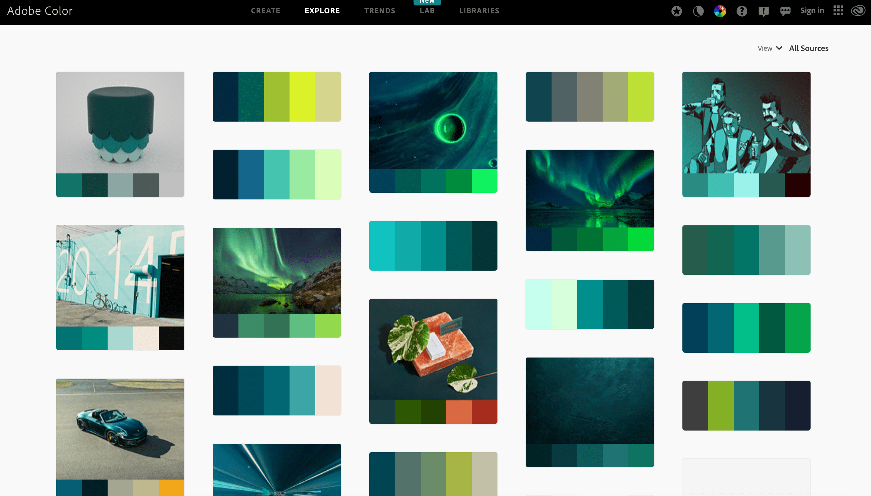
- Adobe Color Palette Generator
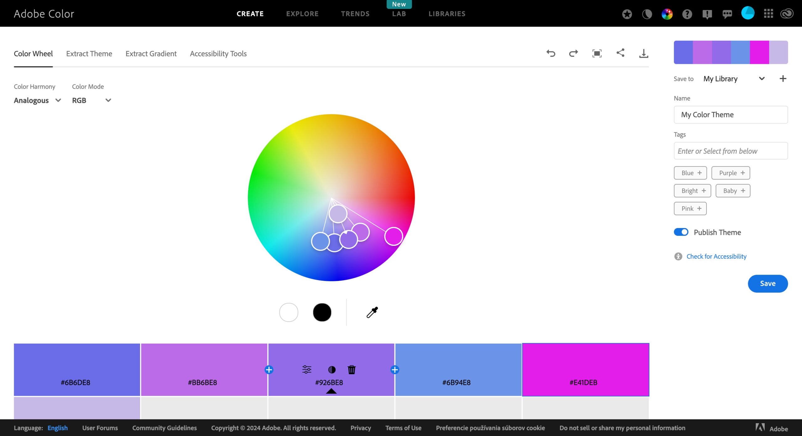
Adobe Color Palette Generator is an online tool that allows you to create custom color palettes based on selected colors. The tool uses advanced algorithms to generate harmonious color schemes.
You can explore different color combinations and save and share your favorite palettes directly from the platform.
- Color Hunt
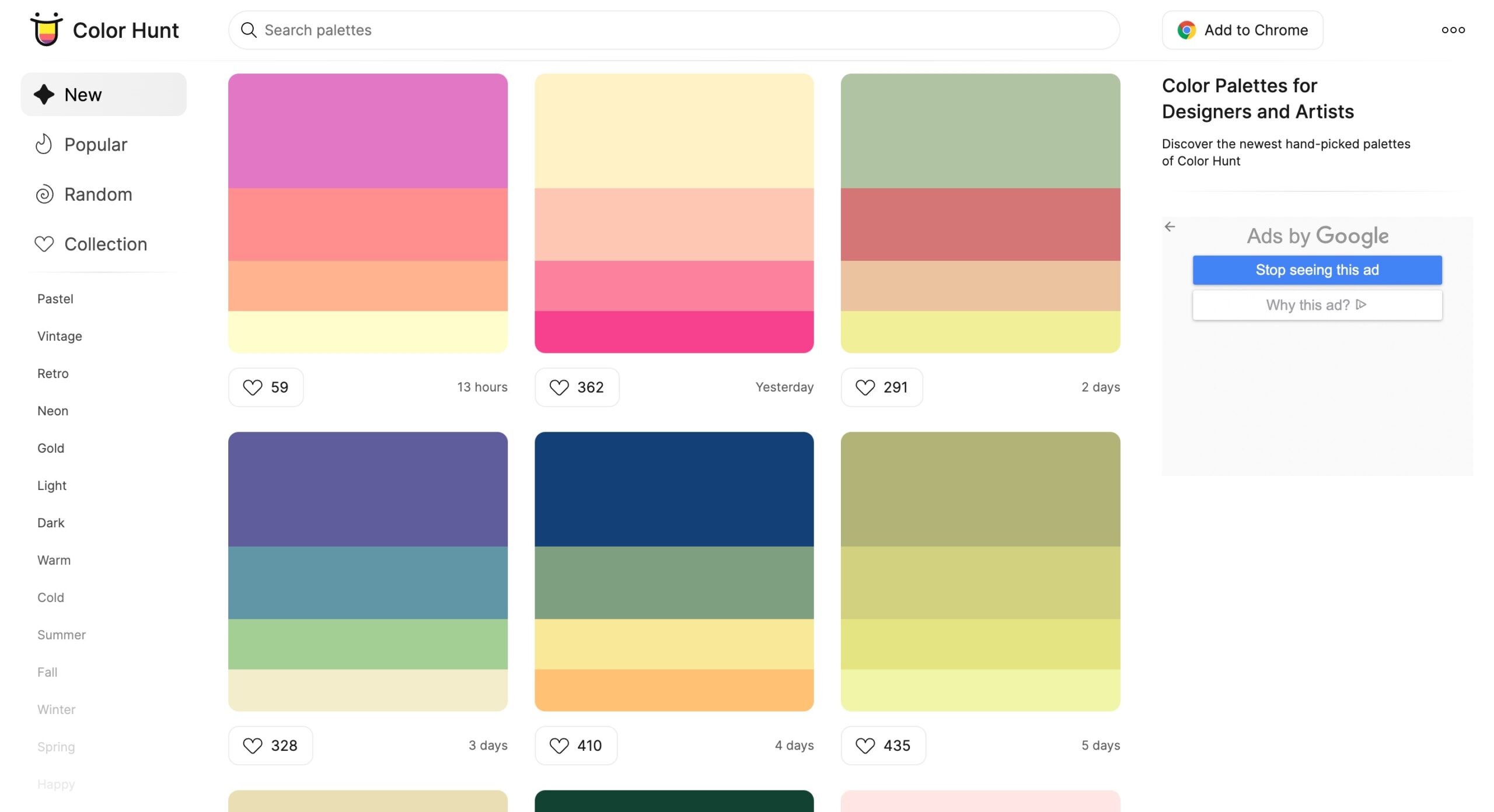
Color Hunt is a web platform that showcases a curated collection of color palettes. It offers a wide variety of color schemes that you can browse and use for your design projects. This is a popular resource for designers seeking inspiration and seeking to discover new and trendy color combinations.
- Coolors
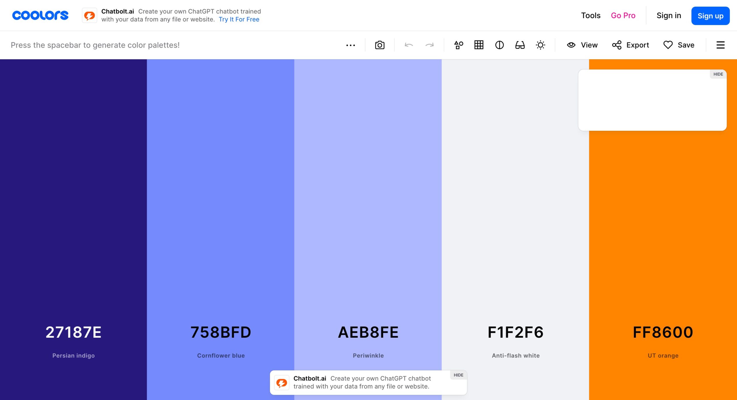
Coolors is a color palette generator to easily create, explore, and customize color schemes. Its interface is user-friendly and intuitive, so you’ll get harmonious color combinations in no time.
How to Extract Colors from Images
Exploring and extracting colors from images or inspiration sources can provide valuable insights and inspiration for creating a color palette. Here are some techniques for this process:
- Color picker tool. Use a color picker or eyedropper tool in graphic design software to select specific colors directly from images or sources. Simply click on the desired color to capture its hexadecimal or RGB value.
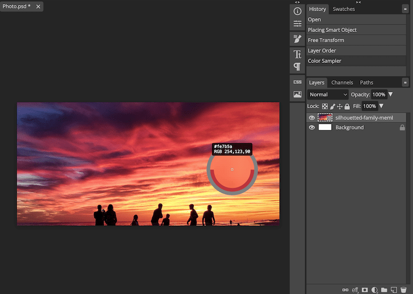
Image: Photopea Color Sampler
- Image to color palette conversion. Use online tools or graphic design software to analyze an image and generate a corresponding color palette. These tools extract dominant colors or create palettes based on the image’s color distribution.
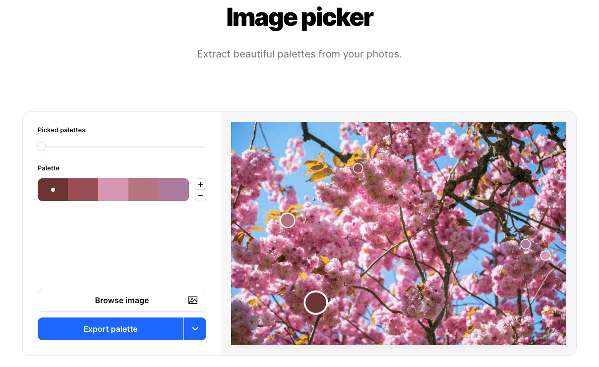
Image source: Coolors Image Picker
- Color extraction from color schemes. If you come across a design or image with a color scheme that resonates with your project, analyze its colors. Identify the primary, secondary, and accent colors and extract their respective color values.
- Mood boards. Create mood boards or collages by collecting images, photographs, or design samples reflecting the desired aesthetic. Observe the color combinations in these visuals and extract the colors that resonate with your project.
Color Palette Inspiration
Finding color palette inspiration is an essential step in creating visually striking designs. One way to find inspiration is by exploring nature and observing the vibrant hues in flowers, nature, night lights, or sunsets.
You can also seek inspiration from art, such as paintings or illustrations, which can spark ideas for color combinations and palettes. Researching color trends in fashion, interior design, or graphic design can provide fresh and modern color scheme ideas.
Exploring online platforms such as Instagram and Pinterest for design inspiration can expose you to various color schemes and palettes.
Testing and Evaluating Color Palettes
Testing and evaluating color palettes through user feedback and A/B testing can significantly impact engagement and satisfaction.
Some of the benefits are:
- Getting user input can provide valuable insights into user preferences and reactions.
- By conducting A/B tests, you can compare the performance of different color combinations and gather data on user behavior, such as click-through and conversion rates.
- The testing process allows for fine-tuning the color palette to align with user expectations and preferences, ultimately leading to increased engagement, and improved user satisfaction.
Use of Color in Design
In good UX design, color is a powerful tool to improve the user experience. It helps differentiate elements, guide navigation, and provide visual feedback.
With color, a designer can establish a positive emotional connection, create a sense of hierarchy, and enhance usability. Thoughtful use of color can significantly impact a digital product’s overall usability and user satisfaction.
Color Breakdowns: How Brands Use Color Palettes
Effective use of color can play a crucial role in a brand’s identity. Let’s review some examples of well-designed websites and how brands use color.
- Decathlon
Decathlon uses an earthy color palette for its website design, including shades of green and brown. These colors evoke a natural and outdoorsy feel, aligning with the brand’s focus on sports and outdoor activities.
However, brighter and contrasting colors like blue and neon green draw attention to key elements such as call-to-action (CTA) buttons. This creates visual interest and directs the users’ focus towards the intended action.

Image source: Decathlon
- Ban.do
Ban.do’s website’s vibrant and bold design choices stand out. It incorporates various bright colors and lively graphics, creating an energetic and playful atmosphere that feels natural to its products.
Using colorful gradients adds depth and visual interest to the website’s elements, enhancing the overall user experience. These design decisions reflect Ban.do’s brand identity and contribute to a visually captivating and lively online presence.
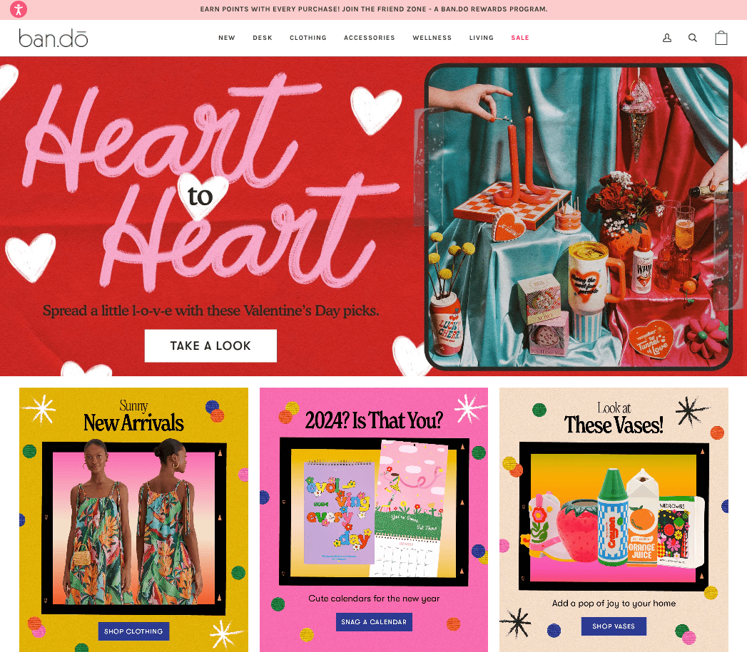
Image source: Ban.do
- G-Shock
G-Shock’s website maintains a sleek and minimalist aesthetic through the use of high-contrast colors such as black, white, and gray. This color scheme emphasizes a sense of modernity and sophistication, aligning with the brand’s rugged and stylish image.
The absence of bold colors keeps the focus on showcasing the durable and functional nature of G-Shock watches, creating a visually clean and cohesive website design.
One thing that stands out through the user journey on the website is the alternating pattern between the two high-contrast colors used in the palette. While the homepage of the website has a black background with white text that pops out, the inner pages are in stark contrast and have black text printed over a white background.
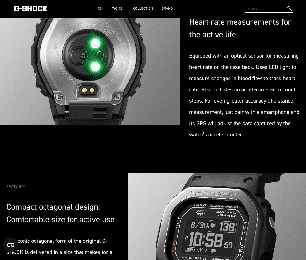
Image source: G-Shock
- Little Tikes
Little Tikes’ website embraces primary colors to evoke a sense of joy and playfulness. These vibrant and bold colors, such as red, blue, and yellow, resonate with the brand’s target audience of children and their parents. It creates a visually engaging and cheerful online experience and is an example of website navigation that becomes an integral part of the overall design.
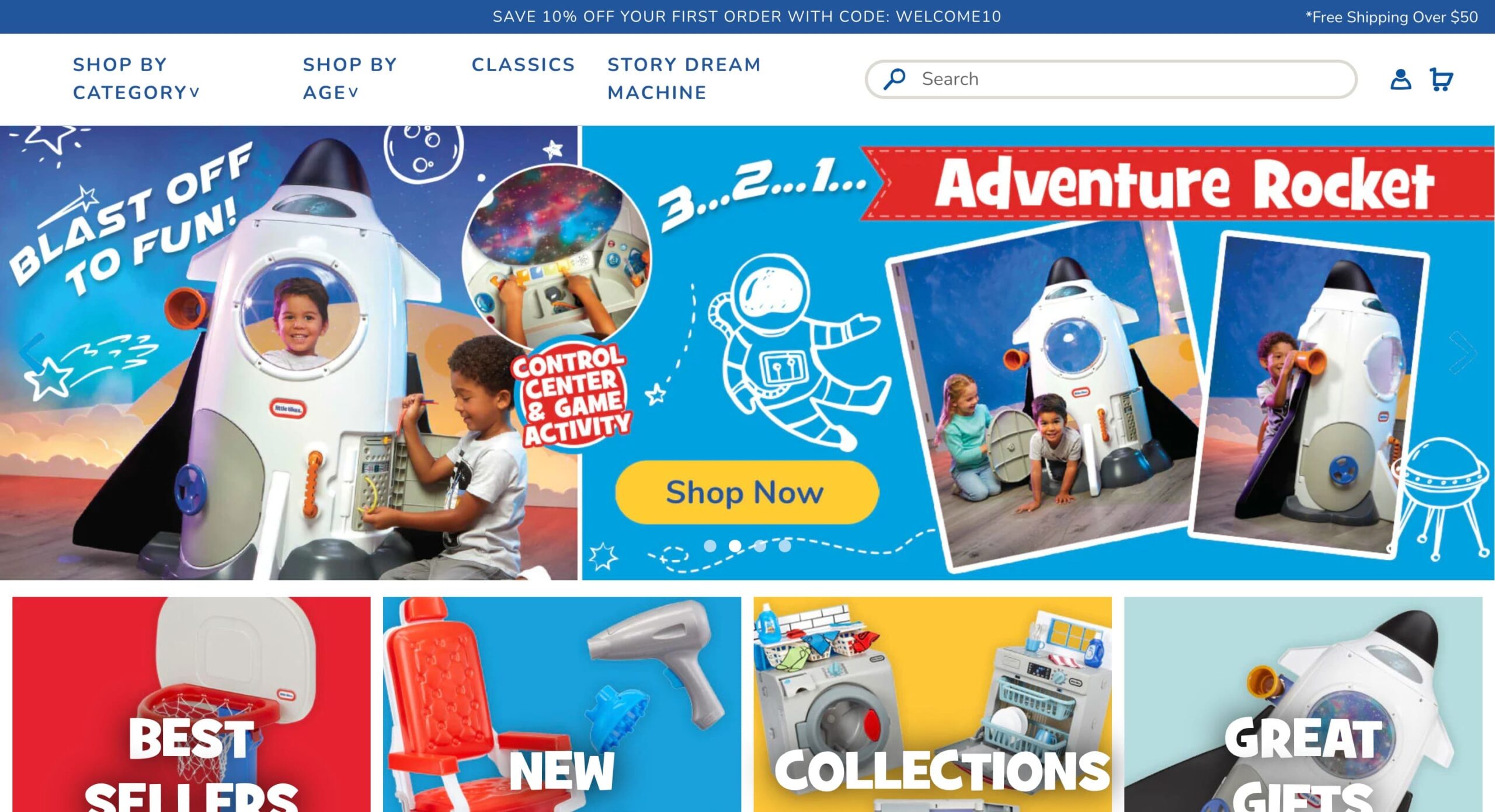
Image source: Little Tikes
- Milk Makeup
Milk Makeup strategically uses a color scheme of black, white, and pink on its website. The monochromatic black and white design creates a sleek and modern aesthetic, while the pop of pink adds a feminine touch. Including a product video on the main landing page further enhances the user experience, allowing visitors to engage with the brand and get a closer look at the products.
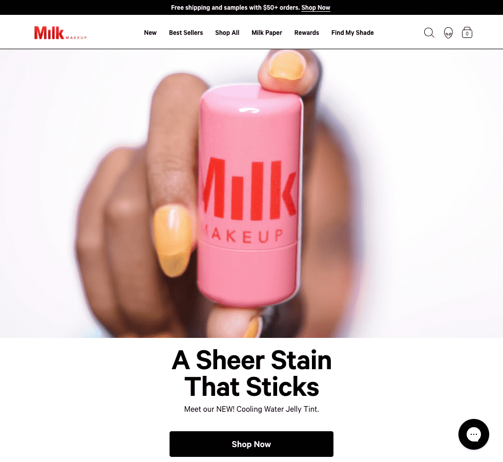
Image source: Milk Makeup
Wrapping Up
Color palettes are crucial in good UX design, impacting user perception, emotions, and engagement. Creating a well-designed color palette can enhance brand identity, guide users toward essential elements, and improve readability.
As we’ve mentioned in this guide, It is essential to balance aesthetics and usability, ensuring that colors look appealing and provide a positive and intuitive user experience.
Choosing a thoughtful color palette means you’ll be on your way to creating optimal user experiences that are visually engaging and enhance overall brand success.
Want to find out what users think about your brand’s color palette and product overall? Register for your UXtweak account and ask them directly! ⬇️