
Let’s imagine: You have a website for your client and start to get complaints from visitors that it does not work correctly on all types of devices. Now, the question arises, how can you design your website for all devices?
Until recently, websites were designed for desktops only. But as you know, not everyone uses desktops nowadays! When a website is presented through a mobile, tablet, or any other handheld device, the user needs to experience smooth and error-free browsing.
The ideal solution is to use responsive and adaptive design solutions that are compatible with all types of devices, browsers, and platforms without compromising the quality of the user experience. This is the process of using CSS media queries to change the website’s layout, adjust image sizes, or sometimes resize the background images according to the device’s screen size. Even better would be to then do usability testing of your website with real users on desktops and conduct mobile usability testing to uncover usability issues you overlooked.
What Are Responsive & Adaptive Designs?
Responsive web design
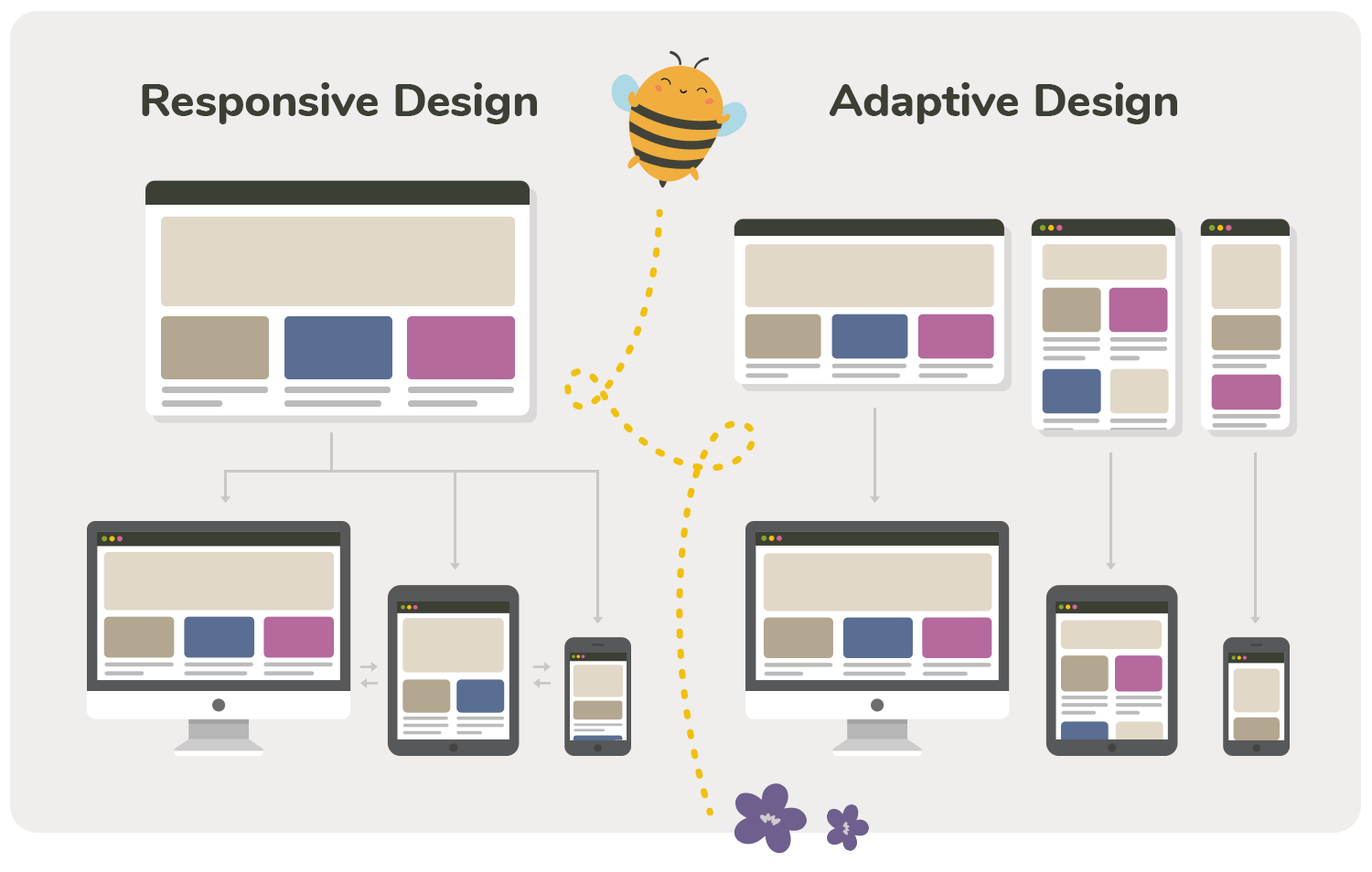
Responsive web design (RWD) is an approach which relies on creating one dynamic design with fluid elements, that adjusts itself automatically to the screen size it is loaded on. It provides consistent user experience with a minimum of scrolling, or panning across various devices, from desktop computer monitors to mobile phones.
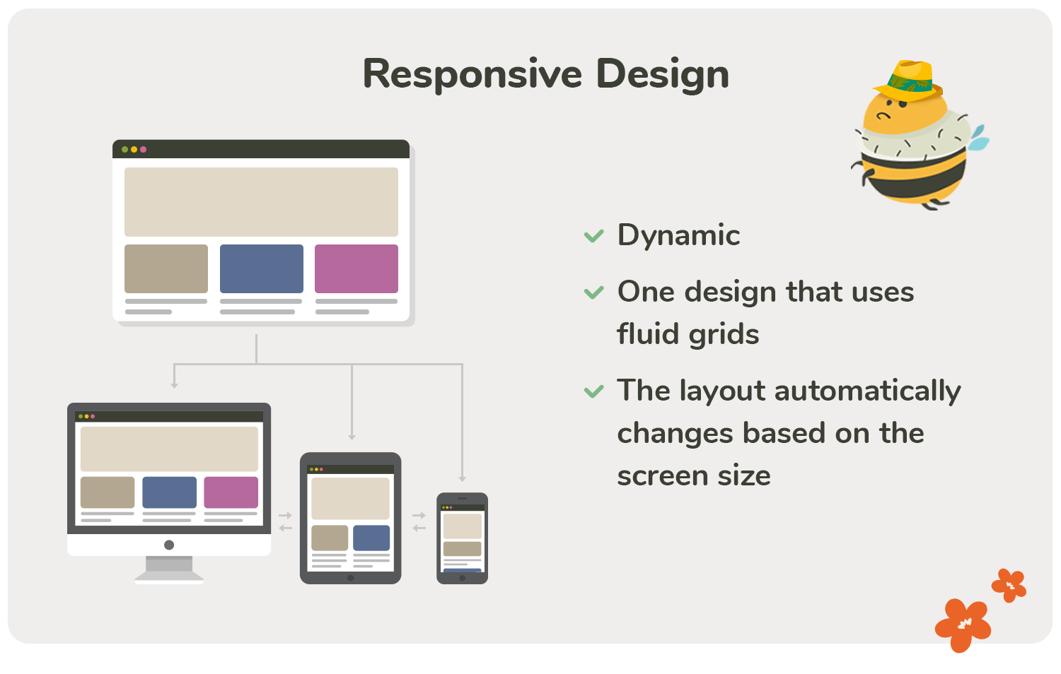
RWD is a way of creating web content that responds to the reader’s screen (as per the user’s action) rather than having each page be designed separately for each device. This approach simplifies web design by allowing designers and developers to create designs and elements only once so they work across all devices. It also allows a website to scale automatically, adapting the layout and design elements to create the best user experience possible. With one shared grid, designers build out the site to remain uniform across different devices.
One of the most famous examples of using responsive UI is the Shopify platform, which aims to give mobile users an optimal experience. It automatically detects different devices at page load and displays a fully customized layout.
Adaptive web design
Adaptive web design (AWD) is an approach that creates multiple versions of a website with tailored layouts, content, and features to fit specific device sizes. It uses multiple fixed layout grids—when the system detects the browser size, it selects the layout most appropriate for the screen. This provides highly tailored user experience.
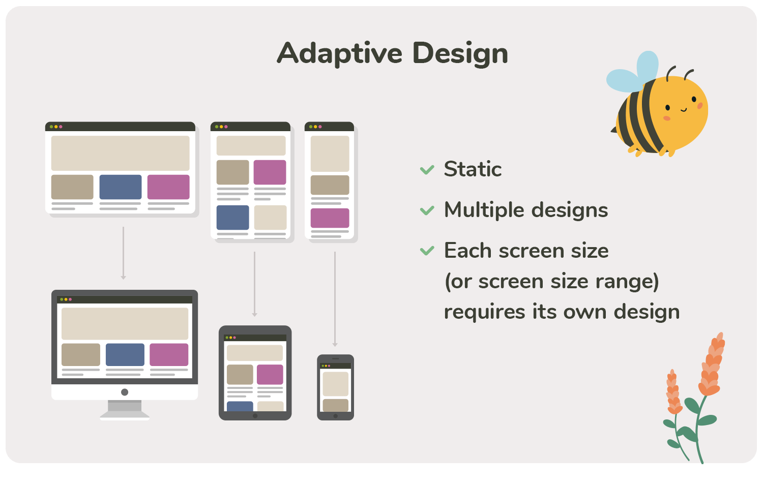
This approach lets you break free from the 960px (or 12-column) layout that was once standard. The idea behind it is to optimize layout and features for every screen size, ranging from small handheld devices like phones and tablets, all the way up to large desktop monitors.
If you have certain users who use older, less capable mobile devices, then you should tailor a separate experience for them. With adaptive designs, you can utilize media queries to change the page’s layout according to the user’s device and browser. Whether it is making images more lightweight and lowering memory consumption, or resizing fonts and increasing readability — adaptive designs can handle anything you throw at them.
This type of web design is used mainly by big-name sites with complex content, such as Amazon or Apple:
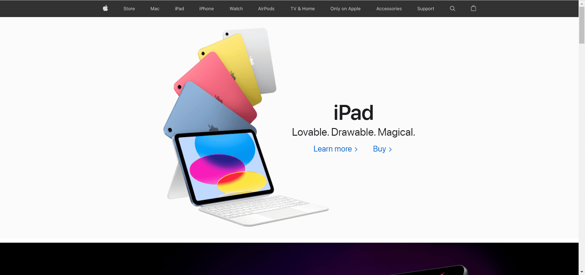
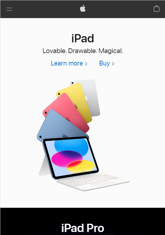
Source: Apple
Responsive vs. Adaptive Design: What to Consider When Comparing
Responsive web design appears to be more commonly adopted than adaptive design, but each approach has its strengths and weaknesses instead of being opposite or mutually exclusive. Both types should be considered when determining what is best for your business since they each have different strengths.
1. The difficulty of realization
On the one hand, you have an adaptive web design that uses CSS media queries to adjust the layout of a website. On the other hand, you have a responsive web design that uses fluid grids and flexible images to adapt to different devices. Most people argue that adaptive designs are more challenging to develop due to multiple layouts for different devices.
This is partially true, as having different breakpoints means more work designing and developing. But this isn’t necessarily the case. It might be easier to fit your website with a fluid design, where you don’t have to worry about assigning specific widths and heights to elements, but this ease comes with consequences.
The main idea behind responsive design seems to be uniformity. Here, you have to ensure that every detail on your website is visible and defined throughout all devices and screen sizes. The only changes throughout devices are the amount of padding, margins, and the number of columns available for displaying content.
2. Load time
Responsive layouts use the same HTML on different devices, while adaptive layouts load completely new HTML depending on the device type. A responsive layout requires more effort in website creation because it uses a single HTML for all devices, but the code uses media queries to show or hide content based on screen width. By contrast, an adaptive layout creates a new HTML for each device with a different width. This leads to faster load times.
Your pages should load quickly if you want to deliver a good user experience. You can lose many visitors if a page takes too long to load. This means that your bounce rate will increase, and your website’s conversion rate will drop. For an eCommerce site, this has a significant impact on the bottom line. For this reason, it is essential to check your website’s speed by using a website auditing tool such as SE Ranking, which will visualize all the necessary parameters so that you can find gaps in the website’s performance and immediately fix them.
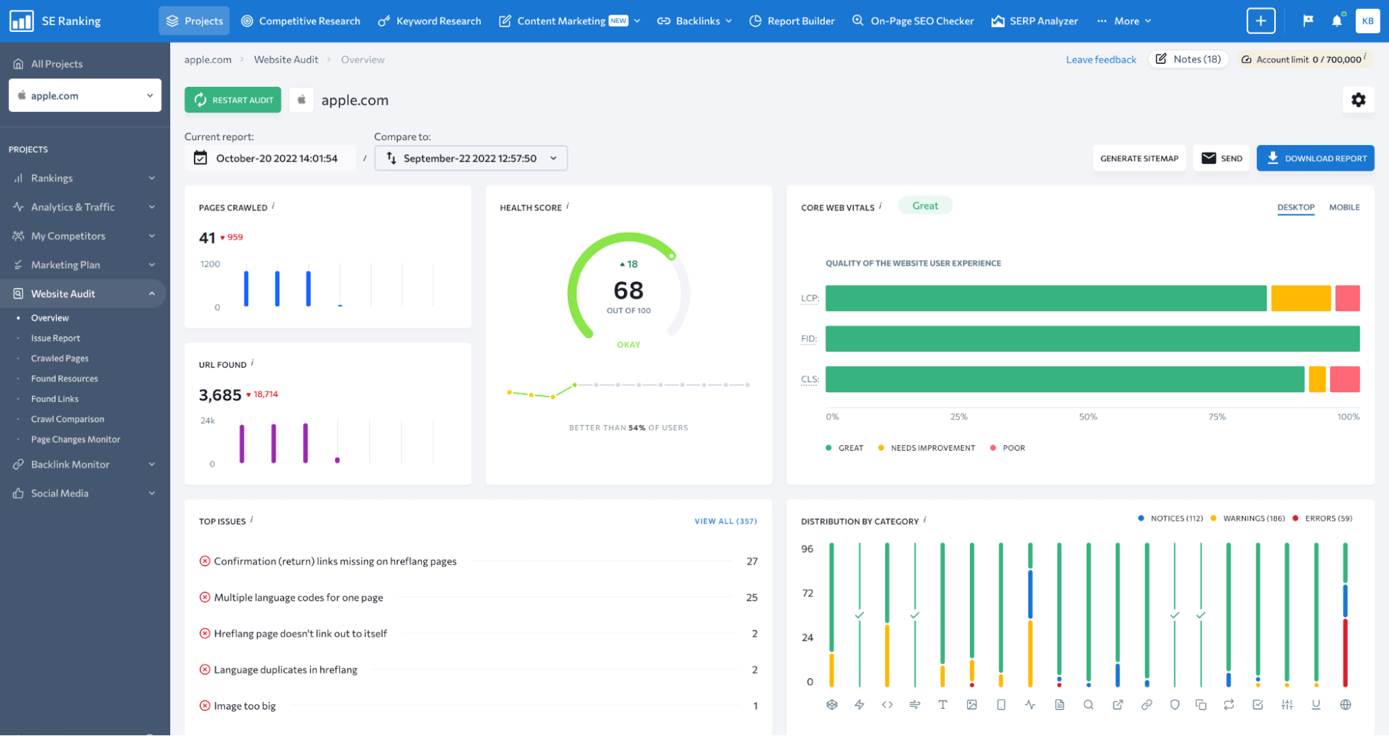
Source: SE Ranking
3. Layout development: one vs. several
With a responsive design, there is only one layout, which resizes for various devices. Be it a PC, laptop, or tablet – the layout will adjust according to the screen size. With responsive design, the designer arranges the sole layout of web-based apps for different devices.
In contrast, an adaptive design works separately with multiple layouts for each device. The idea is to have no situation where a user cannot access the site or have a poor experience because of the layout. This means creating layouts that preserve your brand’s consistency and usability regardless of the device used.
4. Flexibility
Any website that adapts to different screen sizes automatically seems “flexible” to a user. All websites built with responsive design are infinitely flexible because they can be adjusted to any screen size. The pages may have high or low-resolution screens, but the designs adjust automatically according to the screen. It doesn’t matter how narrow or wide your site is. A well-designed responsive UI looks great on any device.
On the other hand, an adaptive design will break the site layout on a new device with a different screen size. The old layout needs to be customized according to the new screen size to fix this. With adaptive design, you may always need to update the layout for different screen resolutions.
5. Level of Control over each detail
Responsive websites are a great starting point for professionals learning to build and maintain sites, but they don’t give you quite as much control over layout and styling. Therefore, you will want to use a content management system (CMS) like WordPress, Joomla, or Drupal to maintain a responsive page. These systems come with free built-in templates that are mobile-friendly.
On the other hand, adaptive websites offer more control but are harder to build and require extensive developer resources. They are usually built by experienced designers who have the opportunity to create more complex sites, and it is easier to fine-tune them at any time. The right solution depends on your needs and budget.
6. SEO friendliness
Getting a good ranking in the search results of Google, Bing, and other search engines is one of the most critical factors for any website. Responsiveness in web design is so popular because your site is more likely to rank higher with this type of design.
The reason why Google likes it: users find responsive designs much easier to use on mobile devices, especially due to their ability to resize according to the window they are viewed against. This provides a better user experience which improves SEO and makes a page much easier to understand and generate more traffic.
Pros and Cons of Responsive Design vs. Adaptive Design
Responsive Design
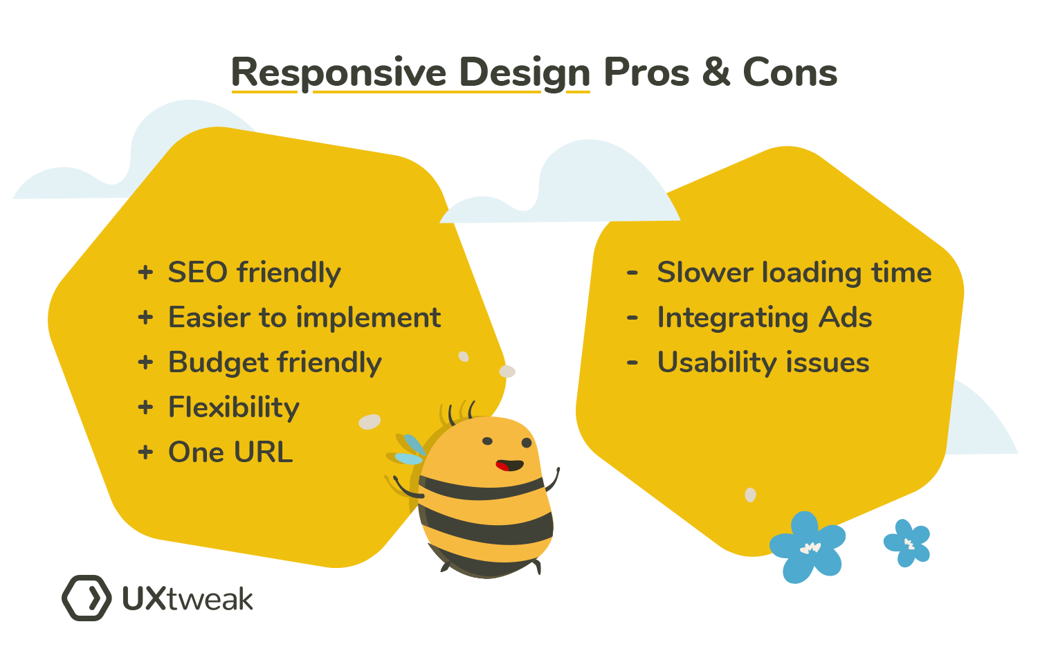
Pros:
- More SEO friendly — This is because the page layout is responsive to different screen sizes and orientations, so it displays predictably and pleasantly on any device. This, in turn, means that the search engines will reward you for your effort in optimizing your site for mobile users.
- Easier to implement — The task is to create a single layout using various online templates instead of creating different layouts for mobile and desktop versions of pages. This makes responsive design faster and easier to deploy because there’s less code to write.
- More budget-friendly — It is more cost-effective because there is no need to build a site from scratch multiple times for various devices. Since responsive sites are built with a single codebase, upgrading your technology is cheaper.
- Flexibility — It is considered flexible since such a design can be adjusted to any screen size, regardless of whether the visitor uses a smartphone, tablet, desktop, or computer.
- Everything in a single URL — With a responsive design, a single URL can be used for all devices. This is a huge benefit because it means you don’t need to create separate URLs for each device, and the user doesn’t need to manage different links.
Cons:
- Slower page-loading — To function on many devices, responsive design requires extra resources for every page load, including a JavaScript file and CSS files. This can cause a noticeable increase in loading time on mobile devices.
- Integrating Advertisements — Advertisements can disappear from the screen in a responsive design if they do not fit vertically or horizontally on your screen.
- Problems with usability — The main problem with RWD is that it does not support the same features on different-sized devices. Some features may be included only in the desktop version, while others may be available only in the mobile version.
Adaptive Design
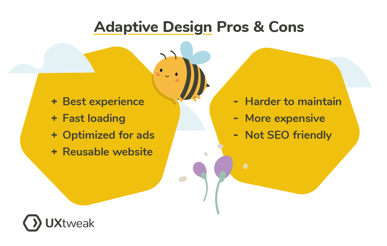
Pros:
- Best Experience — Adaptive design provides a higher degree of compatibility with today’s various devices. It ensures a better user experience by tailoring your content to meet users’ needs on any screen size and in any environment.
- Fast Loading — With adaptive design, your website will be individually rendered and specially tailored to the dimensions and capabilities of each device. And your customers will all get the same fast-loading experience, regardless of their device.
- Optimized for advertising — Advertisers also value the ability of adaptive design to optimize advertisements through data from smart gadgets and on-site user behavior.
- Reusable existing website — Adaptive design means the client can use their existing website and simply change the home page to include a different look, feel, and message. The rest of their site will be reused with minimal or no updates.
Cons:
- Harder to maintain — Unlike a responsive design that can be updated by a developer in a single place and immediately reflect all changes across all devices, maintaining an adaptive site requires different approaches for different situations.
- More expensive — Adaptive design is more expensive because it requires additional development time to create the code, other resources such as developers and designers, and testing time to ensure that the technology works in an intended way.
- Not SEO-friendly — The development of a large number of mobile phones and tablets has led to various screen sizes. For this reason, you must create versions for each size and breakpoint. You may miss a breakpoint by not creating an additional layout, which could result in a bad user experience that search engines like Google do not welcome.
Responsive vs. Adaptive Web Design: the Right Choice
Responsive and adaptive web designs are both parts of the same family. Responsive design is a subset that takes advantage of all devices to create an optimal user experience. Adaptive design was developed not long after responsive design and focuses on providing a suitable layout for each device. Both approaches are equally effective, but it’s up to you to decide which works best for your project.
If you decide to employ a responsive website design, one thing is for sure: responsive websites can take longer to load because they have to deliver a different set of elements and resources for each device. If your main priority is ensuring that your website loads quickly, you should consider using adaptive design instead. Adaptive websites serve different files and/or elements based on the device used by the viewer.
While both have their own merits, it can be challenging to make the right decision. Before deciding which type of website is right for you, ask yourself these questions:
- Who are my customers?
- What devices are they most likely to browse on?
- How can I best reach them?
- How can I provide them with a positive experience so they keep coming back?
Besides, do not forget to think about your needs as well. Ask yourself what your short-term and long-term goals are, what your budget is, and what your competitors use. The answers to these questions will help you make the right decision!
Reading tip on Website design: Website architecture – How to structure your website

Conclusion: Which design is right for your website?
Responsive and adaptive design are two popular terms used to describe different approaches to web design in the 21st century. In short, RWD is an approach to web design aimed at crafting sites to provide an optimal viewing experience across a wide range of devices used by web design companies. AWD is similar to RWD, but it serves different content depending on the device used to access the website. With AWD, the content seen by the user will change based on the size of their screen.
So, responsive vs. adaptive design, do we have a winner? Each approach has its advantages and disadvantages. Learning about responsive and adaptive design more thoroughly can help you decide which one to choose! After you have the best solution for your specific needs, you should take a look at our tips to improve UX on your web page.

