The first contact potential customers have with your online presence is often the landing page of your website. We all know how important first impressions are (and research says you only have 50 milliseconds to make a good first impression with your web design!), so having a good landing page UX is a must. That is why you need to keep improving the UX of your landing pages to make sure visitors do not close them immediately.
Importance of the landing page UX
Your website is the face of your business. Especially nowadays, when a big part of the sales takes place online. A business without an online presence is no longer considered serious or trustworthy.
To create a landing page that converts, consider this advice: use free templates to get started and customize them for your brand. However, even if the design looks great is not enough—you also have to ensure that its UX is high quality.
Most of the decisions and purchases of your potential clients are now being made from the comfort of their own home, sitting on the couch (or let’s be real – often a toilet seat ). Your customers will scan through many websites, including your competitors in the search of the perfect product, service to satisfy their needs. You can no longer rely on the chance to attract your users. Your website needs to stand out, and it is your job to provide the best experience possible. Sure, sometimes you may need to build a design team to create the best landing page there is, but in most cases implementing these tips will be more than enough.
10 tips to improve your landing page UX
In the world of user experience, even a small change can turn into a huge advantage. Such an advantage can increase your conversions. We gathered some tips that will help you improve your landing page UX.
1. Do not make people search to find something
Make sure users can get all the information they need with minimal effort. Your landing page UX needs to be simple, intuitive, and contain answers to all the possible questions users might have.
Remember – businesses lose half of their leads just because users can’t find the information. This means you need to work on improving your information architecture and take notice of how your content is labeled and grouped into categories to ensure you are not missing out on those leads.
So your next question should be: What can I do about it?
To make sure your users don’t get confused with the information architecture of your website, you should find out their expectations and have a clear understanding of the way they think “The Information architecture – IA is the way you organize and structure all the content on your website, app, etc. It is usually represented by your main menu”.
There are two great methods for improving information architecture thus improving user experience that work best together card sorting and tree testing.
Card Sorting
Card Sorting is a research method allowing you to figure out how people conceptualize and categorize the information found on your website. In simple terms – it lets you find out how to group and label your content, so it makes sense to your users. You can create a card sorting study in minutes with an online Card Sorting tool.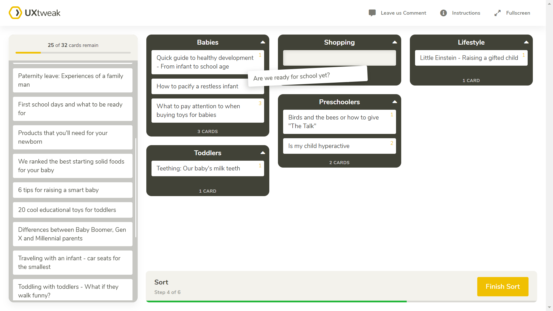
Example of a card sorting study with UXtweak Card Sorting tool.
Tree Testing
Tree testing is a method that tells you how easily users can find information on your website. If users get lost, it tells you exactly where that is. It is a popular method for testing the effectiveness and intuitiveness of information architecture. Basically, it is reversed card sorting and is used to verify the results you acquired with card sorting. To utilize the tree testing method, we recommend an online Tree Testing tool. 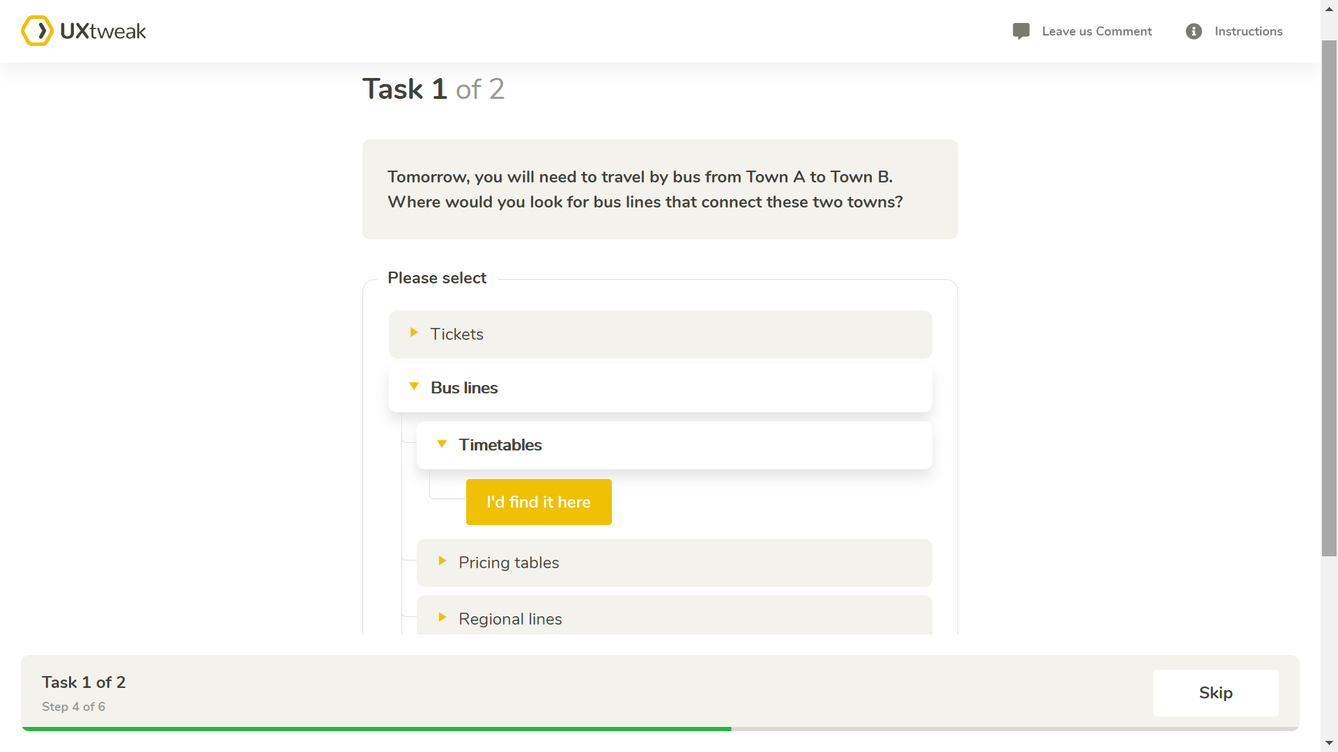
Tree testing study for the bus company.
You can learn more about card sorting and tree testing in Card Sorting Guide and Tree Testing 101. They will provide more information as well as help you with the setup of the studies so you can start creating effective information architectures. As we mentioned before card sorting and tree testing work best when implemented together. If you wish to learn more about why and how to use them effectively, read our article – Card sorting & tree testing = best friends.
2. Say no to horizontal scroll
Nine times out of ten, horizontal scrolling will bring more bad than good for your landing page. It’s unusual for people and takes a lot more effort than the vertical one. Users can hardly guess what information they will get once they click on the arrow, that’s why they usually skip it. Jakob Nielsen – one of the world’s top user experience advocates, considers horizontal scrolling to be one of the top-ten web design mistakes of 2002 but can still be seen to this day. We advise you to take his and our warning against using it.
3. Don’t put too much text
If your landing page is cluttered with text, users will not be able to quickly find what they are looking for. They will just leave and try elsewhere. So remember to keep it simple and straight to the point.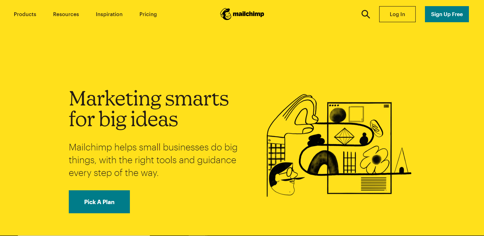
Here is a good example. Keeping it simple and highlighting CTA. Image source Mailchimp.
4. Improve your page’s loading speed
How much time does it take for your page to load? Is it fast enough? We all know how frustrating and annoying a slow website may be. Your landing page should be loaded within 0-2 ideally but in a worst-case in 2-4 seconds, if not, it’s definitely something you should work on as research on the Impact of Site Speed on Your Conversion Rate by Portent in 2019 found out that:
“When pages load in less than 1 second, the average conversion rate is almost 32%. At a 1-second load time, the conversion rate already drops to 20%. At 2 seconds, the conversion rate begins to level off at 12-13% and reaches its lowest at a 5-second load time.”
Findings of the research are:
- 0-4 second load time is best for conversion rates
- The first 5 seconds of page load time have the highest impact on conversion rates
- Website conversion rates drop by an average of 4.42% with each additional second of load time (between seconds 0-5)
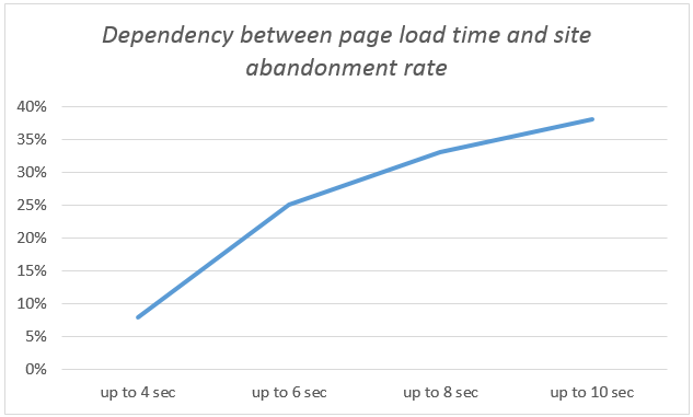
Here you can see a dependency of loading time on site abandonment rate that shows very clearly that the loading time of a website is crucial. Graph by Levon Sukoyan.
A great tip is to compress your images before uploading them on the page. You can also use Google’s Pagespeed Insights tool which will offer tips on how to improve your website’s load time – you only need to enter your URL.
5. Be browser and mobile-friendly
If your website isn’t responsive well, you should get on it immediately. Responsiveness is not a nice-to-have, but an absolute necessity as online users want their content in an easy-to-use format that lets them find what they are looking for. If your website is not capable of doing this, they will find one that is.
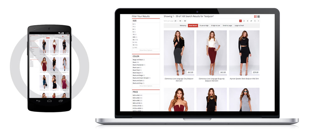
You don’t want your website to look like this on mobile devices. Make sure that all parts of it are responsive.
Make sure your responsive design layout is compatible with all relevant browsers and keeps its integrity.
6. Do not forget the Call to Action
A call-to-action is a key element on your landing page. It will let your user know what to do next. Without a CTA, the user may get confused, not knowing the next steps, and is likely to leave the page without accomplishing their task.
7. Update your web with the latest trends
Some things will never get out of style, such as white space and minimalism, for example. However, sometimes it’s good to add something new. Here are some things that will be trending in 2021:
- Shadows and gradients
They are not new for the designers, but their appearance has changed. Modern gradients are light, airy, made in pastel colors, sometimes mixed with 3D icons. In fact, it’s the same minimalism, just with more volume.
- 3D icons and illustrations
- 2D illustrations
- Pastel colors
- Data storytelling
Simple colorful graphs and charts catch user’s attention and are more pleasant to read than plain text
8. Analyze your user’s behavior
Monitoring your users with website analytics software such as Google Analytics is the bare minimum today. You also need to constantly check your web page availability and performance. It will allow you to make sure your website is always available. Monitor traffic coming to your websites, bounce rate, time spent on the landing page, etc. Look out for any rapid changes or unusual activity which could mean there is a bug or a different issue that appeared on your website that needs to be fixed.
We recommend implementing Session recording. It will allow you to replay your customer’s whole experience on your website like a video as well as to find bugs and issues your visitor’s experience. Session Recording Tool by UXtweak is also designed to collect and index every user’s interaction and make it searchable with advanced filters. Saving you a lot of time in the analysis of the collected data.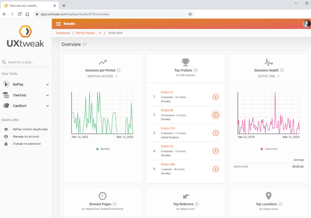
9. Use Heatmaps
Are your customers clicking elements that are not clickable? What do they focus on? What attracts them as first on your website? Are they clicking your CTA? Do they even scroll down enough to find it?
Answers to these questions and a lot more can be found with the help of heatmaps. Heatmaps are a simple and visual way to see where your users click, how much they scroll down the page, or where they place the cursor. UXtweak Session recording provides Click, Scroll, Move, and Tap Heatmaps you can generate anytime. 
10. Test, test, test!
We can not stress this enough. Never underestimate the importance of usability testing. Testing will help you to find out what works and what does not.
A great way to quickly and effectively test the usability of your website is to use an unmoderated testing tool. Online unmoderated testing tools provide you with an affordable solution to test your website with end-users and get actionable insights and feedback to improve upon. With unmoderated testing, you can give participants a real task they should accomplish within your site and then evaluate if they were successful or what stopped them from completing it.
Learn more about unmoderated testing in our guide on Unmoderated usability testing! 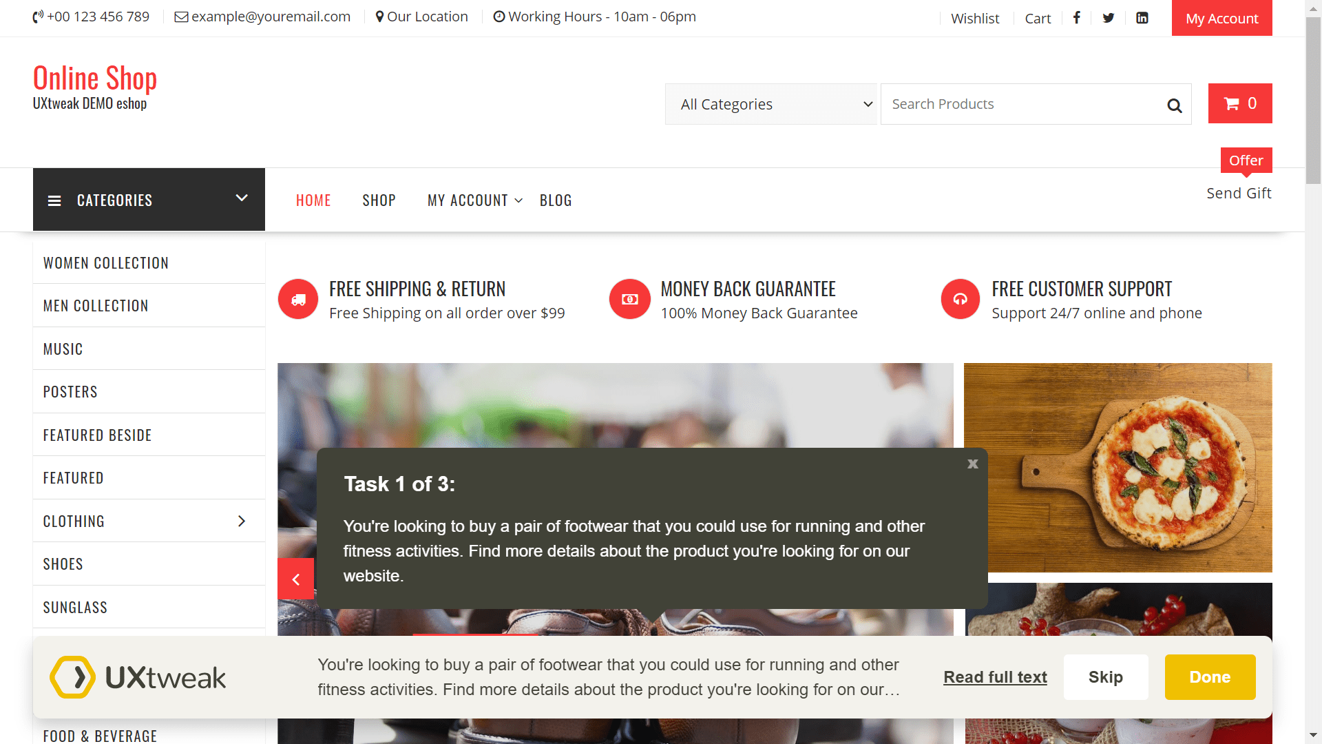
Example of usability testing of e-shop with UXtweak Website Testing tool.
Conclusion
Good landing page UX is now more important than ever. Fifty percent of people tend to form their opinion about a business based on its website. Prepare your landing page for the digital era using some of these tricks and watch your conversions boost like never before.