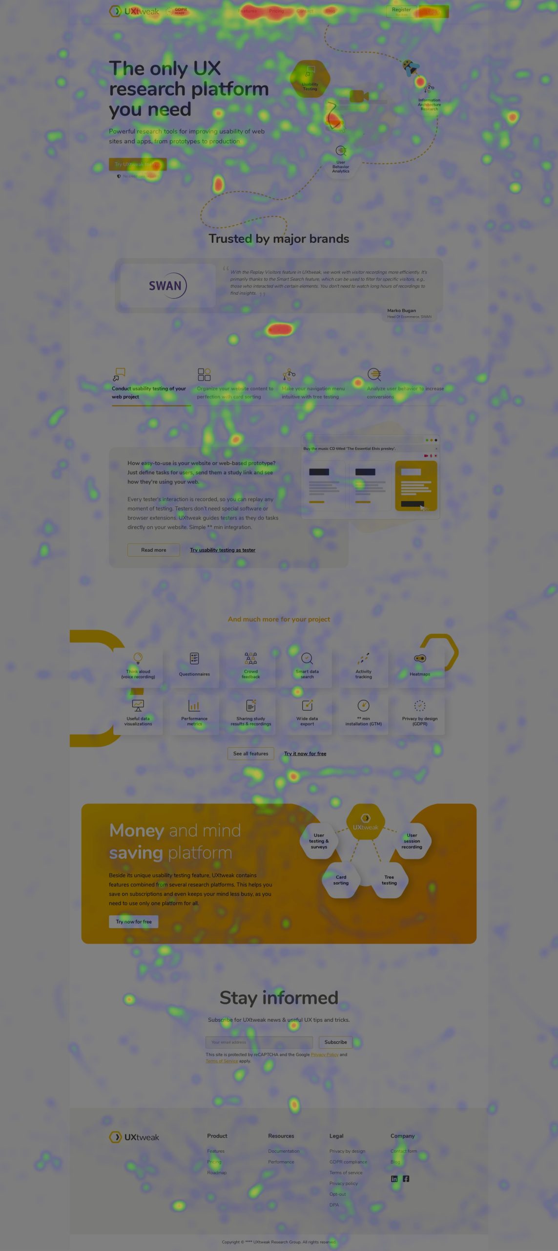
Want to know where users click on your website, where they stop while browsing or how far down the page they scroll? Would you like it shown in a picture, rather than drown in endless charts? Website Heatmaps are an indispensable user research tool that will allow you to do just that.
What are heatmaps?
Heatmaps are graphical representations of large, complex data that allow for its visual interpretation. Simply put, the “heat” is a spectrum of color that portrays the intensity of a phenomenon. The phenomenon can be anything, such as the population density on a geographical map, or the number of clicks on a website. A hot color such as red or orange means high intensity, while a colder color such as blue and black means that the intensity is low. By taking one look at a heatmap, one can immediately see highlights in the data, find relations and discover patterns.
Heatmaps as a concept are over a century old. Their origins come from color-shaded matrix displays, where their roots are seen even today. In spreadsheet tools such as Excel, color scales can be used to colorfully paint the cells in a table according to their values.
Website heatmaps and web analytics
In web analytics, a heatmap is laid over a snapshot of a page. A website heatmap can show which parts of the page were interacted with most, which ones made users stop by, or how the percentage of viewers gradually drops as you scroll down the page.
Heatmaps are rendered from usage data. In this blog, we’ll discuss heatmaps generated in UXtweak and their benefits over heatmaps from other analytical tools. Register at UXtweak for free to try heatmaps of your own web site or app.
There are three types of heatmaps: click maps (also called tap maps on mobile devices), move maps and scroll maps. Each of them portrays different behaviour and can provide different insights, so here’s an explanation for each one.
What are click maps?
Click maps highlight the areas where users click (or tap on smartphone and tablet devices). The areas that were clicked most will appear in hot colors such as red, orange or yellow. By moving your cursor over heatmap areas, you can see the exact number of clicks and the number of visitors who clicked them. This can help you investigate whether users are clicking what they should be.
What are move maps?
Move maps show you areas where people have stopped with their cursor, Since there’s no cursor on smartphones and tablets, these maps only work for desktop devices. A lot of people point the cursor at what they’re currently looking at. Indeed, research also supports a correlation between cursor and gaze position, making move maps are a good approximation for information that you would get with eye tracking (a much more expensive technology that requires specialized hardware). You can read more about the mentioned research – Correlation of eye/mouse movements on web browsing here. Move maps can give you a good idea of whether users are paying attention to what they should be.
What are scroll maps?
Scroll maps aggregate the information about how far down the users have scrolled. A typical scroll map looks like a rainbow – red at the top covering the area of the page that was seen by everybody. Then, the color grows colder as the percentage of people who scrolled lower and lower gradually decreases. If you move your cursor over the heatmap, you can see the exact percentage of people who have seen the page to that level.
Website heatmaps are rendered separately for desktops, tablets and smartphones so that pages can be evaluated separately, based on the session’s origin. Each type of device uses a unified viewport size to generate heatmaps, for example, 1280px for desktops. However, since variable screen sizes can sometimes bring inaccuracies into heatmaps (due to different positions of elements across different viewports), UXtweak also allows you to pick from the recorded viewport sizes to generate highly accurate heatmaps.
UXtweak allows you to generate heatmaps from the collected data dynamically, on-demand. This means you can select any page that’s been recorded and draw a heatmap from it. No need to know in advance which pages you will want a heatmap of. You’ll never have to wait to generate a heatmap or have to worry that you forgot to create one.
Heatmaps in UXtweak also have a date filter. For example, if your homepage changed its layout at the beginning of the week, you can compare heatmaps from this week and the week before to verify that the redesign had the desired positive effect on user interactions.
How to analyze heatmaps?
Just like with any research, the first thing you need to analyze heatmaps is a hypothesis you wish to validate. The hypothesis here is how you expect users to behave on a page so the page fulfils its business goals (visitors converting, visitors subscribing to a newsletter, etc). Once you have that, the analysis is a piece of cake. Looking at the heatmaps will reveal whether the hypothesis is correct or not. Here’s a checklist of what to look for.
- Do people click on important elements? (buttons, links)
This one is rather self-explanatory. Your website likely has more than a few elements that you want people to click. In a click map (or a tap map on smartphones and tablets) you can see where people click, with red, orange and yellow areas being the richest on clicks.
You can immediately see whether people click on elements with the same priority as you’d like them to. Depending on the context, you may try to fix it, or use the heatmap as a basis for user testing (for example, to find out whether people don’t click an element because they don’t find it interesting, or because they don’t understand it). After an update, you can compare heatmaps to check if the problem was fixed.
- Do people click on non-clickable elements?
A counterpart to the previous point. Sometimes, the design of a page can lead users to click on elements that don’t do absolutely anything. In the majority of cases, that means that people expect some kind of reaction. You have two options on how to resolve such an issue. Either consider “why” people would click the non-clickable element and implement it so the click does fulfil user expectations. Or the other option: take more care with how you differentiate clickable elements from non-clickable ones.
- Are people paying attention to what they should be?
If people aren’t clicking on an element, our next question would be “Did they even know it was there?”. This can be especially important on pages that are teeming with content, such as homepages or dashboards. Open a move map and you will see which parts of the website users observed most. If users focused more on the less important content while missing what was key, it may be a good idea to reorganize content based on its priority. Because move heatmaps don’t rely on clicks or taps, they are useful for evaluating non-interactive parts of the website, such as labels, images and text.
- Do people scroll down to see the key content?
People can’t interact with what they can’t see. And even though scrolling is a natural part of the web, sometimes people don’t even realize that there is more on the page than what they are currently seeing.
Take a look at the average fold. It’s how much of the page users usually see while opening the page. If users don’t see what’s the most important about the page in that area, they may not even scroll further. Hold the cursor over the heatmap to see what percentage of visitors have seen the elements that are lower down the page. If you see a sharp drop somewhere, this may be the place where people lose interest in scrolling further.
- Are there device-related usability issues?
With different page layout due to page responsiveness, don’t forget to always investigate all types of devices. An element that’s clicked a lot on desktop may find itself below the average fold and completely ignored on mobile, or vice-versa, the compact interface on mobile may be easy to understand, while a lot of content spread over the whole screen on desktop may end up confusing users.
Why you too should be using heatmaps
A heatmap can offer quick answers to key questions that will help your team improve your web. Questions such as:
- How many people click the CTA? How does it compare with the rest of the page?
- Do people pay attention to this important piece of information?
- What percentage of people scroll down to see the subscription form?
- Why do most registrations come from the desktop, even though there are more visitors from mobile?
- Which variant in A/B testing is performing better?
What’s more, heatmaps are very easy to understand. Whenever you’re making a presentation to stakeholders to show the need for a redesign, a heatmap is the ideal illustration for showing a usability issue at work. Even the most stubborn developers go along with the changes when issues are clearly showing in a heatmap.
Conclusion: The impact of heatmaps
Heatmaps are a powerful tool for user testing and research. There are many questions about a website’s usability that can be explained by a heatmap – how users click, what they see and what catches their attention. While heatmaps are no panacea (they cannot show all usability problems or why they happened, like recordings can), the way they summarize user experience in a visually understandable manner offers immense value in informing businesses about how to build better user experiences.