In what has become a common occurrence in human history, a group of people not long ago set out to understand how the human mind works and returned with insights that have since helped shape our lives and future.
The origins of the Gestalt theory
In the early 20th century, the psychologists, in this case, were Max Wertheimer, Kurt Koffka, and Wolfgang Köhler, who all tried to rationalize how we perceive and understand what we see.
Founded in Austria and Germany, the Gestalt theory takes its name after the German word ‘gestalt’, which is interpreted in English as ‘pattern’. Its major principles focus on the idea that we tend to understand what we see as a whole and not a sum of its parts.
The Gestalt theory and the human mind
Like many design theories, the Gestalt theory builds on human psychology and tries to explain how our minds perceive visual objects.
According to the Interaction design foundation, they are laws of human perception that describe how humans group similar elements, recognize patterns, and simplify complex images when we perceive objects.
Gestalt psychologists believe that humans tend to think of the things we see as being regular, orderly, symmetrical, and simplistic. Basically, our minds will always try to make sense of visually chaotic scenes and find order in disorder.
Using Gestalt principles in UX design
User experience design is all about making processes easier for people who use our products. And what better way to do this than to understand the way our minds interpret the things we see, as well as adjust our designs to adapt to what is natural to us?
With Gestalt principles, we can take a step back and holistically view our designs to understand how users see them and interact with them.
Though commonly applied in visual design, material design, and art, here are some principles that affect how we design products today:
Principle of proximity
This principle states that when we see objects that appear closer together than others, we reflexively think of them as being in a group. The psychological reaction is often so strong that it doesn’t matter if the objects are similar or different. As long as they are close together, the proximity principle will supersede both shape and color.
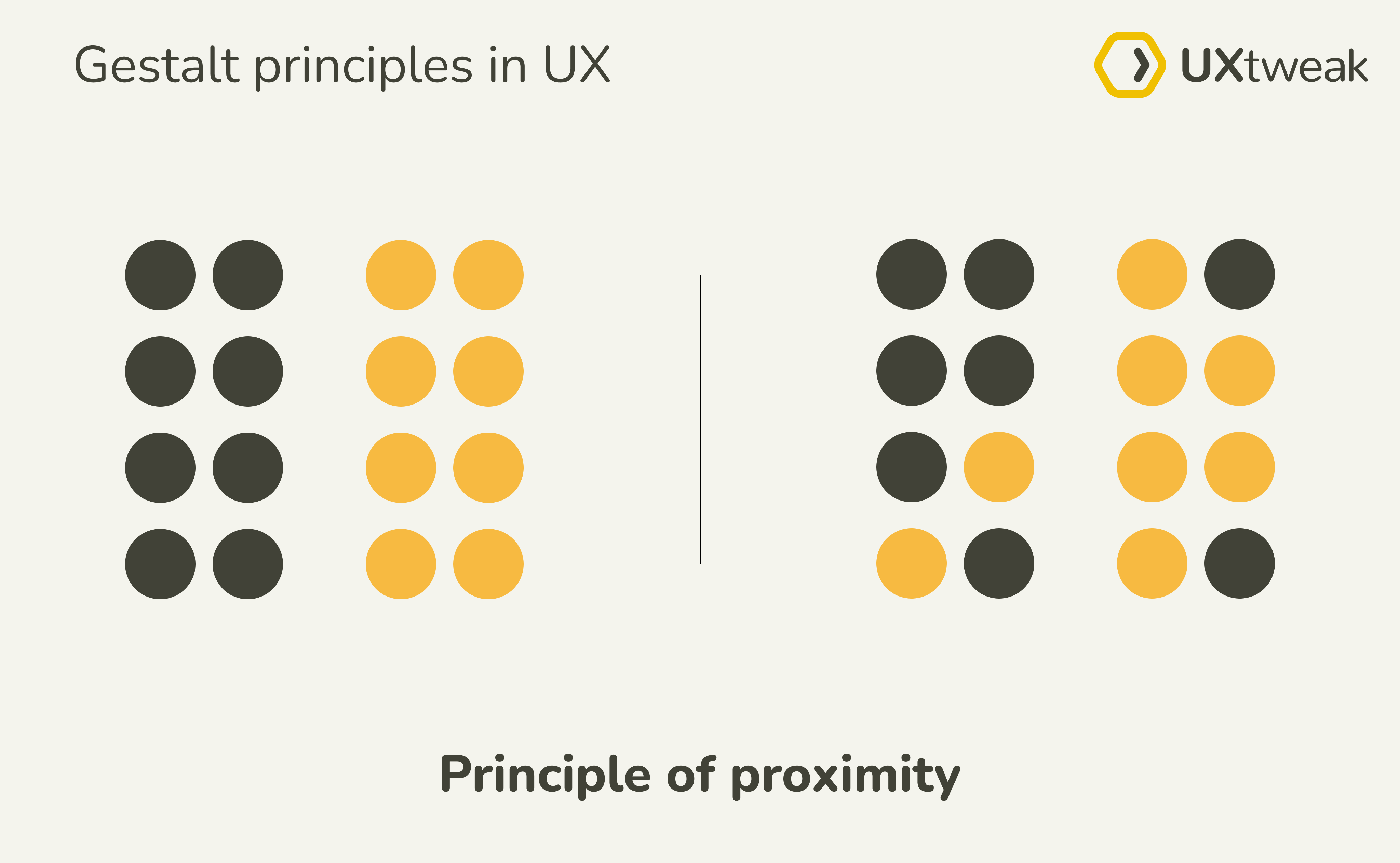
Effect on UX design: The proximity principle helps users associate certain elements with each other. For instance, users are able to establish a relationship between objects and group information when they are near each other. Also, users can perceive menu buttons as being together in a group despite their different shapes.

Principle of similarity
According to the principle of similarity, when we see objects that look similar in color, shape, or form, we tend to group them together and assume they behave in the same way.
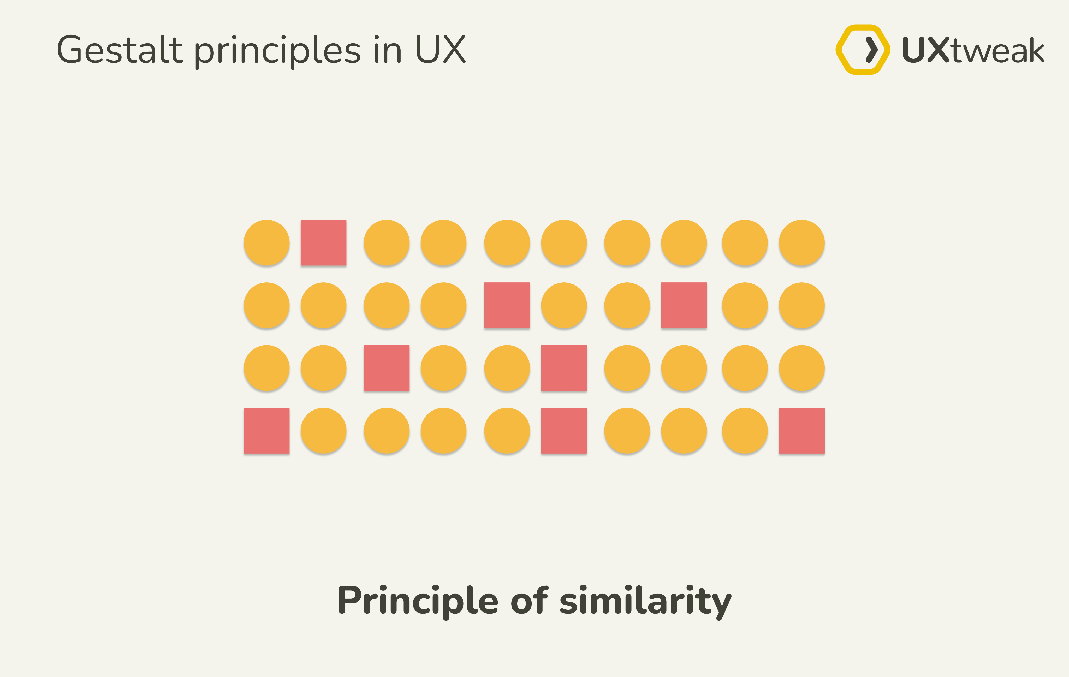
Effect on UX design: It helps users find a correlation between elements and functions. For instance, similar iconography can help users know that such icons function the same way regardless of their location on-screen.

Source: Asos
(Clicking on the heart-shaped icon on one frame will give you the same result as when you click on the heart-shaped icon on the others)
By rightly applying the principle of similarity, we can convey meaning and reduce the need for explanations or guides on a screen.
Principle of continuity
According to this principle, when we see objects in a line, our eyes naturally tend to follow such lines till the end. In some situations, this principle can even override color-based similarity because our eyes will always follow the smoothest possible line first.
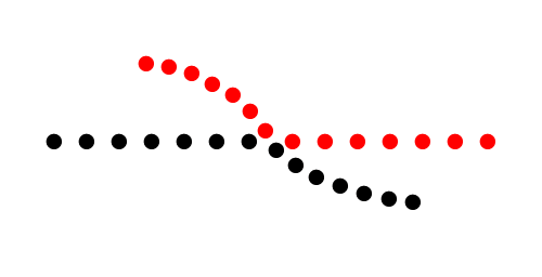
Effect on UX design: With this principle, we can guide users’ eyes in a specific direction within our designs. From drop-downs to horizontal slides, putting elements in a line would hook users’ attention and cause them to follow the designated path.
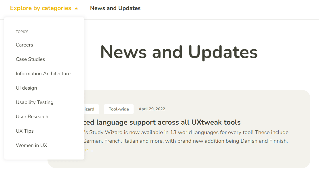
(Putting the topics in a straight line guarantees they will all be noticed)
Principle of closure
This principle says that when we see incomplete objects, our visual perception fails to notice their gaps and instead, we perceive them as being complete. Essentially, our minds automatically fill in the missing pieces of a design or visual element.
Effect on UX design: Though commonly used in logo designs, the principle of closure helps convey information to users. A good example of this is the loading state design.
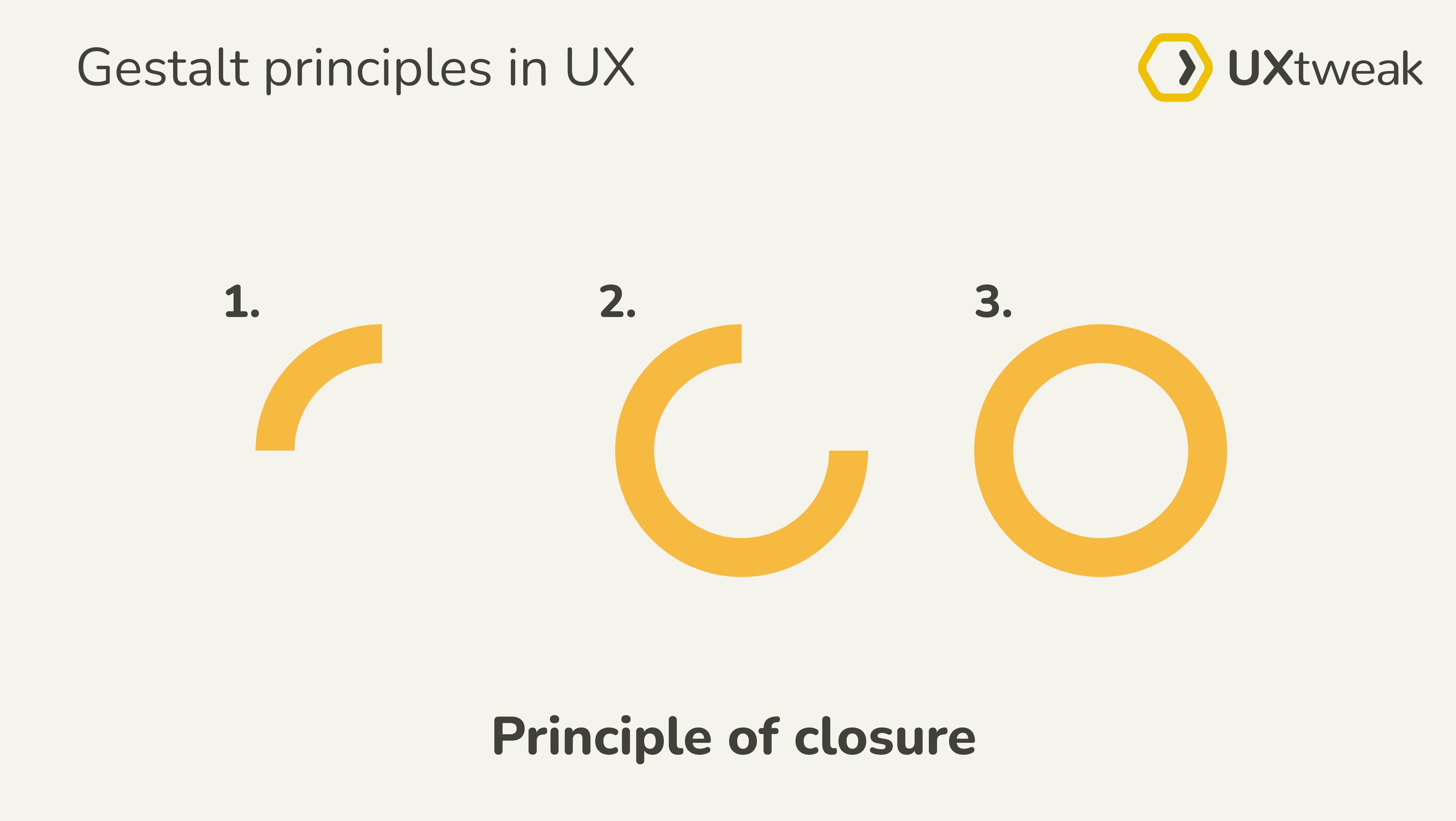
(Our minds interpret a simple arc that is both static and in motion as a circle)
With the closure principle, we can creatively use incomplete objects to pass on a message, because our minds will fill in the gap.
Principle of common region
According to this principle, we perceive objects found in a closed region as a single group. It doesn’t matter if there are multiple other gestalt principles applied to such objects, as long as there is a line drawn around them, we can perceive them to be separate from other objects.
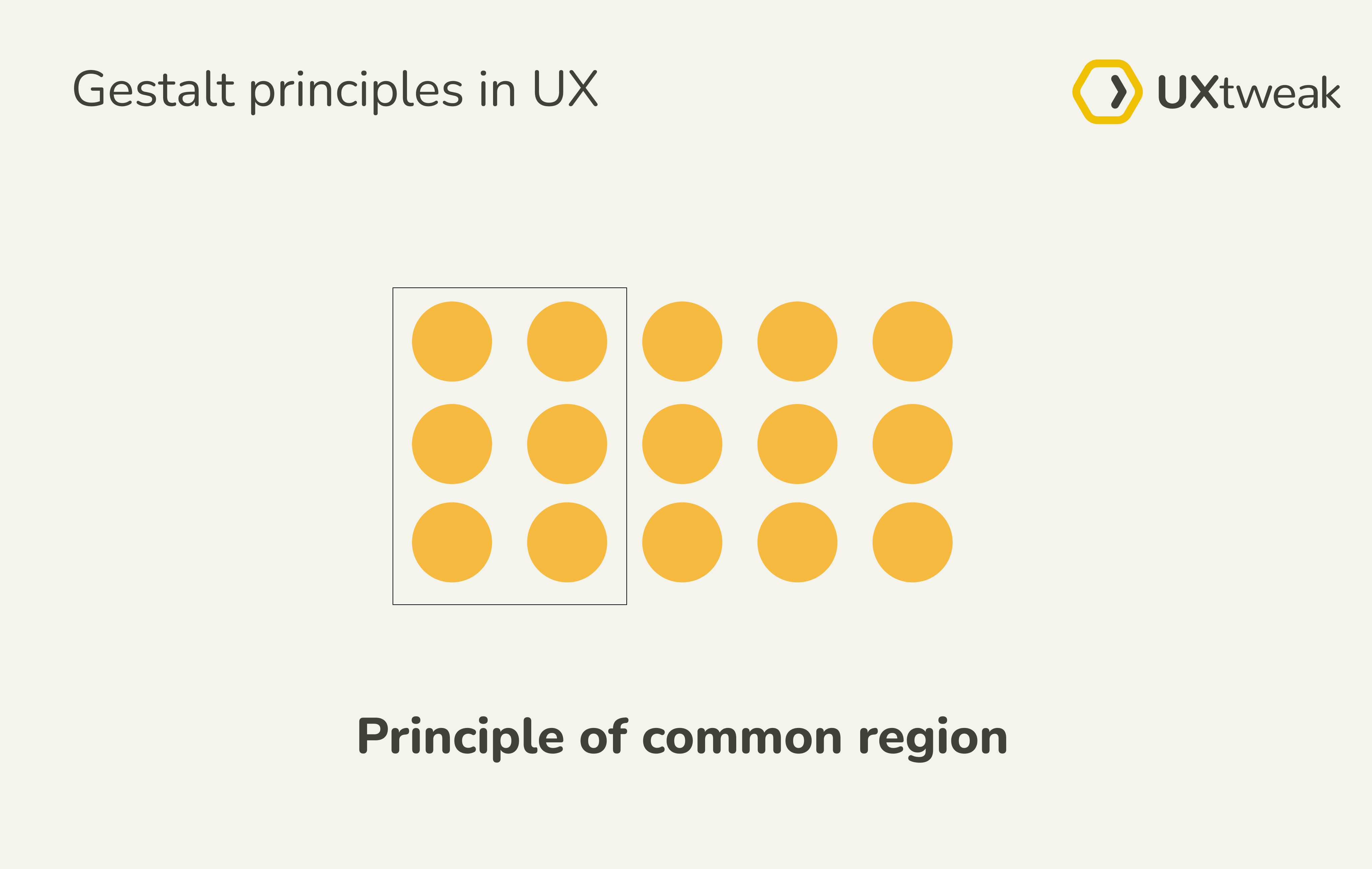
Effect on UX design: As one of the more common principles used in user experience design, we can see it applied in the design of cards, tabs, and frames, among others.

Principle of focal point
The principle says that whatever stands out visually will naturally attract attention and hold our interest. Basically, our minds notice things that are in stark difference from their immediate environment, and we see this occur in everyday life and designs.
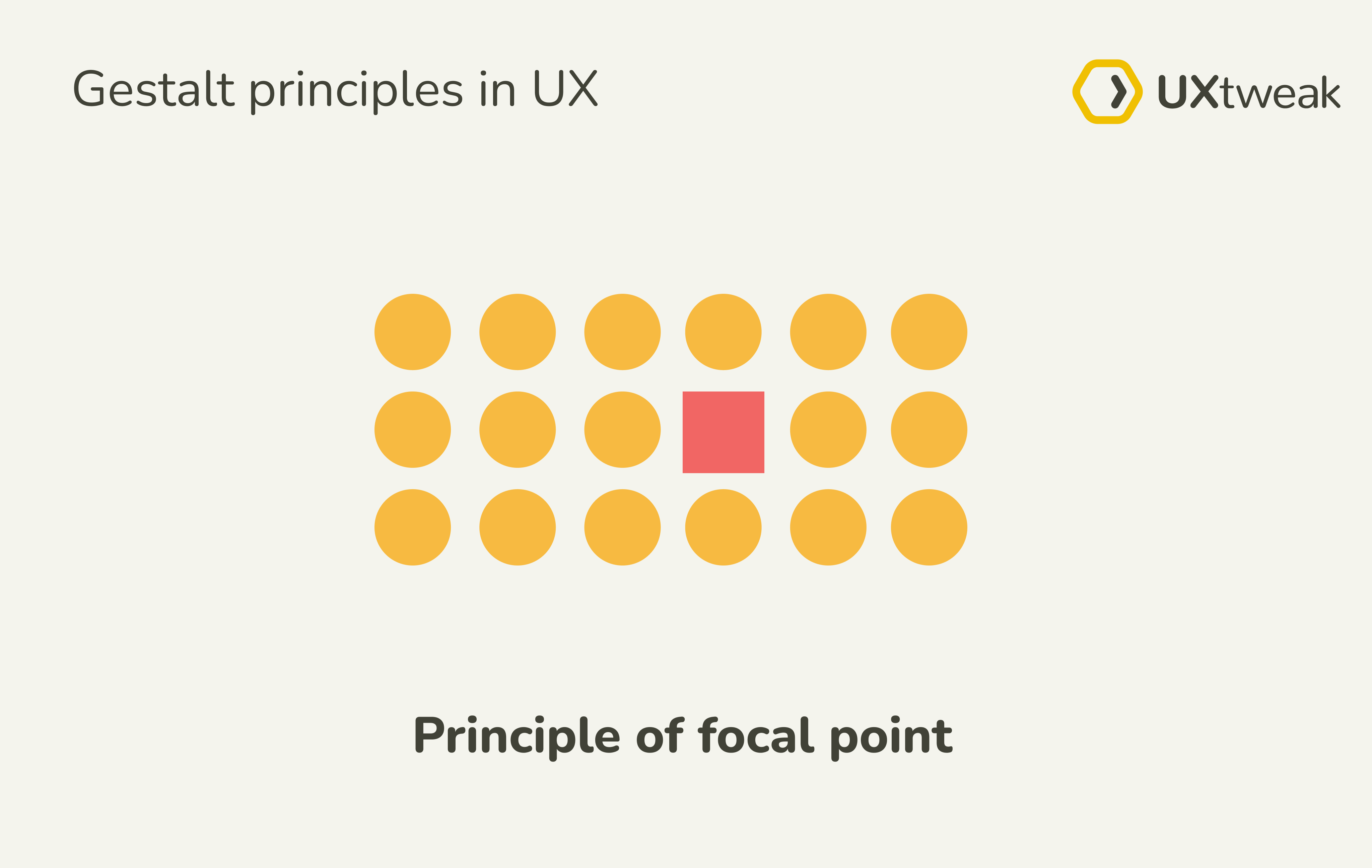
Effect on UX design: We use this principle to draw users’ attention to specific elements or information. An example is the design of CTA buttons and the elements we want users to notice.
(Our eyes are drawn to the ‘check our guide’ because it’s brighter and different)
When gestalt principles harm the user experience
While Gestalt principles can help spice up your design and remove unnecessary distractions, you should never let it delay or confuse your users. By itself, Gestalt principles don’t result in a good user experience because just as with most things in life, there are good and bad sides to it.
In this example, the principle of proximity is applied in the design of this form to help users know what information they need in order to fill in each blank. But because all the elements are close together, it also makes it hard for users to read and fill in the form.
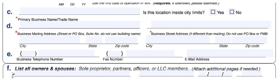
When the Gestalt principles are misapplied or taken to extremes, it worsens the user experience. So how you choose to leverage each principle determines the overall quality of your user experience.
Gestalt principles around us
Despite its massive popularity in the design world, Gestalt principles go beyond designs. They also occur outside of apps and websites. In fact, it’s from our everyday realities that the theory was discovered. From funny pictures on the internet to restaurant menus, we see and use these principles in everyday life – albeit subconsciously.
So if you ever find yourself lacking inspiration in making your user experience better, take a breather and observe your surroundings. The solution might just be around you.