
Key takeaways
➡️ Jakob Nielsen and Rolf Molich first introduced usability heuristics in 1990
🧠 In 1994, Jakob Nielsen refined them into the set of 10 usability heuristics known today
✅ The usability heuristics are general principles that can be applied broadly in the field of interaction design
🔎 Heuristic evaluations help demonstrate the usability strengths and weaknesses of an application or system
💡 Adhering to usability heuristics can improve the overall usability and user experience of interfaces
👉 The 10 usability heuristics have been refined over the years, but have overall remained relatively unchanged
With the advent of new technologies, evaluating and enhancing the usability of experiences has become increasingly important.
In this article, we delve into the 10 usability heuristics, explore their application in performing heuristic evaluations, and provide insights on improving the overall usability of your product.
Let’s dive in.
What are the 10 usability Heuristics?

Usability heuristics are essential principles that provide practical guidelines for evaluating the overall usability of an interface. They were first introduced by Jakob Nielsen and Rolf Molich in 1990, and later refined in 1994.
While their wording and language have been carefully refined to adapt to new experiences and environments, the 10 heuristics have remained essentially the same despite an evolving technological landscape.
By adhering to these heuristics, designers and product teams can effectively identify issues, enhance efficiency, increase learnability, reduce errors, and improve user satisfaction for their products or services.
The 10 usability heuristics are as follows:
1. Visibility of system status
Users should always be aware of what is going on within the system.
Keeping them informed through appropriate, timely, and actionable feedback helps them understand the outcome of their prior interactions and determine what to do next. Systems should effectively convey progress of tasks, indicate system availability (or lack thereof), and display appropriate loading indicators and status messages.
Clear and immediate presentation of system feedback strengthens users’ understanding and proficiency in utilizing the system. Open and transparent communication builds trust. When users understand the system’s state, they feel more empowered and can confidently trust the system to act as they would expect.
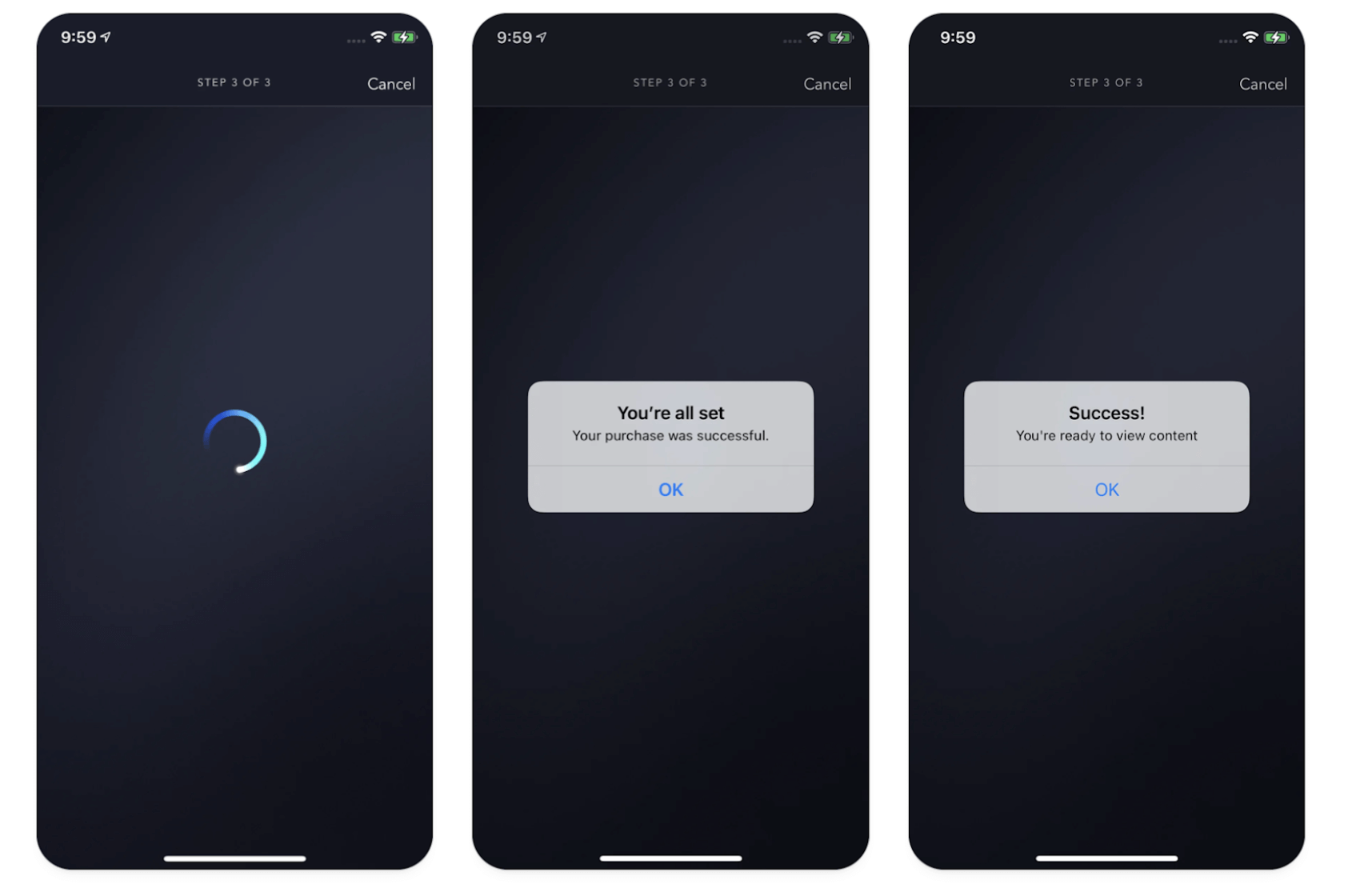
Disney+ onboarding loading and success states.*
2. Match between the system and the real world
The system’s design, concepts, and actions should be familiar and consistent with a user’s expectations of the real world.
It should use language and interaction patterns that users are accustomed to in their everyday experiences. Terminology, icons, and metaphors should draw upon a user’s existing knowledge and experiences to help the system or design feel more intuitive and reduce cognitive load. Avoiding jargon is important, as definitions will not always match those of the user.
Skeuomorphic design is a visual approach that aims to replicate the appearances and characteristics of real-world objects within digital interfaces. While design styles have evolved, the core principle of matching the system to the real world can still be found in many popular apps today.
Examples include calendar, notebook, weather, calculator, and bookshelf applications, which incorporate familiar visual cues to create a sense of familiarity and intuitive interaction.

Apple’s weather app uses weather symbols that match weather in the real world.*
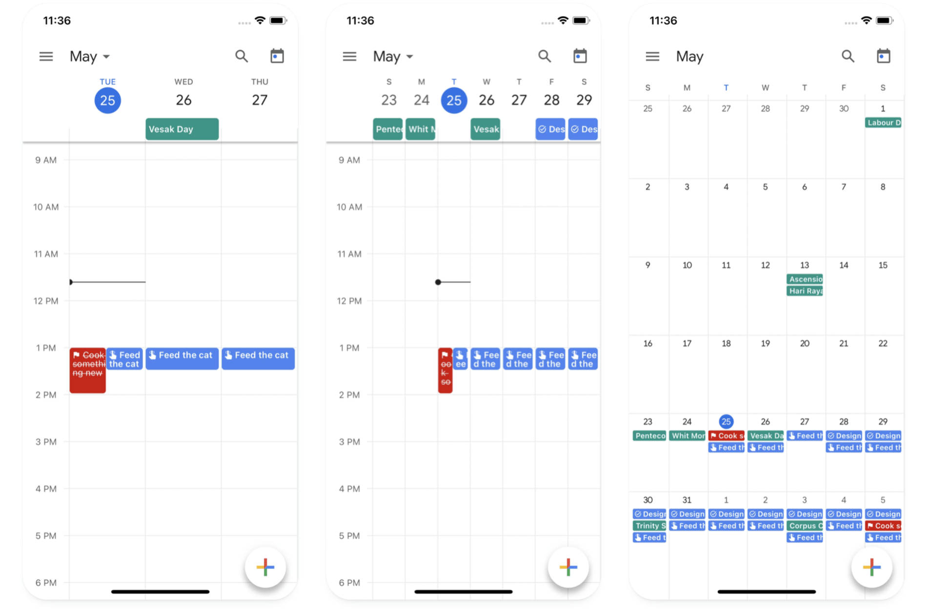
Users utilize Google’s calendar app the same way they would use physical calendars.* 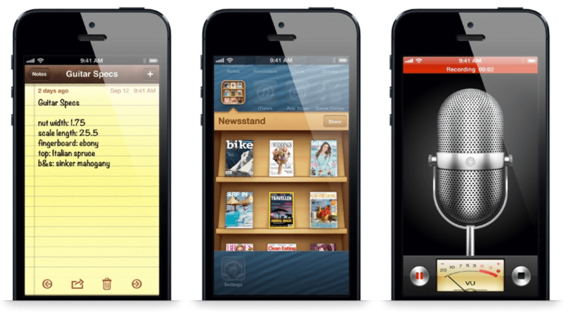
Early skeuomorphic designs of Apple’s early iPhone applications: image source.
3. User control and freedom
Users require control over the system and should be enabled to easily undo actions or exit undesirable states.
Including clear and accessible navigation by offering “Cancel” or “Back” options helps users reduce the fear of making mistakes. Requiring confirmation of irreversible actions helps communicate the finality of users’ actions and helps them make informed decisions.
Just as physical spaces have emergency exits, digital spaces also require intuitive ways to escape.
Implementing “Undo” functionality and facilitating backwards navigation between steps or actions provides maximum freedom within an application. Ensuring these elements are easily discoverable helps users trust the system and navigate it comfortably.
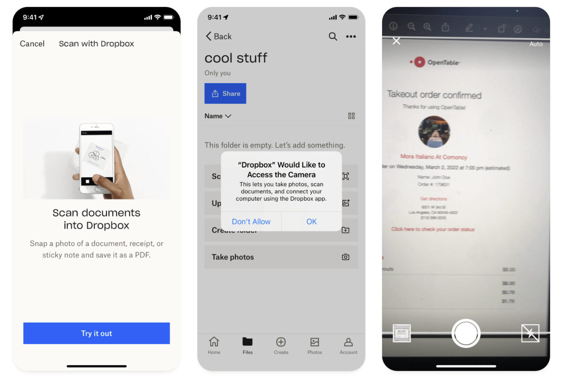
Dropbox’s scan feature enables users to utilize their mobile device to scan documents, accompanied by a readily available “Cancel” option throughout the experience. Additionally, they also provide clear confirmation prompts about permission access.*
4. Consistency and standards
Maintaining consistency within the application, omnichannel, or brand is as important as adhering to established conventions and industry practices.
According to Jakob’s law, users spend most of their time on other sites or applications, which shapes their expectations. As a result, users expect words and interactions will have the same meanings and behaviors across different situations or scenarios.
Familiar patterns should align with those that users are already accustomed to.
Introducing novel elements forces users to learn something, decreasing learnability and efficiency. Internal consistency within a single product or family of products, and external consistency that conforms to industry conventions, are key to higher usability. Maintain consistency across all layers of the system – visually, in layout structures, and in content-specific scenarios.

Sportify’s interface aligns with conventional music, podcast, and video industry standards, making it easy and intuitive to use.*
5. Error prevention
Emphasizing error prevention is more significant than providing effective error messaging alone.
Errors can happen unconsciously due to inattention (referred to as a slip), or consciously because of a mismatch between a user’s mental model and the system (referred to as a mistake). These kinds of errors can be avoided by providing helpful constraints, defaults, or offering useful suggestions.
Focusing priority on high-cost errors is integral, while irritating and frustrating errors can be addressed at a later time. Just as guard rails keep drivers safe on winding highway roads, error prevention keeps users safe from destructive actions while using the system.
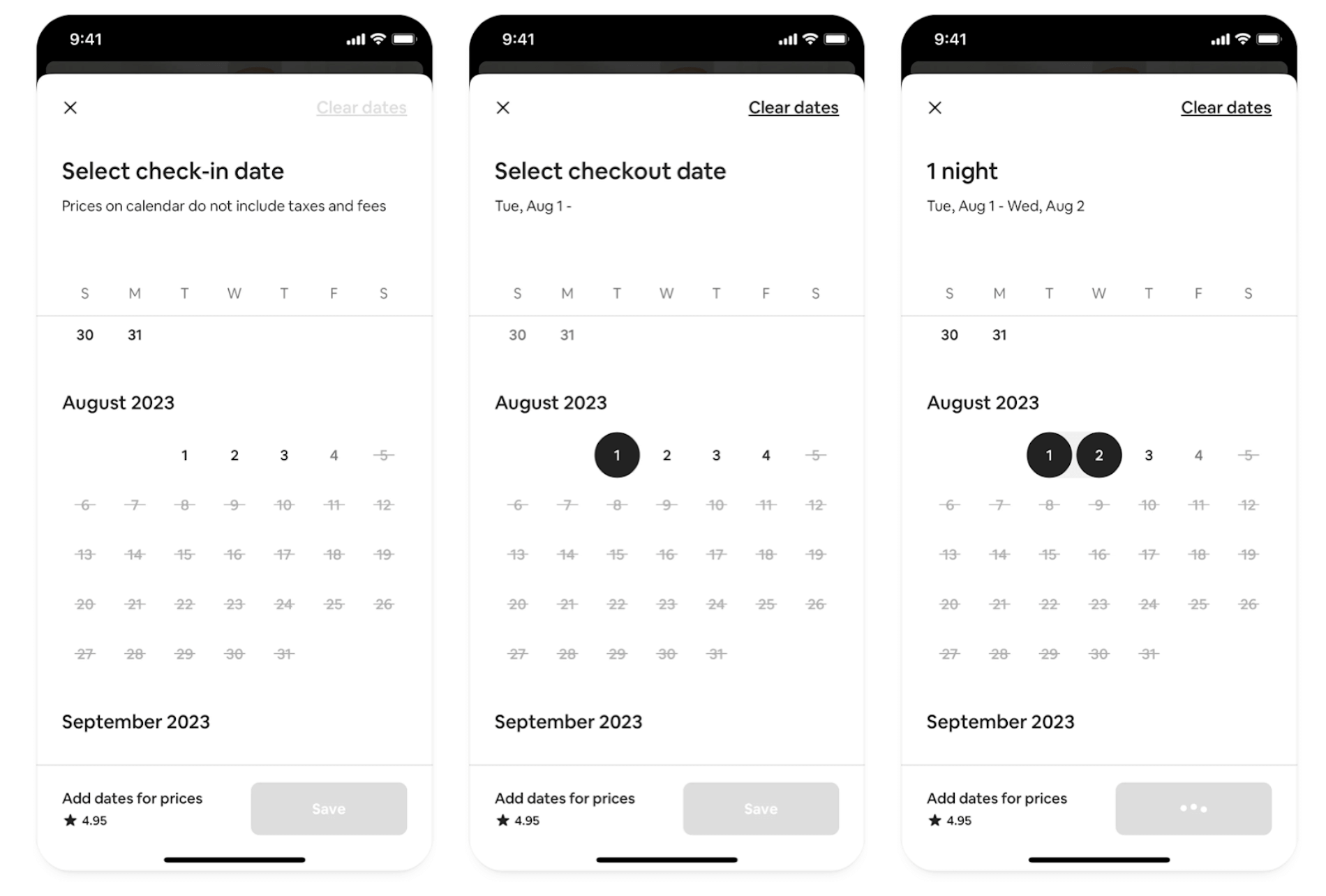
Airbnb’s booking process provides helpful constraints and defaults so users can’t inadvertently book unavailable dates or set departure dates before arrival.*
6. Recognition rather than recall
Facilitating user recognition of options, actions, and information is easier than having them recall information from memory.
Presenting relevant choices, visual cues, and clear labels or prompts enables users to easily identify their desired choice of action. Prominently displaying these elements minimizes cognitive load and helps users progress forward in the system.
Organizing or “chunking” content based on interconnected categories helps users recall elements more easily.
💡 Pro Tip
To get insights on how users expect your content to be categorized, use our card sort tool.
Menus are a classic example of chunking in a recognition-focused interface. Furthermore, offering contextual information is a simpler way of providing helpful guidance instead of overwhelming users with long, inundated tutorials. Onboarding wizard flows help users take immediate action with information presented instead of requiring users to store that information in their short-term memory and recall it later.
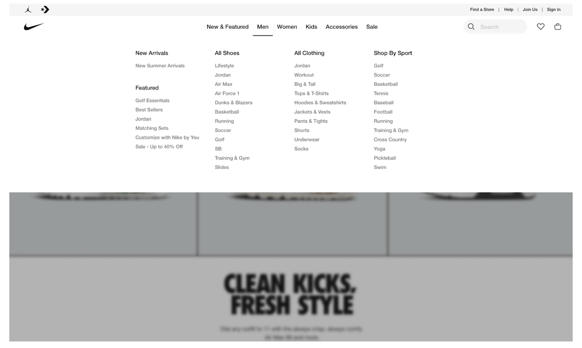
Nike effectively chunks their large catalog of inventory items into its header menu to make it easy for users to locate and recall desired items or categories.
7. Flexibility and efficiency of use
Effective design caters to both novice and expert users. The system should provide new users with ways to easily navigate the system, and empower expert users to leverage system tools with speed and efficiency.
Allowing flexibility in accomplishing tasks accommodates users of all experience levels.
Enabling users to set their own preferences or customizations and offering shortcuts expedites workflows for power users. These shortcuts, also known as accelerators, can take the form of keyboard strokes or touch gestures. Additionally, providing advanced search options or filters makes large data sets easily navigable for commonly used actions or workflows.
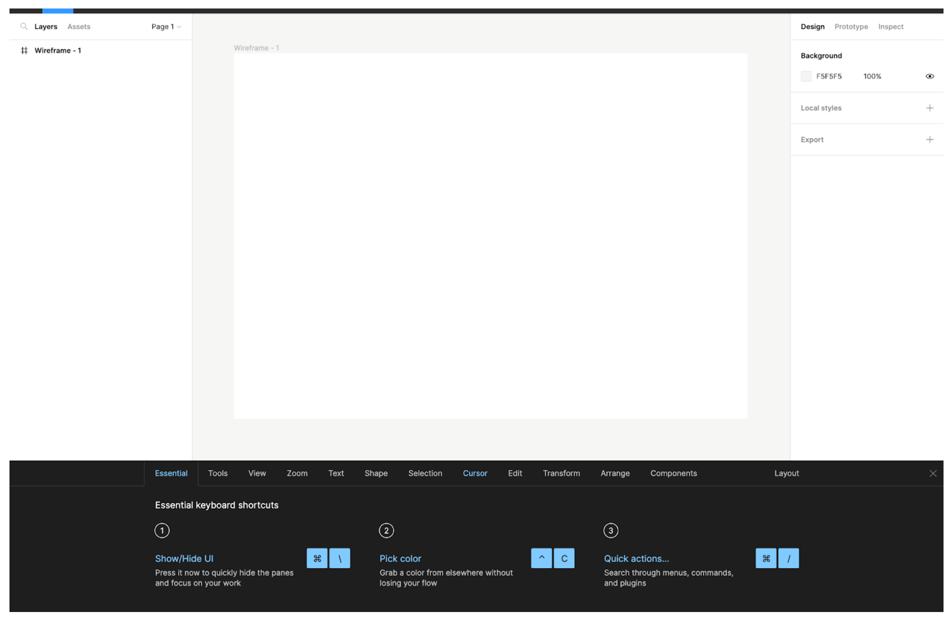
Professional tools like Figma offer many flexible ways to operate the system, and provide helpful accelerators like shortcuts for expert users more familiar with the tool.*
8. Aesthetic and minimalist design
The system’s aesthetic should be visually appealing, and its design should purposefully focus users’ attention by removing clutter and providing a clear hierarchy within the interface.
Eliminating distractions and visual noise keeps irrelevant information from slowing down users’ experiences.
The presence of numerous page elements creates competition among them, diminishing the visibility and importance of each. Prioritizing content and features to support the user’s primary goal is essential. Using ample white space and clean typography alleviates eye strain, and dashboard interfaces effectively summarize the information most necessary for users.

Apple’s aesthetic and knack for minimalist design have influenced digital and physical experiences for decades.*
9. Help users recognize, diagnose, and recover from errors
Errors are inevitable, so providing messaging that clearly spells out the problem and constructively suggests a solution in plain and simple language helps users know how to move forward when faced with interruptions.
The ability to recover from errors and prevent data loss is vital in building user confidence with the system and ensuring overall user satisfaction.
Employing industry-standard visuals and colors helps users quickly recognize when something is wrong. Bold, high-contrast, red text or iconography are the conventional visual cues for error messaging. Communicating using human-centered language helps explain issues politely and prevents users from further confusion.
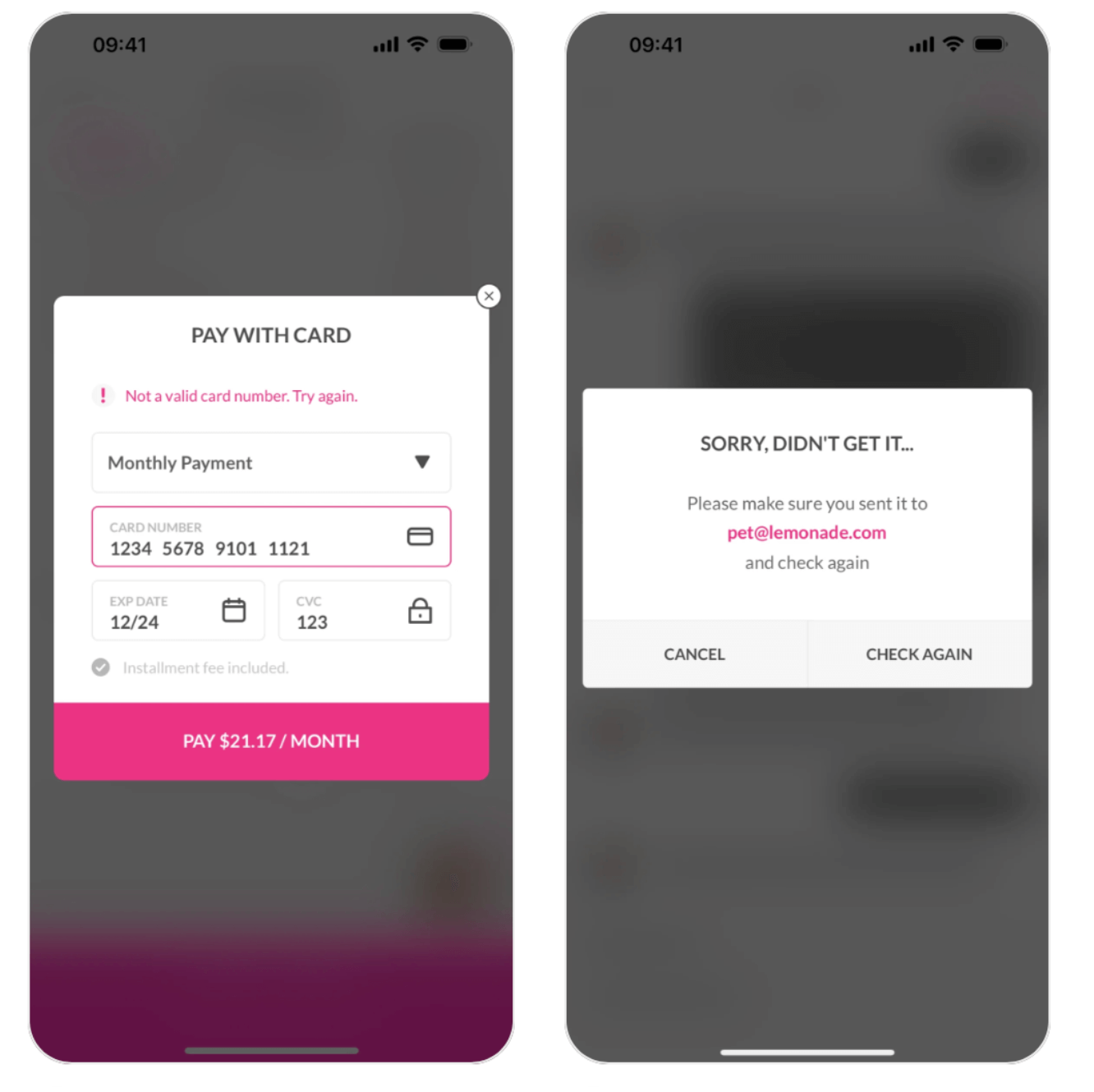
Lemonade insurance provides clear and concise error messaging along with action prompts to help users easily recover from errors.*
10. Help and documentation
As a general rule, the system should be clear, intuitive, and user-friendly. However, it is equally important to supply comprehensive help guides and documentation for users.
Accessible and searchable documentation provides users with the necessary assistance to help them complete their tasks and resolve issues.
“Help Center” or “FAQ” sections serve as valuable resources users can leverage to learn more about a tool or system. The documentation should be concise and action-oriented, helping users more easily carry out their tasks and find answers relevant to their questions or concerns.

ChatGPT’s mobile application contains detailed help documentation.*
*Curated by Mobin
How to do a usability heuristic evaluation?

Understanding the 10 usability heuristics provides research, design, business, and product teams with an actionable guide to begin enhancing their services or applications.
The following steps are useful when conducting a heuristic evaluation:
- Familiarize yourself with the heuristics. Begin by reviewing and understanding the 10 usability heuristics. It’s important to work on common ground when working as a group, so reviewing the heuristics allows everyone to prioritize and determine which heuristics may need to be adapted or customized to suit specific needs.
- Walk through the interface and tasks. Have each participant walk step-by-step through their tasks or activities, and answer any questions that come up or that could hinder the evaluation.
- Evaluate each heuristic. Individually assess how the interface aligns with each usability heuristic. Assess how the interface succeeds or fails for each. Document findings detailing strengths and weaknesses. Rate the severity of violations on a scale of 1-5, and/or use terms like low, medium, or high to gauge impact on the user experience.
- Summarize findings. Compile a list summarizing all issues and strengths. Prioritize severe issues based on impact over minor issues, and focus attention on addressing critical needs first.
- Provide recommendations. Offer actionable recommendations to improve the user interface based on your evaluation. Stay focused on users’ needs, and relate back to the usability heuristics, prompting each suggestion.
- Communicate results. Prepare a usability analysis readout or report that highlights findings, prioritized issues, and, most importantly, your recommendations. Share with stakeholders in design, product, and business. Facilitate discussion where needed, and work toward improving your application with users’ needs in mind.
What to do after an evaluation using usability heuristics?
Taken on their own, these usability heuristics can prove as remarkably valuable guides. When combined with usability testing, however, these heuristics can empower teams to further explore and enhance existing products and workflows.
After conducting your heuristic evaluation, follow these steps to maximize the impact of your findings:
- Implement recommended changes: Improve and iterate on the design interface based on the recommended suggestions from the heuristic analysis.
- Test proposed changes with users: Validate improvements to the system by testing them with actual users. Focus on high-impact and high-severity issues when making changes, especially if your time and/or budget is limited.
- Continuously iterate and refine: Remember that improving usability is an iterative process. Incorporate user feedback continuously to refine the system and ensure ongoing improvement. Monitor revisions to ensure they have addressed the problems you sought to solve through your heuristic analysis.
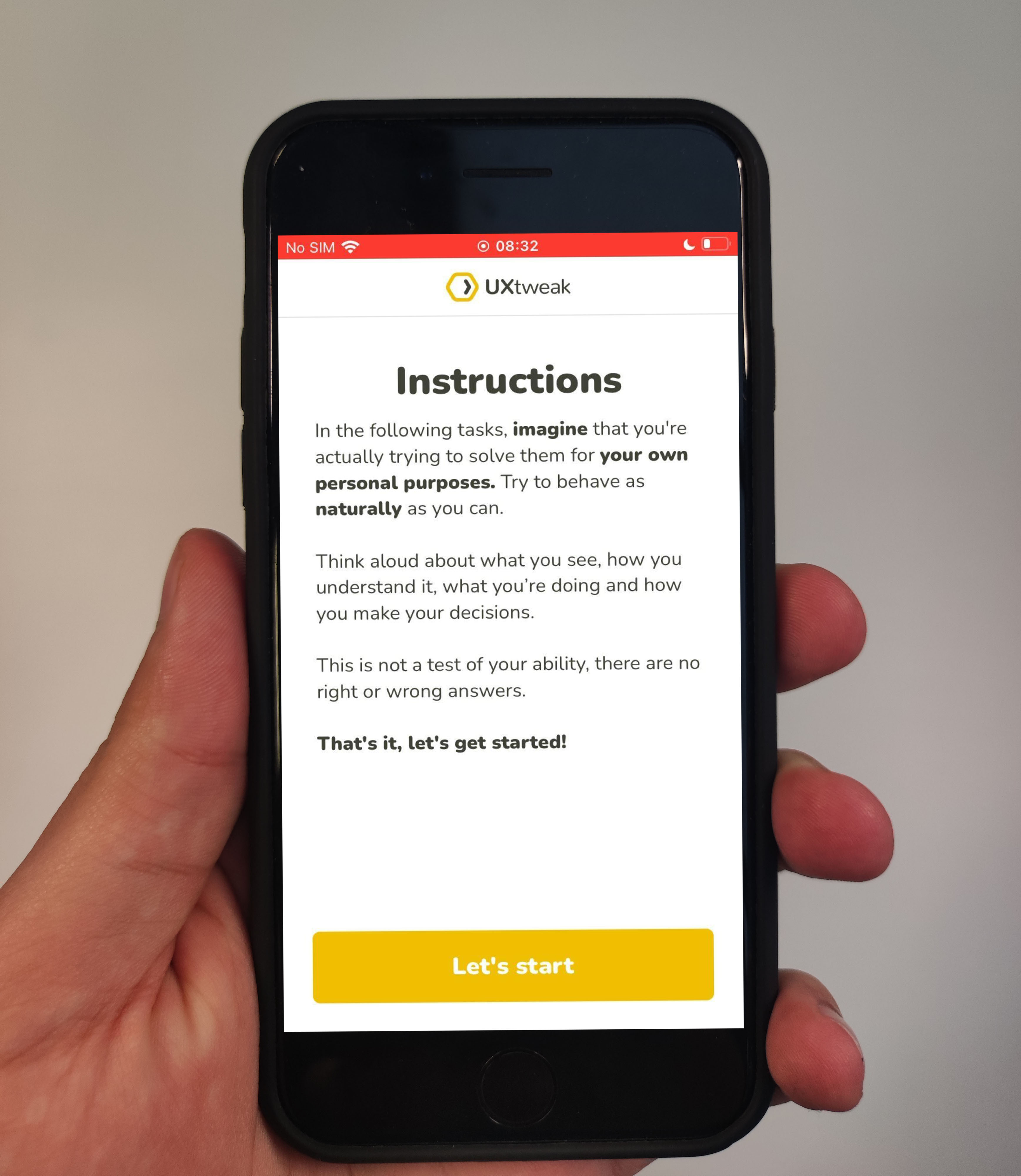
💡 Usability Testing
To test early or late stage revisions based on your usability heuristic evaluation, consider leveraging a usability testing tool to streamline gathering feedback from end-users. If your application is mobile-focused, leverage a mobile testing platform for more streamlined results.
As you continue to iterate, test revisions with users regularly to validate design decisions and increase user satisfaction.
See how usability testing works in these quick demos:

💡 Surveys and Questionnaires
If you’re unable to regularly capture feedback through testing with users, you can also gather user data by sending out surveys or questionnaires. They can be an effective measure for understanding opinions and attitudes of your application, and help your team make informed decisions about the best ways to move forward.
Check out our tips on the best survey tools to get started!

Additional ways to assess usability and cognitive load

In addition to usability heuristics, there are other valuable methods to assess the usability of your application.
These are two notable techniques:
🧠 Cognitive Walkthroughs
Cognitive walkthroughs are generally a workshop-based technique to evaluate the learnability of a system. They don’t involve actual users, and can be a quicker and less expensive way to perform a cognitive analysis within a team or organization.
Facilitators walk through the cognitive exercise with stakeholders relevant to the study, which could be product designers, engineers, subject matter experts, or domain experts.
They take on the roles of certain users and evaluate tasks. Findings and results can be communicated similarly to a usability heuristic study.
👀 Eye Tracking
Eye tracking studies measure and analyze the eye movements and patterns of users as they interact with a digital interface. These studies are specialized, but can provide additional insight into cognitive load by measuring visual attention, gaze behavior, and through data visualizations like heatmaps.
When combined with other performance metrics or other concurrent cognitive tasks, researchers can gather a more comprehensive perspective on a user’s cognitive load.
Conclusion
The core principles of the 10 usability heuristics have remained relatively the same since their inception.
As technology has changed through the medium of new mobile, touch, and responsive interfaces, additional areas of focus have incorporated usability heuristics to provide multi-platform support, accessibility, and congruency for systems.
As these heuristics are refined and adapted over time, they continue to become ever-more-powerful guides to designers and teams to who leverage them.
Complimenting your heuristic design revisions with usability testing using tools like UXtweak will continue to improve usability well into the future. Register for your UXtweak account and start evaluating the usability of your digital product today!