🔦 User insights explain the “why” behind behaviors, not just the raw data.
💡 Real insights must be non-obvious, explanatory, actionable, and user-driven.
🔍 Combining behavioral, attitudinal, and contextual insights gives a complete picture.
🍯 Good insights connect multiple data points into meaningful patterns.
📊 Well-written insights are clear, data-backed, and tied to business impact.
Ever looked at a pile of user research data and thought ‘Okay… now what?‘
Surveys, interviews, session recordings— you’ve got all this information, but it still feels like you’re circling around something without quite landing on what matters. What exactly makes an observation an insight?
How do you turn scattered feedback into something that helps teams make better decisions?
If you’re new to writing user insights, you’re not alone. The tricky part isn’t collecting data; it’s making sense of it.
This guide will show you how to connect the dots and write insights that move beyond what users say to reveal what they really need.
What are user insights?

User insights are the hidden truths that help businesses create better experiences, products, and services. They’re more than survey answers or heatmap clicks — they’re the why behind what users do.
It’s the difference between knowing that users are abandoning your website and understanding that they’re leaving because your checkout process feels untrustworthy.
One is just a fact. The other tells you what to fix. Broadly, user insights fall into two categories:
Quantitative Insights – These are measurable data points like conversion rates, bounce rates, or heatmap clicks.
They tell you what is happening—how many users drop off at checkout, how long they stay on a page, or which CTA gets the most clicks.
Qualitative Insights – These are the why behind the numbers. They come from sources like user interviews, open-ended survey responses, or session recordings, offering context to the trends in your data.
Truly actionable user insights come from blending both—using numbers to spot trends and human feedback to understand the emotions and behaviors behind them.
Things that user insights are NOT
An insight is a hidden truth that reveals the deeper reason behind user actions. It’s something that challenges assumptions, changes perspectives and leads to clear actions.
A real insight must be:
- Non-obvious – It requires more than surface-level data
- Explanatory – It tells you why users do what they do
- Actionable – It leads to clear, strategic decisions
- User-driven – It’s based on real behaviors, not guesses
An Insight Is… | An Insight Is NOT… | Example |
A deep, meaningful understanding of user behavior | A single data point | Not an Insight: "70% of users abandon the checkout page." (This is just a statistic.) |
The reason behind a behavior | A surface-level trend | Not an Insight: "Users spend more time on the pricing page than on other pages." |
Something that leads to change | A generic summary of user feedback | Not an Insight: "Users say they find the dashboard confusing." |
A perspective shift that uncovers an unmet need | A random statistic or fact | Not an Insight: "40% of users uninstall the app within a week." |
An insight connects the dots, explaining why users act a certain way and what can be done to improve their experience. If it doesn’t do that, it’s just data.
Types of user insights
User insights go beyond confirming what you expect — they reveal what truly matters to your users.
As Teresa Torres, Founder of Producttalk.org, puts it:
“When we do a lot of user research, it’s easy to feel confident… But if you do user research well, you will always find something that is surprising.”
Here are three types of insights that help you get there:
Behavioral insights – what users do
People say one thing and do another all the time. Behavioral insights focus on what users actually do, based on actions, patterns, and friction points in their journey.
This is where cold, hard data meets real-world decision-making. They come from actions like clicks, navigation patterns, drop-off points, and in-app interactions.
🛑 Why it’s crucial
Users don’t always know why they act the way they do. They might swear they love your app but still abandon it after a week. They might say your checkout process is “fine,” but data shows they keep dropping off before clicking “buy.”
Attitudinal insights – what users think and feel
If behavioral insights are about what people do, attitudinal insights are about what they say, feel, and believe (even if it’s not always accurate). These come from surveys, interviews, and direct user feedback.
💡Example: Users might say, “I love the idea of this app, but it feels overwhelming to use.” That tells you their perception doesn’t match their expectation.
🛑 Why it’s crucial
Humans are messy. They rewrite their own memories, misjudge their own behavior, and tell researchers what they think they should say. But attitudinal insights reveal expectations, emotions, and trust issues that data alone can’t capture.
Contextual insights – the ‘why’ behind behavior
This is the missing piece most teams overlook. Contextual insights focus on what’s happening around users when they interact with your product. This could include their device, location, distractions, or even their mindset while using a product.
💡Example: A fitness app sees low engagement at certain times of the day. Through contextual research, they find that many users access the app at the gym, where poor Wi-Fi makes streaming workout videos frustrating.
🛑 Why it’s crucial:
Users don’t engage with your product in a vacuum. Their behavior is shaped by their surroundings, their mental state, and external constraints you might not have considered.
Why you need all three
💭 Just behavioral insights? You’ll see the “what” but miss the “why.”
💭 Just attitudinal insights? You’ll design for what users think they want, not what they actually do.
💭 Just contextual insights? You’ll understand external influences but won’t know how they translate into actions.
The real power comes from combining all three. That’s when you stop making educated guesses and start making decisions rooted in deep, user-driven understanding.
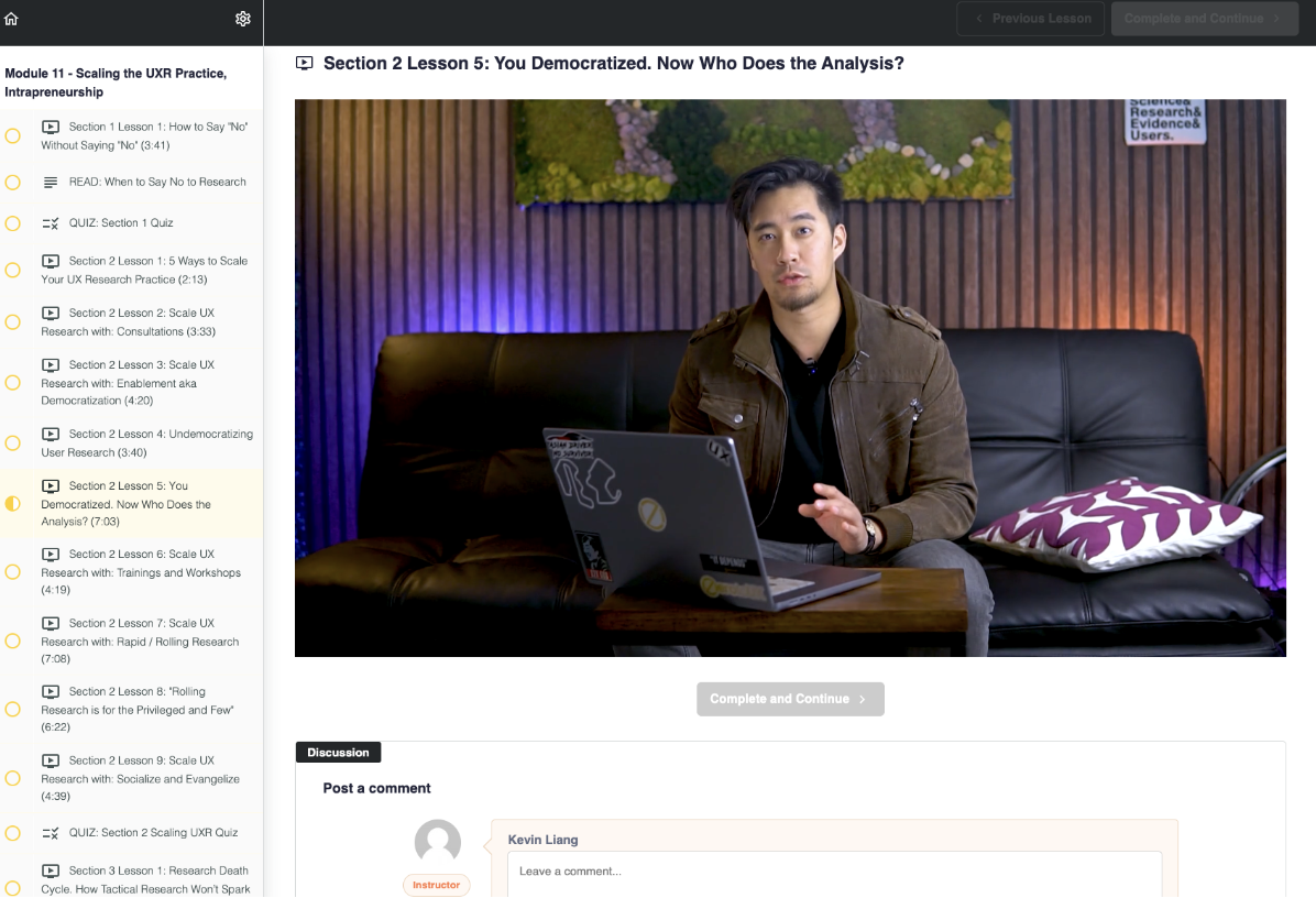
🌟 UX Research Course Recommendation
Learn how to craft user insights and boost your UX Research skills with Kevin Liang’s User Experience Research Self-Paced Masterclass! The course will give you in-depth lessons on:
🔍 Winning UX business strategies
💡 How to use AI to supplement your process
🧠 Human factor psychology
Methods we use to collect data for UX research insights

Great insights start with great data and that comes from listening to users in different ways. Here are some go-to methods for gathering the raw material that insights are built on:
User interviews
User interviews let you step into the user’s mind and hear their thoughts in their own words. These one-on-one conversations are perfect for digging into motivations, frustrations, and decision-making processes.
As Julie Zhou, Former VP of Product Design at Facebook, once said:
“To find ideas, find problems. To find problems, talk to people.”
“To find ideas, find problems. To find problems, talk to people.”
💡Example: Asking users why they stopped using a mobile app might reveal that it’s not the app itself but the constant notifications that feel overwhelming.
Moderated testing is one of the best ways to conduct user interviews. You get to guide users through tasks in real time, ask follow-up questions as they go, and watch their reactions up close.
It gives you both what users say and how they behave, all in one session.
When to use: Exploring why users behave a certain way or understanding emotional responses.
💡 Pro Tip
Want to get the most out of your user interviews? Check out this guide on How to Analyze User Interview Notes to turn raw conversations into actionable insights.
Usability tests
Usability testing shows you what users do and not just what they say. You give users a task (like signing up or making a purchase) and watch how they navigate through the product.
💡Example: You might notice that users repeatedly hover over a button without clicking — a clue that the button label isn’t clear enough.
Here’s why it matters: 88% of online users are unlikely to return to a site after a bad experience. That’s almost nine out of ten potential customers — gone.
One of the best ways to run usability tests is through website usability testing, where users interact with your site to see how easily they can complete key tasks.
Whether it’s testing navigation, checkout flows, or mobile responsiveness, these sessions help you catch issues before they drive users away.
Ready to see it in action? Try it yourself with UXtweak’s usability testing tools! 🔽

Another powerful option is prototype testing, where users try out early versions of your product before it’s fully built.
Use tools that let you test clickable prototypes and gather feedback on your product’s layout, flow, and functionality before you invest time in development.
When to use: Identifying friction points or testing how easy your product is to use.
Surveys
Surveys help you gather user feedback from a wider audience at once. They’re great for spotting patterns and getting a general sense of what users think.
💡Example: A post-purchase survey might reveal that most users find the delivery process too slow; a signal that expectations aren’t being met.
When to use: Collecting quantitative data or validating what you’ve learned from interviews and usability tests.
💡 Pro Tip
Learn more about how do I interpret the results of a Survey study.
Identifying user insights after research

Not every research finding is an insight. Findings tell you what’s happening. Insights tell you why it’s happening and what to do about it.
Think of it like this: if a UX team only looks at findings, they might slap on random fixes without addressing the real problem. Insights go deeper and explain user motivations, hidden frustrations, and the real barriers to action.
So, how do you separate real insights from surface-level findings? Let’s find out.
💡 Insights explain the ‘why,’ not just the ‘what’
A finding tells you what happened. An insight explains why it happened.
Example 1: Sign-up drop-off rates
- Finding: “30% of users abandon sign-up at the phone number verification step.”
(This is just data as it doesn’t explain why users are dropping off.)
- Insight: “Users perceive phone number verification as unnecessary or invasive. Many assume it’s for marketing calls rather than security.”
(Now, we understand why they abandon it and we can fix it.)
What this changes: Instead of just sending aggressive “Complete Your Sign-Up” reminders, the team can:
- Clarify why the phone number is needed (“Used for secure account recovery; never for spam”)
- Offer an alternative verification method, like email or social login
Example 2: Abandoned carts on an eCommerce site
- Finding: “45% of users add items to their cart but don’t complete checkout.”
(That’s data, not an insight.)
- Insight: “Users hesitate because they only see shipping costs at the last step. They feel tricked and leave instead of continuing.”
What this changes:
- Show estimated shipping costs earlier in the shopping journey
- Offer free shipping thresholds to encourage completion
If you only act on findings, you’ll end up making shallow guesses. If you act on insights, you’re solving the actual friction points.
🔦 Insights are actionable and lead to change
A real insight isn’t just interesting; it gives you a clear path forward. If you can’t do anything with it, it’s not an insight.
Example 1: Low engagement in a learning app
- Finding: “Users only complete 20% of online courses before dropping off.”
(Okay, but now what? This isn’t helpful on its own.)
- Insight: “Users feel overwhelmed by the course length. They start with enthusiasm but lose motivation when they see how many modules remain.”
Actionable Fix:
- Break lessons into smaller, bite-sized sections to create momentum
- Show progress bars to reinforce achievement
- Send motivational nudges based on user milestones
Example 2: Subscription box cancellations
- Finding: “60% of subscribers cancel within three months.”
- Insight: “Users enjoy the first box but feel the next ones aren’t personalized enough. They’re not seeing enough variety to justify continuing.”
Actionable fix:
- Introduce a quick personalization quiz for new users
- Rotate more dynamic product selections to keep things fresh
- Offer a ‘pause’ option instead of full cancellation to retain hesitant users
If you can’t take a specific, strategic action based on your research, you don’t have an insight yet.
🍯 Insights connect multiple data points into a bigger picture
A single data point is rarely an insight. Insights emerge when multiple pieces of evidence come together to tell a deeper story.
Example 1: Poor click-through rates on a SaaS landing page
- Finding 1: Heatmaps show users scroll but don’t click the CTA button
- Finding 2: Session recordings reveal users hesitate and reread the pricing section
- Finding 3: User surveys show confusion about what’s included in each plan
- Insight: Users aren’t clicking because they don’t feel confident in what they’re getting. The pricing page doesn’t clearly communicate value.
What this changes:
- Add side-by-side plan comparisons to reduce uncertainty
- Use social proof (e.g., “Most popular plan” badges) to nudge decision-making
- Simplify pricing copy to make benefits clearer
Example 2: Low retention in a meditation app
- Finding 1: Behavioral data shows users rarely complete full meditation sessions
- Finding 2: Reviews mention sessions feeling “too long” for daily use
- Finding 3: Contextual insights reveal most users listen before bed
- Insight: Users aren’t quitting because they dislike the app; they’re falling asleep before finishing and then forgetting to return the next day.
What this changes:
- Introduce “Sleep Mode” shorter sessions to fit bedtime routines
- Send gentle reminders the next day: “Fell asleep last night? Let’s continue where you left off”
- Gamify engagement with streaks or daily check-ins
Real insights don’t live in isolation. They combine qualitative and quantitative data to give a fuller picture of what’s happening and why.
🔍 How to tell if you have a real insight
When reviewing research, ask yourself:
✔ Does this explain why users behave this way?
✔ Does this lead to a specific, meaningful action?
✔ Does this connect multiple data points into a larger pattern?
If the answer is no, it’s just a finding and you need to dig deeper. If the answer is yes, congrats, you’ve uncovered something truly valuable.
How to write an insight

Not all insights are created equal. A well-crafted insight isn’t just an interesting observation; it’s a powerful tool that informs product decisions, improves user experience, and ties back to business goals.
Writing user insights might seem like an easy task. However, in reality, many professionals struggle with this process.
Users on Reddit have shared that understanding the context of people who use insights for decision-making is key to writing better ones.
So, how do you craft an insight that actually leads to change instead of gathering dust in a report?
Start with the core statement
Your insight should begin with a clear, concise statement that immediately explains the most critical takeaway. This should be punchy, specific, and revealing.
🚫 Weak Insight: “Users don’t like our onboarding process.”
📍Strong Insight: “New users drop out of onboarding because the required profile setup feels like a chore rather than an immediate benefit.”
Why this matters: The first sentence should not be a generic observation. It should make the reader immediately understand what’s wrong and why it’s a problem.
Provide context (how did we discover this?)
An insight without context is just an opinion. Back it up with supporting data, real user quotes, or behavioral patterns from research.
Example: Onboarding drop-off insight
🔹 Finding 1: 40% of users abandon the onboarding process before completing their profile.
🔹 Finding 2: Session recordings show users hovering over fields without filling them in, indicating hesitation.
🔹 Finding 3: User interviews reveal that many feel they’re being asked for too much information upfront, which feels unnecessary before they’ve experienced value.
How to write it:
“40% of users abandon onboarding at the profile setup step. Heatmaps show significant hesitation over the ‘Job Title’ and ‘Company Size’ fields. User interviews confirmed that new users don’t yet see the value in providing this information and feel it’s slowing them down from actually trying the product.”
💡 Why this matters: Context builds credibility and helps teams trust and act on the insight. Without it, it’s just an assumption.
Discuss the insight’s impact on UX (how does it hurt the user?)
Explain how this friction affects user experience: frustration, confusion, loss of trust, or a broken expectation.
Example: Onboarding drop-off insight
“For users, onboarding feels like unnecessary admin work rather than an entry point into the product. They want to explore and see value first before committing personal details. This creates a psychological barrier; leading them to exit instead of continuing.”
💡 Why this matters: The team needs to understand the human side of the problem, not just the data. Numbers alone don’t inspire action (empathy does).
Connect the insight to business metrics
If an insight doesn’t link back to a business goal, whether that’s activation, retention, revenue, or engagement, it won’t get prioritized. Show why fixing this issue is a business opportunity.
Example: Onboarding drop-off insight
“This onboarding drop-off isn’t just a UX issue; it directly impacts activation rates. Currently, only 60% of signups complete onboarding, meaning 40% never even experience the product.
This bottleneck is a major contributor to our low trial-to-paid conversion rate (which is currently at 12%). Fixing this could significantly increase activation and, in turn, paid conversions.”
💡 Why this matters: Product managers and stakeholders think in terms of business impact. Connect your insight to a metric they care about.
Provide actionable next steps (what do we do about it?)
Insights should always lead to specific, testable recommendations. A strong insight without action is just a fun fact.
Example: Onboarding drop-off insight – actionable fixes
🔹Make profile setup optional – Allow users to skip and explore the product first.
🔹Reduce friction in required fields – Auto-fill fields where possible or explain why the info is needed.
🔹Test an alternative onboarding flow – Instead of asking users to enter details upfront, prompt them after they’ve completed their first task in the app.
🔹Introduce a progress indicator – Show users they’re just a few clicks away from starting.
💡 Why this matters: No vague suggestions; just clear, testable next steps that can be acted on immediately.
💡 Pro Tip
Before writing an insight, use the 5 Whys Technique to dig deeper into the root cause of the issue.
Moreover, analyze the metrics your team is focused on as this helps ensure your insights are both meaningful and aligned with business priorities.
User insights example
Insight: “40% of users abandon onboarding at the profile setup step because they don’t yet see the value of providing personal details. They feel it’s a barrier rather than a step forward.”
📊 Context:
- 40% of new users drop off before completing onboarding
- Session recordings show users hesitating on form fields
- Interviews confirm that users don’t want to enter details before they’ve seen product value
🤕 UX impact:
- Users feel onboarding is admin-heavy instead of a guided experience
- They leave before experiencing the product’s core value
📈 Business impact:
- Activation rates are low (60%), directly affecting trial-to-paid conversions
- Fixing this could improve trial conversions from 12% to 18%
✔️ Actionable next steps:
- Make profile setup optional during onboarding
- Move personal details collection to a later step
- Add a “Why do we ask this?” tooltip for key fields
- Test a streamlined onboarding version with fewer required fields
Crafting a user insight
Let’s go step by step and craft a user insight that clearly explains the problem, its impact, and how to fix it.
Insight
“Users abandon their carts on mobile because the checkout process feels long and clunky. The lack of autofill, small input fields, and a surprise shipping fee at the last step make users feel frustrated and uncertain, leading them to leave before completing their purchase.”
Context (how did we discover this?)
- Finding 1: 68% of mobile users drop off at the checkout page, compared to 42% on desktop
- Finding 2: Heatmaps show high interaction with the back button and multiple re-clicks on form fields, indicating friction
- Finding 3: Session recordings reveal users repeatedly switching between tabs to re-enter payment details
- Finding 4: User interviews confirm frustration with manual data entry and the unexpected shipping fee
🔍 User quote: “I was ready to buy, but typing my address manually was annoying, and then suddenly, I saw a shipping fee I didn’t expect. It made me rethink the purchase.”
💡 Why this matters: This isn’t just a random drop-off, it’s happening because of a poor mobile experience and last-minute surprises.
UX impact (how does this affect users?)
- Users struggle with manual data entry on mobile, especially for fields like address and card details
- They get frustrated and distracted when switching apps to retrieve payment info
- The unexpected shipping cost breaks their trust, making them hesitate or abandon the purchase altogether
Business impact (why should the company care?)
- The mobile checkout drop-off rate is 26% higher than desktop, meaning thousands of potential sales are lost
- Reducing friction in the checkout process could increase mobile conversions by 15-20%, based on competitor benchmarks
- More seamless checkouts could also reduce customer support tickets related to payment issues
Actionable next steps (what do we do about it?)
- Enable autofill and one-tap payment options (Apple Pay, Google Pay) to speed up the process
- Use larger, mobile-friendly form fields that reduce typing errors and frustration
- Show estimated shipping costs earlier in the process, so users aren’t surprised
- Add a progress indicator (e.g., “Step 2 of 3”) to manage expectations and reduce anxiety
- A/B test a streamlined checkout flow that eliminates unnecessary steps
Final insight statement (pulling it all together)
“68% of mobile users abandon their cart at checkout due to friction points like manual data entry, small form fields, and surprise shipping fees. Heatmaps and session recordings show hesitation, back-button clicks, and form re-edits, while user interviews confirm frustration with typing and unexpected costs.
This directly impacts mobile conversion rates, which are 26% lower than desktop. By enabling autofill, improving form design, and displaying shipping costs earlier, we could significantly reduce drop-offs and increase completed purchases by 15-20%.”
🔥 Why this is a strong insight:
✔ It’s specific and backed by data – no vague assumptions.
✔ It explains the user’s frustration and hesitation, not just the symptom of drop-offs.
✔ It connects to a business problem (lost conversions & revenue).
✔ It ends with clear, testable recommendations.
Final checklist: is your insight strong enough?
If the answer is “no” to any of these, refine it. A great insight doesn’t just describe a problem; it drives change.
- Is it specific and explains why something is happening?
- Does it include supporting data, quotes, or patterns?
- Does it show the impact on UX (how it affects users)?
- Does it connect to a business metric (activation, retention, revenue)?
- Does it end with clear, actionable steps?
Tools for Collecting User Insights

Gathering user insights isn’t just about collecting data; it’s about understanding the story behind user behavior. But the process can get chaotic when you’re jumping between different tools for surveys, usability tests, and session recordings.
That’s why using all-in-one UX research platforms makes a huge difference.
UXtweak is one of the best options for this. It lets you run usability tests, surveys, card sorting studies, and session recordings—all from a single platform.
Instead of drowning in disconnected data, UXtweak helps you connect the dots between user actions and the reasons behind them. Talk to our team today! 🐝
Bonus: UX Research Insights Template
We know that writing great user insights takes practice, so we’ve prepared a user insights template to make the process easier.
The template will guide you through the key steps of writing insights: from structuring your observations to connecting them with business goals.
It also includes a checklist with the characteristics of good insights, so you can quickly double-check if your insights are clear, actionable, and rooted in data.
Whether you’re writing your first insight or trying to sharpen your skills, this template will help you turn raw findings into insights that actually drive decisions.
Download the User Insights Template and start writing insights that make an impact!
Wrapping Up
Writing user insights might sound simple—spot something interesting, jot it down, and move on. But if you want your insights to actually drive change, you need to dig deeper.
The best insights don’t just describe what users are doing; they reveal why they’re doing it and how that connects to your business goals.
With the right structure (and a little curiosity), you can turn scattered observations into insights that spark action.
Tools like UXtweak make that process even easier by helping you collect, connect, and make sense of user data- all in one place. Want to see how it works? Try it for free today!


💡Example: Let’s say you’re running an e-commerce site and notice that users frequently add items to their cart but rarely complete the purchase. That’s a behavioral insight as something in the checkout flow is stopping them.