That’s the Von Restorff effect in action—the tendency for our minds to remember what stands out. And you can spot this phenomenon almost everywhere you look.
Whether in marketing, product design, website interfaces, or entertainment, the Von Restorff effect plays a decisive role. Designers often benefit from this principle as they can compel users to take the desired action if they successfully grab their attention.
So, how can you apply the Von Restorff effect in UX design? In this article, we’ll guide you through everything you need to know to create designs that truly stand out.
What is the von Restorff Effect?
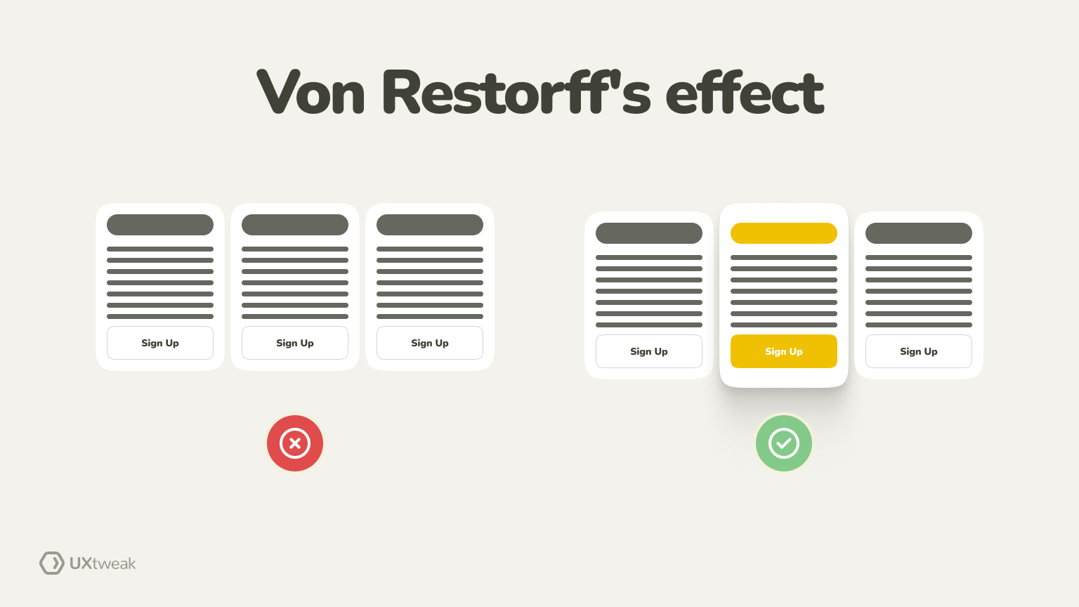
The Von Restorff effect, or the isolation effect, is a psychological principle and a UX law in which an item that stands out from its surroundings is more likely to be remembered than other items.
So, if you’re presented with a list of items and one item is in a different color or font, you’re more likely to remember that particular item than the others. This effect highlights the importance of distinctiveness in memory formation and recall.
Origins of the Von Restorff Effect
The Von Restoff effect was coined by German psychologist Hedwig Von Restorff in 1933.
In experiments, she presented participants with a list of items, one noticeably different from the rest. She observed that people remembered the distinctive items more than others, leading her to propose the principle known as the Von Restorff effect.
Von Restoff Effect Psychology
The psychology behind the Von Restorff effect lies in how our brains process and remember information. Seeing something unique or different from the rest of our surroundings triggers our attention and stands out in our memory. This heightened attention to the distinct item leads to better retention of that information.
From a cognitive perspective, our brains are wired to notice deviations from the norm. This innate tendency is a survival mechanism that helps us identify potentially important or dangerous environmental stimuli.
Understanding the Von Restorff effect can be valuable in the user experience (UX) design process. Designers can use this principle by making key elements visually distinct from other elements. This can guide users’ attention to critical areas of a website, application, or product and enhance user engagement.
Von Restorff Effect in UX
The Von Restorff effect findings are frequently used in UX design to improve user experience by strategically highlighting important elements within a digital interface.
Let’s look at some ways in which the Von Restorff principles are applied:
Call-to-action buttons
While browsing a website or app, notice how the Sign Up or Buy Now buttons pop out. Designers keep them more prominent in size, distinct in color, and placed appropriately to ensure users know what to do. That’s how you capture instant attention and guide users to take the desired action without confusion.
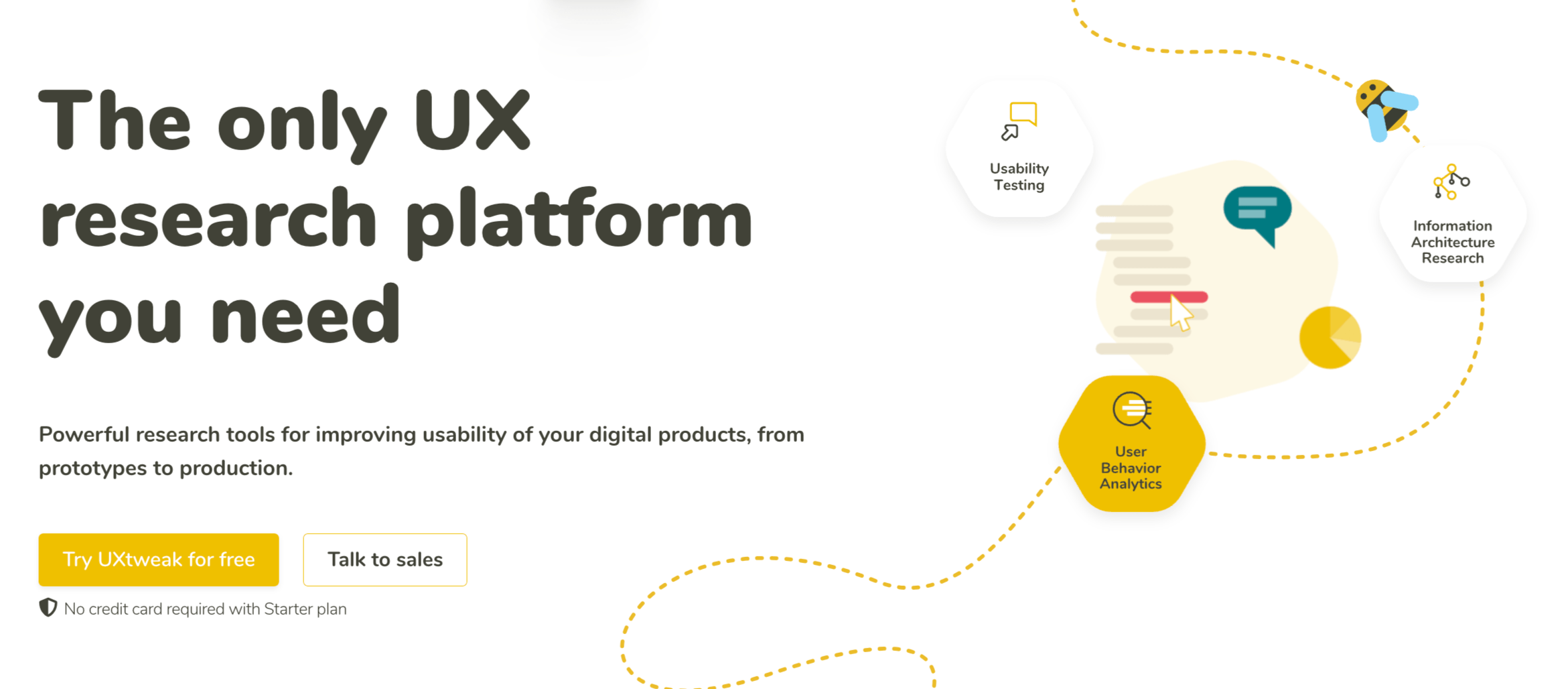
Take a look at the below CTA, for example. Notice how the yellow color stands out, and the moment users come across this!
Visual hierarchy
Visual hierarchy refers to the arrangement of elements in a way that guides the users’ attention and creates a flow. It involves using various visual cues such as size, color, contrast, and placement to convey the importance of different elements. Let’s break down the visual hierarchy of Hubspot, a software platform that connects your data, teams, and customers.
The moment you enter their Hubspot, their striking logo captures your attention. It’s followed by three of its most important sections: software, pricing, and resources. Notice how the logo has a bolder and different font than the rest of the page.

On the right side, you can see how to get a demo is in a distinct orange color as it’s the most important action Hubspot wants its users to take. Just next to it, you’ll see it’s inviting users for its free version. The moment you enter, it shows you exactly what you need to see to take action, neatly arranged in different sizes, colors, and fonts.
Moving further, we see headings, subheadings, CTA buttons, and images, each communicating the desired message to the customers.

Keep moving forward, and you’ll see how Hubspot neatly creates a visual hierarchy by playing around with colors, sizes, fonts, and images.
Reduce cognitive load
People nowadays want to put limited effort and pressure on their minds when finding something. The Von Restorff effect makes all the important elements stand out, thereby minimizing the mental effort required for users to process and understand the content.
For instance, when you enter Tira Beauty, its enticing offers are in focus. If you want to do budget-friendly shopping, these will likely capture your attention. You won’t have to think much; simply click to take advantage of the exciting offers.

Brand identity
Think about when you see a half-eaten apple—doesn’t it remind you of Apple? When you think about social media, that blue from Facebook pops into your head right away. The same goes for Google, with its bright, cheerful colors.
The point here is, that by using the Von Restorff Effect, we can pick colors, symbols, and stuff that make us stand out from the rest. It creates a brand identity in the minds of our customers, which makes them come back for more.
Error handling
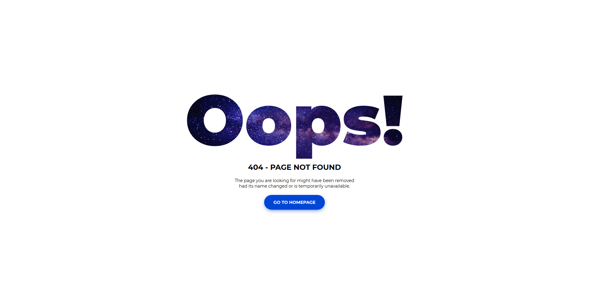
Imagine if the errors we encounter while using apps or websites were as small as the unsubscribe button in most email newsletters. They would irritate users and cause them to leave quickly. As a UX designer, you must make errors visually distinct from other interface elements. Users should quickly notice and take the necessary steps to resolve issues effectively.
Look at this error template that pops out and gives users the necessary direction to guide their next action. People already hate when they come across errors, so the least you can do is make it visually attractive to look at.
Form fields
Have you ever felt that urge to bail out while filling in those never-ending website forms? We’ve all been there. But if you want users actually to stick around and share their info, you’ve got to make those forms interesting. Apply the Von Restorff psychology trick – make your forms pop with a unique style or color scheme to grab attention amidst all the other stuff on the page.
Take Metropolis Moving, a moving company in NYC, for example. Their contact form isn’t your run-of-the-mill type. They jazz it up with a map route and location points. Now, that’s how you make filling out forms less of a chore!
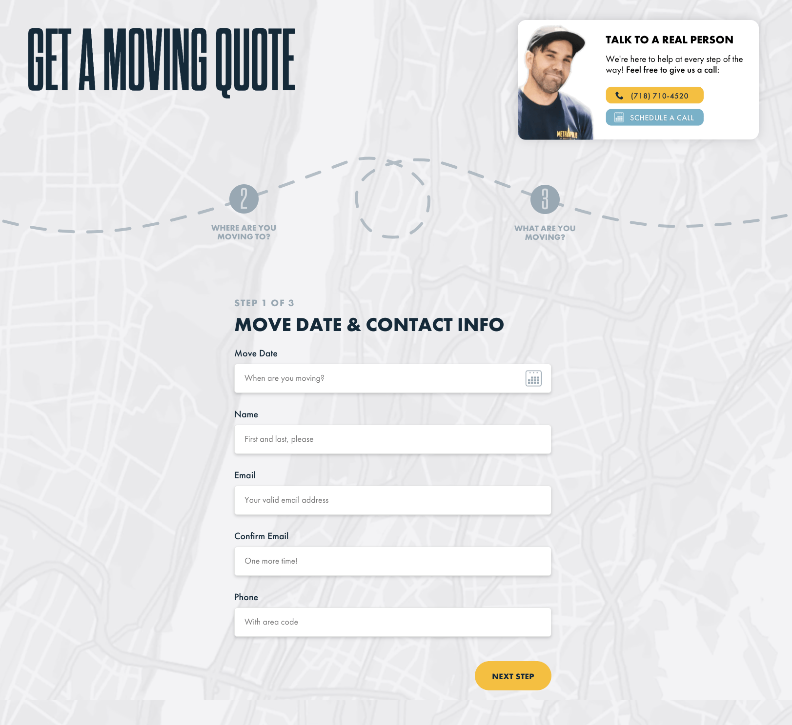
Check out the right corner – see that option to chat with an agent directly? It’s there to help folks out if they’re stuck or confused. They’ve used the Von Restorff effect again, making it stand out with bold colors and icons. So, it’s easy to spot and get the help you need, just like that!
Progress indicators
In tasks that have multiple steps, like booking a flight or signing up for a service, it’s important for users to know how far along they are. A progress indicator helps with that. Think of it as a road map showing where you’ve been and where you’re going.
For instance, when you book a flight online, you’ll see steps like picking dates, choosing seats, and paying. With a progress indicator using different symbols or animations for each step, it’s easy to see your progress. This makes you feel like you’re getting somewhere, which keeps you engaged and less likely to give up halfway through.
With the Von Restorff Effect in progress indicators, designers can smooth the user experience, keep people interested, and encourage them to finish what they started.
Von Restorff Effect Examples
Now that we know how this psychological principle is used in UX design, let’s take a look at some von restorff effect examples to see how brands put this into practice.
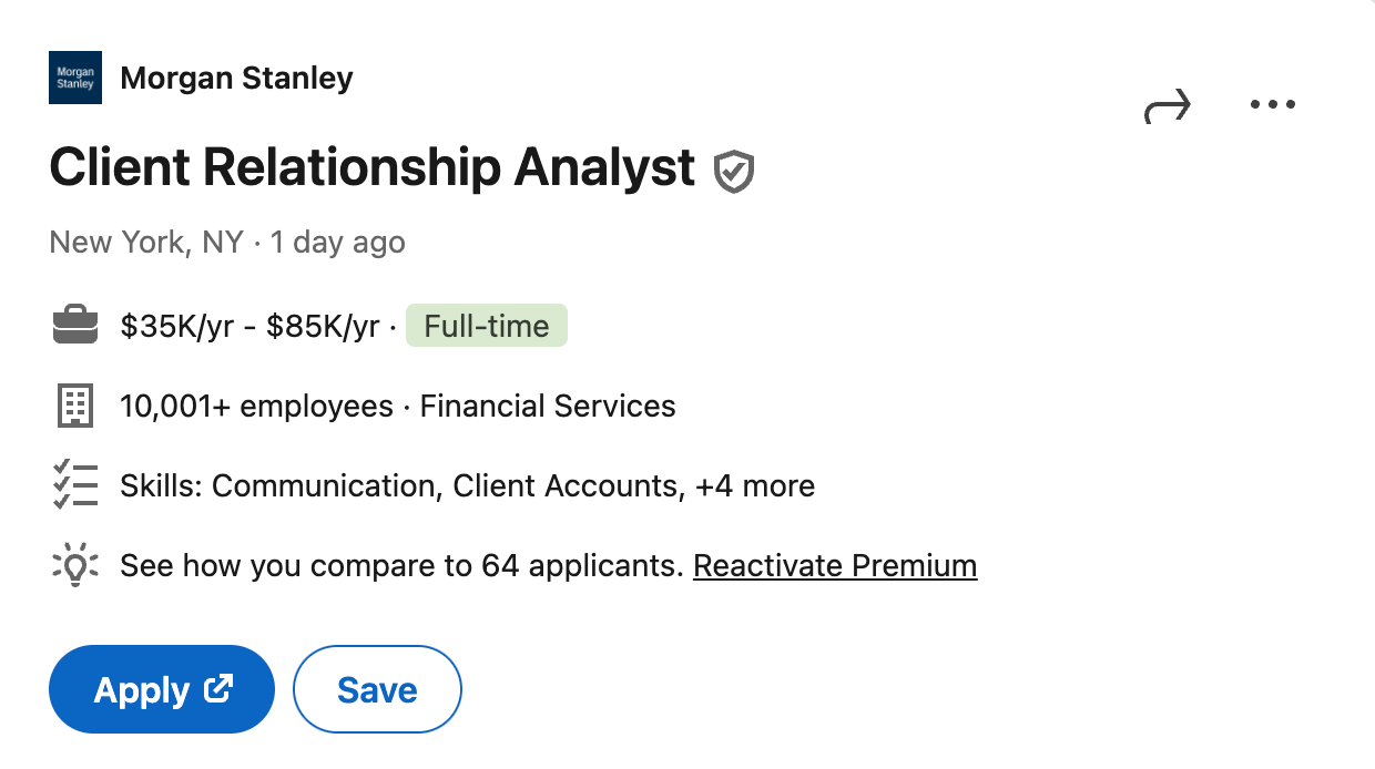
First in our list of Von Restorff effect examples is LinkedIn. It uses this effect in its job application process. When viewing job listings, the Apply button is often styled differently from other elements on the page. This makes it stand out and encourages users to take action, which increases engagement with job postings.
Youtube
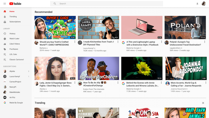
YouTube is a prime example of the Von Restorff Effect in action. As soon as you land on the site, you’re greeted by its iconic logo and various categories to explore. Even if you’re not sure what you want to watch, the options are laid out in a way that makes them stand out visually, drawing you in and making it easy to find something interesting to watch.
YouTube also supports YouTubers by making the subscribe button stand out, encouraging more people to subscribe to their channels. This helps creators build their audience and grow their following more effectively.
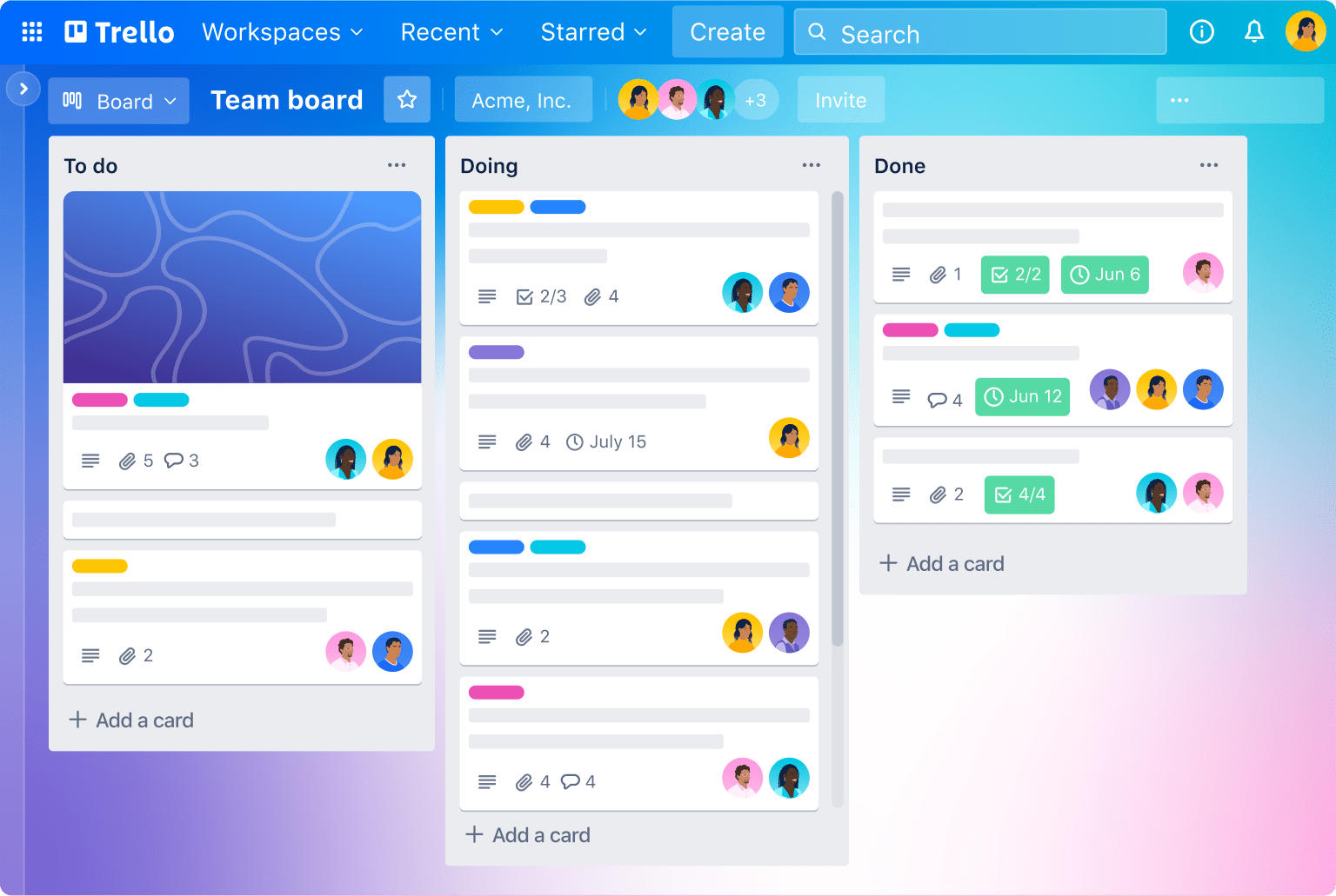
Trello
Take a look at how Trello, a project management tool, makes good use of the Von Restorff Effect. First off, it sets up a clear visual order with its logo, different categories, search bar, and other important icons. Then, it draws attention to key notifications, like showing the number of collaborators for users on the free plan, using a different color and font. Lastly, if you check out the board, you’ll notice how the “Add a Card” option really stands out from everything else in the workspace.
The key takeaway here is to always highlight important notifications for users to ensure they don’t miss out on anything.
Disney+Hotstar
When you visit the Disney+Hotstar platform, the first thing you notice is its iconic logo, which immediately grabs your attention. Right below it, there’s a bright yellow subscribe button that stands out and catches your eye.
As you explore further, you’ll notice how neatly the icons are arranged in the left corner. They make it easy for users to find what they’re looking for without feeling overwhelmed. The icons also highlight new releases and create categories to help users discover content based on their preferences, making the browsing experience smoother and more enjoyable.

Amazon
Have you ever stopped to admire the Amazon logo? It’s designed to signify that they offer everything from A to Z, covering all your needs. It’s hard to miss and instantly grabs your attention. Once you’re drawn in, you’ll notice how they categorize their products. Their hero banners are particularly eye-catching, showcasing tempting offers.
The Kitchen Favorites boldly displayed with vibrant background colors, practically invites you to explore further. And let’s not forget about the highlighted price point, another nudge to encourage action.

Wrapping up
Now you know the right ways of putting the Von Restorff effect in your next designs. However, just knowing this psychological phenomenon is not enough. For instance, if you create a design, you need to know that the elements that stand out are convincing enough to drive users toward the desired action.
You can easily do that using the preference testing tool, which allows you to ask participants which designs they prefer the most. When you communicate directly with the users, you create designs that will likely work. That’s just one of the many tools UXtweak provides to help you deliver an exceptional user experience.
Want to learn more about how UXtweak can help?
Create a free account or book a demo call; our team will help you get started!

