Deutsch
  English
  Español
  Français
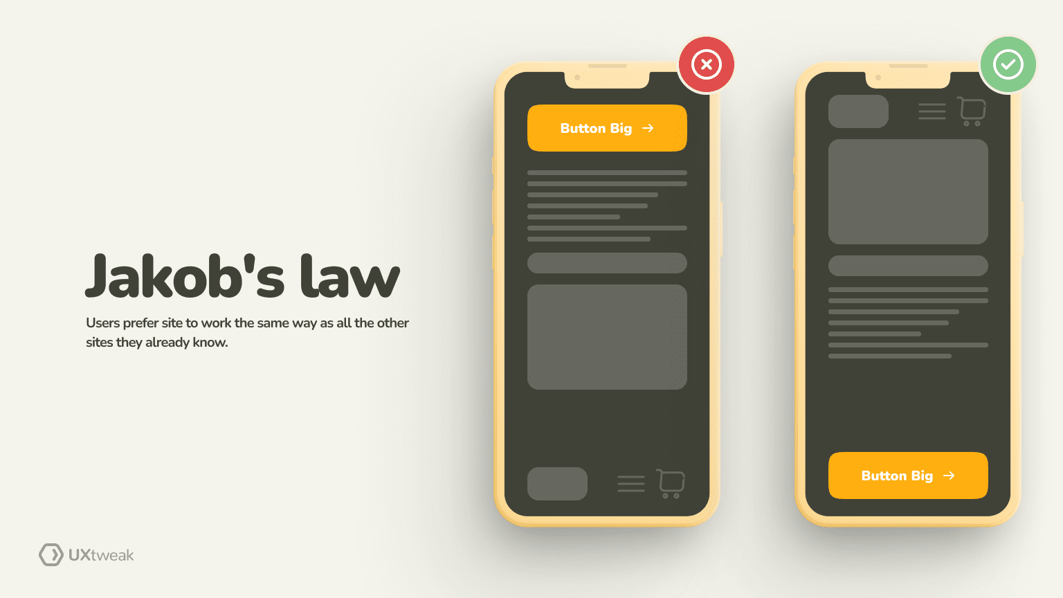
UX laws are web design rules that draw from psychological principles intending to create interfaces that are accessible and easy to use across the board. Jakob Nielsen has described the gist of Jakob’s Law in this quote:
People spend most of their time on other websites. This indicates that users would rather use your website in the same manner as every other website they are familiar with.


In a nutshell, Jakob’s law underlines the importance of familiarity within an interface arguing that users prefer interfaces that work in a similar way with interfaces that they are already familiar with.
When crafting designs by following Jabob’s Law, UX designers have a unique opportunity to enhance not only the usability of their product but also to foster trust among the users.
What is Jakob’s Law?
Jakob’s Law says that users spend most of their time on other websites so they would prefer it if your website was functioning in the same way as the websites, they are already familiar with. This is a principle that stresses the criticality of crafting interfaces with the aim of reducing the cognitive load of the users.
Origins of Jakob’s Law
Jakob’s Law took it’s name after a well-known usability expert who co-founded the Nielsen Norman Group. By engaging in rigorous research Jakob Nielsen understood the importance of familiarity when designing interfaces and proceeded to formulate Jakob’s Law to stress this necessity.
Why is Jakob’s Law important for UX?
You can kiss about 80% of your potential customer base goodbye if you violate Jakob’s Law.
Source: https://jakobnielsenphd.substack.com/p/jakobs-law
Jakob’s Law is one of the most critical laws for UX as it can bring a host of advantages for your users and digital products alike:
Reduced cognitive load
When users navigate websites that are familiar to them they can go through this navigation without having to put a lot of mental effort into this. The familiarity that Jakob’s law ‘secures’ for the websites makes navigation effortless for the users, reducing significantly their cognitive load. The reduction of the cognitive load makes overall the user experience to be perceived as more pleasurable and easeful.
Error prevention
When intercating with familiar interfaces, there is a tendency to make fewer mistakes. This occurs as users know more or less what to expect of the product, or where to find certain call-to-actions or information on a page. This leads to an overall smoother and more seamless interaction with the interface.
Higher task completion efficiency
When an interface is familiar to the users, users can complete tasks quickly and efficiently. Consequently, when crafting interfaces having in mind Jacob’s Law you are more prone to experience a higher task completion rate and overall better conversion rates.
Increased user trust
Last but certainly not least, following Jakob’s Law and designing interfaces that are already familiar to the user has one more very important consequence – it builds trust with the users. When seeing and experiencing familiar interfaces users are far more likely to trust the website leading to increased user engagement and loyalty.
How to Apply Jakob’s Law in UX Design?
If you want to apply Jakob’s Law in your designs but are not sure where to start from we’ve got you covered. Here are some useful tips:
1. Consistency is key
When applying Jakob’s law, consistency is key.
As the famous collection of Laws of UX states: “Consistency in design across different platforms (web, mobile, etc.) can improve user retention by 20-30%. Users appreciate interfaces that behave similarly, allowing them to transfer their knowledge and skills seamlessly between devices”.
Make sure that your design elements like your call-to-action buttons and menu labels to be consistent and to reinforce familiarity reducing the cognitive load of the users. On top of that, it is also critical that this consistency is applied to the patterns of interaction. This will help create a sense of predictability which will allow the users to rely on previous experience to navigate your website or mobile application.
2. Design having the users’ mental models in mind
Deeply understanding and empathizing with your users and their expectations is a huge part of applying Jakob’s Law.
Like with every other law of UX, the user is always at the center of the design process. When creating user interfaces make sure to conduct thorough research deploying methodologies like usability testing and take stock of what users expect from a site.
By deeply connecting with your users and understanding what the expectations are, you can design interfaces that align with the user’s mental models creating experiences that are more intuitive and thus more pleasurable for the user.
3. Focus on simplicity
Simplicity is another key aspect of Jakob’s Law. When designing your interfaces make sure you use simple navigation patterns and that you keep a clear information architecture. Keeping clear and straightforward navigation and prioritizing essential features like other well-known websites out there, can massively help you avoid complicated interaction patterns.
Building an intuitive and simple information architecture for your product is possible even when you have too much content items to sort. You just need to involve users in the process.
With tools like Card Sorting and Tree Testing you can let your users decide what the ideal structure looks like for them and test it to evaluate the intuitiveness!
Check out how these two methods work in our demos ⬇️


4. Adopt established interaction patterns
Another great tip when it comes to applying Jakob’s Law to your designs is adopting established interaction patterns. Using standard navigation layouts can enhance the familiarity of the user with eh interface.
On top of that, those established patterns have already proven to be effective so you do not need to reinvent the wheel every time you are designing a new interface.
Common practices like adding loading indicators to your forms or feedback mechanisms are expected by users and it helps to massively reduce the learning curve when interacting with a new system.
5. Use common feedback mechanisms
Feedback mechanisms are a chapter on their own so let’s focus on those for a minute. Providing users with timely and accurate feedback through familiar feedback mechanisms while they interact with your system can make or break the navigation.
Feedback can guide users through an interface and make them understand what the outcomes of their actions are enhancing the overall user experience.
For example, think about a form submission on a website. When a user fills out a form and clicks “Submit,” a common feedback mechanism is a message that appears to confirm the submission was successful, like “Thank you for your submission!” Additionally, if there were errors, such as missing required fields, users should see clear and immediate feedback like “Please fill out the required fields highlighted in red.”
Remember, that there’s no one right solution for all products. Even though you can implement Jacob’s Law in your design to make it more intuitive for the users, you still need to test your products with real users and understand their unique needs.
For that, there is UXtweak 🐝 – an all-in-one UX research platform that has everything you need to evaluate and improve your products’ UX!

When to apply Jakob’s Law?
If you are wondering when you need to apply Jakob’s Law then the answer is that this law should be applied every time you are designing user interfaces. Whether that is a website or a mobile application, Jakob’s Law should be taken into consideration.
When designing with this familiarity principle in mind the designers have a unique opportunity to craft user experiences that are familiar and feel intuitive, reducing a steep learning curve for new software as well as the cognitive load of its users.
👉 P.S. It is worth noting that applying Jakob’s Law does not mean that UX designers should not be thinking of out-of-the-box solutions or creating improvements on the interfaces that they are designing.
Jakob’s Law examples
Here are some handy Jakob’s law examples to get you started:
Navigation menus
A great first example of applying Jakob’s law is the navigation menus on websites and applications. By adhering to this familiarity principle, designers should consider using standardized placements and structures for their navigation menus.
An example of that would be placing the main menu at the top in the form of a bar with dropdown menus for the subcategories or at the left-hand side of the screen in the form of a hamburger menu. This way, users will know where to head to find crucial information about the product or service without having to spend too much energy on it.

An example of a common navigation menu structure – UXtweak
Search buttons
Search buttons are another design element that should be designed having Jakob’s Law in mind. The search button should be placed in a standardized location such as the right upper corner of the page.
This is because users are used to finding the search functions at this part of the page so this is where they will intuitively go based on their previous experiences with other websites.
Additionally, icons that are linked to searching such as the magnifying glass icon or the binocular icon can also be used to provide clear cues to the users. Finally, using suggested results for the search options can further enhance the user’s familiarity with the search button and offer a pleasurable and frustration-free experience.

An example of a search button placed according to Jacob’s Law – Hubspot Blog
CTA Buttons
Call-to-action buttons are another great example of how Jacob’s Law can be applied to digital interfaces. Buttons should be placed in familiar locations to encourage users to take a desirable action without causing friction.
For instance, users are accustomed to having a CTA button at the right-hand side at the end of a form.
Effective buttons are not only the ones that are placed in a prominent and familiar place but also those with clear labeling. This way, buttons act as cues that essentially guide the users through taking some key actions.
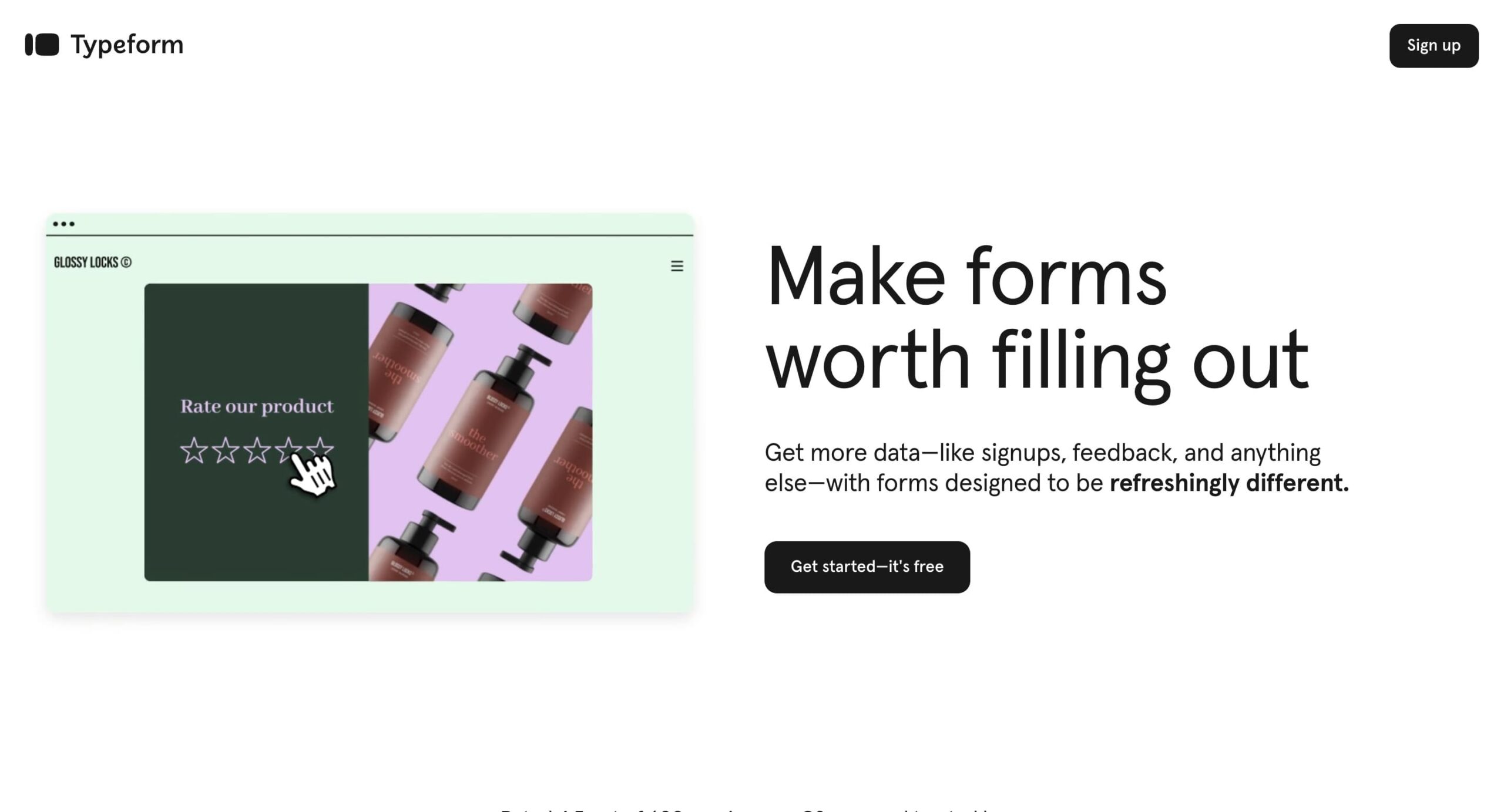
Example of how Typeform uses CTA buttons to guide users
Mobile app design
As previously mentioned, Jakob’s law does not apply only to websites. Mobile app designs should also adhere to this familiarity principle. For instance, designers should use standard navigation patterns for iOS and Android devices.
Following specific guidelines and patterns, like the navigation bar at the bottom of the page they can make it easier for their users to use a new application without a steep learning curve, making the mobile experience more joyful.

An exaple of how Uber uses standardized navigation patterns in their app.
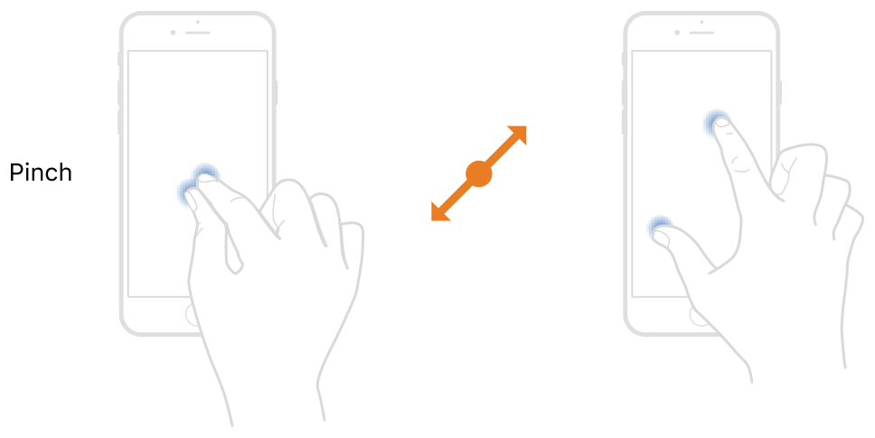
Pinch-to-zoom
The pinch-to-zoom element used in mobile interfaces is a great example of a familiarity principle that UX designers need to adhere to. This gesture which has applications almost everywhere in devices with a touch screen functionality is an element that users expect to find.
Consequently, UX designers should make sure to meet the expectations of their users and improve the overall usability of the interface.
Scrolling
Last but not least, the most used gesture of it all, scrolling is commonly used across interfaces and it is a very familiar interaction aspect. UX designers should implement it in relevant contexts to ensure that users stay engaged and that they have a seamless experience.
A very prominent example is the infinite scrolling on social media platforms which enhances content consumption!

In a nutshell
Jakob’s Law is a fundamental rule in UX that highlights the criticality of designing with the familiarity principle in mind. However, Jakob’s Law does not mean that UX designers will need to copy other designers or never think out-of-the-box solutions as there is always room for improvement in the UX field!
By using this law to their benefit, UX designers have a unique opportunity to leverage previous experiences that users have with digital interfaces and create designs that reduce cognitive load, favor task completion efficiency, prevent errors, and build trust.
If you’re looking to test your designs with users – take a look at UXtweak. Our all-in-one UX research platform is here to support you in every step of the way! Create a free account and try it yourself ⬇️