In UX design, final ideas are always represented by designers visually in a digital format. This visual format is used to communicate with stakeholders and team members in order to discuss ideas, get buy-in and approval on the final state of a design before it is pushed to prototype and test. This visual format is called a mockup.
Mockups typically answer lots of questions that may have been raised earlier in the design process. Let us define what a mockup is and how it differs from wireframes and prototypes.
What is a mockup?
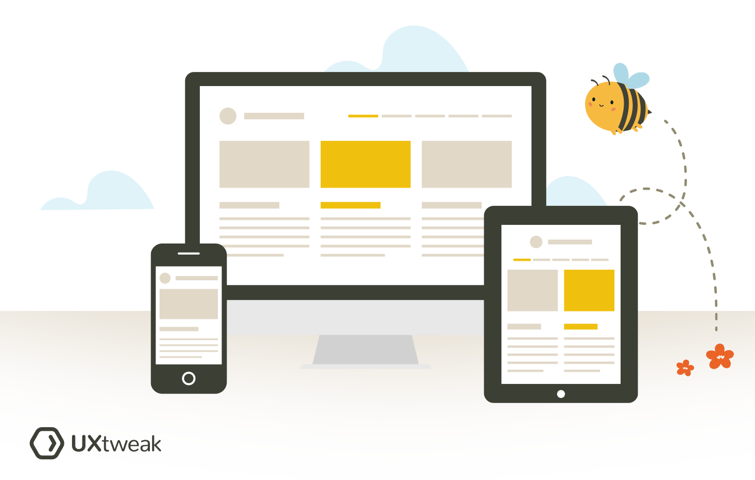
A mockup is a medium-fidelity design artifact that shows what the design of a product (website, mobile application) will look like in its final form. It is often static (non-clickable) and displays all core UI elements such as typography, iconography, color, imagery etc that are needed for interaction by the end users.
Mockups help to establish how users will interpret the product or service through its visual identity. This type of design serves as a middle step between a low-fidelity wireframe and a high-fidelity prototype.
What are mockups used for?
Here are some reasons why mockups are used in the UX design process:
- Improving time-to-market: Mockups provide the development team with a visual reference of the medium-fidelity design to open discussions on constraints (sizing, spacing, grids & layout, colors and typography), which helps move the product to the development phase and launch into the market faster.
- Gathering meaningful stakeholder feedback: Mockups reveal the product design in its final form which gives stakeholders an accurate representation of the product leaving no room for false assumptions. Having such a comprehensive product overview, stakeholders are able to give constructive feedback and share their opinions.
- Gathering realistic perspective: Mockups help the designer to visualize how the design will respond on web as well as mobile which can help to reveal problems that may be associated with color, typography, accessibility and layout etc.
- Enchancing flexibility: Mockups make it easier to make design changes. Building designs with reusable components and design systems allows for the flexibility of quickly making an edit in the design as opposed to making changes to product’s code after the launch. This allows you to improve your designs quickly and save tons of money.

A great representation of the differences between wireframes, mockups and prototypes by InVision.
Wireframes vs mockups: what is the difference?
A lot of early designers often mistake wireframes with mockups and are sometimes not entirely sure when to use which. We have gone ahead to explain what a wireframe is and its difference to mockups.
A wireframe is a low fidelity presentation of a user interface (website, mobile application) that provides a clear outline of the page structure, layout, information architecture, and overall direction of the product. Being low-fidelity means that they are relatively cheap to put together and provide only a rough overview of your interface’s information structure and functionality. Unlike mockups, wireframes do not focus on the visual design details, but rather on the structural elements and the overall layout of a web page.
Wireframes help to turn vague design ideas into tangible concepts, they are especially useful during the early stages of the design process. They are great tools that help designers focus on product ideation, strategy and problem solving rather than the finished product’s look.
The major difference between a wireframe and mockup is that wireframes are low fidelity design and are used to test and ideate while mockups are medium-fidelity designs that are used to visualize the final form of a product’s look.
Prototypes vs mockups: what is the difference?
It is also often very easy for mockups to be mistaken for prototypes as we have seen these terms used interchangeably even though they mean different things. Let’s take a look at how they are different.
A prototype is a super early model/representation of your solution which often depicts how a user will interact with a product. A prototype can either be low fidelity or high fidelity depending on the design need however the goal of UX prototyping is to test key features and user flows so that you can better understand your solution and how your target user will interact with it from the ground up.
The main difference between prototypes and mockups is that a prototype is clickable and it allows users to experience content and interact with the functionality on the interface. Prototypes are essentially used towards the final phase of the design process as it enables the designer to visualize the user journey on how the product may be utilized on a day to day basis. This is also key in spotting usability issues, edge cases and refining the user journey and flow for a more delightful user experience.
Mockups, on the other hand, are medium-fidelity designs. They are not clickable and interactive like prototypes are. Mockups focus on showing the design and look of a final product, primarily it’s visual elements.
Why are mockups so important in UX?

Mockups are very important in UX because they serve as an integral part of the design process where meaningful feedback is drawn from the visual reference of a product.
Primarily, mockups allow designers to visualize and test the UX of their design before it goes into development.
There are different tests that can be carried out on a mockup and they include:
- concept testing
- message testing
- pitting your mockup against the competition in competitive testing
- usability testing
The insights learned from either of these tests when carried out with UXtweak can help to greatly improve the strength and UX of your mockup. This can be useful for iteration and to see how users may experience your product’s design and content.
6 Best practices for creating UX mockups
To create effective mockups and assure they offer a great user experience, it’s essential to know and follow some of the best practices of doing so.
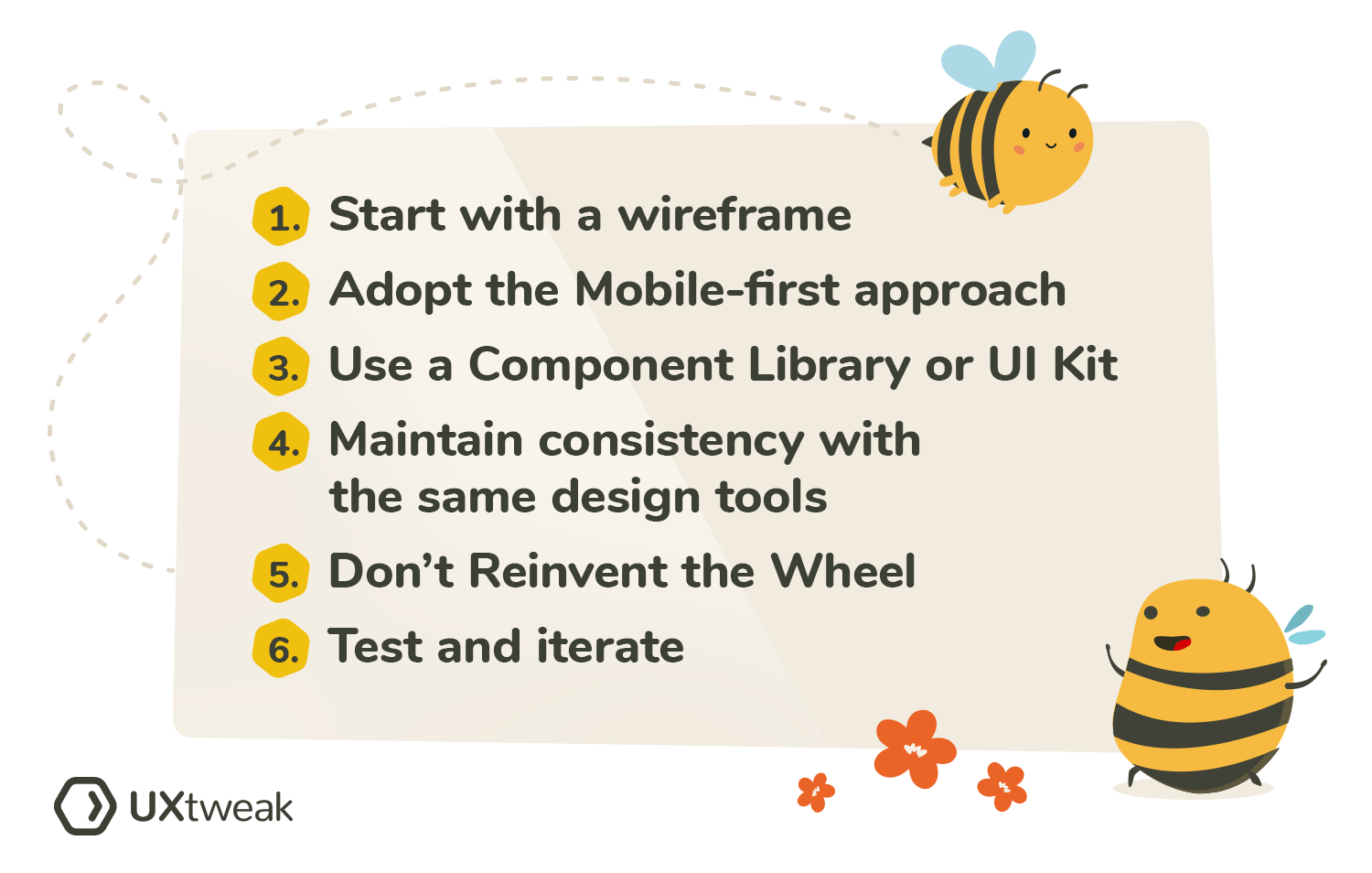
Here are 6 key points to keep in mind when creating a UX mockup:
1. Start with a wireframe
Wireframes are a great way to begin when starting out with designing your mockup. They allow you to quickly visualize the flows you intend to implement into your product. From navigation, to content and design elements, wireframes focus on the structural pieces and the overall layout of a website (page).
This helps to open up the design for ideation and to also act on feedback and insights learned from user research. Wireframes do not need to look fancy, they just need to be coherent and clear enough to pass across the structure and information about the product that will be later designed and built.
2. Adopt the mobile-first approach
In recent times, studies have shown that users navigate through websites more on their mobile devices. This has also seen a rise in the mobile-first design approach. Mobile-first design prioritizes navigation and information on a smaller screen which helps designers to visualize how a product may look on a mobile device. The mobile-first design approach helps to reduce friction when scaling your layout design up or down as it checks for inconsistencies.
To test how well your mockup looks on mobile devices try UXtweak Mobile Testing tool. With UXtweak you can test your mockups and prototypes for usability and iterate as you go!
Here’s a quick video overview of how Mobile Testing tool works:
3. Use a component library or UI kit
Reusable components and UI kits have proven helpful to cut back unnecessary time that may be used to focus on other design priorities when working on a product.
Instead of designing or building a UX mockup from scratch, use UI kit or reusable components from the figma community to help you move and work faster. After deciding on a layout that is effective for your users, customizing the components and design elements to suit and meet your product and design needs becomes very easy and also leads to a faster turnaround time. You can also present to stakeholders, get feedback and iterate on it while saving time.
4. Maintain consistency with the same design tools
Ensure that your design maintains consistency from the wireframes to mockups and high-fidelity prototypes with the same design tool.
Using a holistic end-to-end platform like Figma which enables you as a designer to create early wireframes up until mockups and prototypes saves you from design errors and inconsistencies in layout, typography size, colors etc. Therefore you will not need to switch between softwares and tools no matter the stage you are in the design process.
5. Don’t reinvent the wheel
There are definite Industry-standard UI and UX design patterns that have been established and also work for different industries. These design patterns go a long way to strengthen the user experience of any product by reducing the learning curve of your product to help users meet their needs and goals faster.
A typical example is the ecommerce industry; most ecommerce products leverage similar UI and UX patterns in order to appear recognizable to users and to reduce cognitive load needed to make a buying decision when they either need to add an item to a cart or check out. This leads to faster checkout results and a more familiar interface for users which enhances user experience.
6. Test and iterate
Our last tip, when it comes to designing an effective UX mockup is to test it with future users. Implementing this step into your UX design process will help to gather feedback and pinpoint usability issues when you still have time to fix them. We always recommend running several rounds of user tests on your designs. Here, you can start with testing the mockup and its screenshots before moving on to the high-fidelity prototype tests.
UXtweak Prototype Testing tool is always here to help you with that! You can test your designs by either sharing a link to your Figma mockup or making screenshots of it and uploading them to UXtweak. Either way, you’ll be able to gather users’ opinion on your creation and then analyze and iterate the designs.
4 Tools for creating UX mockups
There are several tools you can use when designing a UX mockup:
1. UXpin
UXpin is a design tool and software that allows UX designers to quickly build wireframes, mockups, and interactive prototypes. They also support readily available reusable components that you can leverage to design a mockup and developers can also build products with.
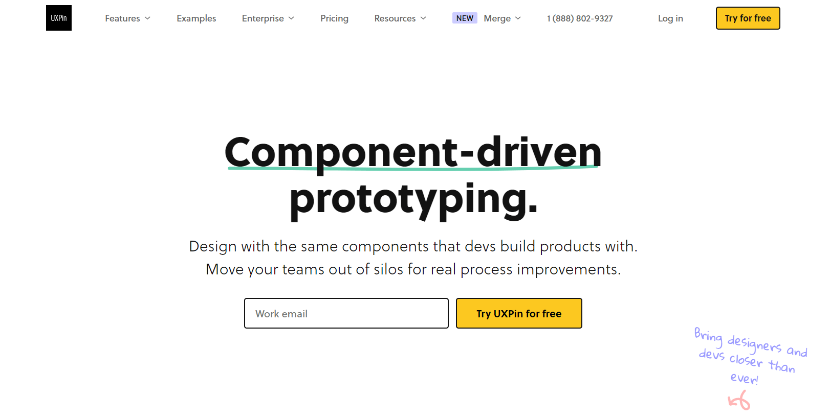
UXpin also allows you to import components from other design tools into a workspace in a way that enhances your workflow. It also facilitates collaboration and can improve your team’s product design process.
Pricing: UXpin is free for all small to mid sized teams. Their paid plans all include a free trial and start from $29 per editor/mo, when billed annually.
2. Balsamiq Mockup tool
Balsamiq mockup tool focuses on getting rid of bad interfaces by starting with low-fidelity wireframes which will lead up to an effective mockup. Used by UX designers, product managers, developers and business analysts, it is a web based tool that is compatible with any IOS or Windows OS software.
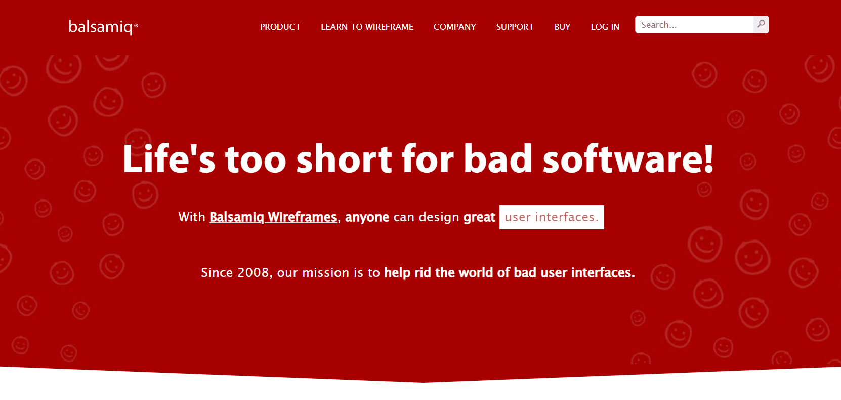
The tool offers online project share controls, real-time co-editing, chat, threaded comments with callouts, and project history perfect for collaboration among designers and product managers and more.
Pricing: Balsamiq offers a trial version of 30 days. Their paid solutions start from $9/month.
3. Mockflow
Mockflow is a design mockup software and tool that helps designers to plan better and sketch interface layouts in a shorter amount of time with little to no complexity. This tool offers different features for early wireframing and mockups such as the editor, preview, reusable components, etc.
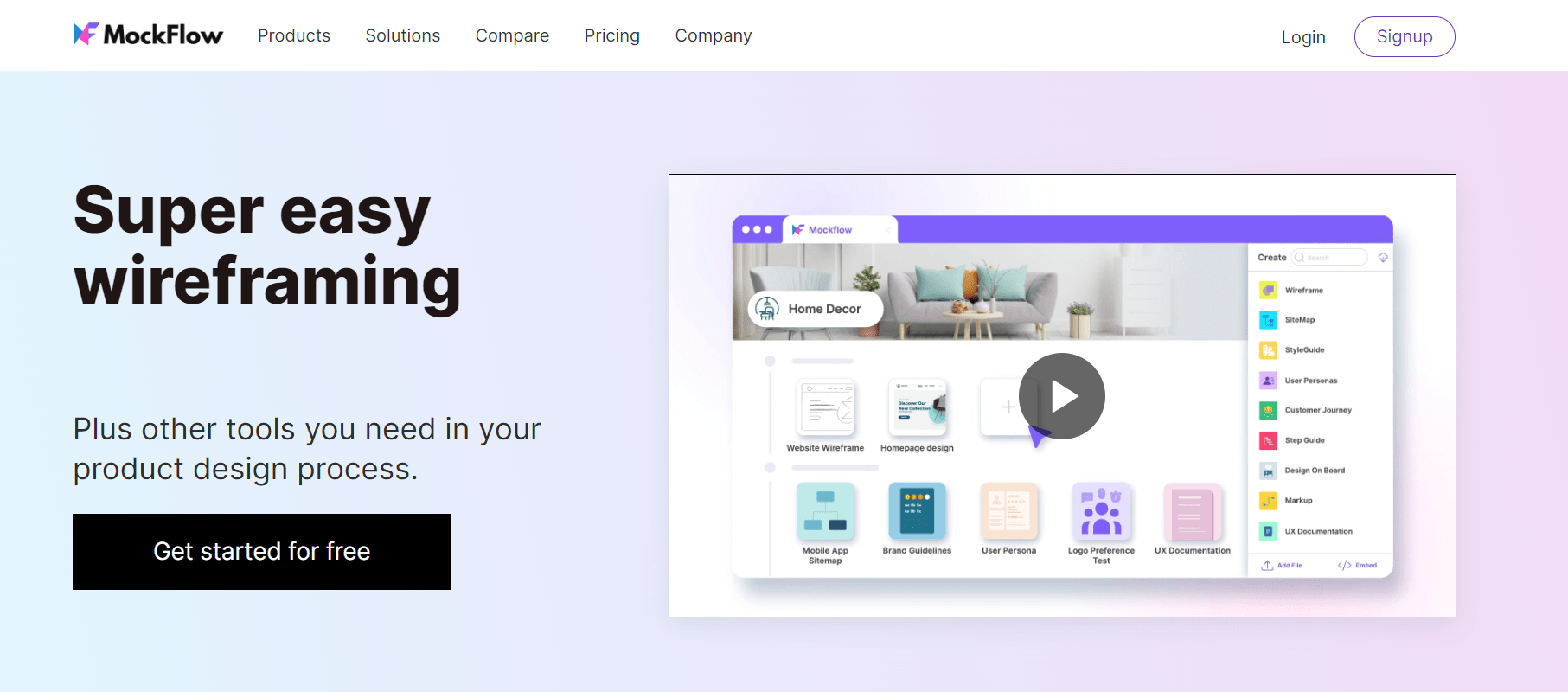
You can collaborate with team members in Mockflow when designing your products UI mockup as enabled by its cloud feature. Mockflow also enhances your workflow and collaboration with team members as it enables you to perform real-time editing, role-based permissions, add annotated comments, and manage workflow.
Pricing: Mockflow allows you to start your design for free and as you progress, you may need to pay for more features. Paid plans start at $14/month.
4. Figma
Figma is a web based cloud design platform great for sharing and collaborating among team members. It allows you to sketch wireframes, design UX mockups and prototype your design with ease. It has a wide array of visual design features that empowers you to create your best work.
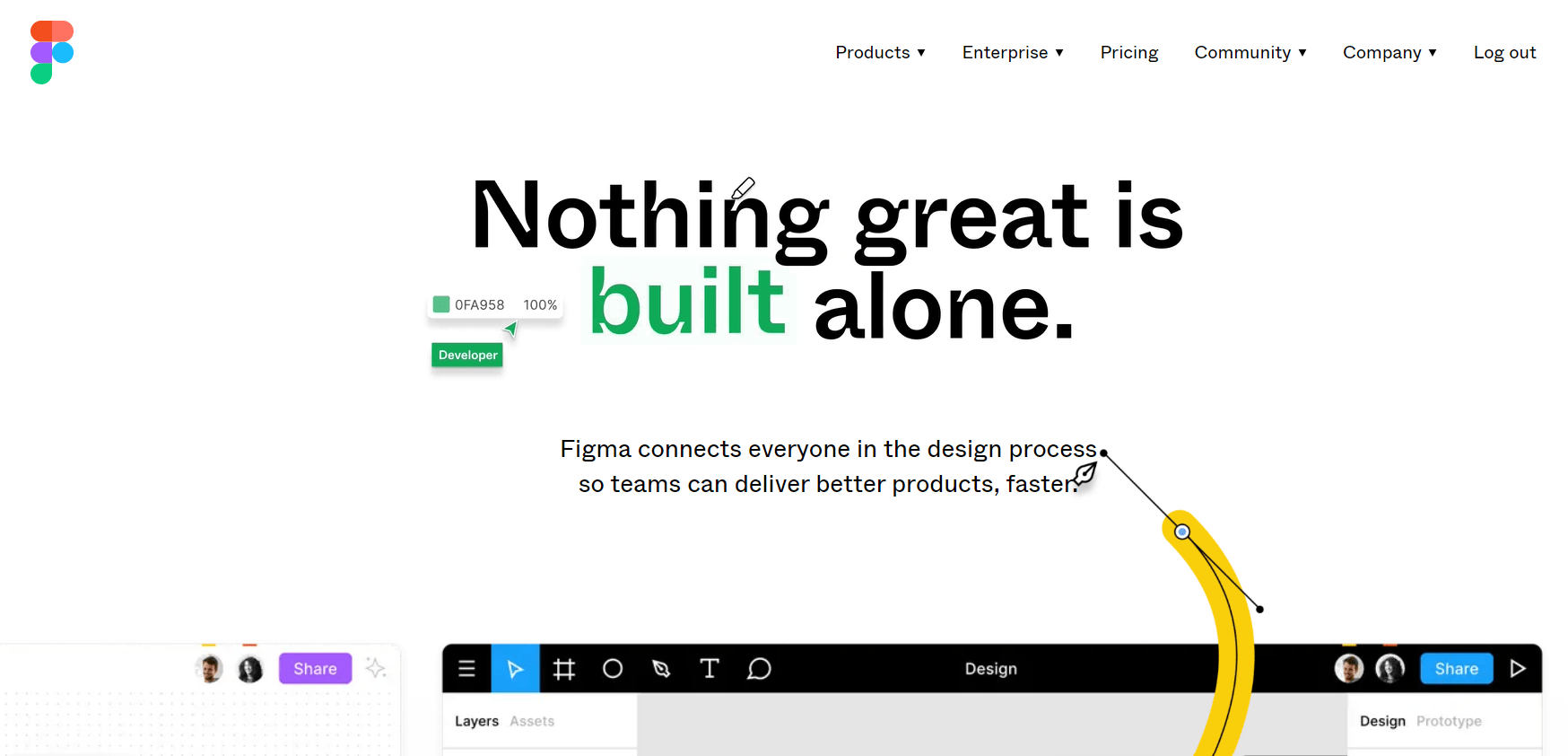
Figma has an expansive layout feature that enables designers to design a full product with functionalities and interactions within one project. Figma allows us to conduct brainstorming sessions and collaborate effectively within the team which enhances workflow and drives product improvement.
Pricing: Figma is free to use for individuals and businesses. You may need to pay to upgrade and access certain new features.
Tips for choosing the best UX mockup tool
With all these tools mentioned, it is easy to get confused on the right tools to use for your own project. Keep in mind these few key points when choosing the right mockup tool that will work for you:
- Fidelity – Your needs as a designer will inform you on the right mockup tool to use for any design project. Ranging from product requirements to design elements, make sure you use the right tool that fits the situation or scenario that you may be working in. This may depend on the deliverable as most times design artifacts may be needed in low, medium or high fidelity. In low fidelity, you can ideate and test early assumptions and ideas however, moving to medium-fidelity may see you focus on navigation, layout, structure and information content. As you progress into the final stages of the design process, high fidelity will reference the full visual design of what the actual product will look like prior to development. This stage houses all the important product features and design elements.
- Cost – There are different costs attached to each tool depending on the features and level of access needed by the designer. Focus on the basic and standard packages and versions of the tools as they almost always have all you need for budding an effective UX mockup that works.
- Flexibility – When faced with time constraints, you can leverage mockup tools that offer ready to use templates, component libraries and UI kits to save time and move fast as opposed to starting from scratch.
Improve user experience with effective UX mockups
As we can see, knowing how to create a good UX mockup is a valuable asset in a designer’s skillset. Mockups can be useful for testing and iterating your designs as well as gathering stakeholder and user feedback. Creating detailed mockups of the future product can help teams to identify and solve potential UX issues, long before the development starts, therefore, saving precious time and money.
If you’re thinking of creating your own product mockup, make sure to test it with users to spot any potential usability issues! Create a free account at UXtweak and start testing today!


