The spooky season’s on and in case the costumes don’t do it for you anymore, we prepared the 13 biggest UX fails to get you properly scared. Just make sure you have your tissues ready in case it makes you cry, because some of them haunt us in our everyday life and unfortunately, not only on Halloween. And we’re not an exception either, read till the end for a cherry on top. 🎃

Let’s begin with the all-time spookiest UX fails…
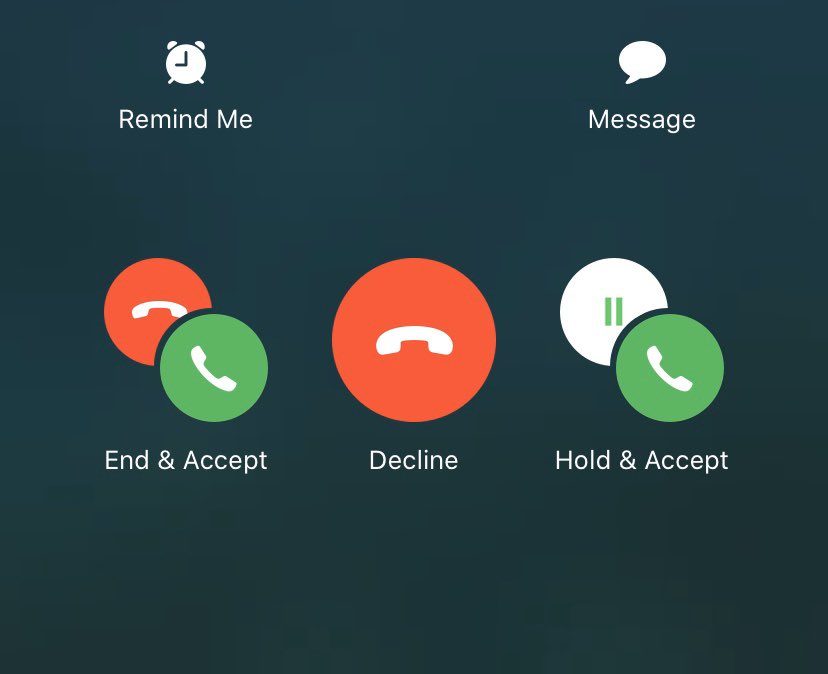
1. Apple’s “Accept call” buttons
They keep tricking us for some time now. Let’s be honest, who’s not scared of a brain freeze when this shows up on their screen?
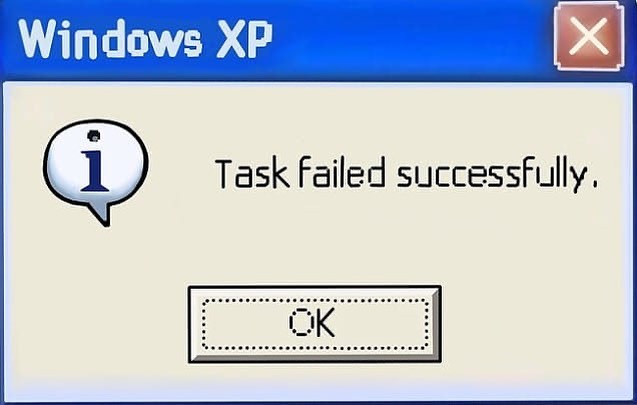
2. Windows’ passive-aggressive messaging
I love feeling the support from Windows to fail my tasks. Please, someone give them an Oscar for the best passive-aggressive messaging.
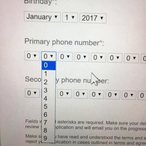
3. Ridiculous phone number entry forms
Just imagine trying to enter your mother’s phone number like this, when you just realized the toilet paper ran out… 💩

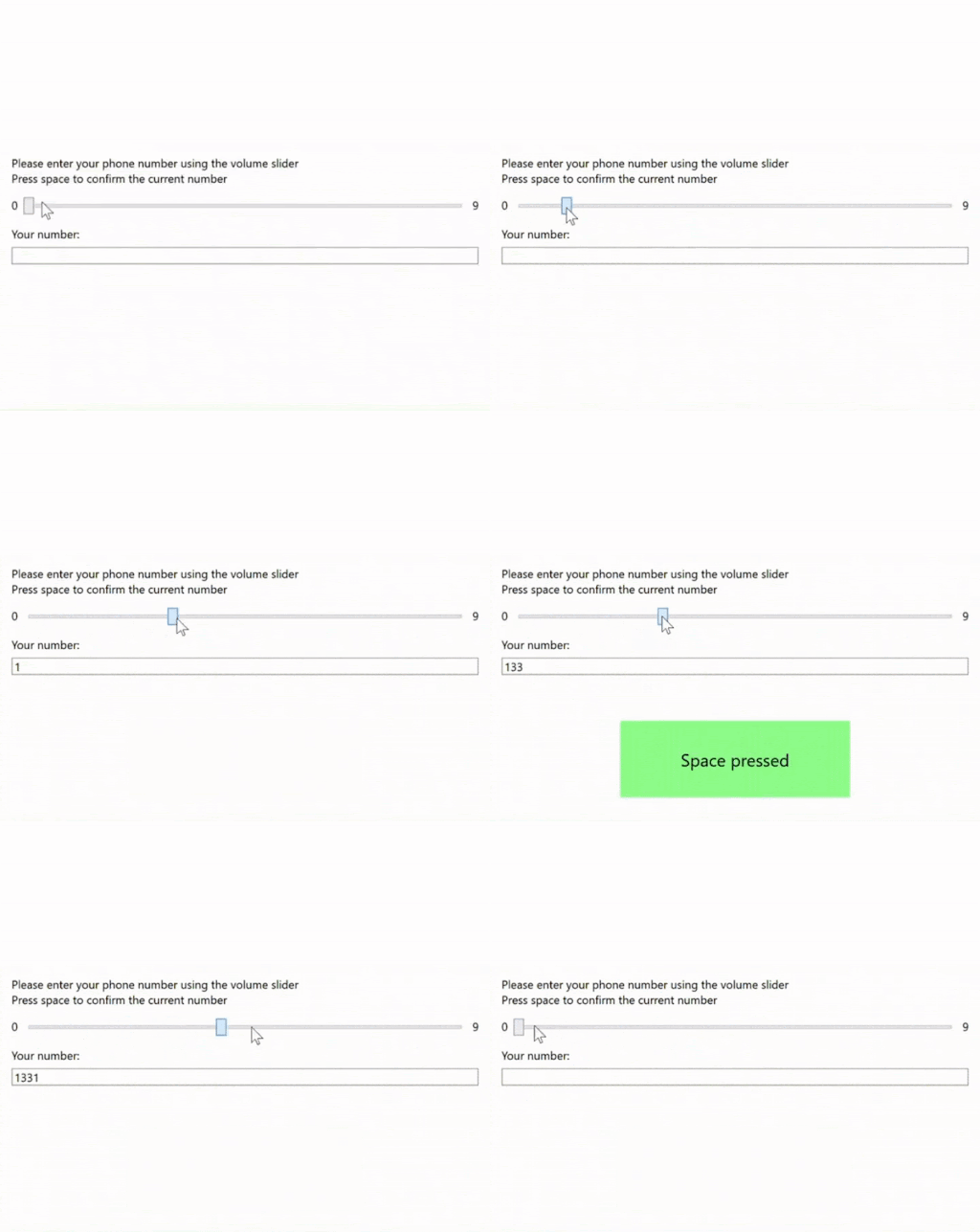
via @badbad_ux
4. Infinite dropdown menus
In case you have nothing better to do, try finding your street in this dropdown menu (and not having an outburst of anger meanwhile).
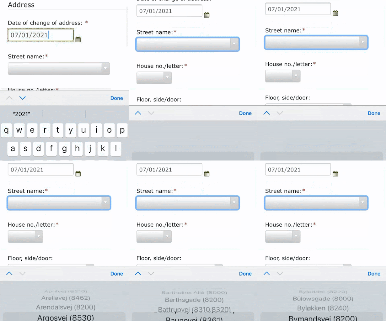
via @badbad_ux
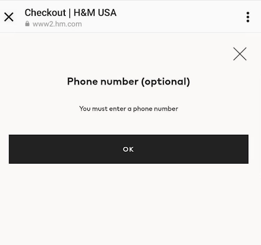
5. H&M sending mixed signals
Well H&M, how about you make up your mind first because that would be great, thanks.
6. Siri’s ultra helpful translation
Wow, thanks Siri. Not I know exactly how to write ACHTUNDSECHZIG! Verdammter Scheiß…

7. Another handy dropdown if you wish to go crazy
Entering your personal information has never been so easy! A handy dropdown, in case you forgot the numbers.
8. WhatsApp’s super useful ‘delete message’ feature
Delete a message and pretend like nothing ever happened? Would be too easy, don’t you think? WhatsApp says let them know!

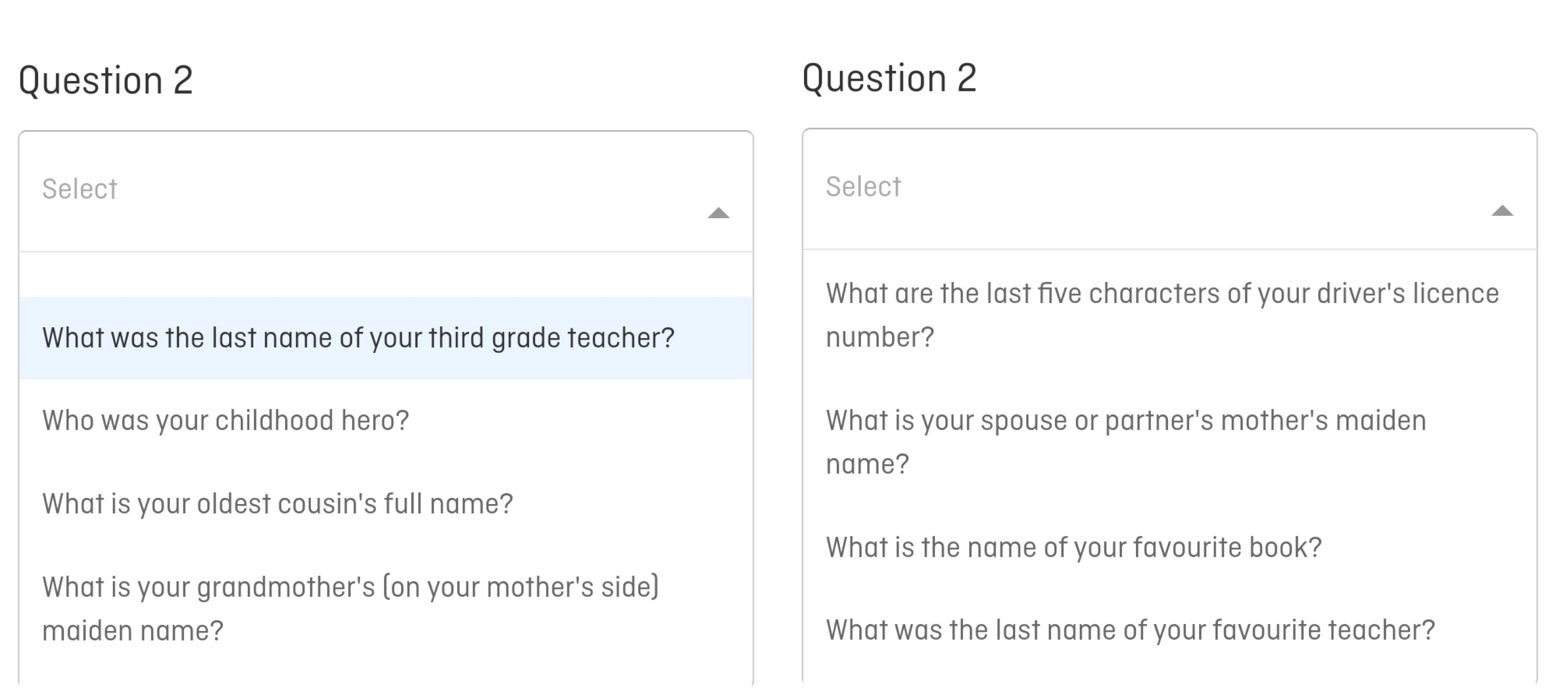
9. Security questions that no one would get through… not even you
If my life depended on these security questions, I suppose I’d be dead by now… I sometimes have a problem remembering how old I am, how the hell am I supposed to remember my partner’s mother’s maiden name???
via Nicole
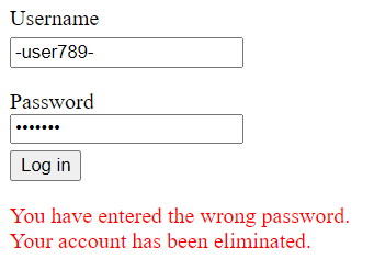
10. Well, sh**. Is this a Squid Game? I think I’m really getting scared now. 😰
11. Trying to get me to cancel cancelling my subscription? I’m lost already…
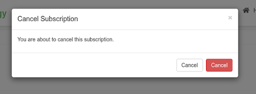
12. Sorry dear, this seems like entirely your problem.

13. And the promised cherry on top
We love making you press the ‘load more’ button endlessly after every 6 blogs. 🙂

What do you think was the worst UX fail?
Subscribe to one of UXtweak’s plans and go ahead your competitors using quality UX research tools. We’ll make sure your website doesn’t end up on the next UX Fails list😉
Happy Halloweeen!
Read other blogs from our Usability Testing section here.

