Key takeaways
🗺️ Wardley Maps are visual tools for showing user needs and technology evolution.
🧩 Mapping helps see the full UX picture and map out the user needs and business goals, all in one page.
📈 The Y-axis shows the visibility to the users, while the X-axis tracks each component’s evolution from the idea to commodity.
🤝 Wardley mapping improves cross-team alignment by giving everyone a shared view of what’s valuable and where effort should go.
🐝 UXtweak helps teams understand real user behavior and needs through surveys, interviews, and usability testing.
Do you ever feel like you’re designing in the dark and building features without knowing if they truly matter to the user? Not anymore. Wardley Mapping is changing the game now.
This technique helps businesses visualize how their products, services, or systems evolve over time. It maps user needs against different components and their maturity stages.
These maps help UX teams see the big picture and prioritize what users actually need, based on hard evidence.
So, are you ready to map your way to a better UX? Let’s dive in.
What is Wardley Mapping?

Wardley Mapping is a powerful visual representation that maps out business capabilities, user needs, and technological evolution in a single view.
It was created by Simon Wardley in 2005, born out of his frustration with repeatedly making costly strategic mistakes.
While serving as CEO of Fontango in 2005, Simon Wardley noticed a critical gap in how most organizations approached business strategy. He saw that the decisions were mostly made without any clear context, competition or user needs.
Anticipating the need, Simon Wardley turned to military history and The Art of War by Sun Tzu to shape his thinking.
He identified five key elements that every strategy should consider: purpose, the environment you’re in, patterns of change, guiding principles, and leadership. These became the foundation of his mapping approach.
Companies that use Wardley Mapping report better cross-team alignment, reduced duplication of work, clearer investment decisions, and a stronger grasp of where to compete or partner.
Some teams even use lean Wardley mapping tactics to start small and evolve as they grow.
The framework is deceptively simple, so much so that it’s often underestimated at first.
As Andrew Milford puts it,
It is so simple, I thought it was useless. But, for the first time, we have stopped looking at Excel rows and we have understood our situation. Thank you.
Wardley Mapping examples
Here are two value chain mapping examples to explain how Wardley maps can be used to improve your UX strategy:
Example 1: Improving a retail eCommerce checkout experience
Imagine a mixed-sized retailer is experiencing a drop during checkout. The UX team now needs clarity, whether it’s a design issue or there’s a missing feature.
The team then starts by mapping the user needs for a simple checkout. They identify key components, such as payment gateways, cart UX, fraud detection, and customer support, as activities that serve this need.
Activities like payment processing and fraud detection are marked as commodities, while cart design and guest checkout UX are marked as custom-built.
The mapping exercise highlights that the payment system, although essential, isn’t a unique value driver.
By creating clarity about where the problem originates, the retailer can outsource payment to Stripe, reallocating resources to ultimately improve the user experience and boost conversions.
Example 2: Cloud migration strategy for a SaaS company
A B2B SaaS provider is evaluating whether to move its on-premise infrastructure to the cloud. The leadership is uncertain about which components should be migrated and what should stay in-house.
To guide their decision, the team created a Wardley Map to identify the issue at its core. They map multiple components on the map, including user interface, data storage, authentication, monitoring, and infrastructure.
On the evolution axis:
- Authentication and data storage are in the product-to-commodity phase.
- Monitoring is still a custom in-house solution, but it’s taking engineering bandwidth.
Wardley mapping reveals that cloud-managed services can replace most back-end infrastructure and monitoring tools.
Only the UI and proprietary business logic remain as differentiators. This way, the company is able to save significantly in operational costs and also accelerate deployment cycles.
Main benefits of the Wardley Mapping method

The Wardley mapping framework can be used in many different situations because of its unique and powerful benefits and use cases. These core benefits include:
💡 Clarity on what the customer actually experiences
One of the most powerful outcomes of a Wardley Map is the ability to visualize what your customer interacts with directly or indirectly.
Wardley mapping reveals the entire chain of value delivery, from visible touchpoints like your website interface to invisible systems such as data security and infrastructure.
By mapping out these components, businesses can identify what most affects the user’s product experience.
It also highlights where friction points exist and whether those components are mature, evolving, or in need of innovation.
💡 Context-aware strategic planning
Wardley Maps expose how your internal systems and technologies improve over time. This lets you align your business strategy with the reality of technological evolution.
So, rather than guessing where to innovate or cut costs, you get a visual breakdown of what should be custom-built and what should be outsourced.
💡 Pro Tip
Always consider user needs and market maturity in your strategic planning—what’s valuable in one context may be obsolete or commoditized in another.
💡 Better cross-team communication and decision-making
A value chain map provides a common visual language for stakeholders across various departments, including engineering, UX, marketing, and others. It simplifies complex systems and aligns everyone around a single strategy.
This way, businesses can avoid misalignment, reduce internal friction, and stay focused on long-term value creation.
💡 Pro Tip
Regularly align teams around a shared strategic map to minimize friction and keep everyone focused on long-term value, not just short-term wins.
Wardley Mapping explained
If you want to use a Wardley Map, you must understand how it works and what each part of the map represents.
Let’s break down the key axes, stages of evolution, and how components are arranged on the map to form a complete picture of operational strategy.
Y-Axis: The value chain
The vertical axis of a Wardley Map represents visibility to the users, or how close a component is to the end user’s perception.
At the top of the axis are elements the user directly interacts with, such as the user interface or application front-end. These points are highly visible.
As you move downwards, the components become increasingly invisible to the user. For instance, databases, infrastructure, and back-end services. This perspective provides clarity around value creation.
X-Axis: Evolution of components
The horizontal axis shows the evolution of each component from left to right. It is divided into four key stages:
👉 Genesis: The origin of a new idea or innovation. It’s experimental, unproven, and typically unique.
👉 Custom-built: This indicates that the component is more defined, bespoke, and often tailored for specific use cases.
👉 Product/rental: The component becomes standardized and is offered as a product or service to others.
👉 Commodity/utility: It is now widely available at a low cost and often provided as a utility or infrastructure.
Each stage has different implications. In Genesis and Custom-built, components require more innovation and incur higher costs. In Commodity, price drops, but the stability increases.
📌 Example: in the SaaS cloud migration example mentioned earlier, authentication and data storage were found to be in the Product or Commodity phase. This made them ideal for outsourcing to cloud providers.
💡 Pro Tip
Wardley Mapping can also be used by individuals for personal knowledge management systems.
The user and product details
Every Wardley Map starts with the user at the top of the Y-axis. This is the person or entity whose needs you’re mapping.
You can define the user by using a user persona, based on real customer data. These personas represent your ideal user’s behavior, goals, and pain points.
If you’re unfamiliar with this process, watch the video below for a better explanation.
Once the user is defined, all mapped components should support that user’s desired outcomes. This clarity prevents teams from building features of tools that serve internal processes rather than real customer needs.
Components and dependencies
Each component in a Wardley map represents a capability, technology, or process required to meet the user’s need. These can be tangible, such as APIs or servers, or intangible, like brand trust or customer service.
To create these maps, we need to:
👉 Identify all components necessary to fulfill the user’s needs.
👉 Position each based on its visibility (Y-axis) and stage of evolution (X-axis).
👉 Draw lines between the components to show dependencies. Every line implies “this component depends on that one.”
As Simon Wardley said himself,
Maps help to understand ‘the components involved in creating something, understanding how evolved those components are’, learn about the economic patterns in the industry, and use this information for anticipation.
How to create a strategy map – Wardley Mapping

Now comes the part that you might be waiting for. Before going straight to creating a Wardley Map for your company, it’s worth practicing the technique. This ensures you understand its core principles and can use it effectively when it counts.
Here’s how you can create a value chain map, aka Wardley Map, for your business.
1. Define the user
Every map starts with the user who you’re mapping for. This should be a specific type of user, not “everyone” or “the market.”
📌 Example: instead of writing “retail professionals,” define your user as “a retail manager who needs real-time inventory updates.”
But how do you know what your user actually wants?
This is where you can use UXtweak to your advantage. The platform offers powerful tools like user interviews, surveys, and usability testing tools. 🍯
These help you understand customer needs, frustrations, expectations, and preferences, directly from real users.
🔽 Try it yourself with UXtweak’s usability testing tools!
The platform lets you run structured interviews or open-ended conversations with users. With it, you can easily collect user feedback with targeted surveys and track user actions with usability tests and session recordings.
So, instead of guessing what your users care about, you base your map on facts, patterns and user behavior. Ultimately, it’ll help you create a user persona based on those insights.
2. Define the components
Components are the building blocks that support the user’s goal. They include systems, services, processes, data, and interfaces. In short, these are the things you need to serve your users.
For this, you can brainstorm activities that directly or indirectly support the user’s needs. Answer the following questions while making a list:
👉 What does the user see?
👉 What needs to happen behind the scenes?
👉 What technologies or people are involved?
Note down the answers you get, such as the design, API gateway, customer service portal and so on. You don’t need to narrow anything down yet, just write everything that comes to your mind.
💡 Pro Tip
Transitioning from folders to tags can revolutionize your note organization.
3. Create the value chains
In this step, you’ll be refining your ideas. A value chain visualizes how each component contributes to overall user experience (UX) management and satisfaction.
It’s typically a top-down approach, starting with the user and branching out to dependencies.
Place the user at the top and list direct user-facing components below it. Now, continue down with the components that support the ones above and connect lines between them to show logical dependency.
Focus on clarity, not perfection. The idea is to understand what supports what.
📌 Example: Payment UI → Payment Gateway → Encryption Service → Server Hosting
4. Add the evolution axis
Move each component horizontally across four stages of evolution. This gives you strategic visibility: what should you build, buy, or outsource?
Head to each component one by one and ask yourself if this is unique to you, or if you could buy or outsource it. After that, plot the component where it truly belongs, based on data, not on emotions.
Just make sure the components are plotted according to the four stages of evolution we discussed above.
📌 Example: Hosting → Commodity, Fraud detection → Product, Recommendation engine → Custom-built, AI personalization → Genesis
5. Look out for inertia and blockers
Sometimes the map reveals components that should evolve but haven’t. That’s called inertia, and it’s a key strategic insight. Some common blockers include:
👉 Legacy systems that are hard to retire.
👉 Teams are emotionally attached to custom tools.
👉 Lack of knowledge about modern alternatives.
👉 Budget approval delays.
For this step, use a red marker (or tag) to flag these areas on your map. Then, ask teams why they are still doing this in-house when it can be outsourced. This way, you’ll be able to optimize your internal operations and increase your margins.
📌 Example: If you’re still using a self-hosted CI/CD pipeline when using CircleCI or GitHub Actions, thinking it would save 20+ hours/month, then that’s inertia.
6. Discuss and iterate
Your Wardley Map is almost complete. However, you can increase its value by sharing it with different teams and discussing the results you achieved.
Other teams will see different patterns, and that’s a good thing, as you’ll be able to see the same thing from another perspective as well.
Bring together product, engineering, design, and business teams and ask them the following questions:
👉 What components should we stop maintaining?
👉 Where should we innovate?
👉 Where should we cut costs?
Update the map according to the answers you receive to create a clean and finished Wardley Map. Remember, the best Wardley Maps are never “finished”; they evolve as your UX strategy matures.
Understanding gameplay and doctrine in Wardley Mapping

Understanding the strategic dimensions of gameplay and doctrine is essential for using Wardley maps to their full potential. These two concepts influence how businesses act, evolve, and gain a competitive advantage through mapping.
Gameplay in Wardley Mapping
Gameplay refers to the set of strategic moves an organization can make once the landscape is clearly understood through a Wardley Map. After mapping the value chain, businesses can start making decisions in their favor.
These moves are based on known patterns observed across industries, often referred to as “strategic plays.” It helps you respond to your environment and change it according to how it would benefit you.
Doctrine in Wardley Mapping
Doctrine is used for universal principles or best practices that improve the way an organization operates, regardless of its industry or context.
Unlike gameplay, doctrine is context-independent; it’s about doing things right before doing the right things.
Simon Wardley outlined several layers of doctrine, including communication, situational awareness, and a bias for action, among others.
Wardley mapping is like your internal playbook that helps you create a strong foundation, so your strategic gameplay is more effective.
💡 Pro Tip
Focus on mastering doctrine first—solid principles like clear communication and situational awareness build the foundation for effective strategic moves later.
The best Wardley Mapping canvas
To make the process easier for you, here’s the best Wardley Mapping template and canvas that you can use to understand your users’ needs.
With this setup, you can clearly see how your product or system components interact, depend on each other, and evolve over time.
Four best Wardley Mapping tools
Even though you can draw these by hand, it’s best to use Wardley mapping tools to polish what you’ve come up with. Below are four top tools you can use, with each offering unique value.
1. UXtweak
UXtweak is a UX research platform that’s especially valuable at the beginning stages of Wardley Mapping. It helps you uncover what to include in your user persona and provides insights through its interview feature to identify pain points, expectations, and the components in your map that truly matter to the user.
With tools like session recording, you can replay real user journeys. Moreover, card sorting and tree testing show how users organize and find content.
UXtweak also provides surveys feature, five-second tests, and first-click tests that reveal what catches users’ attention and what gets ignored.
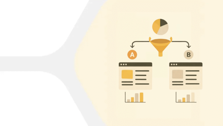
🔽 Try UXtweak’s A/B Testing and Session Recording tools yourself!
Key features
- Website testing – reveals how users interact with your site, helping you identify pain points, broken flows, or confusing layouts.
- A robust customizable Survey tool – lets you gather targeted, direct feedback from different customer segments, with flexibility to match your brand and goals.
- Session recording – capture real user behavior on your site or app, so you can spot drop-offs, rage clicks, and usability issues in context.
- Prototype testing – allows you to test early versions of a product before launch, helping you validate assumptions and adjust based on real user reactions.
- Mobile testing – ensures your mobile experience works across devices and OS versions, which is key as more traffic shifts to mobile.
- Moderated testing – involves real-time observation and follow-up questions, giving you deeper understanding of customer motivations and thought processes.
Pricing & Plans
- Starter Plan: Free, includes 1 active study and 15 responses per month.
- Basic Plan: €113/month, with 3 active studies and 50 responses per month.
- Custom Plan: Unlimited responses and custom support, with pricing based on requirements.
Plans are billed annually, with monthly options available. Visit the UXtweak pricing page for details.
2. Miro
Miro is a powerful visual collaboration platform with built-in templates and infinite canvas space. It’s perfect for drawing Wardley maps with your team in real-time.
Additionally, it provides visual freedom with sticky notes, arrows, shapes, and pre-made Wardley map templates. All in all, it is ideal for remote teams.
Key Features
- Drag-and-drop mapping components.
- Template library including strategy canvases.
- Real-time collaboration & commenting.
- Zoomable infinite whiteboard.
- Integration with Jira, Slack, and more.
Pricing & Plans
- Free Plan: Includes a single workspace with 3 editable boards.
- Starter Plan: €8/month, offers unlimited boards in a single workspace.
- Business Plan: €16/month, including unlimited boards in multiple private workspaces, customized for each team or client
- Enterprise Plan: custom pricing
3. OnlineWardleyMaps
This tool was designed specifically for creating Wardley Maps. It has a focused environment that allows you to define components through visibility, evolution directly on a grid that mirrors Simon Wardley’s original layout.
With OnlineWardleyMaps, you don’t need to build anything from scratch; just add the components, and it’ll do the rest for you.
Key Features
- Built-in evolution stages and grid.
- Ability to save and share maps.
- Support for component dependencies.
- Keyboard shortcuts for quick editing.
- Markdown-style syntax for fast component definition.
Pricing & Plans
- The tool is absolutely free.
4. Figma – Flexible design and diagramming
Figma is widely known for UI/UX design, but its flexibility makes it excellent for building structured Wardley Maps. It’s especially helpful if you want to design maps that are both strategic and polished in appearance.
With customizable grids, shape tools, and reusable components, Figma lets you design and share maps that are both functional and presentation-ready.
Key Features
- Real-time collaboration and comments.
- Customizable canvas with layering.
- Component-based design for reuse.
- Vector-based graphics for clean export.
- Plugins for flowcharts and mapping.
Pricing & Plans
- Free Plan: Includes unlimited drafts, UI kits and templates.
- Professional Plan: from €3/month, offers team-wide design libraries.
- Organization Plan: from €5/month, supports unlimited teams.
- Enterprise Plan: from €5/month, includes everything from custom team workspaces to design system theming and APIs and SCIM seat management.
Learn Wardley Mapping
If you’re just getting started with Wardley Mapping, there’s no better place to begin than with Simon Wardley’s own free mini-course. It breaks down all the core concepts, like value chains, evolution stages, and strategic gameplay into simple lessons.
📚 Start here: Simon Wardley’s Free Mini Course
This course is ideal for beginners, providing a solid foundation for utilizing maps in real-world business strategies.
Wrapping up
Wardley Mapping is a powerful tool that brings clarity to complex decisions. By mapping components, understanding value chains, and placing them along their evolutionary path, you can build smarter strategies.
However, if you’re still unsure about what your users really want, that’s often the first blocker. This is where UXtweak shines.
Use it to gather real user feedback, define clear personas and uncover the needs that should sit right at the top of your map.
It enables you to gather, analyze, and interpret customer data by leveraging a strong list of features like usability testing, behavioral analytics, and surveys for free. Try it for free today and gain insight into your users’ needs! 🐝






📌 Example: In a retail e-commerce use case, the shopping cart and product display page would be at the top, while data storage, payment processing, and hosting would be at the bottom.