A quick google search shows taxonomy as a ‘system for naming and organizing things, especially plants and animals, into groups that share similar qualities’ – Cambridge English dictionary. But in fact, it goes beyond that.
Every day, we apply the logic behind information taxonomy to almost everything we do, from either arranging books in a library according to a chosen system like genres or to organizing goods in a supermarket. And if you’re the type who keeps your wardrobes well-organized, you more than likely have a system to arrange them too.
The reason behind all this is that you want to make it easier for yourself to locate things as quickly as possible.
The goal of taxonomy is to make navigation easier.
And when we don’t deal with animals or the occasional neat wardrobe, we do apply the logic behind taxonomy in designing websites and apps.
Information taxonomy in websites
The first time a customer visits a website, it might feel like they have landed on a new planet and need to find their bearings. And fast.
In just a quick glance, users want to understand what the page is about, find what led them to the website, and be informed of the next steps they’re supposed to take in order to get it. In other words, they’re looking for information. Even still, having the sleekest design in the world won’t help them, especially if your content isn’t well-structured for easy navigation.
Here is where taxonomy saves the day.
Taxonomy, which is a subset of Information architecture, is a crucial tool for organizing content. It goes beyond arranging information according to a hierarchical structure, but also determines the vocabulary that is used to label it as well.
You can also learn more about information architecture from our YouTube video!
When creating a taxonomy to aid the discoverability of information within your apps and websites, the first thing to do is gather all existing content and audit them.
Afterwards, there are many other things to consider, such as the type of organization, their target users, as well as the prevalent culture. For example, how an online retail website organizes information differs from how a social media website does, and the way people interact with them is also different. Lastly, culture can play a significant role in influencing word choices within websites.
Therefore, taxonomies vary according to websites.
Principles behind good information taxonomy
There is no one-size-fits-all template for organizing and labeling information, so creating a taxonomy for your website can often seem like a daunting task. However, it doesn’t have to be.
Though taxonomies may differ across websites, every good taxonomy generally follows the same principles.
Put users first
Always consider the needs of your users and what they want to achieve on your site.
“Before you begin your design, understand your user’s journey and needs. Pairing the user needs, along with an understanding or mapping of existing metadata (after performing an inventory of information) can help you tailor your taxonomy to fit your user journey.” – XD Adobe
Every product is designed with a target audience in mind. So who are they? Why are they using your product? And how do you help them easily achieve it? Ideally, you should have a UX persona to help you with those questions. If you don’t, make sure to watch our video about UX personas and how to create one:
This principle of putting users first will help you label and organize your content in a manner that is not only great for your customers’ experience, but will also help increase the overall performance of your site.

Avoid guesswork
Now that you know who your customers are and their needs, it’s imperative to find out how they think and interact with your website. For example, what words do they use to describe things, how do they group information, and how do they prefer to navigate your website? The answers to these questions are vital if you want to have a good website.
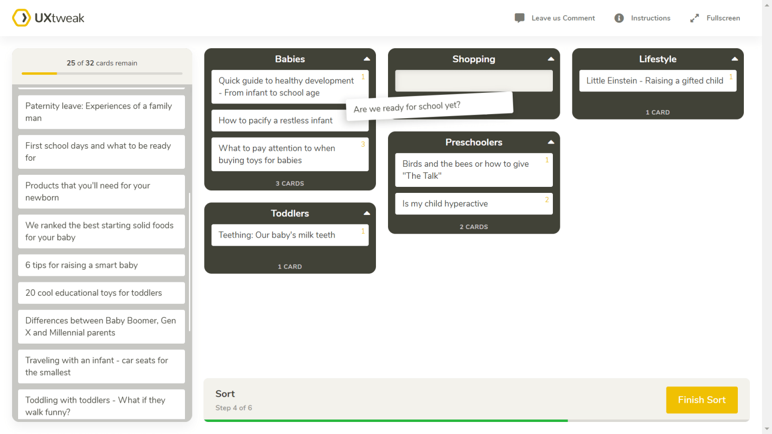
A simple and effective way of carrying out this user research for your information taxonomy is card sorting.
According to the Nielsen Norman Group (NN/g), “Card sorting is a UX research method in which study participants group individual labels written on notecards according to criteria that make sense to them.”
Creating the cards and recruiting participants for this test can be done with the help of UXtweak’s online card sorting tool. Simply create your cards, share the study link to people across your social media platforms, or convert your website’s visitors to participants using Recruiting widget and analyze the data for meaningful insights.
You can choose an open card sorting technique where participants organize content into groups and label them or a closed card sorting technique where they group content according to predefined categories. You may even try a combination of the two methods. Whatever works best for you!
Pro tip: Carry out user research before creating a taxonomy for your website so you can back your decisions by evidence and not assumptions.
Keep it up-to-date
Creating a taxonomy for your website or app is not a one-and-done situation. People evolve, words take on a new meaning, products get updated, nothing in life stays the same. And this includes the way we handle and organize information.
Once in a while, take time out to review your taxonomy, keep track of its performance, and make the necessary adjustments.
Test your taxonomy with UXtweak
After organizing and labeling the information on your website for better navigation, it’s important to conduct a series of tests and evaluate how the taxonomy performs. Tree tests, which are also known as ‘reverse card sorting,’ are widely used and proven to give valuable insights.
How to conduct a tree test for your website
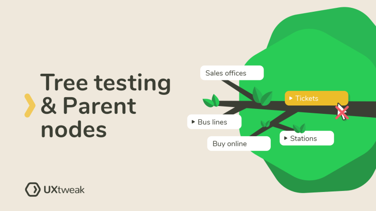
Firstly, to avoid any confusion, it’s called a tree test because the hierarchical structure of websites looks like – well, trees. The categories and subcategories represent the branches that all stem from the homepage.
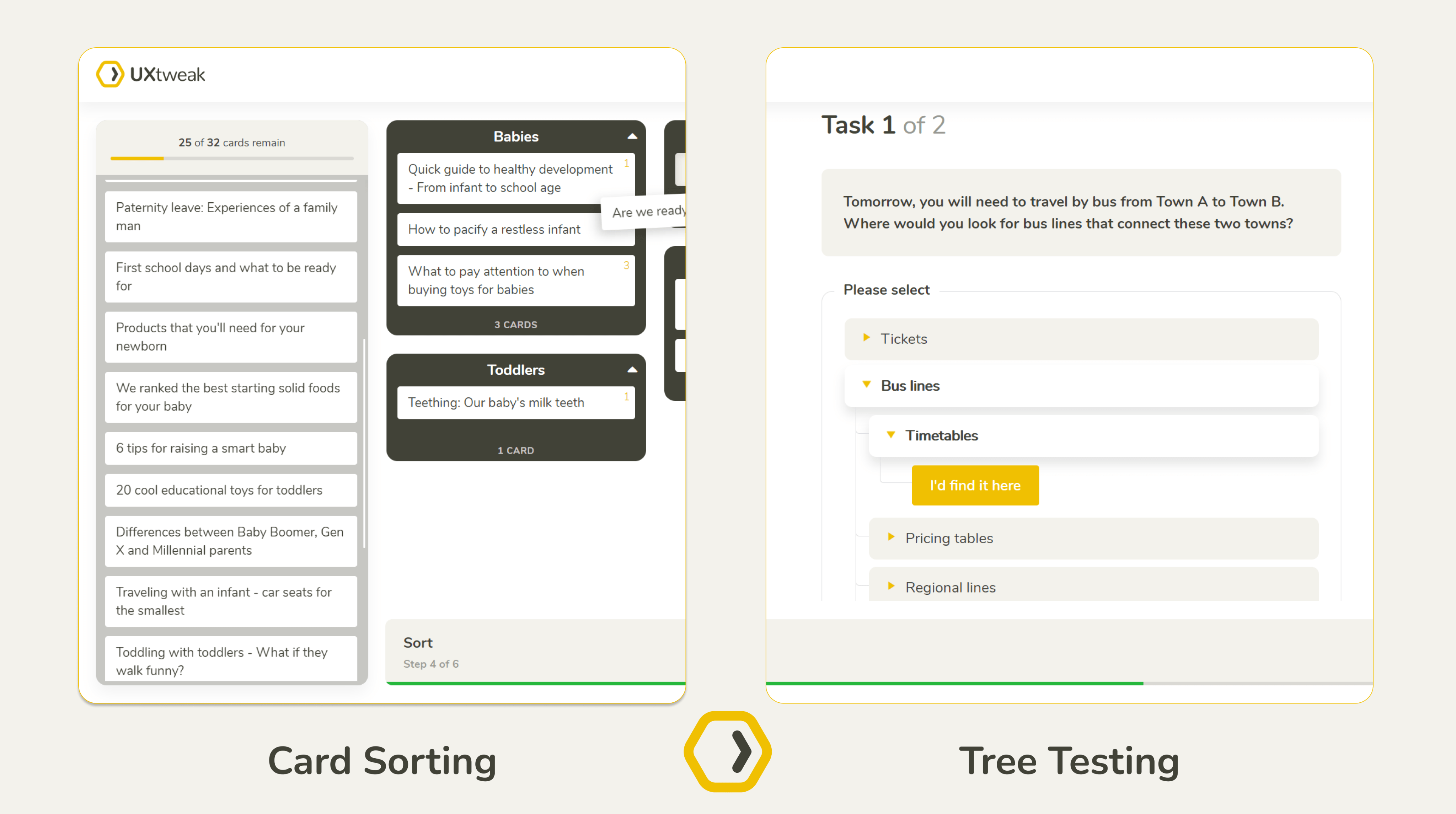
In a tree test, you give your participants a rudimentary visual representation of the website’s structure along with a set of tasks for them to complete. Here’s how it works:
- Recruit actual users
- List all the categories and subcategories on your website
- Define the tasks you’ll give participants
- Analyze results
For example, this tree test for a bus company’s website asked participants to locate where they’d find the opening time for the ticket sales office within the website.

The user searched through the listed categories and subcategories to select the one they felt would contain the information they were required to find in the task.
UXtweak’s tree testing tool helps you create the website structure, screen participants, and analyze the data. It will help you determine how easy it is for people to find information within your website and learn where they get lost.
Types of taxonomy used in popular websites
Let’s look at some popular websites and how they organize their navigation for improved user experience.
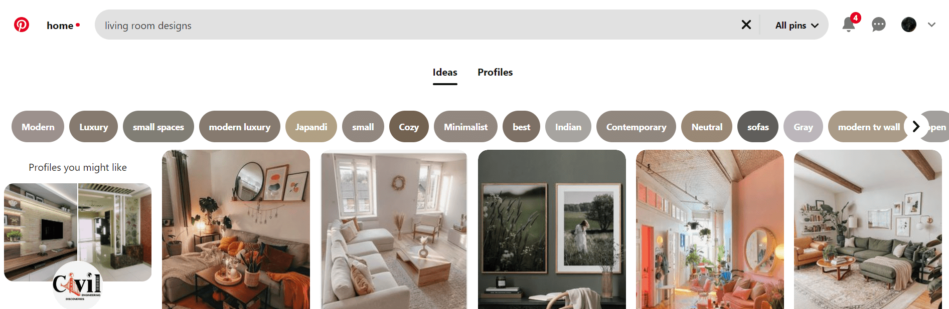
Pinterest uses a very simple type of taxonomy known as flat taxonomy. Every category is listed horizontally at the top, and there’s not much depth to them.
ASOS
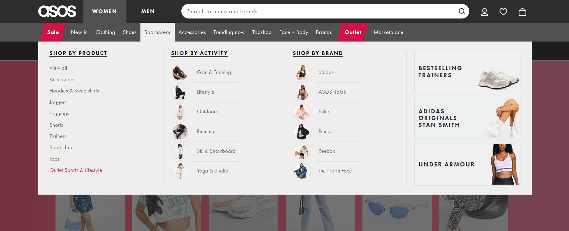
ASOS uses hierarchical taxonomy, the most common type among websites. We can trace the categories and subcategories to a single starting point. Information is grouped and labeled according to chosen similarities that make it easy for customers to shop for items.
Netflix
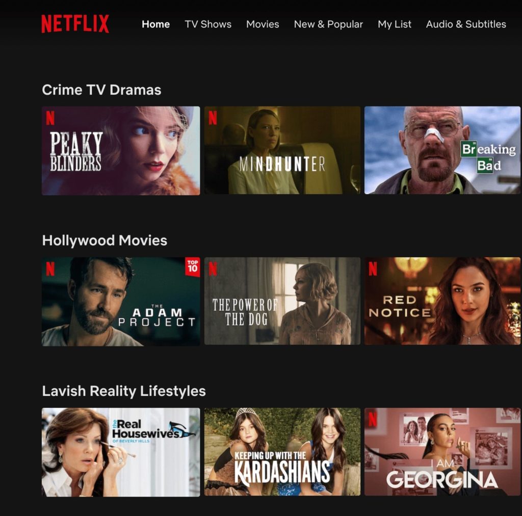
Netflix uses network taxonomy, which is also common among websites. This type of taxonomy organizes content into associative categories. So, although they may belong to different categories, there still exists a level of similarity among them. One example is Netflix’s ‘My List’, which contains different movie genres and types.
Yelp
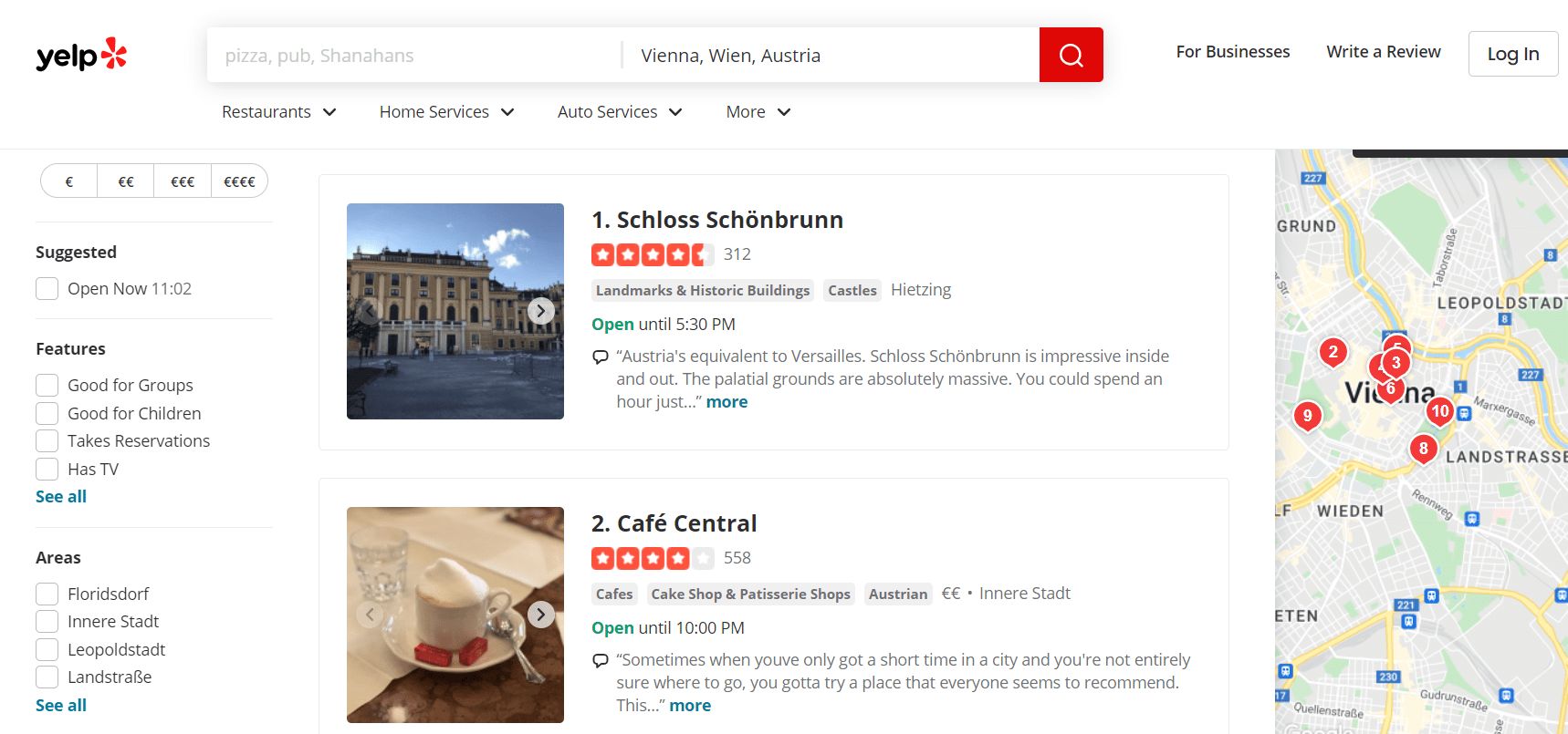
Yelp is a good example of facet taxonomy, where an item can belong to multiple categories using its many associative taxonomies. For example, you can search for restaurants using different filters and still have a few of the same restaurants appear in the search results because they meet the criteria.
How taxonomies improve content and SEO
By assisting in the organization of content in a way that is both user- and search engine-friendly, taxonomies play a significant role in content and SEO.
When the information has a clear and organized taxonomy it is simpler for consumers to find what they’re looking for, and for search engines to crawl and index. In order to more easily develop an extensive and coherent website, taxonomies can also help to identify and fill in content gaps.
Also, by ensuring that data is adequately classified with pertinent keywords, UX taxonomy can be used to develop a uniform language for a website, which can aid SEO. This can enhance a website’s ranking in search results by assisting search engines in comprehending the content and context of the website.
Information taxonomy in the design process
“A good taxonomy is typically a collaboration between UX designers, content strategists, information architects, marketing, and development folks.” – UX Booth.
Taxonomy in design is not limited to how websites and apps are presented to your users, but also has a role in how effective your work process is. From content management systems to design systems and research repositories, taxonomies make the design process easier for everyone.
In addition to enhancing the user experience and expediting the design process, taxonomy can have a substantial effect on project management. The designers can strengthen the cooperation and communication between team members by creating a clear and uniform taxonomy for project assets, such as design files, documentation, and research material. By ensuring that everyone is using the same information, errors and misunderstandings are less prevalent.
Information taxonomy can play an important role in improving the usability of digital products by organizing information to match users’ mental models and expectations. Users bring their individual concepts and standards about the structure and presentation of information when they engage with digital products. Designers can make digital products that are more user-friendly and logical by creating an information taxonomy that corresponds to these mental models.
Differences between taxonomies and folksonomies in UX design
Both folksonomies and taxonomies are techniques of information organization in UX design, although they differ significantly in some important ways.
A UX taxonomy is a hierarchical classification scheme that associates comparable objects based on shared features. To make it simpler for users to locate what they’re looking for, taxonomies are frequently used in UX design to arrange content, such as items or articles, into categories and subcategories. Through user research and content analysis, taxonomies can be developed, and they can assist with the creation of an easy-to-use navigation system.
In contrast, a folksonomy is a classification system that is more user-driven. These user-generated tags are not hierarchical and can be more arbitrary, reflecting the various ways that individuals classify data and think about it. Users can find material based on their own unique requirements and preferences using a more adjustable and customized method thanks to folksonomies.
Both taxonomies and folksonomies are useful in UX design; which one to use will depend on the project’s particular requirements.
While folksonomies may be better suited to developing a more individualized and user-driven experience, taxonomies may be more efficient for structuring massive amounts of content.
How information taxonomy can improve accessibility
Information taxonomy can be a crucial component in making digital products more accessible, especially for users with disabilities. Because it enables people with impairments to access and interact with digital resources like any other user, accessibility is essential for the web.
Some ways that information taxonomy can increase accessibility include:
- Information organization: By clearly and consistently categorizing and labeling information, designers can make it easier for users to find and access the information they need. This is especially helpful for users with disabilities who use assistive devices such as screen readers or keyboard navigation to view digital information.
- Optimizing Navigation: Accessibility depends heavily on the quality of your product’s navigation. By providing distinct and consistent titles for navigational elements like menus, links, and buttons, good information taxonomy can enhance the navigation process and make it more intuitive. This will help your users to navigate the product in a more intuitive way and avoid accessibility issues.
- Consistency: Consistency is crucial for accessibility since it gives users an idea of what to expect from a website or app. Users with disabilities can more easily understand and use the digital product if the content is consistent in terms of structure, labeling, and navigation thanks to a well-designed information taxonomy.
- Meeting Accessibility Standards: The goal of accessibility standards is to make digital information accessible to individuals with disabilities. They consist of sets of rules and best practices. Designers may make sure that their digital creations adhere to accessibility rules and legislation by implementing accessibility standards into the information taxonomy. This can lessen legal concerns and guarantee that a wider range of users, including those with disabilities, can access the digital product.
Benefits of using information taxonomy in UX design
The UX taxonomy can be used to strengthen the design process and make it more logical, effective, and efficient.
Here are 3 ways how good UX taxonomy can help UX design:
- Optimizing End-User Experience: The UX taxonomy greatly improves the end-user experience by simplifying access to the information they need. Users can easily navigate the interface, find the content they need, and achieve their goals by viewing information organized in a logical and understandable way. A well-designed UX taxonomy allows for more intuitive navigation mechanisms, which improves the overall user experience. Boosting user pleasure and engagement, which is crucial for product success, is possible through a carefully thought-out UX taxonomy.
- Building intuitive navigation structure: good UX taxonomy helps to structure information in a user-friendly and intuitive way so that everything is easy to find and access at all times. Taking time and developing this structure will benefit you in the long run, as users will not ever feel stuck or confused when navigating your product. Smooth navigation process not only improves user experience but also helps to increase conversions and lower your pages’ bounce rates.
- Scalability: Information taxonomies can also be used to help guarantee that designs are scalable. The management and organization of massive volumes of data created can be difficult as projects become increasingly complicated. By offering a structure for classifying and managing design elements, a well-designed UX taxonomy may facilitate scaling designs. This can make it simpler to incorporate new features and functionality into the design and guarantee that it keeps its coherence and consistency over time.
Easy navigation equals a better user experience
By helping your customers spend less time and effort on finding what they need within your website, you are, in fact, making their lives easier and their experiences better.
Like Matt Rae, Design advocate at Adobe XD says, “the more granular your taxonomy is, the more specific a user’s search can be.”
So, if you are ready to improve your users’ searches, create an account at UXtweak and fine-tune your information taxonomy with the help of Card Sorting and Tree Testing today!