So, your team has just finished developing the first prototype of a new project management platform. It’s packed with features—task management, real-time collaboration, and in-depth analytics—and you’re excited, thinking it’s going to be a huge hit.
But then, you start testing it with a small group of users. Almost immediately, you get feedback: the interface feels cluttered, the collaboration tools are confusing, and the analytics dashboard is rather complicated.
Suddenly, what seemed like a home run is showing cracks. This is where prototype testing really earns its keep. It’s your chance to catch issues before they become problems for your users.
In this guide, we’ll dive into the nuts and bolts of prototype testing—how to do it right, the methods that work, and examples to learn from.
What is prototype testing?
Prototype testing is like giving your product a test drive before it hits the road. It’s the process of putting your early version of a product—a prototype—in front of real users to see how it performs.
Think of it as an opportunity to catch issues, gather feedback, and make improvements before the final launch. You’re checking to see if everything works as expected and if users find the product easy to use.
It’s better to spot problems now, while they’re still fixable, rather than after the product is out in the world. In simple terms, prototype testing helps you make sure your product is on the right track before it’s too late to turn back.
Why is testing and evaluating a prototype important?

Testing your prototype can save you a lot of time and money spent in un-doing or re-doing things. Here’s how it helps:
Concept validation
Concept validation means making sure your idea actually works in the real world. You might think your product is perfect, but until you test it, you won’t know if it solves the problem or meets users’ needs. Testing a prototype can help you see if your product’s concept is solid or needs adjustments.
Early discovery of design flows
When you test a prototype, you can spot issues in the design before they become big problems. Maybe a button is hard to find, or a feature doesn’t work the way users expect. These might seem like small issues, but they can have a big impact on how your product is received.
Cost efficiency & risk mitigation
When you test early, you can identify and fix issues before they turn into expensive problems. Fixing common issues such as navigation and design issues is much cheaper when the project is in its initial stages.
Securing stakeholder buy-in
Testing a prototype allows you to showcase how the product works and its potential value. For example, if you’re developing a CRM tool, demonstrating a functional prototype can help convince investors of its viability and worth. This helps build confidence among stakeholders.
Discovering new opportunities
Prototype testing can help you enhance your product in ways you have yet to think of. For instance, while testing a prototype for a project management tool, users might suggest features you hadn’t considered, like advanced reporting options. These discoveries can lead to features that make your product more appealing.
Types of prototype testing you should know
A prototype can be as simple as a basic visual sketch of your product. Or it can be an interactive model that lets users explore its features.
To know which prototype suits your needs best, here are the types of prototypes you should know about:
Types of prototypes
Prototype type | Description | Ideal use | Example |
Low-Fidelity Prototype | Basic sketches or wireframes, often paper-based or simple digital mockups. | Suitable for early-stage concept validation | A paper prototype of a mobile app for ordering food |
High-Fidelity Prototype | Detailed and interactive digital mockups resembling the final product | Usability testing, design validation, stakeholder presentations | An interactive prototype of a mobile banking app |
Functional Prototype | A working model that mimics the final product's functionality | Testing core functionality; feasibility checks | A fully functional resident app |
Interactive Prototype | A prototype that users can interact with, simulating user experience | User experience testing; interface and flow validation | An example of a prototype going from low-fidelity to fully functional and interactive |
Visual Prototype | A static, detailed representation of the final product's appearance | Visual design feedback; marketing materials; stakeholder approval | A visual prototype of a smartphone |
Moderated vs unmoderated prototype testing
When it comes to prototype testing, you have two main approaches: moderated and unmoderated testing.
Moderated prototype testing involves a facilitator who guides the session, either in person or online. It allows real-time interaction as the facilitator can ask questions, provide prompts, and observe user behavior as it happens.
Unmoderated prototype testing allows users to interact with the prototype independently, with no assistance, usually through an online prototype testing tool. It’s ideal for quickly gathering data from a large number of users. Moreover, since there’s no moderator, the feedback tends to be more genuine.
Aspect | Moderated prototype testing | Unmoderated prototype testing |
What is it? | Testing guided by a facilitator, with real-time interaction and feedback. | Independent testing by users without real-time guidance |
Use case scenarios | Ideal for complex prototypes needing in-depth insights | Best for quick, large-scale testing where natural user behavior is key |
Interaction level | High â Facilitator interacts directly with participants | Low â No direct interaction during the test session |
Data type | Rich, qualitative insights | Mostly quantitative data, though qualitative insights can be included |
Qualitative vs quantitative prototype testing
Qualitative prototype testing focuses on understanding the “why” behind user behaviors. We use methods like interviews, observations, and usability sessions to explore user experiences in depth.
This helps uncover motivations, challenges, preferences, and other core insights into how users interact with your prototype.
Quantitative prototype testing, on the other hand, is all about the “what.” It involves collecting numerical data on user interactions, such as task completion rates, error frequencies, and time spent on tasks. These insights can help identify patterns and validate design decisions across a broader user base.
Aspect | Qualitative prototype testing | Quantitative prototype testing |
What is it? | In-depth exploration of user experiences and motivations | Data-driven analysis of user interactions and performance metrics |
Use case scenarios | Ideal for understanding user needs and uncovering detailed feedback | Best for validating design decisions with numerical evidence |
Data type | Rich, descriptive, and often subjective insights | Numerical, objective data that can be statistically analyzed |
Sample size | Typically smaller, focusing on the quality of feedback | Usually larger, focusing on statistical significance |
8 Prototype testing methods for UX researchers

Now let’s jump onto the methods of prototype testing to test and validate your concept, ideas, or full-fledged prototypes:
1. Usability testing
Usability testing is like watching users interact with your prototype in real-time. You give them tasks and see how they handle them, which helps you spot any struggles and issues in their experience.
Example: Say you are working on a new fitness app. You’d ask users to create a workout plan and track their progress. Watching them navigate through these tasks will show you where they get stuck or confused.
2. Heuristic evaluation
This is where experts look at your prototype and check it against a list of usability principles. They don’t use it themselves but rely on their knowledge to spot potential problems. It’s a quick way to get expert feedback and catch common usability problems before users even see your design.
Example: If you’re designing a website for an online store, usability experts would check if your site meets principles like making navigation clear and giving users feedback on their actions. They’d flag issues like confusing menus or unclear error messages.
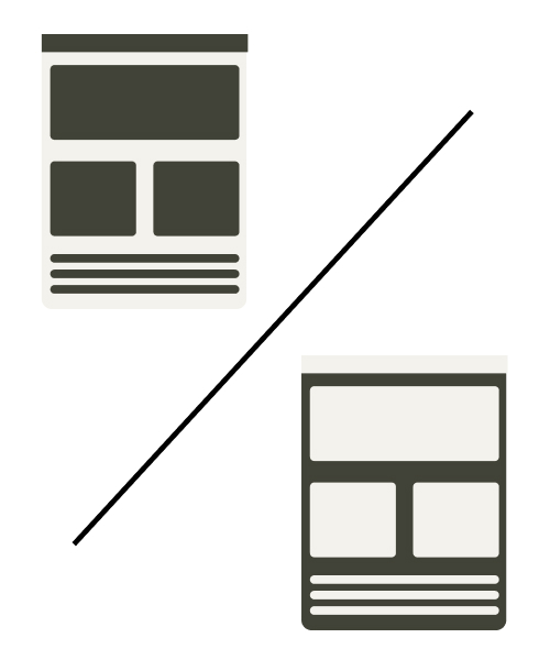
3. A/B testing
A/B testing is all about comparing two versions of something to see which one performs better. You show version A to some users and version B to others and measure the differences. It’s great for making data-driven decisions and determining which design tweaks work.
Example: Let’s say you’re testing two different call-to-action buttons on your site: one that says “Buy Now” and another that says “Shop Now.” Tracking which button gets more clicks can help you choose the most effective one.
See how prototype A/B testing is different from classical prototype testing:
4. Preference testing
This method involves asking users to choose between different design options. It’s less about usability and more about what they find visually appealing or preferable. Using preference testing, you can understand user preferences and make design choices that align with their tastes.
Example: Let’s say you have two homepage layouts for a website, and both seem equally compelling. Instead of letting your assumptions do the work, show both to users and ask which one they prefer and why. Their feedback will help you choose the more engaging design.
5. Card sorting
Card sorting is a method that reveals how users organize information in their minds, helping you design clearer and more logical interfaces. Give users a bunch of “cards” with different content or features. Then, ask them to sort them into categories that make sense to them.
Example: If you’re redesigning a travel agency’s website navigation, you create cards labeled with different sections like:
- Flight booking
- Hotel reservations
- Travel insurance
You then ask users to sort these cards into categories that make sense to them. From their sorting, you might find that users group “Flight Booking” and “Hotel Reservations” under “Plan Your Trip” section.
You also notice that they place “Travel Insurance” under “Travel Essentials.” These insights help you organize the website’s navigation to align with user expectations.
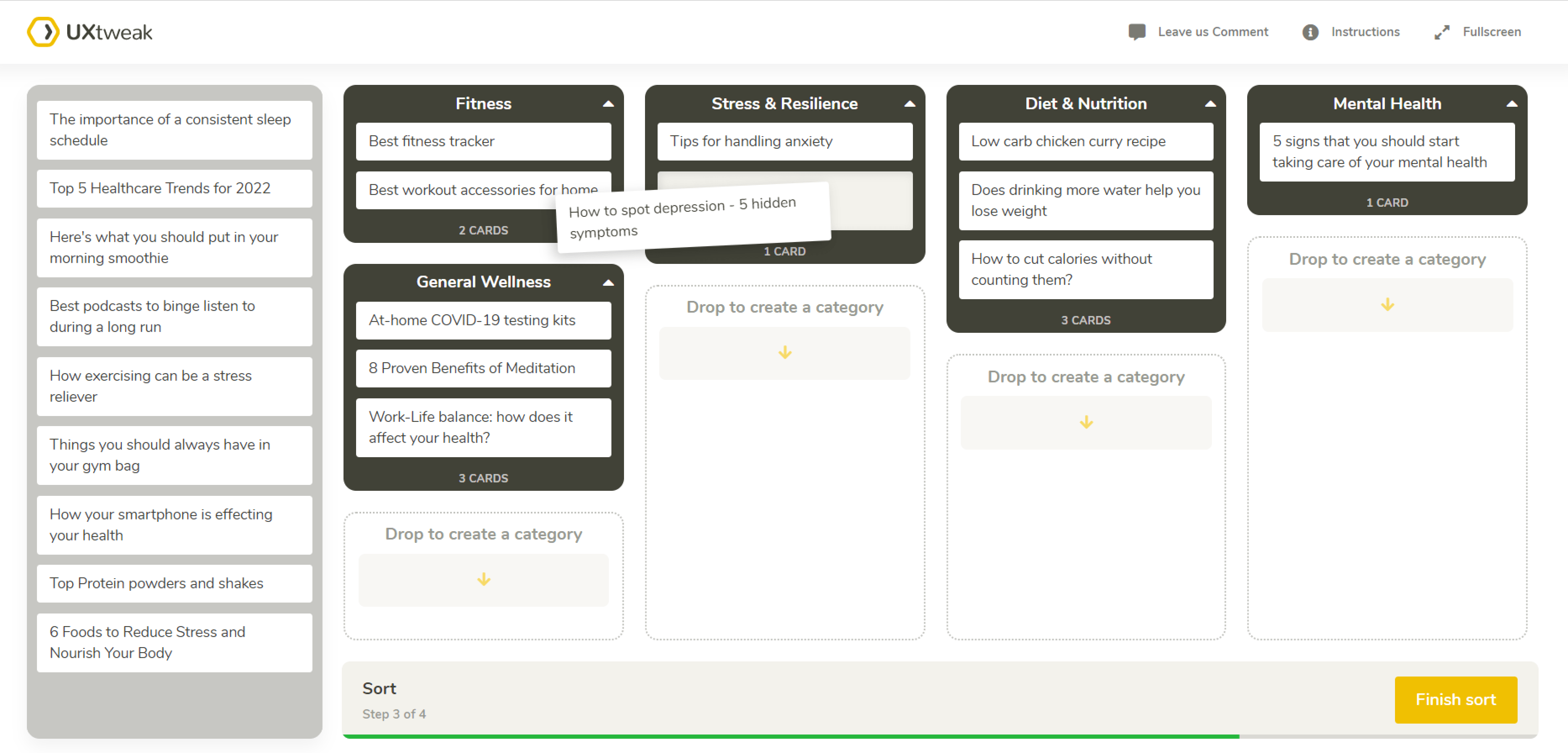
Example of a card sorting study for an online health magazine with UXtweak Card Sorting Tool.
6. Tree testing
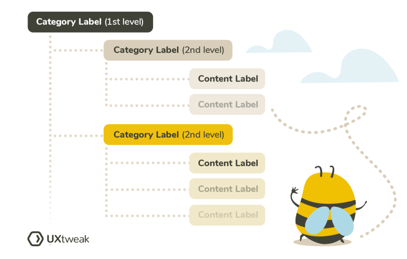
Tree testing is used to evaluate how easily users can find information in a website’s structure. You give them a simplified version of your site’s hierarchy and see if they can locate specific content. It helps you assess whether your site’s information hierarchy is effective and user-friendly.
Example: You’ve created a new navigation structure for an online store. You’d test it by asking users to find a particular product, like “running shoes,” using only the site’s menu structure.
7. First-click testing
First-click testing checks whether users click on the right element on their first attempt. It ensures that critical features are easily discoverable without users having to jump through hoops to find them.
For a new software application, you might ask users to locate and use a specific feature, like “Export Report.” Seeing where they click first can reveal if the feature is placed intuitively.
8. Five-second testing
In five-second testing, users view a design or prototype for just five seconds and then answer questions about their recall or understanding of the content. It provides quick design feedback and whether users can grasp the essential information at a glance.
For a new advertising banner, you’d show it to users for five seconds and then ask them what message or CTA they remember.
If they remember the main message, your banner does its job effectively. If they fail to, make some tweaks and test again.
14 questions to ask when testing a prototype
Asking your audience the right prototype testing questions will help you gain insights that improve your offering. So, here are some questions to get you started:
Usability testing
- How would you describe your experience navigating through the prototype?
- Were you able to locate the features or information you were looking for? If not, what was challenging?
- Were there any parts of the prototype that you found confusing or frustrating? Please explain.
- Did you encounter any issues or unexpected results while completing tasks? If so, what were they?
- How would you rate the responsiveness and speed of the prototype on a scale of 1 to 10?
Heuristic evaluation queuestions
- Do any elements of the prototype seem to go against common usability principles (e.g., visibility, user control)? If so, which ones?
- How would you describe the clarity and consistency of the navigation throughout the prototype?
- How well does the design align with conventions or user expectations you’re familiar with?
- Are there any elements you feel could be removed or simplified? Please explain.
- How does the design support your ability to remember and access objects, actions, and options?
A/B testing questions
- How would you compare the visual appeal of the two versions of the design?
- Which call-to-action do you find more compelling, and why?
- Which version made it easier for you to complete the task? Please describe your experience.
- Was there anything unclear or confusing in either version? If so, what?
- Which version would you prefer to use regularly? Please explain your preference.
Preference testing questions
- Which design option do you prefer overall, and what are the reasons for your preference?
- What specific elements or features influenced your preference?
- Are there aspects of the less preferred design that you believe could be improved? If so, how?
- How do each of the designs align with your needs or expectations?
- Which design do you believe would be more effective in achieving its intended purpose? Why?
Card sorting questions
- Were there any cards that you found challenging to categorize? If so, which ones?
- How would you expect to find this information in the final design?
- Are there any items that didn’t seem to fit well into any of the groups? Which ones?
- Are there any additional groups or categories you would suggest that aren’t currently represented?
- How would you describe the difficulty of categorizing these items?
Tree testing questions
- How would you rate the organization of the site’s structure on a scale of 1-10?
- Were there any categories or items you felt were missing from the structure? If so, which ones?
- Did you notice any categories that seemed redundant or overlapping?
- Were there any labels or headings that were unclear or misleading? If yes, which ones?
- What suggestions do you have for improving the organization or navigation of the tree?
First-click testing questions
- Where would you first click to find [specific item or information]?
- Did the location you clicked match your expectations? Why or why not?
- If you didn’t find the information you were looking for, where would you click next?
- Were there any areas you considered clicking but decided against? If so, why?
- How intuitive was the placement of the item you were looking for?
Five-second testing questions
- What was the first thing you noticed on this page or screen?
- How would you describe what this page or screen is about?
- What key elements or features stood out to you during your brief glance?
- Did anything on this page or screen cause confusion within the first five seconds? If so, what?
- Was there anything you expected to see that was missing? What was it?
When should you test your prototype?
Testing your prototype is crucial at various stages of development. Here’s when you should roll out your prototypes:
Early and often
Start testing as soon as you have a basic prototype. Early testing helps catch issues before they become bigger problems.
After major changes
Every time you make significant updates or changes, test your prototype. This ensures that new features or adjustments work as intended.
Before launch
Conduct thorough testing just before you launch. This is your chance to iron out any last-minute issues and ensure everything is ready for users.
During development
Schedule regular testing sessions throughout the development process. This will help you stay on track and refine the design based on real user feedback.
When you’re stuck
If you hit a roadblock or are unsure about a design decision, test it. Feedback can provide clarity and guide your next steps.
Remember, the goal of testing is to gather feedback and improve your prototype. The more you test, the better your final product will be!
How to test a prototype: step-by-step guide

Let’s now look at the steps needed for prototype testing.
📚 During preparation
As you are preparing for the testing, focus on the following:
1. Set objectives for prototype testing
Start by clearly defining what you want to achieve with your prototype testing. This will guide your entire process. Here are some questions to consider:
- What specific aspects of usability are you testing?
- Are you interested in understanding user preferences or needs?
- Do you want to evaluate the functionality of certain features?
Setting specific goals will help you focus your efforts and gather the most relevant data.
2. Optimize your prototype for research
Make sure your prototype is in its best possible state for testing. This might involve:
- Simplifying complex features
- Ensuring all interactive elements work properly
- Creating realistic scenarios for users to engage with
Remember that it’s your first impression on your ideal users. Try to make it as positive as possible.
3. Recruit participants for prototype testing
Find participants who closely match your target audience. That way, the feedback you receive is relevant and actionable.
Consider factors such as:
- Demographics (age, gender, location)
- Behaviors and habits related to your product
- Specific needs or pain points that your prototype aims to address
4. Choose a testing method & a research tool
Decide on the most suitable method for your testing. This could be:
- Moderated or unmoderated: Will you guide users through the test, or will they navigate on their own?
- Qualitative or quantitative: Are you looking for in-depth feedback or numerical data?
Once you are clear on the testing method, invest in the research tool that best suits it.
You can use different tools for usability testing, recordings and analytics. Or you can invest in a platform that provides access to all these tools and more in one place.
With UXtweak you can conduct all types of prototype testing by just sharing a link to your prototype! Learn more about UXtweak Prototype Testing Tool or see it in action in this video:
💻 During the study
While conducting the study, here are the essentials:
5. Brief participants on the study goals
Begin by explaining the purpose of the study to participants. Clear instructions help ensure that participants are focused and provide relevant feedback.
Make sure they understand:
- What do you want to learn from the test?
- How they should interact with the prototype.
- Any specific tasks or scenarios they need to complete.
6. Record and observe
Observe and record participants interacting with the prototype if you conduct moderate research. It will help you collect real-time feedback and identify immediate issues or reactions.
A good prototype testing tool will do all that for you, giving tasks to the participants and recording them as they complete those. At UXtweak, after the testing session is finished, you can find all your recordings at your Dashboard, for easier analysis. You can also export those if needed 📤
7. Collect study notes
During moderated prototype testing, take detailed notes on participants’ reactions, comments, and any issues they encounter. This includes:
- Participants’ reactions: note any visible signs of confusion, satisfaction, or frustration
- Comments and verbal feedback: record direct quotes and key points from their verbal responses
- Interaction details: document how they navigate through the prototype, including any specific actions or difficulties
- Task completion: track how well and how quickly participants complete the given tasks.
Work smartly on attaining these, as they will provide you with relevant context to the collected data later on.
8. Ask post-study questions
After participants have completed their tasks, ask follow-up questions to gain deeper insights:
- Which features did you find useful or valuable, and why?
- Were there any parts of the prototype that you found challenging or frustrating? If so, could you describe them?
- Did you experience any technical issues or bugs while using the prototype? If so, what were they?
- How would you describe your overall experience with the prototype?
- Was there anything about the prototype that stood out to you as unexpected or surprising?
- How does this prototype compare to other similar products you’ve used?
- Were there any features you expected or would have liked to see that were not included in the prototype?
Add these to your list and think of more questions to gain final insights.
🔎 During results analysis
It’s time to analyze the results with a focus on the following:
9. Collect & analyze notes
Review the notes you took during the sessions. Look for recurring themes, user reactions, and any issues noted. And for unmoderated testing, examine the data collected from tools, including screen recordings, analytics, and survey responses.
Look for key trends, user behavior patterns, and common issues.
10. Analyze the transcript
If you have recorded transcripts from moderated sessions, analyze these to extract meaningful insights. Pay attention to participants’ comments on specific features or tasks. Also, look out for common difficulties they faced while testing the prototype.
11. Prepare a UX research report
Compile your findings into a comprehensive UX research report. This report should include:
- A summary of the main takeaways from your analysis
- Actionable suggestions for improving the prototype
- Charts, graphs, and screenshots to support your findings.
12. Communicate findings
Lastly, share your findings with relevant stakeholders. Use visuals and straightforward language to convey your insights. Try to highlight the most critical feedback and recommendations. Along with that, offer practical suggestions to improve the prototype.
Best prototype testing software in 2024
Let’s now look at some of the best prototyping software you can use to validate your product:
1. UXtweak
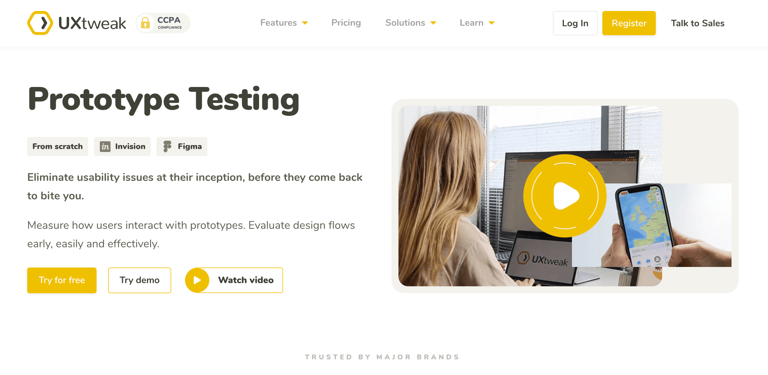
UXtweak is an all-in-one UX research and testing tool, with Prototype Testing being one of its main features. The tool offers to conduct either moderated or unmoderated prototype testing and makes it easy for you to set up the study, recruit participants, and analyze the results.
You can schedule, conduct, and analyze all your interviews and user tests without switching between tools. This all-in-one approach makes gathering feedback and refining your prototype much easier.
Features:
- Prototype testing
- User interviews
- Moderated testing
- Mobile app usability testing
- Card sorting tool
- Website usability testing tool
- 5 second test
- Tree testing tool
- Preference test
- Online surveys
- First click test
See UXtweak’s Prototype Testing in action in these demos:
Pros
- Helps with recruiting participants for your tests
- Both moderated and unmoderated prototype tests
- Multiple data export options
- Quality recordings
- Allows to conduct prototype A/B testing
- Provides the option of building a custom plan as per your needs
- Get access to a wide range of tools on one platform
- Easy to use for beginners testing their prototypes for the first time
- Advanced analytics and a handy dashboard that stores all the insights
- Free plan available
Cons
- Understanding the dashboard can take time
User reviews
According to Capterra:
Overall score – 4.9/5
Ease of Use – 4.8/5
Customer Service – 5/5
Pricing & Plans
UXtweak provides a free starting plan that lets you manage small research projects easily.
The paid plans, which include a wide range of tools and features, include the plus plan (ideal for solo researchers) for $49 per month, billed annually, and a business plan that provides up to 5 seats.
You can also connect with our team and develop a custom Enterprise plan suiting your requirements.
2. UserTesting
UserTesting is a platform that helps teams quickly gather feedback on prototypes from real users. The platform allows designers and developers to observe user behavior, identify pain points, and make informed decisions with video recordings. This feedback loop is crucial for refining designs, ensuring usability, and reducing the risk of costly errors.
Features
- Video recordings of user sessions
- Targeted user selection
- Customized test creation
- Comparison tests
Pros
- Provides rapid insights from real users
- Helps extract in-depth qualitative data
- Flexible test creation options
- Gives access to a broad user base
Cons
- The platform can be expensive for smaller teams or startups
- Provides limited quantitative data needed for some research purposes
- Depending on the target audience and test complexity, getting feedback might take longer than expected.
User reviews
According to Capterra:
Overall Rating: 4.5/5
Ease of Use: 4.4/5
Customer Service: 4.4/5
Pricing & Plans
Plans are disclosed upon request.
3. Lyssna (formerly UsabilityHub)
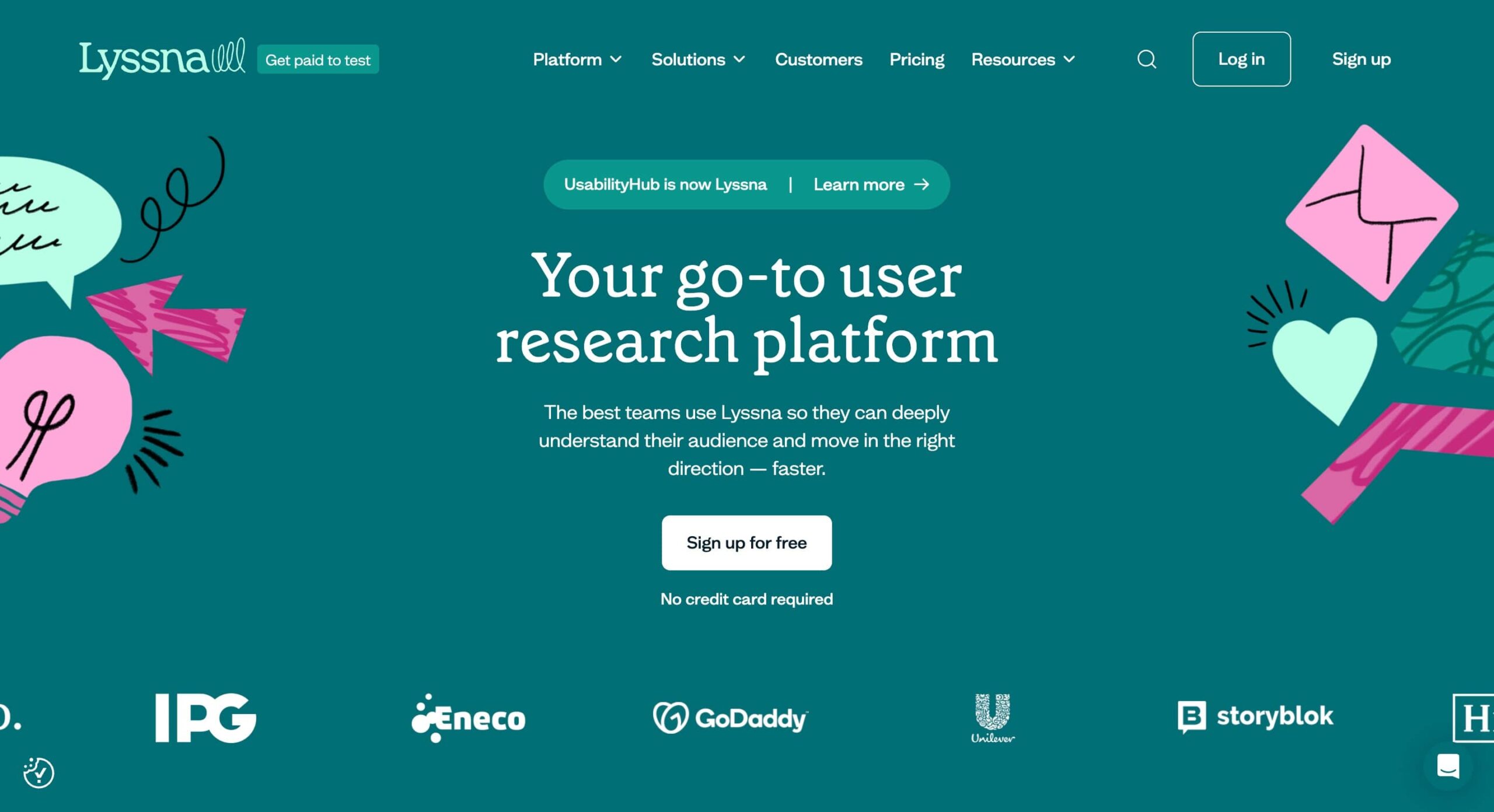
Lyssna is a versatile tool designed to simplify and effectively test prototypes. It offers various testing methods, such as first-click tests, five-second tests, and preference tests, allowing teams to gather actionable insights from real users.
Features
- Usability Testing Tools
- Feedback Collection
- Session Recording
- Heatmaps
Pros
- Enhanced usability insights
- Efficient feedback collection
- Integrates with other analytical tools with ease
Cons
- Advanced prototype testing tools can be expensive
- Some tools require specialized knowledge
- Setting up prototypes and configuring testing scenarios are time-consuming
User reviews
According to Capterra:
Overall rating: 4.7/5
Ease of use: 4.7/5
Customer service: 4.9/5
Pricing & Plans
Lyssna provides a free plan, a Basic plan ($75 per month), a Pro plan ($175 per month), and a custom Enterprise plan as per your needs.
Learn more: if you want to learn about these tools in detail, here’s a list of our best prototype testing tools that will help!
Common mistakes to avoid during prototype testing
When you are on the way to test your first prototype, avoid the following:
Asking leading or biased questions
Leading questions suggest a specific answer or imply the right way to respond. For example, asking, “How much do you like this feature?” can pressure users into a positive response.
Instead, keep your questions neutral and open-ended. For example, you can ask, “What are your thoughts on this feature?” This way, you get honest feedback without influencing their responses.
Ignoring the context of use
Testing your prototype in a vacuum can lead to feedback that doesn’t reflect real-world use. For instance, testing a mobile app without considering how users interact with it on the go might lead to skewed results.
Make sure to test in realistic settings.
If your app is meant for use on the go, try to simulate that environment during testing to get accurate feedback.
Failing to find the right participants
Testing with participants who don’t match your target audience can lead to irrelevant feedback. For example, if you’re designing a product for tech-savvy users but test it with non-tech users, the feedback might not be useful.
However, finding relevant users can be difficult.
UXtweak makes it easier for you, as you can always recruit quality participants through our User Panel.
Our experts will find exactly the right people for your target group, even if your audience is very niche. This ensures you get relevant, actionable insights from the right users.
Learn more about UXtweak User Panel 🐝 or watch this quick video:
Overlooking negative feedback
It’s easy to focus on positive feedback and ignore criticism. However, overlooking negative feedback can lead to missed opportunities for critical improvements.
Try to embrace all feedback, positive or negative. It’s a valuable opportunity to identify and address weaknesses in your design.
Avoiding these common pitfalls will help you gather more accurate and useful feedback, leading to a better-designed product.
Best practices to improve prototype testing in 2024
If you are looking for the right ways to make the most of your prototype testing, add these things to your list:
Combining qualitative and quantitative research
Qualitative insights offer detailed feedback on user experiences, while quantitative data provides statistical evidence of trends and patterns.
Combining the two methods will give you a fuller picture of how users interact with your prototype.
Always conduct iterative testing
Iterative testing involves testing your prototype multiple times throughout the design process. Each round of testing helps refine and improve the design based on user feedback.
This way, you don’t have to make costly changes when you just test the final product with users.
AI integration in the research process
AI can help enhance the prototype testing process by providing advanced data analysis, predictive insights, and automation of repetitive tasks.
It helps you gain deeper insights faster and more efficiently.
Use a blend of AI tools that can analyze user behavior, predict trends, and offer actionable recommendations to improve your prototype.
Need a tool for prototype testing? Try UXtweak!
Now that you’ve got the hang of prototype testing, it’s time to level up with a tool that makes this process easier. UXtweak has everything you need to dive in and get started.
Here’s the best part: it’s not just about finding flaws. UXtweak helps you figure out what works and what doesn’t so you can refine your designs with confidence.
By the time your design is ready to go live, you’ll know it’s been shaped and validated by real user experiences—giving it a better shot at hitting the mark.
So, let’s start validating those cool ideas, shall we?
Talk to our team today or go on and try the Prototype Testing Tool yourself by registering for our free plan!

