Key takeaways
💡 Usability ensures a product is easy and intuitive to use, reducing friction and saving time
🧩 Usefulness ensures a product solves a real problem or fulfills a meaningful need
🔗 Utility, usability, and usefulness are connected: a product is only truly useful when it combines the right features with smooth, intuitive interactions
🧪 Structured approaches such as JTBD analysis, concept testing, diary studies, surveys, and competitive analysis help validate whether your product solves meaningful problems and meets user expectations
🚀 Testing is essential both before and after launch. Methods like prototype testing, heuristic evaluation, surveys, and session recordings reveal where users struggle and which features add real value; UXtweak integrates all of these and more in one platform
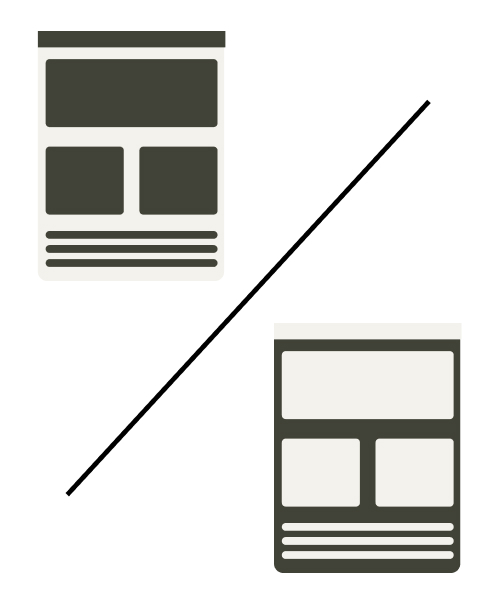
Usability vs Usefulness is the trade-off that makes or breaks how users perceive your product.
You’ve probably seen it happen: a sleek app launches with fanfare, only to be abandoned because it solves nothing of importance. Or worse, it does address a real problem but buries the solution under clunky menus and confusing flows.
Both scenarios end the same way: uninstalls, bad reviews, and missed growth.
A polished interface can’t rescue a product that lacks value, and a valuable idea won’t survive poor usability. To build products people actually adopt and stick with, you need both.
In this article, we’ll dig into how to strike that balance, backed by examples and practical testing methods you can apply right away.
Usability vs usefulness
Usability vs Usefulness are often lumped together in UX conversations, but they solve very different problems.
👉 Usability is about ease: can users move through your product without friction?
👉 Usefulness is about impact: does the product actually solve a meaningful need?
A product that nails usability but lacks usefulness becomes a polished shell with no purpose. On the other hand, a highly useful product that’s painful to use ends up abandoned despite its value.
One makes your product simple, the other makes it indispensable. You need both if you want users not just to try your product, but stick with it.
Aspect | Usability | Usefulness |
Definition | How easy and intuitive a product is to use | How well a product solves a real problem or fulfills a need |
Focus | Efficiency, clarity, and smooth interaction | Value, relevance, and alignment with user goals |
Key question | “Can the user figure out how to use this?” | “Does this product actually help the user achieve what they want?” |
Measurement | Task success rate, error rate, time on task, satisfaction scores | User adoption, retention, customer satisfaction, willingness to pay |
Failure point | Confusing, frustrating, or inefficient interface | Easy to use but irrelevant or low-value |
Example | A ride-hailing app where booking a cab takes two taps | The ride-sharing feature that helps users split fares and save money |
Utility, usability, and usefulness
Utility, usability, and usefulness are often confused, but they capture very different layers of product experience. Think of them as the building blocks of value:
Utility → Does the product have the right features?
This is about what the product can do. A note-taking app that lets you write, tag, and sync across devices has utility. Without essential features, no amount of sleek design makes it valuable.
Usability → How easy is it to use those features?
This is about how the product works in practice. If adding a simple note requires five steps hidden in clunky menus, usability is poor. As Steve Krug says, “Usability is about people and how they understand and use things, not about technology.”
Usefulness → Does the product solve real problems effectively?
Usefulness = Utility + Usability. It’s the sweet spot where the right features meet effortless interaction.
💡 Pro Tip
Avoid working backwards from a product. Don’t try to make a product fit a problem after the fact; start with the user’s pain point first.
Example of usability
Usability shows up when using a product feels effortless.
Take Trello, for example. You open a project board, create tasks, drag them across columns, and assign team members, all without thinking twice.
The interface is clean, interactions are intuitive, and even first-time users can get started quickly.
✅ Why it works:
- Clear navigation: Boards, lists, and cards are organized logically, so users know exactly where to go
- Intuitive interactions: Drag-and-drop and simple menus reduce friction and cognitive load
- Immediate feedback: Actions like moving tasks or marking them complete give instant confirmation, making workflows feel smooth
💡 Pro Tip
Don’t just make features visible, make them predictable. Test first-time user flows: if someone can complete a core task in under 30 seconds without guidance, your usability is winning. Every extra click or confusing label is a friction point costing retention.
Example of utility
Utility is about solving the right problem.
Take Airbnb, for example. Whether you’re looking for a weekend getaway or a long-term stay, the platform provides listings, availability, pricing, and reviews, all in one place.
It doesn’t just show options but solves a real problem: finding reliable accommodations quickly and safely.
✅ Why it works:
- Direct problem-solving: Search, filter, and booking tools cover everything users need to find a place to stay
- Comprehensive features: Maps, reviews, and instant booking give actionable information at a glance
- Trust and reliability: Verified hosts and clear policies make the solution dependable
💡 Pro Tip
Ruthlessly audit every feature for problem-solving power. Ask, “If this didn’t exist, would users notice?” If the answer is no, cut it. Features without clear utility are wasted effort and cognitive clutter.
Example of usefulness
Usefulness happens when the right features meet effortless interaction.
For instance, Spotify doesn’t just give you access to millions of songs (utility); it makes discovery easy through curated playlists, recommendations, and a clean interface (usability).
The combination creates daily value that keeps users coming back.
✅ Why it works
- Feature richness: Playlists, libraries, search, and recommendations address multiple user needs
- Seamless experience: Easy navigation, autoplay, and smart suggestions make listening intuitive
- Habit-forming value: Users rely on it to discover, enjoy, and share music, making the product indispensable
💡 Pro Tip
Map your product’s utility to its usability in measurable ways. Track key actions and adoption metrics: a feature is only truly useful if users can complete it effortlessly and repeatedly. Otherwise, it’s just a shiny tool nobody uses
How to test a product’s usability
Before you launch, or even after, testing your product’s usability is key to ensuring users can navigate, interact, and achieve their goals without friction. The goal is simple: make the experience effortless, intuitive, and frustration-free.
As Aaron Walter once put it,
Designers shooting for usable is like a chef shooting for edible.
In other words, usability should be the bare minimum. A product shouldn’t just “work,” it should work so smoothly that users don’t have to think twice.
So, let’s see how you can test a product’s usability both before and after launch:
Before launch
Focus on spotting friction points early, so users don’t run into them later:
1. Usability testing with real users
Recruit a small group of target users to perform core tasks while you observe. Look for hesitation, repeated clicks, or confusion.
📌 Example: In a productivity app like Trello, you can measure how long it takes a new user to create, assign, and track a task. Every pause or misclick is a friction signal that can inform redesigns before launch.
Remember to watch how users struggle, not just whether they succeed. A user completing a task in 3 minutes instead of 1 reveals hidden friction that can silently erode retention.
With UXtweak, you can capture these moments effortlessly—observe clicks, pauses, and hesitations in real time, turning subtle struggles into actionable insights that improve your product step by step. 🐝
2. Prototype testing
Build low- or high-fidelity prototypes to evaluate navigation, feature placement, and interaction flow. UXtweak’s prototype testing tool lets you test realistic scenarios without full development. 🍯
🔽 Want to see it in action? Try UXtweak’s prototype and A/B testing tools yourself!

💡 Pro Tip
Catching friction at the prototype stage is exponentially cheaper than fixing it after launch. Observing a click pattern or dead-end interaction early prevents costly rework later.
You should also encourage users to “think aloud” during prototype testing. Their verbalized confusion reveals design gaps that metrics alone can’t capture.
3. Heuristic evaluation
UX experts review your design against established principles, such as Nielsen’s heuristics, cognitive load rules, and accessibility standards. Identify glaring usability flaws before real users encounter them.
📌 Example: Redundant menu items or inconsistent button labeling can block adoption even if all features are technically functional.
Try combining expert heuristics with real user insights. Experts spot obvious issues; users reveal the subtle frustrations that drive drop-offs.
Include accessibility checks, screen reader flows, color contrast, and keyboard navigation, to ensure usability for all users.
4. Pre-launch A/B testing
Test multiple variations of key screens or flows with a small audience. This could be button placement, copy, or onboarding steps.
Data-driven insights here ensure you launch the version that maximizes task completion and minimizes friction.
Also, prioritize testing high-impact flows, those that drive adoption, retention, or conversion. Even small improvements in these areas deliver outsized gains.
📌 Example: Changing a call-to-action placement can increase task completion by 15–20%.
5. Task success & time metrics
Measure task completion rates and the time it takes to finish critical actions. Slow or failed tasks are clear signals of friction.
📌 Example: Say you are onboarding a new user in a SaaS platform. If it takes more than three steps or five minutes to set up the first project, drop-off rates spike.
To sum it up, track both completion and efficiency.
Even when users complete tasks, excessive time or repeated clicks indicates opportunity to simplify and improve retention.
After launch
Once your product is live, the focus shifts from pre-launch assumptions to how real users actually interact:
1. Analytics & heatmaps
Numbers tell a story, but only if you read them carefully. Track clicks, navigation paths, scroll depth, and drop-off points to see exactly where users stall or exit.
Heatmaps reveal which areas grab attention and which are ignored.
💡 Pro Tip
Look for patterns, not isolated clicks. If 30% of users abandon a checkout flow at the same step, that’s a clear signal to rethink labeling, layout, or microcopy.
2. Session recordings
Watching real users navigate your product uncovers subtle friction that numbers alone can’t capture. Hesitation, repeated taps, or abandoned tasks reveal pain points in context.
When conducting session recordings, it’s highly recommended to take notes, segment by user type, and look for recurring behaviors. Even a single confusing element, repeated across sessions, can quietly drive churn.
This is exactly where UXtweak shines. Its session recording tool lets you follow users step by step, highlighting the small friction points that often go unnoticed but matter most. 🐝
3. Surveys & feedback widgets
Direct feedback complements behavioral data. Prompt users at the right moment with targeted questions like, “Did you complete your goal?” or “Which part of this process was confusing?”
💡 Pro Tip
Conducting empathy interviews could be even more advantageous than simply surveys. Conversations uncover real pain points, whereas surveys often capture surface-level or hypothetical issues.
4. Customer support insights
Spend time with customer-facing teams as customer service reps have direct access to recurring user issues, providing a great starting point to identify real problems.
Frequent questions about a specific feature often indicate a design flaw, not user ignorance.
💡 Pro Tip
Tag usability-related tickets and look for trends. Fixing high-impact, recurring issues reduces support load and enhances user satisfaction simultaneously. Think of support data as a direct line to user frustration points.
5. Continuous A/B testing & iteration
Even small tweaks, such as button placement, wording, and flows, can have a significant effect on usability. Test, measure, and iterate constantly.
As Brenda Laurel says,
Design isn’t finished until somebody is using it.
How to test a product’s utility

Testing utility is all about confirming whether your product actually solves a real problem or fulfills a need. Here’s how to test it:
JTBD (Jobs-To-Be-Done) analysis
JTBD analysis is a framework for understanding the real “job” users are hiring your product to do. It focuses on outcomes over features, helping you build solutions that actually deliver value.
How to do it:
- Map the tasks users want to accomplish.
- Identify pain points and obstacles they face.
- Conduct interviews or workshops to uncover hidden needs and frustrations.
📌 Example: A navigation app’s job might be: Get from point A to B quickly and reliably. Users may reveal that:
- Traffic alerts are essential
- Alternate route suggestions save time and reduce stress
Concept testing
Concept testing is a method for validating ideas, sketches, or prototypes with users before full development. It ensures your solution resonates and solves real problems.
How to do it:
- Present clickable mockups, wireframes, or storyboards.
- Ask users to react to features, rate usefulness, or indicate likelihood of use.
- Note points of confusion or areas for improvement.
📌 Example: A grocery app tests a “smart cart” feature where frequently bought items are suggested automatically. Users may reveal that:
- The suggestions save time and reduce decision fatigue
- The interface needs clearer labeling to avoid confusion
Diary Studies
Diary studies involve users documenting their interactions and experiences over days or weeks, revealing real-world behavior and long-term utility.
How to do it:
- Have participants log tasks, challenges, and successes using notes, photos, or app-based journals
- Keep prompts simple and consistent
- Review logs for patterns and recurring pain points
📌 Example: Navigation app users document their daily commutes, noting if suggested routes saved time or traffic alerts helped. Patterns may show that:
- Certain routes are consistently ignored
- Real-time alerts are the most valuable feature
Surveys
Surveys collect quantitative feedback on which features are useful, missing, or unnecessary.
How to do it:
Ask targeted questions such as:
- “Which feature helped you complete your task most efficiently?”
- “Which features do you rarely use?”
- Use rating scales, multiple choice, or open-ended responses.
📌 Example: A grocery delivery app surveys users about “reorder favorites” and “scheduled delivery” features. Users may reveal that:
- Reorder favorites is highly used and appreciated
- Scheduled delivery is less important and often ignored
Competitive Analysis
Competitive analysis evaluates similar products to understand what users value and where competitors fall short.
How to do it:
- Analyze features, user flows, pricing, and customer feedback.
- Identify gaps and opportunities to improve your product.
- Compare usability, convenience, and unique value propositions.
📌 Example: A grocery app reviews Blinkit and Instacart. Users may reveal that:
- They love “reorder favorites” features
- Complex checkout flows cause frustration
- A simpler quick-reorder option would improve their experience
Create useful products with UXtweak
UXtweak isn’t just another usability testing platform, it’s a complete research toolkit that helps you uncover both how users interact with your product and why they make certain choices.
From validating early ideas to refining final designs, UXtweak bridges the gap between assumptions and reality. Whether you’re fixing navigation, testing new concepts, or collecting large-scale feedback,
It gives you everything you need to build products that don’t just look good, but work beautifully.
Key Features
- Website usability testing: Watch real users explore your site or app. See where they get stuck, which paths they follow, and how long tasks take.
- First Click Testing: Check if users instantly know where to click to start a task.
- Five Second Testing: Show users your design for just five seconds, then ask what they remember.
- Concept Testing: Share ideas, prototypes, or features and see if users actually find them valuable.
- Surveys & Feedback Tools: Collect direct feedback at scale. Ask what’s most useful, what’s missing, and how satisfied users are.
- Live Interviews: Talk to your users in real time, observe their behavior, and dig deeper into motivations or frustrations.
Pricing
- Free Plan (€0/month) – A great way to experiment with UX research tools at no cost. Includes access to all tools, 15 responses/month, 1 active study, and 14-day access to results.
- Business Plan (€92/month, billed annually) – Ideal for teams that require essential UX research tools and features for their projects. Includes 50 responses/month (upgradable), 1 active study (upgradable), unlimited tasks per study, 12-month data retention, reports and video exports.
- Custom Plan (Pricing upon request) – Tailored for organizations with advanced research needs, providing unlimited active studies, customizable responses, live interviews, access to a global user panel and much more.
Wrapping up
At the heart of every great product is a simple balance: it has to be easy to use and worth using in the first place. Usability smooths out the path, and usefulness makes sure the path actually leads somewhere valuable.
Together, they’re what turn good ideas into products people stick with.
That’s exactly where UXtweak gives teams an edge.
Whether you’re running First Click or Five Second Testing to fine-tune usability, or leaning on concept tests and surveys to validate product ideas, the platform brings everything into one toolkit.
And with a global User Panel of 155M+ people, you’ll always find the right voices to test with. Your design decisions will no longer be guesses, but grounded in real behavior and feedback.
Ready to make every feature count? Try UXtweak for free today! 🐝


📌 Example: Duolingo isn’t just a language-learning app with lessons (utility). Its gamified interface, reminders, and streaks (usability) make learning addictive, turning it into a truly useful product people keep coming back to.