Key takeaways
🔦 A UX scorecard is a structured document that guides UX designers through an objective assessment of the overall usability and performance of a digital product.
💡 UX scorecards are crucial in ensuring the continuous refinement and success of digital products.
🔍 A UX scorecard consists of a range of components that allow for the comprehensive assessment of a product’s user experience incorporating both qualitative and quantitative insights.
A UX scorecard is a structured document that guides UX designers through an orderly and objective assessment of the overall usability and performance of a digital product.
The utilization of UX scorecards, as an integral part of UX reviews, offers UX designers a unique opportunity to measure the effectiveness of their digital product.
It also helps pinpoint areas of improvement through a structured approach that is less prone to mistakes.
What is the goal of a UX scorecard?

The main purpose of a UX scorecard is to offer the UX design team a structured way to evaluate the performance of a digital product when it comes to user experience and usability.
Whether that is a website, platform, or app, the primary goal of the scorecard is to uncover sticking points by measuring the usability of the different design elements based on user and business needs.
UX scorecards should therefore be regarded as guiding tools for product teams to make more data-informed and strategic decisions to meet business goals.
Finally, scorecards promote objectivity and have the power to move the team away from assumptions and personal views about what’s best for the user.
What is included in a UX scorecard?

UX scorecards are crucial in ensuring the continuous refinement and success of digital products.
A UX metrics scorecard consists of a range of components that allow for the comprehensive assessment of a product’s user experience, incorporating both qualitative and quantitative insights.
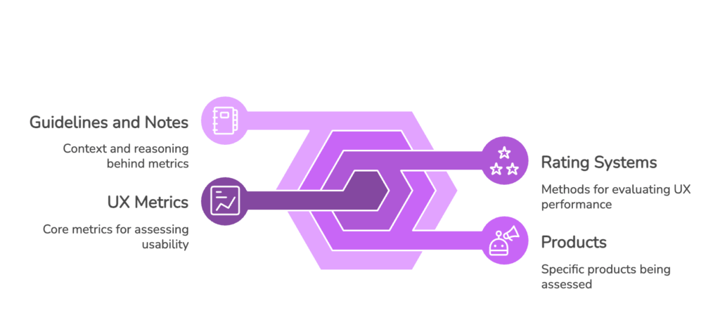
This way, UX scorecards can be used as a space for product teams to measure and improve a host of different UX metrics. Here are the key components of a UX scorecard:
📍UX metrics
UX metrics are one of the most critical components of a UX scorecard as they provide the metrics against which you can assess the product’s usability and overall user experience.
If you are stuck on the metrics, some key ones to include are task success rates, which indicate the percentage of users who can complete a task without errors, and usability testing metrics, which help quantify usability and track potential issues.
Another important metric is error rates, which measure the percentage of attempts to complete a task that fail.
Finally, the time on task, which indicates how long it takes users to complete a task is also an important KPI to be on the lookout for.
💡 Pro Tip
Learn more about UX metrics and which ones to consider in our article: What Metrics are Used to Measure UX Effectiveness?
📍Rating and scores
Rating systems and scores are other building blocks of the UX scorecard as they are crucial in understanding the product’s performance based on the UX metrics.
One of the most common ways to rate UX performance is through percentage scores.
Numerical scales, usually from 1-5 or 1-10, are also a common UX rating system practice often used to represent overall performance.
Finally, color coding is extensively used to indicate different satisfaction levels or usability making it easier for teams to quickly assess performance.
📍Products
It goes without saying that every UX scorecard is designed to evaluate a specific product. The UX scorecard will hence include certain information about the product that is being assessed.
Some of those key details are the product name, the particular feature or flow that is being assessed, e.g. the checkout process, as well as a description of the test scenarios via which the flow will be tested!
📌 Example: A high bounce rate might make more sense with the note that a page or product section has recently been removed from the site.
📍Guidelines and notes
Those are crucial as they provide the reader of the document with the context within which the metrics and ratings occur.
Guidelines and notes help stakeholders from cross-functional teams understand the reasons behind certain scores or metrics.
📌 Example: A high bounce rate might make more sense with the note that a page or product section has recently been removed from the site.
How to create a UX scorecard

Crafting an effective scoreboard requires meticulous preparation which involves not only selecting the right metrics but also organizing and grouping them for maximum readability.
Here are some actionable steps you can take toward scorecards without a hitch:
Focus on researchers’ and designers’ needs
When crafting a UX scorecard it is crucial to take into consideration the needs of both the researchers and the designers of the team.
The scorecard should therefore be actionable in the sense that it can offer clear insights that can guide the product’s improvement.
On top of that the scorecard should also be flexible to be able to adapt to the varied needs of the different teams.
💡 Pro Tip
Involve both researchers and designers early in the process to gather input on key metrics, ensuring the scorecard is both actionable and adaptable to evolving project needs.
Choose the right metrics
When selecting your metrics, reflect on the most important aspects of the user experience for the product you are assessing.
For instance, if you are evaluating an e-commerce platform then metrics such as conversion rates or cart abandonment might be some of the metrics that should be top of mind.
Use helpful tools
When crafting your scoreboard, do not forget to take advantage of the tools available on the market!
Tools like Miro are great for data visualization purposes, while Google Sheets or Excel are super handy for organizing and calculating scores.
Finally, Figma can be a great tool to design the whole scorecard and it gets bonus points for the easy sharing options!
Organize the UX scorecard for better readability
The organization of your UX scorecard can make or break its effectiveness. Always ensure that scorecards are well-structured and designed for readability.
This is particularly important as the document will be shared with various stakeholders who will need to quickly assess and act on the information presented on the scorecard.
A great way to do so is to divide the scorecard into easily identifiable sections such as ‘Navigation’, ‘Usability’ etc.
Another great way to promote readability is the use of color coding which can quickly communicate extra information without further written explanation.
Last but not least, always provide the right amount of context especially when it comes to metrics or numbers.
🌟 Want to include user interviews in your UX research?
Try UXtweak’s Live Interviews!
Seamlessly schedule, recruit, conduct, and analyze your all user interviews.
⬇️ Learn more about the feature and be the first to try it!
Example of a UX scorecard
As discussed, UX scorecards provide an organized and structured way to access user experiences. Here is an example of how a UX scorecard might look like:
Criteria | Use Case | User Story |
Focus | System interaction and detailed flow | User goal and the value they want to achieve |
Scope / Detail Level | High detail: includes main flow, alternate flows, and exceptions | High-level: enough to prompt discussion and exploration |
Structure | Often structured as: Actor → System → Steps (including conditions & paths) | Follows: “As a [user], I want to [action], so that [benefit]” |
Purpose | To capture all functional requirements and system behavior | To define and prioritize features from a user’s perspective |
Example | User logs in → system validates → access granted or denied | As a returning user, I want to log in quickly so I can access my account |
Best For | Complex systems, regulatory environments, detailed workflow documentation | Agile development, MVPs, fast iteration, ongoing team collaboration |
Most common UX scorecard metrics
If you are unsure where to start with your UX scorecard metrics here are some of the most common ones you can include to ensure an effective validation:
Task success rate
The task success rate is one of the key metrics to include in your scorecard. It shows the percentage of users who complete a task on a digital interface.
This is a quintessential metric as it indicates whether users can achieve a goal, such as making a purchase, efficiently.
📌 Example: In an e-commerce checkout process, a 90% success rate shows a frictionless flow with no or little issues.
Error rate
Another key metric to include is the error rate which indicates the percentage of users who fail to complete a task successfully.
This is another critical metric for your product’s health as a high error rate might mean there are sticking points to be addressed in your flows.
For instance, in the context of a sign-up form, a high error rate might indicate that there could be something wrong with the input fields of the form.
Single Ease Question (SEQ)
Last but not least, the Single Ease Question is the ultimate barometer of a product’s overall usability. SEQ is a post-task usability rating scale from 1 to 7 where users can rate the task completion time.
This is a great way to capture the overall sentiment of your users. For instance, in a music streaming platform, a 7/7 SEQ score suggests a frictionless streaming experience.
Enhance the usability of your products with UXtweak – an advanced tool that helps you collect, connect, and make sense of user data – all in one place. Try it for free today! 🐝
🔽 Want to see it in action? Try UXtweak’s survey in action and website usability testing tools!
Our tips for a great UX scorecard

To maximize the effectiveness of your UX scorecard, follow these best practices:
👉 Use color gradients in your scorecards
Using color gradients in your scorecards can boost readability and help teams quickly identify usability problems!
Use green for those areas where user experience is great already, yellow for those areas that need slight improvement, and red for critical errors or areas that need immediate attention.
👉 Divide your UX scorecard into sections for a holistic evaluation
Grouping similar metrics into meaningful sections like ‘usability’, ‘navigation’, and ‘engagement’ helps organize your assessment.
This approach creates a holistic framework that covers all necessary areas of user experience rather than focusing on isolated data.
👉 Product-level vs. Task-level metrics
Another great tip to ensure more accurate UX evaluation is to include both product-level metrics, which measure overall user satisfaction, and task-level metrics, which focus on specific flows that you want to pay particular attention to.
👉 Use usability questionnaires for standardization
Last but not least, do not forget to take advantage of standardized usability surveys, such as the Net Promoter Score and the Single Ease Question to allow for history benchmarking as well as benchmarking across different products!
💡 Pro Tip
Learn more about the 6 Most Common Standardized Usability Questionnaires in this article.
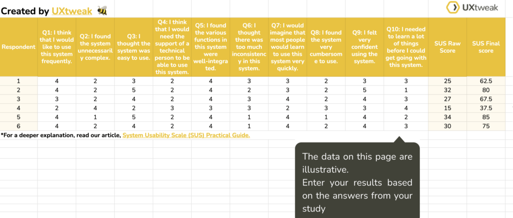
UX scorecard template
Here is a handy UX scorecard template to get you started:

📥 Download .xlsx
Wrapping up
UX scorecards are powerful tools for improving user experience as they provide a solid framework for the display of clear metrics that can massively help teams track progress and check back with the user needs and business goals!
UXtweak is currently the best tool for comprehensive iterative testing, helping you maintain a fully up-to-date scorecard!
With features, such as live interviews, usability testing and session recording, improving your UX has never been easier. Try it today for free!


📌 Example: The completion task rate can be indicated in a percentage, e.g. 95% task completion, for better interpretation of the results.