We’ve all been there. You come to a website with a clear intent to spend money today and enjoy your quarantine shopping, but for some reason, you’re just not having it. Everything feels so overwhelming and hard to find, it’s like you’re lost. Why should it be so hard to make a purchase? Well, it shouldn’t. You just got to a website with a bad ecommerce UX.
And while it’s hard to believe that in our modern world such a thing still exists, many of us continue to face it every day. The purpose of this article is simple: we want to make sure your users have the best experience dealing with your e-commerce website.
Why UX is important in eCommerce?

Regardless of how exceptional the products on your web store are, your eCommerce shop should stick to best industry practices. Otherwise, your efforts may be futile. For many shopping websites, even a minor change in conversion rate can result in a significant increase in annual revenue. As a result, eCommerce UX is critical because it is directly related to profit.
The consumer is king, and if he is dissatisfied with your business, you will not generate income. This is true for all online marketplace platforms, whether they are a B2B, B2C or a C2C (also sometimes known as a P2P). Customers abandon your site when they have a bad user experience, and 88% of clients are less likely to come back to a site after a poor user experience. However, if you offer an excellent user experience, you will boost conversion rates, persuade users to spend more money on your products and create a strong sense of customer loyalty in your buyers.
Most e-commerce websites have a quite similar structure and can be divided into 5 main sections:
- Homepage
- Search & Navigation
- Category page
- Product page
- Checkout
Each of them has its own specifics and purposes on their way to guiding customers to purchase. In this article, we will give you some useful tips on improving these sections in order to make your ecommerce UX design better and conversion rates higher.
Homepage tips for good eCommerce UX
Research says it takes around 2 seconds to make a first impression. That’s how fast users are going to judge your website. After that, they either stay to continue the buyer’s journey or leave and never come back. The homepage is usually the page your customers see first, which makes it literally the face of your whole business.
So, how do you make a good first impression? Well, first of all – showcase the product. That’s the reason people get to your website, so make it as attractive as possible. Large, high-quality pictures with good lighting will work perfectly.
Here are some eCommerce UX design tips to keep in mind when designing your homepage:
- The menu
One of the most important parts of your homepage is the menu. People are used to seeing navigation on top of the page, so our advice is simple, just put it there. You should also make sure your search looks right, but we will talk about that a little later.
- Credibility
Great practice for building trust is to demonstrate credibility. Share customer testimonials, show your partners, highlight your benefits. Explain why people should choose your brand over the competitors, what makes you great and unique.
- Contact information
A thing lots of modern brands are failing to provide is contact information. Offer multiple ways to get in touch. Email is a must, but you can also add chatbot, live chats, and of course, social media links. Brands that are hard to contact will never appear trustworthy. Show users, you are ready to give them all kinds of answers and support.
- Categories
Make sure main category entries are also displayed on your homepage, it will help users a lot with navigation. You can drop hints by showing some of your best-selling products, seasonal offers, and latest discounts.
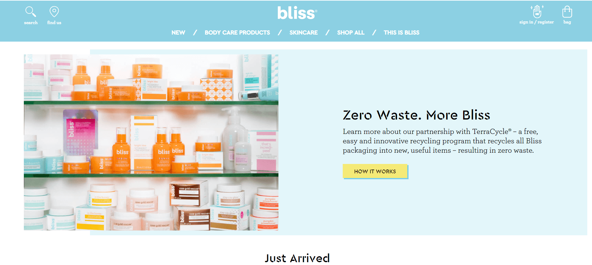
Bliss is a great example of a good Homepage. The navigation is easy and intuitive, they have a clear CTA and showcase the product from the first second:
Search & Navigation tips for good eCommerce UX
Website navigation is something most people don’t even notice until they get completely lost and annoyed. It’s crucial for people who know what they are looking for and it’s also a huge part of your eCommerce UX. Your navigation should be intuitive and provide users with a clear and easy path on a way to your product.
Try to think of it from the customer’s point of view. They perceive information differently, therefore it may be hard for them to understand your information architecture if it’s not based on what they are used to see.
There are some navigation basics for an ecommerce UX, such as including prominent Calls-To-Action buttons that inspire users to purchase, or making sure that all the important information on the website is reachable in 3 clicks. There should always be a brand’s logo present because it’s often used to get to the homepage.
The main elements of your navigation system are the menu and the search, so we’d like to pay some special attention to them:
Menu bar
The menu should be present on every page in the same place so your users would be able to find their way around with ease, no matter the subject. The top navigation menu is a proven pattern, which has been tested on numerous websites. Users expect to find it there, it’s intuitive and simple, that’s why we recommend it for all pages, especially ecommerce.
Sometimes it’s also good to make your menu fixed, so it does not disappear when you’re scrolling. The fixed menu allows users to move around the website quicker and it comes in handy when you have a lot of scrolling to do. Just make sure it doesn’t block any content, this can be very annoying.
If you’re selling a niche-specific product, consider including some of your top categories in the menu. This may save a lot of time for your users.
Search
A best friend of anyone who came to your website with a specific purpose. Half of the time people know what they are looking for and your job is to help them find it as quickly as possible. The key to achieving it is creating a user-friendly search bar. It should be available on every page, visible, with clear borders, and overall easy to find.
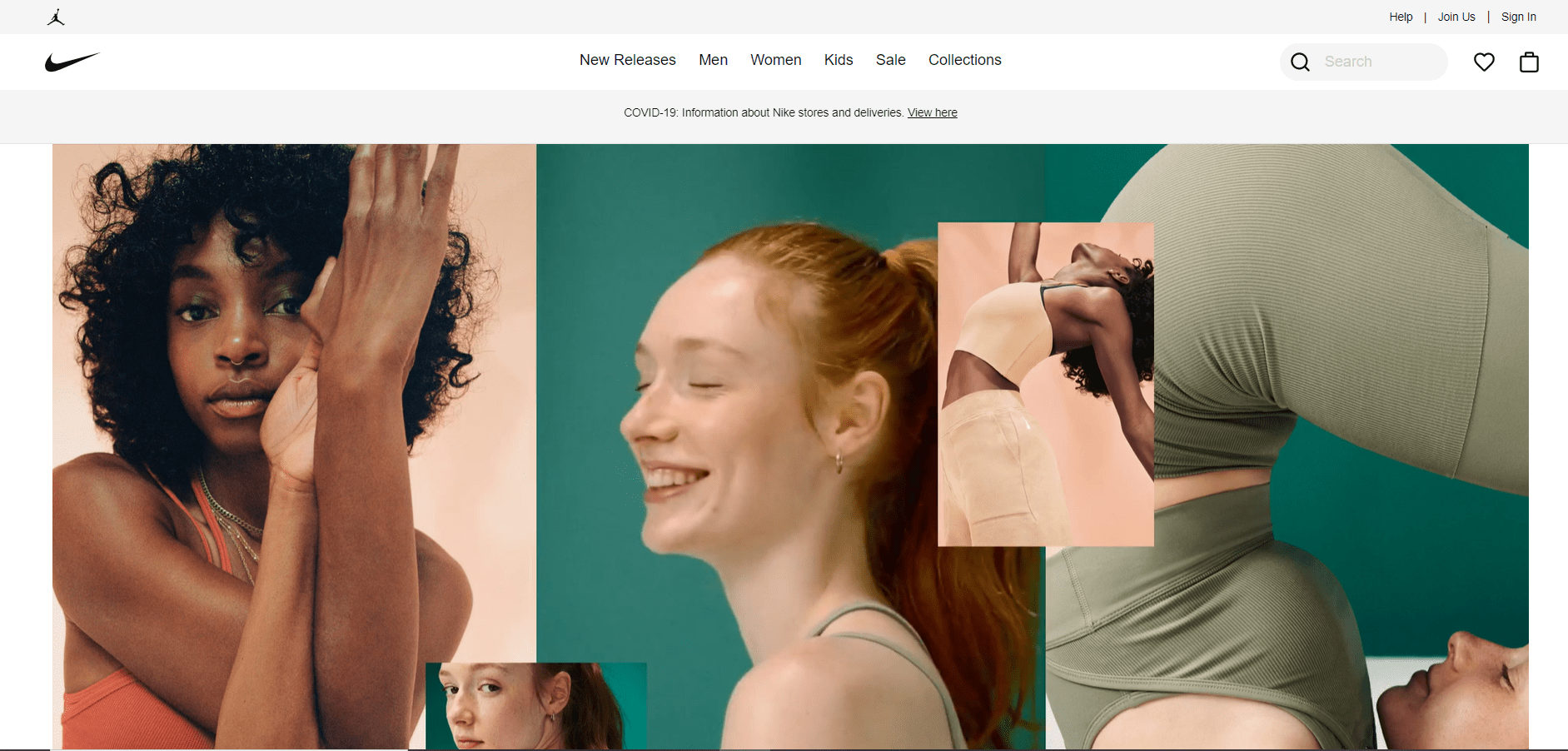
Your users will benefit from autocomplete, you can also provide them with useful tips, such as most searched products. Offer relevant filters, and in case no results come up, suggest users to take a look at some of your most popular categories. An example of a good navigation from Nike:
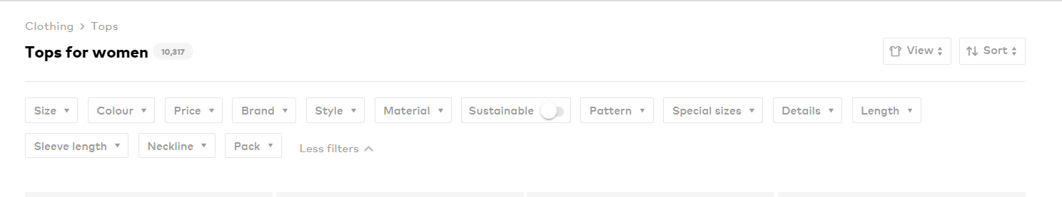
Category page tips for good eCommerce UX
The task of a category page on any ecommerce website is to successfully guide customers down the funnel. In other words – take them to one or more product detail pages.
Let’s take a look at some things you should optimize for them to get there:
Include all types of filters
A good filtering system helps consumers find what they’re looking for based on various categories. Of course, it always depends on the product you’re selling, but try to be as specific as possible. However, there is a filter that will come in handy no matter what – and it’s the price filter. Check out our guide to choosing the right filtering system for your e-commerce website: Filter vs. Facet: which navigation element to choose?
Here’s how AboutYou filter their products:
Use breadcrumb navigation to guide your shoppers
Customers often try to return to a category, but they can’t remember what they clicked to get there. Breadcrumb navigation elements will show them their clear path and make it easier to return to a significant page. Here’s a great example from Ikea:

Display the price
Some brands continue to ignore the fact that users want to know the price of a product as soon as they see it. Keeping it secret, making them go to the product page just to find out it doesn’t suit their budget and immediately go back makes no sense. Good ecommerce UX should be fast and convenient, so make sure the price is not hidden.
Show subcategories on the sidebar
That way you can make it fixed and don’t worry about blocking any content. Plus, it’s the most common place, we usually expect to find it there.
Showcase discounts of this specific category
When users get to a category page you already know what they are looking for. Which makes it a perfect place to display some relevant discounts for this specific category. It can be especially effective with people who are good deal hunters.
Use descriptive category labels, that your users can relate to
It may sometimes appear boring to you, but it’s essential for your information structure to be easily understood. Users should know exactly what they click on and what they can expect to find there.
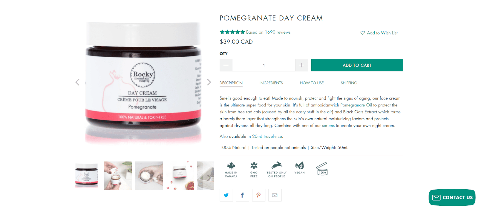
Product Page tips for good eCommerce UX
A product page is a place where the decision is made: Do I want it or not? That’s the question we all ask ourselves while shopping online. Your job here is to convince a person that it’s the right fit for them. That they not only want it, but they also need it. In order to do that you should eliminate all possible doubts and leave no obstacles in the way.
Here’s what you can do:
Provide high-quality pictures
This is a must-have, considering the fact that customers can’t see the product in real life before buying. Your pictures should be large, have good lighting and quality. Show the product from all its different angles and don’t forget to add a picture of it in a natural usage environment. This will help users to visualize themselves using the product. It’s also great to have a zoom feature to show all the little details.
Video or a 360-visualization
We highly recommend adding them too. It’s a great way to provide an illusion of a full experience with the product, even though it’s online. The video will show everything that the picture is missing. Moreover, not many brands have them yet, so you will definitely stand out.
Customer’s reviews
Ask buyers for feedback about the product and display it on the page. You may encourage them by offering discounts on their next purchase. Showing reviews and support from other customers is a great way to build trust and reduce potential doubts.
Delivery and Returns information
This is something you always expect to find on an ecommerce website but see so rarely on the product page. Which is a huge mistake. Users will look for it anyway, so why don’t you put it right there in the product detail to save their time. Be completely transparent, show how easy and fast it can be.
Adding payment method icons is also a great practice for your ecommerce UX. Users will be able to see at a glance if their preferred method is available.

Creative and engaging product descriptions
Try to carry the personality of your brand through the description. Enough with official and dry texts. Try to make some effort to catch the user’s attention. It also should not be too long. A couple of sentences is more than enough for a good description.
Be transparent about your shipping costs and delivery time
This type of surprise is nobody’s favorite. You don’t want your users to uncover some additional shipping fees during the checkout process and decide they don’t want to buy from you anymore. Such things left you feeling deceived, which is not the impression you want to make.
If the product is available in different sizes or colors, don’t forget to mention that too. Good product page example from Rocky Mountain Soap:
Checkout tips for good eCommerce UX
Congrats! You’ve successfully guided your users down the funnel and they are now ready to pay. It might seem like the job is done and there is nothing that could distract them from making a purchase. However, you’d be surprised how many people leave ecommerce websites on this stage just because of a bad UX. A good checkout page should give the buyer the smoothest transaction and we are here to make sure your buyer gets one.
These are some tips for your ecommerce checkout UX:
Simplify the process
Your buyer’s checkout should be a clear path with no distractions on the way. Make it fast and easy, with just several clicks. Don’t ask for any extra information, leave it for later.
Guest checkout option
Adding an option to register or log in after making a purchase is a great time savior. And it’s not only convenient for the users. Guest checkout makes sure you don’t interrupt a person’s buying experience which is a huge advantage for you too. Most of the time people just want to make a fast purchase, without giving their email for marketing purposes, let them do it.
Payment methods
We live in a world of technology where everyone is used to a different payment method that suits them the best. Having classical options is no longer enough. It’s time to integrate some alternatives. Offer to pay via Apple Pay, Google Pay, PayPal, and maybe even consider adding cryptocurrency payments. Don’t forget to mention that buyer’s security and privacy are in reliable hands. That’s what truly matters in a digital environment.
How can UXtweak help with eCommerce UX?
We all know that in order to design a website with good eCommerce UX you should try to look at it from the user’s point of view. But how hard can it be sometimes! This is what our platform is for.
We recommend starting with improving your navigation system. It makes sure your users end up exactly where they want to be and where you need them to be to reach your business’s goals. If something is wrong at this stage, you risk messing up the whole conversion funnel. Start by running a simple Card Sorting and Tree Testing studies, to check for any potential problems and figure out the best navigation structure for you.
Our Website Testing feature will show you how people are using your website and help to uncover usability issues. Nowadays, more than half of online sales are done from mobile devices, so you might want to run a Mobile usability test too and check if everything works right.
There is also such feature as Session Recording which allows you to record and replay visitor’s entire journey. It shows you the website from a user’s perspective, so you don’t have to wonder and question everything. You can see what they do from start to finish and then make all the improvements needed for your web specifically.

Other eCommerce UX design tips
Become more than just an online store
People visiting your shop should be eager to find and purchase the products they require. But they have higher expectations. Online stores can build massive brands that provide visitors with amusement, guidance, and content. And you must stay true to this process. It would be especially beneficial if you provided a regularly updated blog.
Along with being fantastic for UX by providing visitors with essential information, it also aids your SEO efforts. It can be time-consuming, but the final outcome is always superior. Furthermore, you must be active on social media, have a unique character, and post frequently.
When you bring up your company, you want your target group to look into your products and services.
Provide Social Proof
Social proof can always be displayed across user-generated content such as feeds on social media, user comments, email subscribers, or your follower count. You can provide any information that indicates help from others, which can affect viewers to believe in your company and store.
As an outcome, it reduces worries or skepticism about your product lines, resulting in a better user experience.

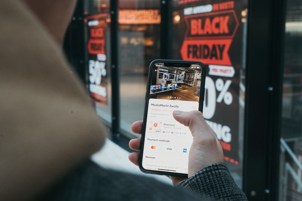
Aim for a user-friendly mobile eCommerce experience
All major online businesses have released mobile applications and adapted their web pages for smartphone owners. Another important point to be noted is that if a site is not optimized for smartphone users, mobile users are four times more likely to give up a task. That should be sufficient to pique your interest in mobile development.
Your eCommerce user experience design should prioritize creating a mobile-friendly site because this will boost customer accessibility and purchases. Use our Mobile Usability Testing tool to test and improve your mobile eCommerce UX.
Reduce the time it takes for your online store to load
One of the main reasons people buy online is that they do not need to stand in a queue to buy something or stand in line to charge for the products in their cart. The goal of internet shopping is to save time. What if your online store requires an eternity to load?
Most guests will leave your online marketplace instantly and may never return. In fact, 45% of users abandon a website that requires more than three seconds to load. In a matter of seconds, you will end up losing approximately half of your potential clients. Page load time should be between 1-2 seconds. The quicker your web page loads, the greater the user experience. This also will help you gain your Google ranking.
Improve your eCommerce UX with these tips!
Fine-tuning your eCommerce UX is not an easy task. But trust us on that, it’s worth 100% of your effort. And don’t be afraid to ask for help. We’re always here to help you understand your users better!
Register for your free UXtweak account, try out our tools for free and improve your web!