The variety of software products that are used within organizations tend to be notoriously complex. However, with advancements in design and the introduction of remote work, more companies are realizing the importance of good enterprise UX.
What exactly is enterprise UX?
In simple words, ‘enterprise UX is the design of software that helps people do their jobs’ – Forbes. It is the design of everyday tools which are used in working environments like Slack or Asana.
And since organizations need enterprise software to operate and achieve their fundamental goals, the user experience of these tools is of paramount importance. The design of a product alone is not enough to help you complete your tasks. UX designers should consider the employees who use this software for their day-to-day tasks.
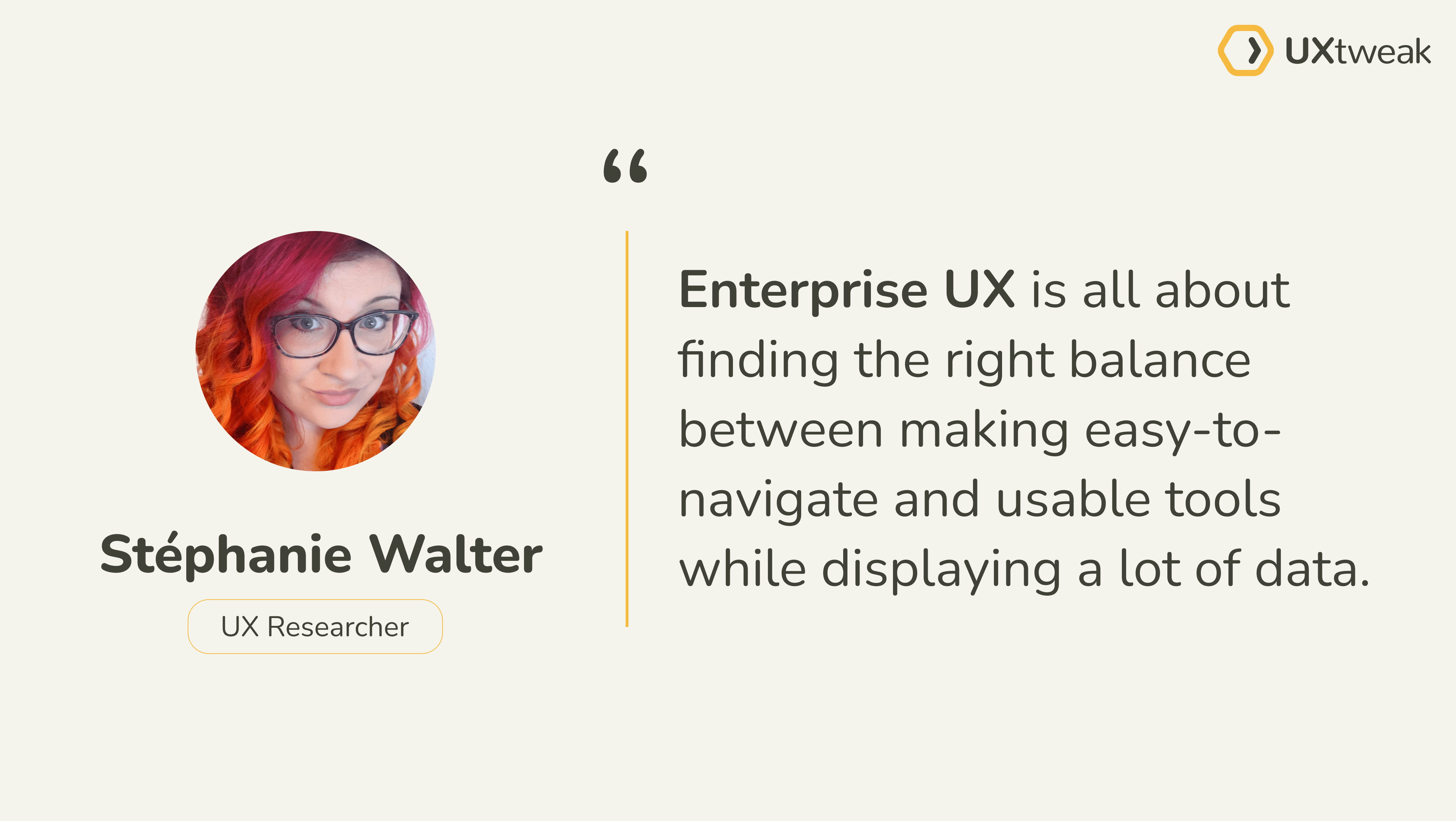
Therefore, the saying “a user interface is like a joke – if you have to explain it, it’s not that good” doesn’t work in such environments. Users need prior knowledge and sometimes even expect some degree of training on such tools.
We could rephrase this as “an enterprise user interface is like a joke. And like any good joke, users might need some prior knowledge in order to understand it.
It doesn’t make it a bad joke, but neither a bad interface.“– Stephanie Walter
Enterprise user experience VS Consumer user experience
When we talk about ‘designing with users in mind,’ we automatically think of B2C products (consumer products) and their users – how they will interact with the app, their pain points, and their tasks. But we often forget about B2B products (Enterprise products), despite the products having end-users as well.
If a consumer product does not prioritize the user in its design, the user can always substitute it for another with a better user experience. Therefore, many design teams put more focus on improving the user experience of consumer products – creating products that are accessible, inclusive, user-friendly, and so on, unlike they do for enterprise products.
But still, every product used for work directly impacts the employees, regardless of whether they are good or bad. An interface that is too complex to interact with will reduce their productivity and affect the stakeholders’ return on investment for that particular product. A sloppy enterprise UX could even make work more tedious and thus affect employee satisfaction in the long run.
Both B2C and B2B products need to have a good user experience if users or stakeholders are to enjoy maximum benefits.
However, there are distinct characteristics that differentiate them, as well as play a part in their UX design:
Scalability
For consumer apps, the scalability of the product remains largely unknown until it is released. So product teams are continuously testing and iterating to get the best version of their product and new features to grow their market share.
The situation is the opposite when it comes to designing enterprise software. Here, products are designed for a specific group of people and tasks, and this limits the potential scaling up to the actual or projected size of an organization.
Because of the limitation of enterprise products, both creatively and market-wise, few UX professionals are interested in venturing into the realm, since they are interested in building consumer products.
End users
When designing consumer products, product teams prioritize end users’ experiences because they have the power to forfeit one product in favor of an alternative, if it doesn’t meet their expectations or they find it difficult to use.
In enterprise applications, however, the decision-makers are often not the users. High-level executives choose the products based on their own preferences and metrics, and not necessarily the end users’ (employees) experience. As a result, these products are designed to meet the executives’ needs and not the actual users, which is against the fundamental principles of UX. Such products often end up functional for all purposes, yet are tedious and hard to use.
Tasks
For consumer products, end-users accomplish single tasks like watching a movie, ordering a meal, and so on. But on the other hand, end-users use enterprise software to complete many different tasks. Multiple users also join in at independent points in the workflow.
This type of usage makes enterprise UX much more complex in its design process, since it has to consider different user types, their goals, their user journey, and different pain points all within one product.

Source: Unsplash
Best practices for enterprise UX design
Enterprise software has long been associated with an ‘ugly’ stereotype – a design that’s too complex and unappealing for people to use. But despite the challenging nature of enterprise UX, it is possible to create a good user experience. And so, the easiest hack is to follow the same care given to consumer products – after all, employees are users too.
So here are some best practices for designing good Enterprise UX:
Have a great ‘first use’ experience
Good first impressions go a long way. If the first experience proves unpleasant, it can be difficult for users to get the most out of the product. So make the onboarding process short and simple for users. Guide them to complete their pressing tasks immediately without the need for learning all the features.
Connect on a personal level
Having a consistent brand identity and letting your brand personality shine in the product helps you connect on a deeper level with users instead of becoming generic software. When the product is more humane in both copy and design, users find it easy to interact with and don’t feel stressed out while carrying out their activities.
Simplify navigation
Go easy on the tabs! Having too many functions on a screen can be jarring and overwhelming for users to navigate. In some cases, it may even incite anxiety.
When designing enterprise products, maximize clarity by giving navigation tabs only to the most relevant features. But do not oversimplify in a way that hinders functionality.
We can also consider a few tips:
- Categorize low-value features into a single tool: Structure is everything. Identify which functions to group under an umbrella and put them under an appropriate heading. If done well, it will significantly reduce clutter and make navigation easier. To make sure you create effective categorization run a study using card sorting tool and have your targetted users create the categorization for you.
- Have a visible Help button and other vital elements on the main navigation bar for users to access from any page.
- Offer collapsible sidebars that help users navigate while keeping the screen simple and neat with enough white space.
- Optimize the user interface for different user roles: Since not everyone on a team would use the product the same way or for the same purpose, provide an option for users to specify their roles and get access to specific features. In order to optimize user feedback you can easily test user interfaces with the help of a first click testing tool.
UX writing
To make navigation easier and help people properly use the product, the copy within the product should be clear, concise, and error-free. Understand the users and speak their jargon when necessary to help them carry out their tasks with little to no mental strain.
Also, name the elements within the product appropriately and present information at the right time while communicating with them in a natural-sounding manner.
Think flexibly
All potential users have to be considered. The ideal product should be easy for new users to understand to eliminate the need for rigorous training workshops on how to use the software, which costs valuable time and money.
On the other hand, expert users should not find themselves thrown off by a radical change in the user interface because we want to simplify the product for new users.
Moreover, there are different employee levels ranging from junior staff to managers, and each has varying degrees of access to information. So UX teams have to think flexibly to accommodate the various user groups, their access levels, as well as the different types of tasks they want to use for the product to achieve success.
Good enterprise UX design examples
Here are some enterprise products that are doing it right:
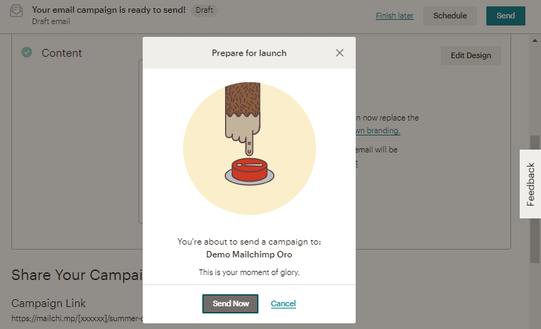
Customer Relationship Management (CRM) – Mailchimp
When it comes to personality, Mailchimp is a solid example of how to connect with users and inject delight in everyday tasks through their brand voice.
Productivity suite – Airtable
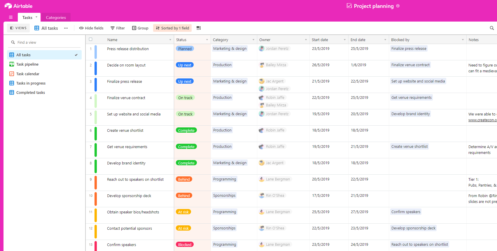
Keeping tabs on your projects can be simple and easy on the eye. Airtable helps new users learn how to complete their current tasks through its collapsible sidebar. This way, they can quickly overcome the learning curve without feeling overwhelmed.
Communication – Slack
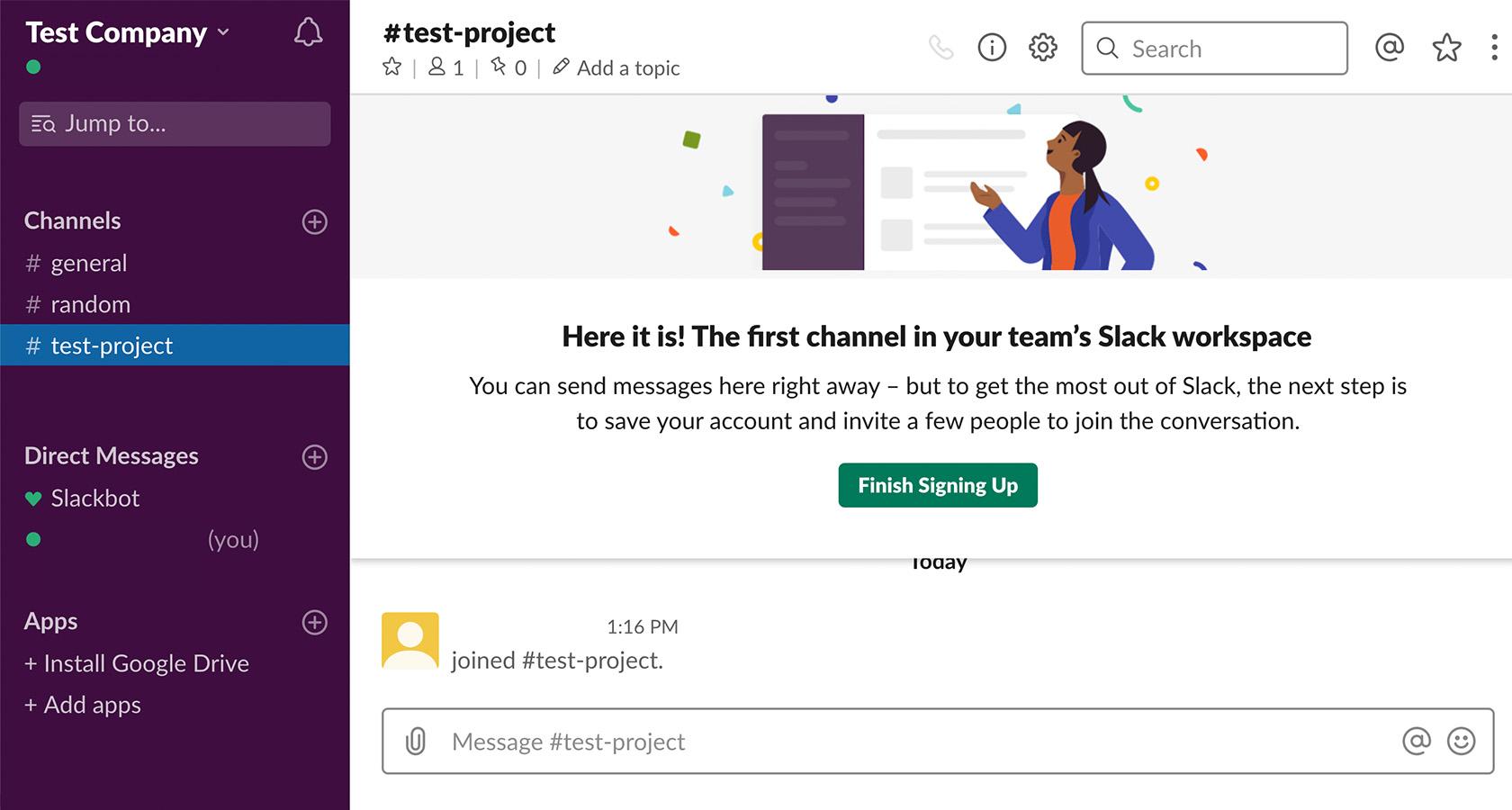
Slack gives users quick wins by letting them achieve immediate tasks before completing the onboarding process. Their slackbot is also always available to guide users within the product.
Project management – Asana
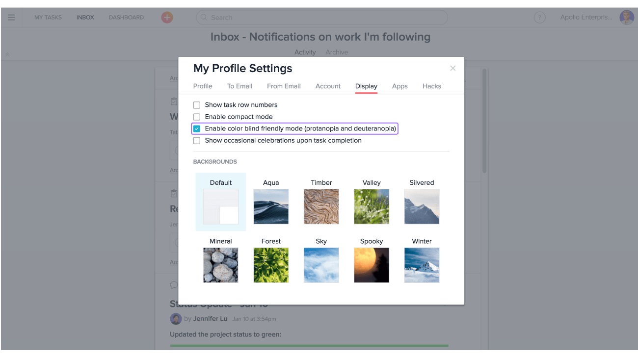
Asana stands out for its simple and user-friendly interface. It’s also a great example of UX done right, since it considers all pain points to make their product accessible to their different user types.
Invoicing – QuickBooks
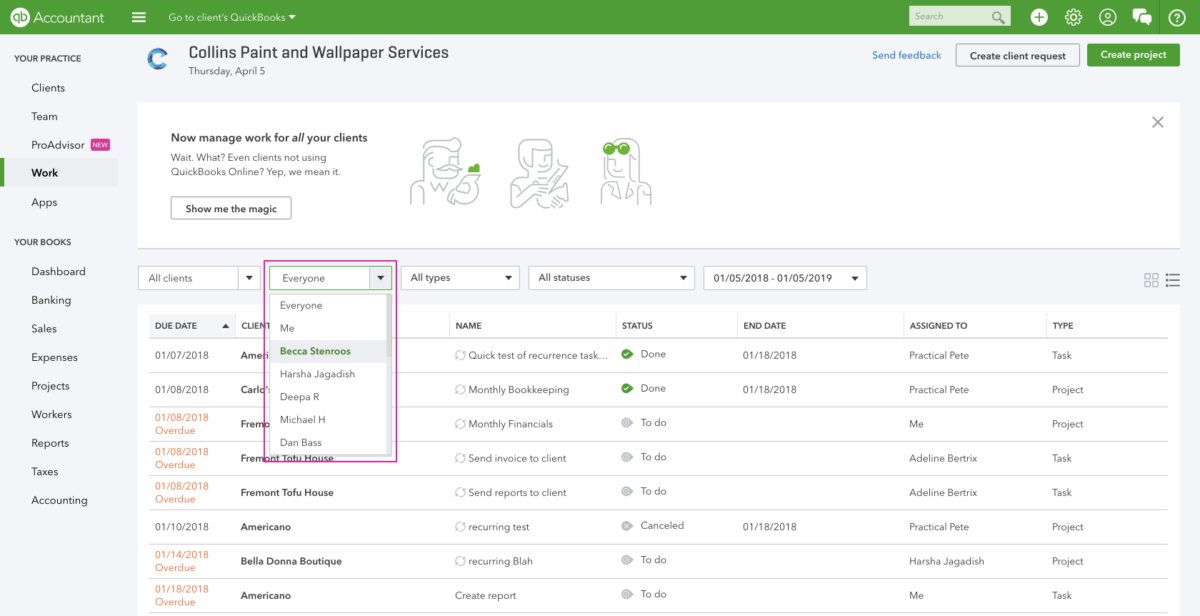
Invoicing can be daunting, especially when working with a large client base, and it’s up to the designers to make the enterprise product easy to navigate. Having well-organized tabs and incorporating features to simplify search makes navigation easy for users. It also helps them complete their tasks quickly and efficiently.
The ROI of enterprise UX is always worth it
When we invest in the user experience of enterprise products, employees find it easy to accomplish tasks, collaborate with colleagues, and level up their skills by mastering new tools. They can also complete projects quicker and more efficiently, which increases their productivity and ultimately increases the company’s profits.
So having some product teams take on this space and revolutionize how they design their enterprise products is a step in the right direction, and one we hope more companies would adopt.
Go ahead and test the enterprise UX of your company with our all-in-one usability testing tool. Register today!
