
In the ever-changing world of the internet, icons are a crucial part of a screen designer’s toolbox. Ideally, icons should be helpful, natural, and easy to use.
It’s a mistake to assume that your taste or opinion reflects that of the audience, so ensuring that app icons are comprehensive and effective can only be achieved through app icon testing.
In this article, we’ll take a look at how to perform and evaluate icon testing for apps properly.
What is Icon testing?

Icon testing is the analysis and testing of designs with icons as part of their design. The process aims to find out whether the icon communicates its meaning correctly, if it is easy to understand, and if the icon can easily convey information users can use.
Whenever we use a given word in a sentence, our brain processes its meaning before we even ask ourselves what the word means. We have learned this process by default, and it is so natural that we do not realize how important it is. The same happens when we see an icon in the designs: our brain processes its meaning without effort.
In addition to conveying a brand’s personality through color and style, icons must also convey meaning. As their name implies, icons are visual representations of objects, actions, or ideas.
However, the icon is simply eye candy if it does not convey any clear meaning to its users immediately. Badly used icons will result in visual noise that hinders the user’s ability to accomplish tasks.
The purpose of testing icons is to ensure that they are recognizable, and that people can easily deduce the information the icon depicts. If you want to learn more about UX research and testing, visit our Guides.
Why use icons?
Icons are used in design for a variety of reasons. We have listed a few of the most common ones below.
Visual Hierarchy
The most common reason is to communicate hierarchy in the design. Icons are often used to represent different levels of information (from large icons representing the most significant parts of an application to smaller icons representing individual parts) or to highlight specific design aspects.
Easy Recognition
Designers can also use icons to make it easier for users to recognize different elements in a design. You can use similar icons with different colors, sizes, or other visual cues (such as a circle and square). Or, you may use symbols unique only to your apps, such as arrows pointing at things or numbers showing how many items are inside an object.
Easier Navigation
Using icons also allows for easier navigation throughout your app with less effort from the user. People familiar with an app interface are much more likely to identify what they’re looking for if they see icons rather than text labels and numbers (which could vary from screen to screen).
Representation
Icons can convey information and make it easier for users to understand what the icon represents. For example, an icon for a computer with a monitor and keyboard could describe any computer with these essential elements, such as an Apple Mac or PC.
Icons can also represent something that is not tangible, such as an emotion or feeling. In this way, icons can help the user connect with their product or service quickly and easily by only conveying essential messages.
Convenience
Suppose you need to switch between two applications on your computer or phone. In that case, you don’t have to remember how they look or what they do — click on their icon instead! This saves time and effort when switching between programs or apps.
Why do you need to be testing icons?
Iconography is a powerful tool for conveying information. It can help people quickly get the gist of what you’re about, as well as help them navigate your website.
But if you want to use icons properly, you must test them. Here are some reasons why you should be doing so:
Findability
Is the icon on the page easy to find? Will users know where to find it again?
These are questions that any designer or developer should ask themselves before starting to work on an icon. If someone doesn’t know where an icon is located, they won’t bother looking for it — and if they do look for it, they’ll be more likely to leave without interacting with it.
Recognition
Do people understand what the icon represents? A good icon conveys its meaning quickly, but a bad one can confuse people or cause them to wonder whether they should interact with it at all. For example, check out these bad examples of icons:
An average user may be unable to tell what these icons represent without labels, so testing your icons with real users is essential.
Ease of Use
Does your icon make it easy for users to understand what action they should take next? This can improve conversion rates and user engagement.
Icons are an essential part of a website and the first thing your users will see when they arrive on your page. It is vital to ensure that your icons perform well without creating any issues for users. If an icon fails to render correctly, it can cause users to have difficulties accessing information within your website.
Compatibility
Will your icons work well across devices, such as a cell phone, desktop, or tablet? Your icons should also be compatible with other websites. If you have a social account or another website where people use the same type of icons as yours, those icons will also work on your site!
Testing your app icon for app store optimization
A field of its own, app store optimization (ASO) is an area, where icon testing is extremely important. If you want your application to stand out, one of the main elements you need to focus on is a good, representative, and visually pleasing icon.
If you want to find out more about app store optimization and how you can apply your UX skills there, check out the video below.
Methods for testing icons
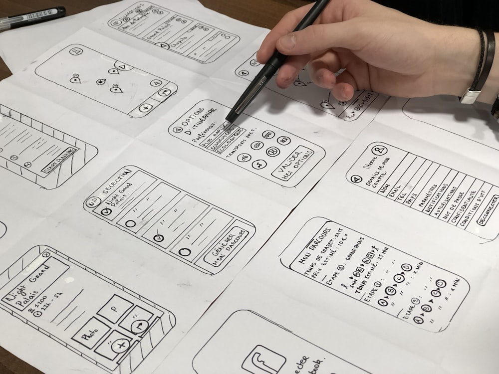
The best way to test an icon’s effectiveness is to conduct a usability study. A usability study systematically investigates how people use a product or service. Usability testing aims to determine whether users can quickly learn how to use a product, whether they understand its features and functions, and whether it solves their problems.
A usability test is based on giving participants a set of tasks to perform with your product and watching them interact with it. It helps you easily identify problems with your design and improve it by providing feedback from real users.
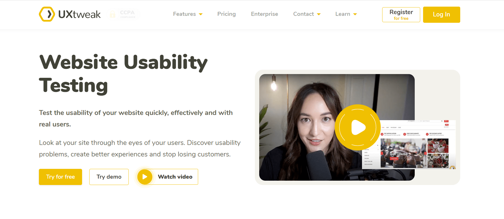
UXtweak has tons of exciting features to help you reach actual users. Our Recruiting Widget was designed to simplify the recruitment process. You can recruit real users and turn them into testers with the Recruiting widget without any extra effort. Additionally, with our User Panel feature, you can have access to a wide demographic of respondents all at the click of a button!
You should be careful with finding testers even when conducting small, cheap, and quick research, as it too will contribute significantly to the further development of your product. Here are some useful tips for finding the right respondents for user testing.

Findability Methods
Findability is one of the strongest and most reliable usability tests, since it tries to determine whether the user can find an icon on a website using only its name.
The basic idea behind findability testing is that users will be able to find an icon if they know what it looks like; however, that doesn’t necessarily mean they’ll be able to remember or understand why they found it in the first place. Take, for instance, a webpage with five different images of cats. In this case, a user might find one cat, but leave without remembering it.
Time-to-Locate Tests
Time-to-locate tests are similar to findability tests, except that they measure how long it takes users to locate an image on a website. In this case, we’re looking at how quickly users can identify an image compared to other pictures on the same site or across multiple sites.
Recognition Methods
Recognition methods are designed to determine whether users can recognize an icon when they see it. It is usually best to run this test after you’ve already tested your icons using one of our other methods. This test requires some training or practice before you can use it effectively.
Eye Tracking Studies
The most common method for testing icons is through eye tracking studies. Eye tracking studies measure how long people look at different parts of the screen when interacting with an application or website. This method can determine where essential elements are located on the screen, how often users click on them, and what happens when they click on them.
Click-through Tests
Another method for testing icons is through click-through tests, which involve showing participants an icon while interacting with an interface or application and recording how many times they click on that icon during that interaction period. This method can help you understand why users don’t click on some aspects of your application, whether it’s because they’re not easy to use or they have a vital icon.
Another way of conducting an icon test is by doing Preference Testing. Whenever you have a couple of different icon designs and are struggling to choose the one you like most, ask your users and find out which one they prefer!
How do Icons Improve Usability?
Icons are an essential part of most mobile and desktop applications. They help users navigate apps, web pages, and other digital products. Here are some ways Icons can improve the usability of a product.

1. Icons are easily recognizable
Icons are iconic, meaning they have a recognizable form that is recognized by people who are exposed to them. This is why icons are used in many applications on the web or other devices.
2. Icons save space
The small size of icons reduces their file size, freeing up valuable space on your site or app. This can make the entire site load faster and reduce bandwidth costs.
3. Icons make good touch targets
Icons have a larger target area than text, making them more friendly for users with smaller screens or fewer mobile accessibility options.
4. Aesthetically pleasing
How does your icon appear? Does it complement your website’s design? Do the symbols on your site match this one?
This is particularly crucial on mobile devices where icons are more prominent and often utilized. Usability suffers when symbols and actions are organized in an unattractive UI.
Wrap Up
Think of icons as the first impression your users get of your app or website. A wrongly-used icon means a bad first impression. If you give people a subpar icon, they won’t think highly of your other design elements either.
This is why the testing of icons is so important: it ensures that you create an effective, consistent representation of every element in your design. Try Uxtweak for free and conduct a quick and easy icon test!


