🛠️ A CRO audit is more than a quick design tweak; it’s a full-funnel investigation into why visitors aren’t converting by analyzing user behavior, conversion paths and design bottlenecks
🧪 Combining both qualitative (user feedback, usability testing) and quantitative (analytics, heatmaps, A/B tests) data gives a complete view of why users drop off
♻️ A CRO audit isn’t a one-off; it’s an ongoing process of testing, learning, and optimizing to steadily boost conversions and ROI
📉 Analytics and heatmaps reveal patterns but only real user testing shows why. UXtweak goes further, enabling usability studies, task-based tests, and live interviews to uncover the reasons behind user behavior
🤝 Pair UXtweak’s User Panel with moderated sessions to not only spot conversion roadblocks but also uncover the underlying user motivations and frustrations
A CRO audit is often the missing piece when websites underperform.
The problem isn’t usually traffic; it’s what happens after visitors land. You can invest in ads, SEO, or social campaigns, but if people click in and leave without buying, signing up, or booking, the money never pays off.
A CRO audit gets to the root of that. It shows you where visitors drop off, what’s causing friction, and why your funnel leaks. When you address those barriers, small changes can create outsized results.
More sign-ups, more demos, more sales, without spending a dollar more on driving traffic.
What is a CRO audit?

A CRO audit, or Conversion Rate Optimization audit, is a systematic review of your website designed to find out why visitors aren’t converting into customers.
Unlike simple fixes such as changing a headline or button color, a website conversion audit digs into every part of your funnel.
This includes your data, design, copy, user experience, and even the psychological triggers that drive decisions.
The purpose of a CRO website audit is to find the hidden leaks in your conversion funnel that are costing you sales.
Importance of regular CRO audits
Regular CRO audits are a crucial part of ongoing conversion research. They help you find hidden friction, keep up with changing user behavior, and continuously improve how your website turns visitors into customers.
Here are three big reasons why you should prioritize a CRO website audit:
✅ You catch problems before they bleed revenue
Little things can kill conversions without you noticing. A broken form field, a slow-loading checkout page, or a confusing navigation path can drive visitors away in seconds.
Regular CRO audits make sure you catch those issues before they lead to lost sales.
As Jeff Gothelf, author of Lean UX, puts it:
Conversion optimization is about finding the right mix of value proposition, call to action and price point to convince a customer to take a deeper level of engagement with your product or service.
A CRO audit is what helps you pinpoint whether that mix is working or where it’s falling short.
✅ You keep pace with shifting user behavior
Online behavior isn’t static. The way people interact with websites evolves constantly: more mobile usage, shorter attention spans, higher expectations for speed and personalization.
What worked last year may already feel outdated today.
Regular website CRO audits help you stay aligned with how your audience actually shops, reads, and clicks now, not six months ago.
💡 Pro Tip
Use A/B tests alongside your audits to experiment with micro-changes like button placement, headline tweaks, or simplified forms. Small adjustments informed by actual user behavior can prevent friction points from becoming revenue leaks.
✅ You get more out of every marketing dollar
Driving traffic isn’t cheap, whether you’re paying for ads, investing in SEO, or building campaigns on social media. But all of that spend is wasted if your site fails to convert.
CRO audits make sure you’re not just buying clicks but turning them into customers.
Every tweak that improves the user journey makes your existing marketing budget work harder and deliver a higher ROI.
Did you know? 💡
We have analyzed what CRO practitioners say about cost vs. impact.
Many emphasize that a $5,000+ audit sounds expensive until you calculate what even a 20% lift in conversions would mean for revenue. If you’re already paying for traffic, the ROI of fixing leaks in your funnel can easily outweigh the audit fee.
CRO audit checklist

Running a CRO test can feel overwhelming, so here’s a step-by-step checklist to guide you:
1. Analytics and data review
- Pull conversion rates by device, source, campaign → compare with benchmarks
- Identify pages with high bounce rate (>60%) → list top 5 offenders.
- Use Behavior Flow (GA) to spot funnel leaks
- Export your top 10 exit pages → investigate why users leave
2. User experience & usability
Test site navigation for clarity and ease of use.
- Run a First-Click Test to see if users can find key actions quickly
- Try site navigation yourself on desktop and mobile → does it take more than 3 clicks to reach a product page?
- Test all forms and remove optional fields, check auto-fill works, and confirm forms load smoothly on mobile
- Go through checkout flow on mobile → highlight unnecessary steps (e.g., forced account creation)
- Run your copy through Hemingway App → check for clarity, skimmability, and persuasive CTAs
- Go through checkout flow on mobile → highlight unnecessary steps (e.g., forced account creation)
- Run your copy through Hemingway App → check for clarity, skimmability, and persuasive CTAs
3. Design & visuals
- Check if CTAs are visible within 3 seconds of landing
- Run a 5-second test with a colleague: “What action stood out?”
- Test site on multiple browsers and devices
- Measure site speed and flag pages that load >3 seconds
4. Content & messaging
- Review top 5 landing page headlines and ask: “Does this clearly say what we do and why it matters?”
- Highlight benefit-driven copy (not just features)
- Add or update trust signals: reviews, testimonials, security badges, guarantees
- Pick 3 competitors and compare messaging → what unique angle are you missing?
💡 Pro Tip
Use UXtweak’s Preference Testing tool to see which headline or CTA copy resonates most with users.
5. Technical performance
- Run Google PageSpeed Insights and list critical fixes
- Crawl site and fix broken links, redirects, or 404s
- Verify SSL/security signals
- Confirm tracking tools (GA, GTM, Hotjar, etc.) work correctly
6. Behavioral Insights
- Review heatmaps for top 3 landing pages → are users clicking where you expect?
- Watch at least 10 session recordings → note common sticking points
- Check your site’s internal search queries → what terms are users typing that suggest intent/frustration?
- Map common paths to conversion → are people taking unnecessary detours?
7. Texting & Experimentation
- Make a list of top 3-5 elements to test (headlines, CTAs, layouts, pricing
- Score each by Impact vs. Effort
- Write clear hypotheses (e.g., “Changing CTA wording will increase clicks by 10%”)
- Document result in a testing log
💡 Pro Tip
When it comes to CRO for mobile don’t just resize for smaller screens; optimize the entire journey.
On mobile, even tiny friction points (like a hard-to-tap button or slow-loading image) kill conversions fast. Test with real users on mobile to see if:
CTAs are thumb-friendly (44px+ tap target).
Forms have mobile keyboards that match input type (number pad for phone, email keyboard for email fields).
Checkout flows minimize typing (auto-fill, wallet payments, one-tap checkout).
9 website CRO audit steps

With your audit checklist in hand, you now have a clear picture of what to look for. The next step is understanding how to run an effective audit from start to finish.
Here are some core steps to follow:
📍Step 1: Set clear website objectives & KPIs
Before you dive into an audit, define what “conversion success” means for your business.
A conversion isn’t one-size-fits-all. For an e-commerce store, it might be completed purchases. For a SaaS company, it could be demo requests or free trial sign-ups.
For a publisher, it might be newsletter subscriptions. If you don’t pin this down, you risk measuring the wrong things.
As James Gurd rightly puts it,
To do CRO you need insight to create hypotheses for testing.
A test without a hypothesis to prove/disprove has no focus. UX can help in terms of understanding why something might be happening e.g. Why aren’t people adding to the basket on mobile? A structured UX approach would use customer centric thinking to look at how users interact with the website, what works and where issues lie.
They would then apply this, in the context of good practice, into concepts for improvement based on identified user needs. So UX thinking can improve the structure, focus and relevance of CRO projects.
This means your objectives and KPIs shouldn’t just be numbers pulled out of thin air. They should tie back to real user behavior and the hypotheses you’ll later test.
Start by asking:
👉 What is the single most valuable action a visitor can take on my site?
👉 What are the secondary actions that still contribute to the business (e.g., adding to cart, downloading a guide, signing up for emails)?
From there, define KPIs that match those actions. For example:
- Homepage → % of visitors clicking into product pages.
- Product page → Add-to-cart rate.
- Checkout page → Cart-to-purchase completion rate.
- Blog → Newsletter sign-up rate.
💡 Pro Tip
Map objectives by page type. Success on your homepage (getting people to explore deeper) is different from success on a product page (getting them to hit “Add to Cart”). This makes your audit far more targeted and actionable.
📍Step 2: Map the website funnel
The next step is to understand how visitors actually move through your site.
It’s more like laying out a journey: starting from the first touchpoint (like a landing page or ad click) all the way to the final conversion.
Mapping this out can help you ask the right questions:
👉 Where are visitors dropping off most often?
👉 Are they getting stuck browsing categories without adding items to their cart?
👉 Is checkout abandonment unusually high?
👉 Do free trial sign-ups fail to convert into paying customers?
When you see the funnel clearly, the weak points become obvious and you can focus your CRO efforts on fixing the leaks.
Did you know? 💡
We have analyzed what CRO practitioners and PPC experts discuss in communities like r/PPC.
It turns out, many of them stress that a CRO audit should go beyond dashboards. Actually walking through the site like a customer adding items to cart, testing payment flows, and checking post-purchase messaging often reveals issues that data alone can’t capture.
📍Step 3: Evaluate page performance
Your site might look great, but if it loads slowly or breaks in key places, visitors won’t stick around long enough to convert.
Start by running speed tests on your most critical pages: homepage, landing pages, product pages, and checkout flows.
A delay of even one second can cause noticeable drop-offs, especially on mobile. Beyond speed, check:
Technical issues → Broken links, unresponsive CTAs, JavaScript errors, or forms that don’t submit correctly.
Cross-browser performance → A page that works fine on Chrome might glitch on Safari or Edge. Mobile responsiveness → Does the layout break on smaller screens? Are buttons easy to tap with a thumb?
It’s a sought out way of clearing the road before inviting more traffic.
📍Step 4: Analyze visitor interaction
Numbers tell you what’s happening on your site, but they don’t always explain why. That’s where behavioral analysis comes in.
With tools like session recordings, heatmaps, and scroll tracking, you can watch how real people move, click, hesitate, or drop off on your website. Here’s what to look for:
- CTA engagement → Are visitors hovering near your call-to-action but not clicking? Maybe it’s unclear or not compelling enough.
- Navigation confusion → Do users keep clicking menus or links that don’t lead where they expect? That’s a signal your navigation needs rethinking.
- Form interactions → Are people starting forms but not finishing them? Session replays can show if they get stuck on specific fields.
- Scroll depth → Are users only seeing 30% of your page before leaving? That might mean your most important content is buried too far down.
📌 Example: let’s say you notice users repeatedly clicking on a product image as if expecting it to zoom, but nothing happens. That single piece of insight tells you an easy fix could improve the experience and nudge people closer to converting.
💡 Pro Tip
Don’t get distracted by one-off behaviors. Focus on patterns that show up across multiple sessions. If dozens of visitors hesitate at the same step or abandon at the same point, you’ve found a friction area worth fixing.
📍Step 5: Audit messaging & content placement
Even the smoothest funnel and fastest site can fail if your messaging doesn’t connect. Your content needs to do more than just “fill space,” it has to guide, persuade, and reassure visitors at every step.
Start by reviewing your:
Headlines → Do they clearly state the value you offer, or are they vague and clever for the sake of it? A headline should answer, “Why should I care?” within seconds.
Product/service descriptions → Are they focused on benefits (what users gain) rather than just features (what the product has)?
Landing page copy → Does it align with the ad, email, or search result that brought visitors there, or does it create a disconnect?
Trust signals → Reviews, case studies, or guarantees should appear close to decision points to reduce hesitation.
Placement matters as much as messaging. If your most compelling proof points are buried at the bottom, or your CTA only appears once at the very end, you’re losing opportunities.
For instance, moving a strong testimonial above the fold can significantly improve conversions.
💡 Pro Tip
Test messaging hierarchy and placement; sometimes moving a single paragraph or CTA above the fold can dramatically increase engagement.
📍Step 6: Review Forms & CTAs Across the Site
Forms and calls-to-action (CTAs) are where interest turns into action.
Yet, they’re often where friction is highest. A CRO audit should scrutinize every form and CTA, because even small barriers can stop conversions cold.
For forms, ask:
- Length → Are you asking for too much information upfront? Do you really need a phone number for a newsletter sign-up?
- Clarity → Are field labels clear? Is the purpose of the form obvious?
- Error handling → Do users get helpful inline validation (e.g., “Enter a valid email”) or frustrating red error messages after submission?
- Responsiveness → Do forms adapt cleanly on mobile, where typing is harder?
For CTAs, review:
- Placement → Is the button visible without scrolling? Do longer pages repeat the CTA where it makes sense?
- Design → Does the button stand out from the rest of the page, or does it blend into the background?
- Microcopy → Does it say “Submit” (cold and generic) or “Get My Free Demo” (specific and benefit-driven)?
- Context → Is the CTA matched to user intent? Someone reading a blog may not be ready to “Buy Now” but might click “Download the Guide.”
📌 Example: imagine a SaaS site where the “Book a Demo” button only appears once at the very bottom of a long features page. Simply moving that CTA higher and repeating it after a key testimonial can improve engagement without changing the copy.
💡 Pro Tip
Don’t just make forms shorter; guide users with smart defaults, inline validation, and clear microcopy. Highlight the benefit of each action (e.g. “Get your free eBook instantly”) and remove anything that interrupts their flow. Small clarity tweaks can lift conversions more than major redesigns.
📍Step 7: Check trust signals & social proof on key pages
Build credibility on pages where conversions happen.
Include testimonials, reviews, security badges, guarantees, or real-time indicators like “X people purchased this today.” Users convert faster when they feel confident and reassured.
💡 Pro Tip
Authenticity beats flash. Real customer stories with names, faces, and specifics work far better than generic stock reviews or cookie-cutter trust badges.
📍Step 8: Benchmark website against competitors
Your website doesn’t exist in a vacuum and your visitors are comparing you to competitors, whether you realize it or not. That’s why benchmarking is critical.
Take a close look at how others in your space design their landing pages, product flows, CTAs, and checkout experiences. Notice where they’re doing well, and more importantly, where they’re dropping the ball.
That’s your opportunity to differentiate and set a new standard.
💡 Pro Tip
Don’t copy competitors pixel-for-pixel. What works for their audience might backfire with yours. Use benchmarking for inspiration, not imitation.
📍Step 9: Prioritize issues, implement, & monitor
Not all audit findings are created equal. Start by ranking them based on potential impact and the effort required. High-impact, low-effort fixes should always take priority.
Once prioritized, roll out changes methodically rather than all at once. This way, you can clearly see what’s driving results and avoid muddying the data. Track every change against your KPIs to measure real improvements in conversions.
As Suzan Olson points out,
Both UX and conversion optimization utilize the scientific method and require iterative testing, though with UX, iterative testing occurs early in design where with conversion optimization it occurs after initial deployment.
The takeaway? Treat CRO as an ongoing cycle, not a one-off project.
Keep monitoring, testing, and refining so your website continuously evolves with your users and the market.
💡 Pro Tip
Create a simple scoring system for each issue (impact vs effort) to objectively prioritize fixes and make data-driven decisions.
Companies that offer CRO audit services

Let’s take a look at some of the top CRO audit service providers and what makes their approach stand out.
Conversion Sciences
With over 17 years of experience, Conversion Sciences offers comprehensive CRO services, including A/B testing, funnel optimization, and user experience enhancements.
Their flagship Conversion Catalyst service provides a full-time CRO team (analysts, strategists, designers, developers) for a monthly rate, promising serious lifts in 180 days; or they keep optimizing until you reach your goal.
Invesp
Founded in 2006 in Chicago, Invesp is one of North America’s oldest and most respected conversion rate optimization agencies.
Specializing in A/B testing and funnel optimization, Invesp provides data-driven CRO strategies to improve website performance and user experience.
SiteTuners
Founded in Tampa, Florida, SiteTuners has been laser-focused on conversion rate optimization since 2002, long before “CRO” even became a buzzword.
Their approach is rooted in neuromarketing and behavioral economics which sets them apart from their peers.
ConversionFlow
Based in Texas, since 2005, ConversionFlow is a conversion optimization company which specializes in e-commerce development and marketing. They guarantee a 10% increase in conversions within 60 days or work for free until achieved.
OuterBox
Founded in 2004 in Akron, Ohio, OuterBox is a distinguished performance marketing agency known for combining SEO, PPC, CRO, and web development under one roof.
They conduct thorough research, implement tests, and iterate on insights; typically driving 10–30%+ improvement in conversion rates for clients, whether for e-commerce or lead generation websites
How to use AI for CRO audit?
Here’s how AI tools like ChatGPT and Claude can assist in conducting CRO audits.
💡 Do a heuristic review with AI
Sometimes you’re too close to your own website to see what’s missing. AI can help you step back and run a heuristic review, basically checking your site against common CRO principles like clarity, relevance, urgency, and trust.
- Feed in your landing page copy or screenshots
- Ask AI to point out confusing language, weak CTAs, or areas where the design doesn’t support conversions
- You’ll get an unbiased perspective in minutes
📌 Example prompt: “Here’s the copy from my landing page. Can you evaluate it using the LIFT model (Clarity, Relevance, Distraction, Urgency, Trust)? Suggest 3 stronger headline variations that focus on urgency.”
💡 Benchmark against competitors
Your visitors don’t look at your website in isolation. They’re comparing you to alternatives. AI can help you analyze competitor websites and spot what they’re doing better (or worse).
- Drop in competitor landing page content alongside yours
- Ask AI to highlight key differences in messaging, CTAs, social proof, or layout
This helps you figure out gaps you can close or strengths you can double down on.
📌 Example prompt: “Compare this competitor’s homepage to mine. What are they doing better in terms of CTA placement, trust signals, and copywriting style? Give me 3 suggestions I can apply right now.”
💡 Analyze behavior data at scale
Watching endless session recordings or scrolling through heatmaps can be overwhelming. This is where AI shines; it can summarize big patterns for you.
- Use tools with AI summaries to find trends
- Instead of hundreds of recordings, you’ll get insights like “Most people abandon on pricing page after 20 seconds”
- That gives you a clear next step for testing
📌 Example prompt: “Here’s a CSV export of scroll depth and exit rates from my pricing page. Summarize the top 3 friction points users might be facing and suggest CRO fixes.”
💡 Generate copy & experiment ideas
Sometimes your current copy is fine, but you need fresh angles to test. AI can brainstorm variations for headlines, CTAs, or product descriptions so you can A/B test faster.
- Ask for variations based on different emotional triggers (trust, urgency, exclusivity)
- Use AI to reframe benefits in ways that resonate with different personas
- This gives you ready-made test candidates without the blank page struggle
📌 Example prompt: “Rewrite my headline ‘Save time with our project management tool’ into 5 variations: 2 emphasizing urgency, 2 emphasizing trust, and 1 emphasizing exclusivity.”
💡 Make sense of user feedback
Survey data and customer feedback hold immense value, but they can be overwhelming to sort through. AI can cluster open-text responses and show you the recurring themes.
- Upload raw survey responses or NPS feedback
- Ask AI to group comments by topic (pricing confusion, onboarding friction, feature requests)
- You’ll instantly know what’s frustrating users most, instead of manually tagging responses
📌 Example prompt: “Here are 150 survey responses from users who didn’t convert. Can you group them into themes and tell me the top 3 reasons people didn’t sign up?”
💡 Personalize with smarter segmentation
CRO isn’t just about tweaking buttons; it’s about giving the right nudge to the right person. AI can help you segment users based on behavior patterns.
- Identify micro-segments like “users who visit pricing twice but don’t convert”
- Then ask AI to suggest targeted nudges (special offer, testimonial, or free trial CTA)
- This makes your experiments more precise and impactful
📌 Example prompt: “Segment my users based on this data: visitors who viewed pricing twice but didn’t sign up, and visitors who abandoned checkout. Suggest 2 personalized offers or CTAs I could test for each group.”
Best tools to conduct CRO audit
Let’s now look at some CRO tools you can use to run the audit efficiently:
Google Analytics
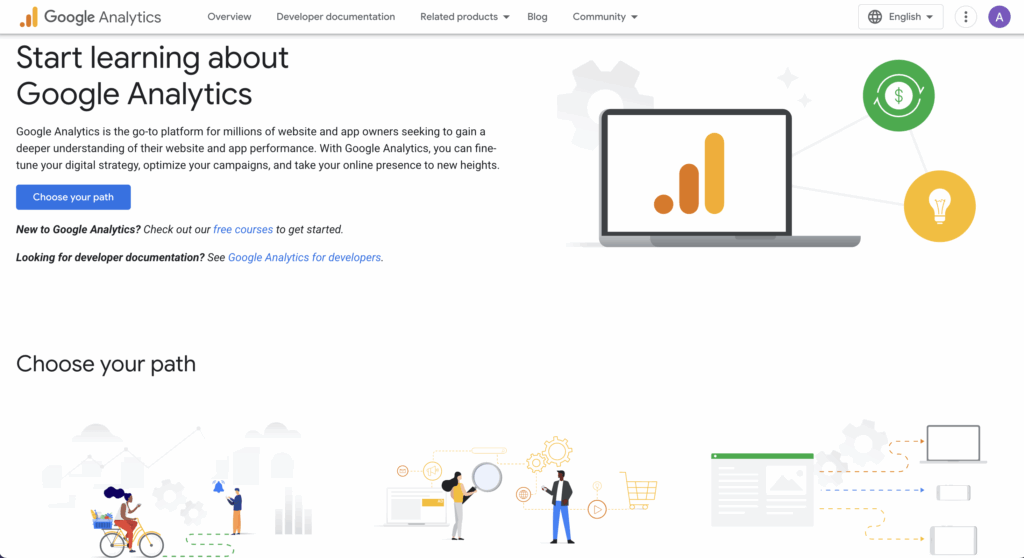
Google Analytics is a widely used web analytics platform from Google. It delivers detailed insights into website and mobile app activity, such as session duration, engagement rate, user flow, traffic source, and conversion behavior.
Key features
- Real-time reporting: Monitor live users, page views, and interactions
- Conversion tracking & funnels: Set up goals (e.g., form submissions, purchases) and visualize where users drop off in funnel
- User segmentation & cohort analysis: Analyze how different user groups perform and evolve over time
- Behavior flow & user paths: Understand navigation patterns and identify friction points
These features are crucial for CRO audits to pinpoint where users disengage, which segments convert better, and how content or UX changes impact results.
Pricing
- Google Analytics 4 (GA4) → Free for everyone.
- Google Analytics 360 (Enterprise version) → Starts at $50,000 per year and can go up to $150,000+ per year, depending on usage and contract.
Ahrefs
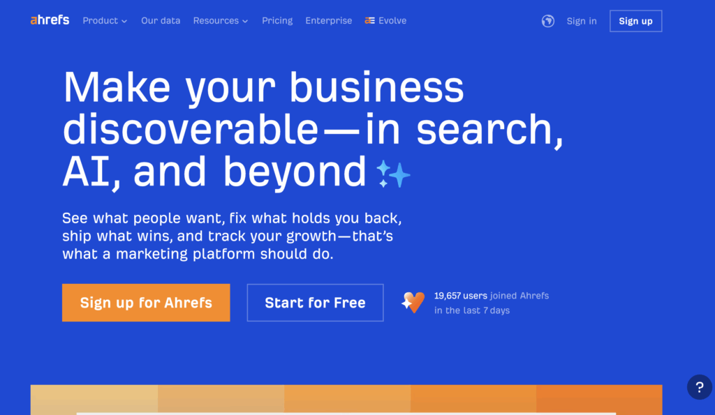
Ahrefs is one of the most powerful SEO and site analysis platforms, primarily known for backlink research and competitor analysis.
While it’s often used for SEO, it also plays a key role in CRO audits by finding technical issues, content gaps, and performance issues that affect conversions.
Key features
- Site audit: Identifies technical issues like broken links, slow-loading pages, or crawl errors that disrupt the conversion journey
- Site explorer: Provides deep insights into traffic sources, top-performing pages, and competitor strategies, helpful for benchmarking landing pages
- Content explorer: Lets you research high-performing content in your niche to identify opportunities for conversion-driven content improvements
- Keyword explorer & rank tracker: Helps evaluate whether your landing pages are reaching the right audience and tracks performance over time
Pricing
- Lite: $129/month
- Standard: $249/month
- Advanced: $449/month
UXtweak
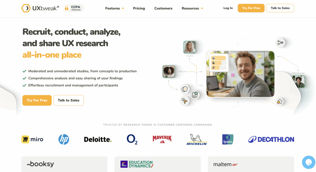
UXtweak is an all-in-one UX research and testing platform designed to help businesses uncover exactly why users aren’t converting.
Instead of guessing where visitors drop off, you can watch real behavior, test design changes, and validate decisions before rolling them out. For CRO audits, UXtweak gives you the clarity you need to turn friction points into opportunities.
Key features
- Session recording & heatmaps: Watch real users interact with your site and find the exact spots where they get stuck, distracted, or drop off
- Usability testing (Live sites & prototypes): Validate conversion paths before or after launch, whether it’s a checkout flow, sign-up process, or product demo
- Card sorting & tree testing: Ensure your navigation makes sense to your users, so they spend less time being confused and more time converting
- Surveys & on-site feedback: Capture your visitors’ thoughts in their own words as sometimes the fastest way to fix a conversion leak is just to ask
- Preference & A/B testing: Let your users choose the design, copy, or layout that nudges them closer to hitting that “buy now” button
- Mobile & accessibility testing: Make sure your conversion funnels are seamless for everyone, no matter the device or ability
These features give CRO auditors a complete toolkit, from identifying micro-interactions that frustrate users to validating large-scale redesigns.
Pricing
UXtweak has designed a variety of pricing plans to suit different user testing requirements:
- Free Plan (€0/month) – Forever free, a great way to experiment with UX research tools at no cost. Includes access to all tools, 15 responses/month, 1 active study, and 14-day access to results.
- Business Plan (€92/month, billed annually) – Ideal for teams that require essential UX research tools and features for their projects. Includes 50 responses/month (upgradable), 1 active study (upgradable), unlimited tasks per study, 12-month data retention, reports and video exports.
- Custom Plan (Pricing upon request) – Tailored for organizations with advanced research needs, providing unlimited active studies, customizable responses, live interviews, access to a global user panel and much more.
For more information on the features of each plan, visit the UXtweak pricing page. 🐝
Adobe Target
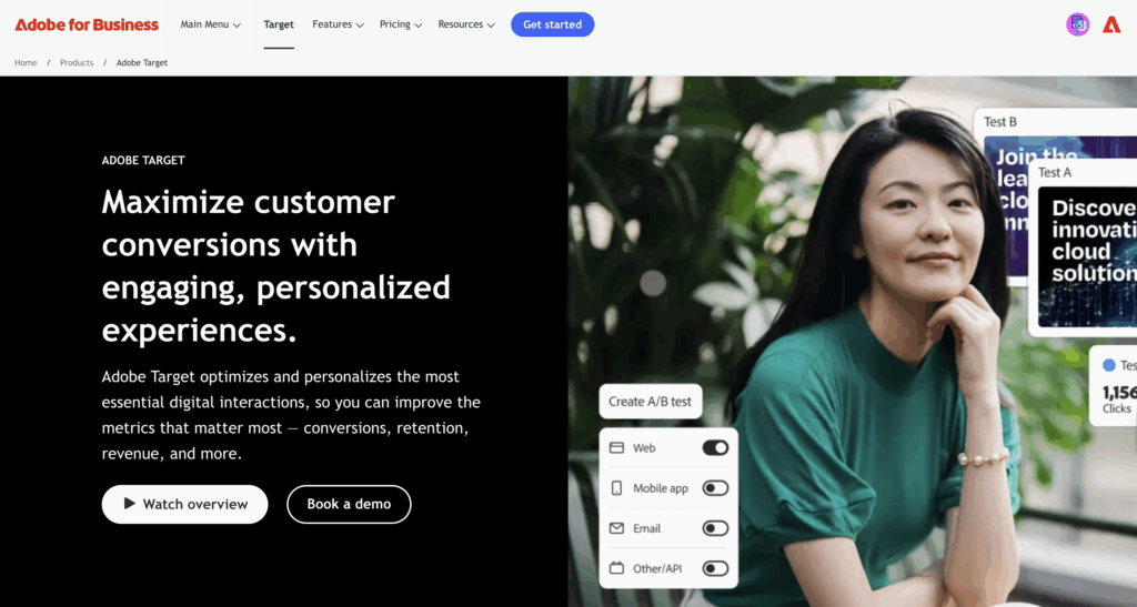
Adobe Target is an enterprise-grade experimentation and personalization tool that helps businesses optimize digital experiences at scale. It’s built for companies that want to move beyond static A/B testing into AI-powered personalization.
Key features
- A/B and Multivariate Testing: Run structured tests to identify winning variations
- AI-Driven Personalization: Adobe Sensei (AI engine) automatically delivers the right content to the right audience
- Automated Recommendations: Suggests relevant products or content to users based on behavior and history
- Advanced Targeting: Segment users by demographics, behavior, location, or device to deliver tailored experiences
Pricing
Adobe doesn’t publish fixed pricing; it’s customized based on business needs, traffic volume, and contract. Typically, pricing starts in the tens of thousands of dollars annually, making it best suited for enterprises.
Heap
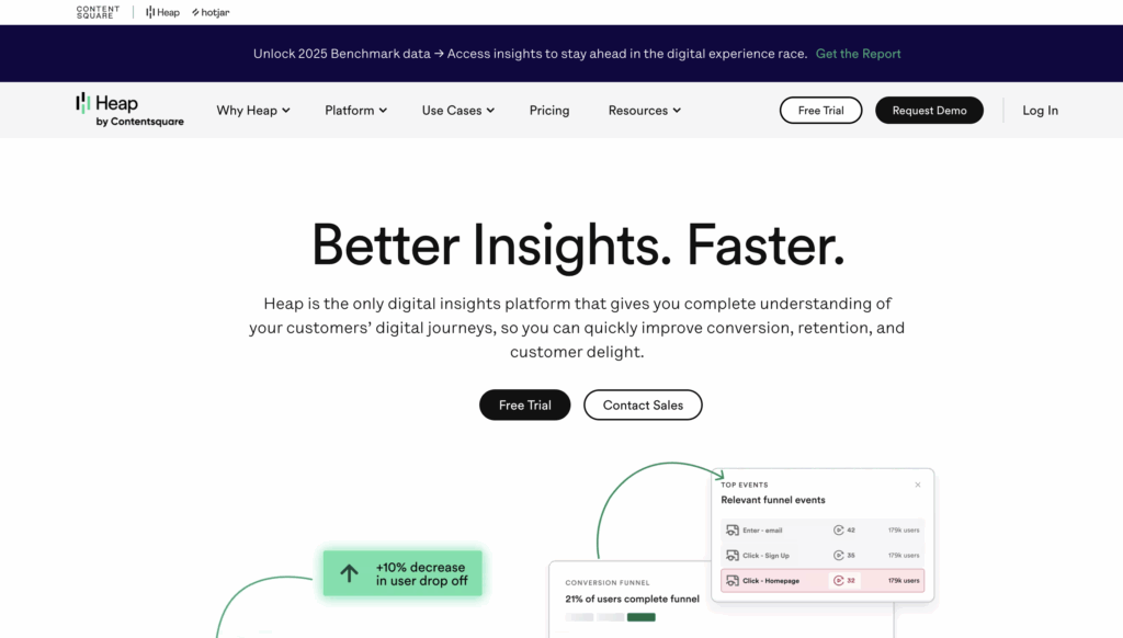
Heap is a digital insights platform built for teams that want every user interaction automatically tracked; no coding, no tagging, no “oops, we forgot to set up that event.”
It captures everything visitors do across your site or app and turns it into actionable insights for CRO.
Key features
- Autocapture: Every click, tap, swipe, and form fill is recorded automatically, so you never miss key data
- Retroactive analysis: Forgot to define an event? Go back and analyze past data without starting from scratch
- Conversion funnels: Visualize drop-offs and see exactly where users abandon the journey
- Journey maps: Understand how real users move through your site and spot friction points you didn’t even know existed
Pricing
- Free plan → Up to 10,000 sessions/month
- Growth → Custom pricing based on usage
- Pro & Premier → Custom session pricing
GTmetrix
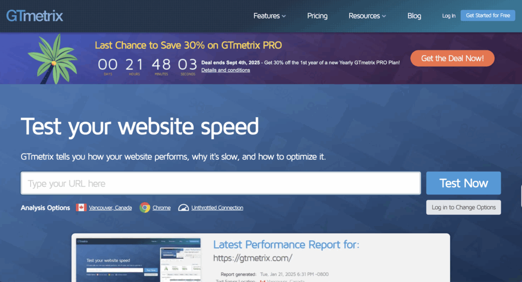
GTmetrix is a website performance testing tool that highlights speed and loading issues; crucial for conversion rate optimization, since even minor delays can hurt user experience and conversions.
Key features
- Performance & Structure Scores – Offers detailed scoring on page speed and structure to quickly flag critical issues.
- Waterfall & Resource Analysis – Breaks down every asset’s load time; JavaScript, CSS, images; making it easy to spot bottlenecks slowing user flow.
- Mobile & Global Testing – PRO plans give access to over 40 simulated mobile devices and 15+ global test locations (including Singapore) to mimic real-world user conditions.
- Historical Tracking & Monitoring – Compare past performance, set up hourly or daily monitoring, and get alerts; ideal for spotting regressions on high-converting pages.
Pricing
- Micro: $5.00/month
- Solo: $14.50/month
- Starter: $28.00/month
- Growth: $55.50/month
- Champion: $85.00/month
- Team: $225.00/month
- Enterprise: $600.00/month
- Custom plans available as well
💡 Pro Tip
Read more about the 15 Best Multivariate Testing Tools: CRO in 2025 in this article and choose the best one for you.
CRO Audit template
Here’s a CRO audit template you can use to evaluate your site step by step.
CRO Audit Report template
A strong CRO audit report should:
- Be data driven, not opinion-driven → Back every insight with analytics, heatmaps, or recordings.
- Highlight business impact → Instead of “forms are too long,” say “shortening the form could improve sign-ups by X% based on benchmark data”
- Be concise but actionable → Stakeholders don’t want 50 pages of screenshots. They want clear problems, fixes, and expected outcomes
- Prioritize issues → Rank by impact (high/medium/low) so teams know what to tackle first
That being said, here’s a CRO audit report template that can help. Some sections are filled with hypothetical scenarios to explain how you can go about it:
How to present the CRO audit report to stakeholders
Even the best audit fails if it doesn’t inspire action. When presenting:
Tell a story with the funnel → Walk stakeholders through the user journey (awareness → landing page → checkout). Show where the biggest leaks are.
Visualize the data → Use graphs, screenshots, heatmaps, and simple charts along with your explanations.
Speak their language → Frame findings in terms of business KPIs like revenue, cost per acquisition, or ROI, not just “conversion rate.” For example: “Fixing this form could recover ~200 lost leads per month.”
Prioritize ruthlessly → Don’t overwhelm with 30 recommendations. Group fixes into quick wins, medium-term, and long-term. Stakeholders will remember the top three changes, not the full list.
Show impact vs effort → Use a simple 2×2 matrix or table (Impact: High/Medium/Low, Effort: High/Low). This makes prioritization visual and avoids endless debates.
End with next steps → Provide a clear action roadmap with owners and timelines. For example: “Marketing updates landing page copy this sprint, Dev team shortens checkout in Q2.”
Wrapping up
Running a CRO audit is all about uncovering why your visitors act the way they do. The right insights turn wasted clicks into steady growth.
That’s where UXtweak stands out as the best tool for usability and user testing. It’s built for both unmoderated and moderated testing with real users, so you can validate every design and flow.
And if you don’t have an active user base, no worries, UXtweak’s User Panel connects you with a specialized pool of participants for usability studies or user interviews, so you’re never stuck waiting on feedback.
Try UXtweak for free today and turn real user insights into measurable conversion growth! 🐝




📌 Example: Break the funnel into clear stages. For an e-commerce store, that might look like:
Landing page → Category page → Product page → Cart → Checkout → Purchase.
For a SaaS business, it might be:
Blog post → Landing page → Free trial sign-up → Onboarding → Paid plan.