
➡️ Data-driven UX design means making decisions with factual evidence from analytics, testing, and user feedback instead of guesswork.
✅ The core principles are user-centricity and iteration. Put users first and continually refine your design with ongoing feedback.
🧪 Usability testing, interviews, A/B tests, heatmaps, session recordings, and competitive analysis are the main ways to collect actionable data.
🔥 Tools like UXtweak, Mixpanel, Hotjar, and Figma plugins help capture user behavior, test assumptions, and bring data into your workflow.
🎯 The goal is simple: build designs that actually solve user problems, improve business outcomes, and stay relevant through constant iteration.
What if your design choices weren’t just guesses, but backed by data? That’s exactly what data-driven design makes possible.
By using this process, you can base your choices on real evidence from how users interact with your website and app. Every color, button, and feature is shaped by insights, not mere assumptions.
The result is a design that feels natural and aligned with what users actually want. So, all that’s left is to dive into what data-driven design is and how you can use it for your benefit.
Let’s get started!
What is data-driven UX design?

Data-driven design is the practice of creating a user experience based on real evidence instead of personal opinions or guesswork.
Designers collect insights from user behavior, analytics, surveys, and testing, then use that data to shape layouts, features, and interactions.
The benefit is clear: you’re not just hoping users will like your design, you’re building something that meets their actual needs.
According to a study by McKinsey, companies that put data at the center of design decisions see up to 32% higher revenue growth compared to their competitors.
That’s because the design isn’t just aesthetically pleasing, it’s also practical and effective.
💡 Pro Tip
Don’t just rely on gut instinct. Tap into existing data, such as usage metrics, previous test results, or behavior logs, as the foundation for your design decisions.
Importance of data-driven design in product development
One of the biggest advantages of data-driven design is clarity. Traditional design often involves debates over what users “might” want.
With data-driven UX design, you can show evidence such as user behavior, analytics, or test results that back every decision.
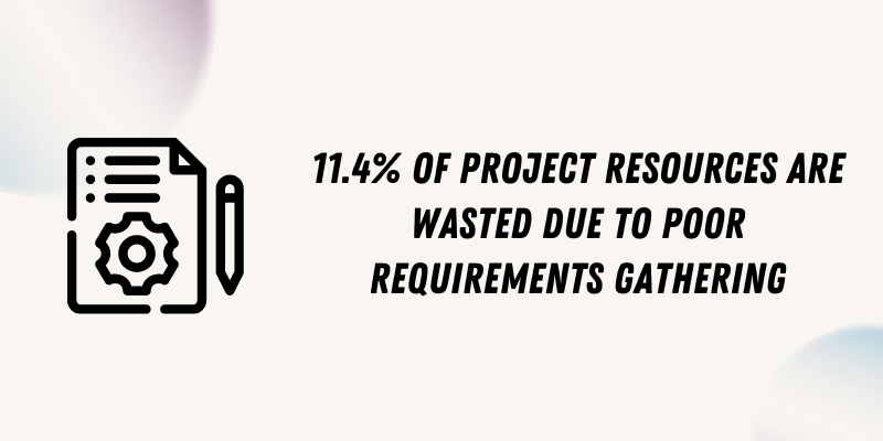
This not only builds stronger products but also aligns teams faster because everyone is looking at the same facts. Another reason it’s so important is performance. Building the wrong feature is costly.
Research shows that 11.4% of project resources are wasted due to poor requirements gathering. Data eliminates that risk by showing what users really value.
Many teams fall into the trap of thinking that creativity alone can carry a product to success. However, without solid data, even the most innovative ideas risk falling short. As Thomas Walton puts it:
Data is the lifeblood of UX—no amount of creativity and innovation can take the place of well-researched, fact-based data.
Data-driven design principles
Data-driven design is guided by a few key principles that make sure every choice you make is intentional and impactful. Two of the most important ones are user-centricity and iteration.
Let’s discuss what both principles represent.
🙋♀️ User-centricity
At its core, data-driven design is about prioritizing users. This means every design choice, whether it’s button placement or content structure, is validated by real user data.
Instead of assuming what’s “intuitive”, you test and observe how people actually interact.
This principle is powerful because users don’t always behave the way we expect.
That kind of impact doesn’t come from guessing; it comes from learning directly from users and knowing what they want.
🔄 Iteration
Great design is never “finished,” it evolves. Iteration means using data to make small, continuous improvements, rather than treating continuous product design and development as a one-time project.
You launch, measure results, learn from them, and refine.
Iterative design remains relevant as user needs and behaviors evolve. Think of how apps like Instagram or LinkedIn regularly tweak features, test new layouts, and remove what doesn’t work.
The principle of iteration also lowers risk. This way, you can make gradual adjustments that are easier to measure and reverse if needed.
How to collect data for data-driven design?

To design with confidence, you need the right kind of data. The good news? You don’t need to be a data scientist to get it. There are simple and practical methods you can use to understand your users and make smarter design choices.
Let’s go through them one by one.
💡 Usability testing
Usability testing involves observing people as they use your product. You give them tasks, such as “sign up for an account” or “find product X,” and observe how they do it.
See UXtweak’s website and prototype usability testing tools in action! 🔽

For this, invite 5 to 10 users, either in person or online, and ask them to share their screen while completing tasks. Notice where they struggle, what confuses them, and what feels smooth.
Users will often show you problems you didn’t even realize existed. Think of it as shining a light on hidden cracks in your design.
💡 User interviews
Sometimes the best way to get insights is the simplest: just ask. User interviews let you hear directly from people about what they like, dislike, and expect.
Tools like UXtweak enable you to conduct interviews and identify areas where your design is lacking.
Want to include user interviews in your UX research?
Try UXtweak’s Live Interviews!
Seamlessly schedule, recruit, conduct, and analyze your all user interviews.
⬇️ Learn more about the feature and try it yourself!
Start by preparing open-ended questions like, “What frustrates you the most when using this app?” or “Can you tell me about the last time you achieved [a specific goal] with it?”
Keep the tone casual and listen more than you talk. If you push too hard, users may give “polite” answers. Try to encourage them to share stories and examples. That’s where the real insights come out.
As famously captured by David Travis in Think Like a UX Researcher:
Great design doesn’t live inside designers. It lives inside your users’ heads. You get inside your users’ heads by doing good UX research: research that provides actionable and testable insights into users’ needs.
💡 A/B testing
Ever wonder which button color works best, or which headline gets more clicks? A/B testing helps you find out. You show one version (A) to half of your users and another version (B) to the other half.
For instance, test two checkout page designs. The one that results in more completed purchases wins.
The beauty of A/B testing is that it eliminates the guesswork from design decisions. This way, you let user behavior decide what works and not meeting debates.
💡 Heatmaps
Heatmaps show you where users click, scroll, or ignore on a page. They create a visual map of engagement. These include the hot zones, where people focus the most, and the cold zones, where they don’t.
To use website heatmaps, install a tool like Hotjar or Crazy Egg on your site. Let it collect data for a week or two. Then review the results: are people clicking where you want them to? Are they scrolling far enough to see your call-to-action?
Don’t forget, heatmaps make it obvious if your design guides users successfully or leaves them lost.
💡 Session recordings
If heatmaps show you the big picture, session recordings zoom in on the aspects with more detail and real-time interaction.
They record individual user sessions so you can literally watch how people interact with your product, click by click.
It may feel strange at first, but it’s incredibly powerful. You’ll notice patterns like hesitation before clicking, rapid back-and-forth scrolling, or users abandoning forms midway.
Use recordings to spot frustrating design issues that numbers alone can’t explain. It’s like sitting behind your user’s shoulder without being in the room.
💡 Competitive analysis
Sometimes the best lessons come from looking outside your own product. Competitive analysis is about studying how your competitors design their experiences and identifying what works (or doesn’t).
Start by signing up for their product, using their app, or walking through their website.
Take notes on layout, navigation, and features. Compare it with your own product, where are they smoother, and where do you outperform them?
This isn’t about copying. It’s about spotting opportunities to stand out and learning from the successes and mistakes of others.
The process of data-driven design
Data-driven design may sound complex, but when broken down into clear steps, it becomes manageable and practical. Here’s a simple six-step process you can follow to put it into action:
📍Step 1: Define your goals
Every product and UX design decision should start with a purpose. Ask yourself, what problem am I trying to solve? It could be reducing checkout drop-offs, increasing sign-ups, or improving mobile navigation.
Whatever it is, just be specific. A vague goal like “make the site better” won’t guide you. However, a clear goal, such as “increase free trial sign-ups by 20% in the next three months,” would definitely help you measure your progress.
📍Step 2: Collect the right data
Once you know your goal, start gathering data that relates to it. This can come from usability tests, A/B testing, heatmaps, analytics tools, or even customer interviews.
The trick is not to drown in data but to focus on insights that directly connect to your goals.
📌 Example: If you want to improve the checkout process, track drop-off rates, and review session recordings for that flow.
💡 Pro Tip
If you don’t have enough user data at this stage, that’s fine. Start with your intuition, sketch a prototype, and test it with a few users.
📍Step 3: Analyze and identify patterns
Raw data alone doesn’t tell the story; you need to make sense of it all, too. Look for trends and recurring pain points.
Are users consistently dropping off at the same point in the form field? Are heatmaps showing people ignoring your call-to-action button?
By identifying patterns, you can distinguish between noise and meaningful signals.
📍Step 4: Create hypotheses and design solutions
Now, based on your insights, create a hypothesis.
If you don’t know what it is, it’s a simple statement, such as: “If we shorten the sign-up form from five to three fields, more users will complete it.”
Then design a solution that addresses the problem. Keep it focused. Don’t redesign the entire page if the issue is just one confusing step.
💡 Pro Tip
When you’re facing pushback on your design backed by data, don’t argue; inviting collaboration works better. Ask your peers or stakeholders, “How will we measure whether your idea succeeds?”
📍Step 5: Test and validate
Don’t just assume your solution works. You need proof to see if it actually works. Your goal should be to determine whether your design change actually makes a difference.
If it works, you’ll see results like higher conversions, more clicks, or longer engagement times.
However, if it doesn’t, you don’t need to stress out. You’ll learn something valuable from your test and can try again to find a better solution.
📍Step 6: Iterate and refine continuously
Data-driven design isn’t a one-and-done exercise.
Users need change, trends shift, and what works today might not work tomorrow. Keep testing, learning, and improving. Even minor, consistent tweaks can lead to significant long-term improvements.
Data-driven design examples
Here are five real-world examples of companies using data-driven web design to help you see how they gain more customers:
Example 1: Flos USA – Checkout conversion doubled
Flos USA is an interior design product manufacturer that was struggling to maintain its conversion rates.
To improve this, they utilized behavior-tracking tools such as heatmaps, scrollmaps, and session recordings to identify user pain points during the checkout process.
With those insights, they redesigned the checkout flow, improving navigation and optimizing product selection. As a result, their checkout conversion rate jumped by 125%, delivering an impressive ROI.
Example 2: Airbnb – Smarter filters and search experience
Airbnb uses data to fuel its design improvements. By analyzing user behavior and preferences, they’ve modified their search filters (e.g., ryokans in Japan, castles in Spain) and interface.
These include popular property types or points of interest.
This data-driven design thinking made it easier for users to find what they want and has helped increase bookings and satisfaction.
Example 3: Slack – Simplifying with user feedback
As Slack’s interface evolved, so did its complexity. To fix this, the team prototyped simplified versions and tested them with 100 real users worldwide.
They discovered a preference for what’s obvious rather than being clever and trying to reinvent the wheel. These informed interface updates included channel sections and reorganized layouts. The results were improved usability across teams.
Example 4: Amazon – Personalized recommendations
Amazon’s recommendation engine is famously fueled by user behavior, such as past purchases and browsing history.
Using this data, Amazon delivers personalized suggestions (for example, “Customers Who Bought This Also Bought…”), which boosts both customer satisfaction and sales.
As one of the largest internet retailers, this data-driven website design demonstrates that these minor tweaks are indeed effective.
Example 5: Netflix – UI and content personalization
Netflix continuously refines its product using A/B tests, surveys, and analytics. This approach led to features such as user profiles, autoplay previews, and content recommendations.
Each one of these features was customized to enhance engagement and retention based on what users said and showed while using the platform. Netflix’s interface changes based on real user interaction, not guesswork.
Helpful tools for data-driven UX design
Looking for the best tools to help you build the best data-driven product design? Here are the ones you can use today.
1. UXtweak
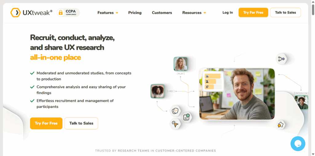
If you want to understand how people use your product, UXtweak is a great place to start. It gives you everything you need to observe real users and uncover usability issues.
You can run live interviews to talk directly to participants as they explore your design, or test how people navigate your website to see exactly where they get stuck.
Even small details, like tracking users’ first clicks when completing a task, help reveal if your design is guiding them effectively.
Thanks to this combination of methods in one platform, UXtweak makes it easy to discover problems, validate ideas, and ultimately create a smoother user experience. 🐝

2. Mixpanel
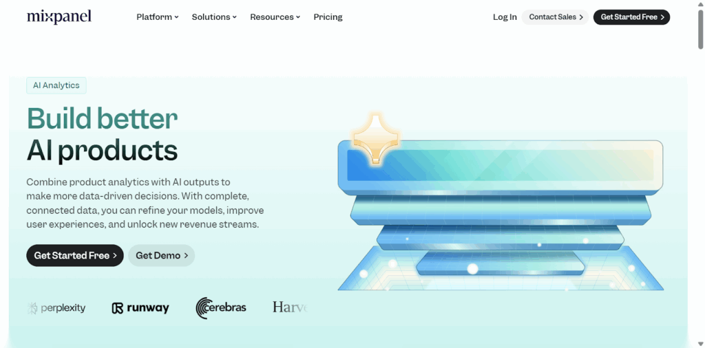
Mixpanel focuses on what users actually do, not just what they say. It tracks actions step by step. For instance, you can see if users browse products, add them to a cart, then leave before checkout. This helps you spot patterns and drop-off points.
You don’t need to be a data scientist to use it – the dashboard is clean and straightforward. You can build funnels, check retention rates, and see how people move through your app in real-time.
3. Hotjar
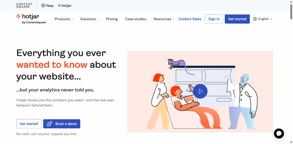
Hotjar is like a magnifying glass for user behavior. It shows you heatmaps of where people click, scroll, or completely ignore your design. You can watch actual recordings of user sessions, almost as if you’re sitting next to them as they explore your site.
Additionally, Hotjar enables you to run surveys to capture users’ thoughts in real-time. So you don’t just see what they did, you hear why they did it. This mix of visuals and feedback provides a comprehensive view.
4. Figma plugins
If you already design in Figma, plugins can bring data straight into your workflow. For example, the Baymard UX Best Practice Cards plugin gives you research-backed guidelines while you’re designing. That means you’re now designing with proven standards in mind.
Another handy one is EyeQuant Inspect, which works like a quick heatmap. It predicts what parts of your design attract the most attention. Before testing with users, you can fine-tune layouts to ensure that important elements are clearly visible.
Mistakes to avoid during the data-driven design process
Data-driven design can transform how you build products, but it’s easy to slip into traps that reduce the value of your insights. Let’s look at the most common mistakes and how you can avoid them.
⚠️ Introducing bias
One of the biggest mistakes is letting bias creep into your data.
This can happen if you only test with people who already love your product or if your survey questions push users toward specific answers. To avoid this, always aim for a diverse group of participants and keep your questions neutral.
⚠️ Ignoring qualitative data
Numbers are powerful, but they don’t tell the whole story. For instance, analytics might show that users are dropping off on a signup page, but it won’t explain why.
That’s where qualitative data, like interviews or session recordings, fills the gap. Many teams make the mistake of focusing only on numbers and miss the human perspective.
⚠️ Overcomplicating the process
Another common mistake is being overwhelmed by too much data. Collecting endless heatmaps, surveys, and reports can feel productive, but if you don’t turn those findings into clear actions, they’re useless.
A better approach is to focus on the metrics and utilize UX resources that directly tie to your goals. Just keep the process simple and actionable.
💡 Pro Tip
Start with intuition when you must, but always follow up by asking, “What data am I missing?” Then design a quick test or prototype to gather just enough insight to make an informed decision.
Optimizing data-driven design UX process with AI
Instead of spending weeks gathering and interpreting information, AI tools can analyze user behavior in minutes. This means you can transition from “what happened” to “why it happened” much more quickly.
📌 Example: AI can automatically study heatmaps, user flows, or even voice-of-customer feedback to highlight patterns you might miss. It doesn’t just crunch numbers, it connects the dots.
AI also helps scale personalization. Rather than building a one-size-fits-all experience, you can deliver content or interfaces to different user groups automatically. This makes products feel more intelligent and relatable.
📚 If you’re looking to master this approach but are not sure where to start, enrolling in a data-driven design UX course can be a smart move.
One standout option is the Data-Driven Design: Quantitative Research for UX course by Interaction-Design Foundation. It teaches how to use real data to guide UX decisions.
💡 Pro Tip
Maven’s Data-Informed Design course may be worth exploring, especially if you’re looking for courses others in your field are already recommending.
Wrapping Up
Data-driven design is the key to creating products that people genuinely love using. However, it’s one thing to base your decisions on data, and another to have the right toolkit to collect and use that data to your advantage.
The best solution? UXtweak.
From usability testing to card sorting, from heatmaps to live interviews, it’s an all-in-one tool that helps you understand your users better and design smarter.
So if you’re serious about creating designs that feel effortless to your users, don’t wait. Try UXtweak for free today!

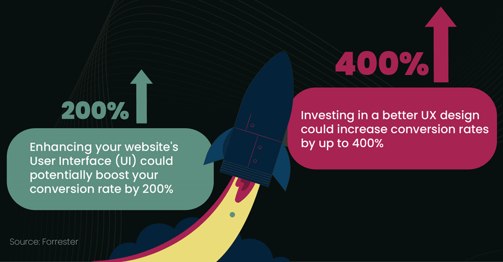
📌 Example: A Forrester study revealed that a well-designed user interface can increase conversion rates by up to 200%.